Learn Coding Visually
Learn to code with interactive, live-preview playgrounds — HTML, CSS, JavaScript, React & more.
 HTML Playground42 lessons · Click-based · Live preview
 CSS PlaygroundLearn CSS with a live editor
 JavaScript Playground60 lessons · DOM · Async · Canvas
 React PlaygroundLearn React with a live code editor
 GSAP PlaygroundLearn GSAP animation interactively
 SVG Playground44 lessons · shapes · paths · animation
 SCSS Playground45 lessons · Sass modules · tokens
 Tailwind PlaygroundLearn Tailwind CSS with a live editor
 Bootstrap 5 Playground50 lessons · live preview
Download Button — Progress Ring HTML CSS JS Snippet
Download Button · Buttons · Plain HTML, CSS & JS · Live preview
What's included
Features
stroke-dashoffset is updated every requestAnimationFrame rather than via CSS transition, so the fill is smooth and export-safe.stroke-dasharray = circumference and a shrinking offset to draw the arc — the standard SVG progress technique.-90deg so progress begins at 12 o'clock, the conventional direction users expect.1 - (1 - p)²) makes the ring slow near the end, feeling like a real transfer instead of a robotic linear fill.p, so they can never drift out of agreement.startDownload ignores clicks while loading or done, so rapid clicks cannot stack or restart the animation.finish shows success, then resets the ring and returns to idle after a pause, re-arming the button.About this UI Snippet
Download Button — Idle → Progress Ring → Success State Machine
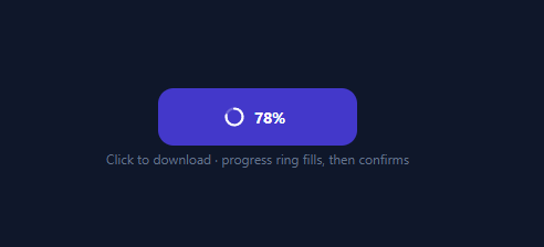
A download (or upload, or save) button that just sits there during a transfer feels broken. The polished version turns the click into a visible journey: the label gives way to a filling progress ring with a live percentage, and on completion it confirms with a checkmark. This snippet implements that micro-interaction in plain HTML, CSS, and vanilla JavaScript: a three-state button driven by a JavaScript-animated SVG ring, an eased percentage, and an automatic reset.
Three states, cross-faded in place
The button holds three layers — idle (icon + "Download"), loading (ring + percentage), and done (check + "Saved") — stacked absolutely and toggled by classes on the button. Switching states cross-fades the layers with opacity and a small vertical slide; the button keeps a fixed size, so there is no width-morph jank and the animation is purely opacity/transform, which exports cleanly to utility frameworks. The button background also shifts colour per state (indigo → deep indigo → green) to reinforce the change.
JS-driven SVG progress ring
The ring is two SVG circles: a faint track and a progress stroke. The progress is drawn with the stroke-dash technique — stroke-dasharray set to the circumference (2πr) and stroke-dashoffset reduced toward zero to "draw" the arc. Rather than a CSS transition (which utility frameworks do not reliably apply to stroke-dashoffset), the offset is updated every frame in a requestAnimationFrame loop, so the fill is smooth and fully under your control. The SVG is rotated -90deg so the ring starts filling from the top, the conventional direction.
Eased, realistic progress
A linear fill looks robotic. The loop applies an ease-out curve (1 - (1 - p)²) so the ring races ahead early and slows near the end — closer to how a real transfer behaves. The percentage text updates in lockstep with the ring from the same p value, so the number and the arc never disagree.
Re-entrancy guard and auto-reset
startDownload ignores clicks while the button is already loading or done, so spamming it cannot stack animations or restart mid-fill. On completion, finish switches to the success state and, after a short pause, resets the ring and returns to idle so the button is ready for another download.
The 2.2-second timer stands in for a real transfer — replace it by driving setProgress from a fetch with a ReadableStream reader or an XMLHttpRequest progress event. Pair this with a loading button for generic async actions, an upload progress component, or an add to cart button micro-interaction.
Build with AI
Build, Understand, Optimize, and Extend It With AI
Instead of tracing the state machine yourself, paste this snippet's HTML, CSS, and JS into an AI coding assistant like Claude and ask it to explain exactly why setProgress() applies the ease-out curve 1 minus (1 minus p) squared to the stroke-dashoffset instead of a linear fill, and why the ring's progress is driven every frame from JavaScript rather than a plain CSS transition on stroke-dashoffset. The same assistant can help optimize it, for example checking whether the requestAnimationFrame loop should be cancelled if the button is removed from the DOM mid-download to avoid a leaked animation frame. It's also useful for extending the button: ask it to wire setProgress to a real fetch response stream's reader, add an error state with a retry affordance, or support a cancel button that aborts the in-flight transfer and resets the ring. Treat the code less like a finished artifact and more like a starting point for a conversation.
Prompt to recreate it
Copy this into your AI assistant of choice to build the effect from scratch, or as a jumping-off point for your own variant:
Build a download button with a three-state progress indicator in plain HTML, CSS, and JavaScript using an SVG ring — no animation library.

Requirements:
- A single fixed-size button containing three absolutely-positioned, stacked content layers: an idle layer (icon plus label), a loading layer (an SVG progress ring plus a live percentage number), and a done layer (checkmark plus success label), switching visibility by toggling CSS classes on the button rather than changing the button's size.
- Cross-fade between the three layers using only opacity and a small transform translate, with a fixed-height button so nothing reflows when state changes.
- The SVG ring must consist of a static track circle and a separate progress circle, both using stroke-dasharray set to the circle's circumference (2 times PI times the radius) computed in JavaScript from the radius, with the whole SVG rotated -90 degrees so the fill visibly starts from the top.
- Drive the progress circle's stroke-dashoffset from a requestAnimationFrame loop (not a CSS transition) so that every frame recomputes an eased value using an ease-out curve like 1 minus (1 minus progress) squared, making the fill move quickly at first and slow down near completion, and update the percentage text from that exact same eased value so the number and the ring can never show conflicting progress.
- Guard the trigger function so clicking the button while it is already in the loading or done state does nothing, preventing overlapping or restarted animations.
- On reaching 100 percent, switch to the done state showing a checkmark and success label, then after a short delay automatically reset the ring's offset and switch back to the idle state so the button is ready to be clicked again.
Want to tighten it up first? Run this prompt through the AI Prompt Studio to score it across 8 quality dimensions, catch anti-patterns, and tune the wording for Claude, ChatGPT, or Gemini before you paste it in.
Step by step
How to Use
- 1Paste HTML, CSS, and JSA purple "Download" button with a download icon appears on a dark background.
- 2Click itThe label cross-fades to a progress ring that fills from the top while a percentage counts up beside it.
- 3Watch the easingThe ring races ahead early and eases as it nears 100%, mimicking a real transfer rather than a linear bar.
- 4See the success stateAt 100% the button turns green and shows a checkmark with "Saved".
- 5It auto-resetsAfter about two seconds it fades back to the idle "Download" state, ready to run again.
- 6Wire a real transferReplace the timer by calling
setProgressfrom a fetch stream or XHRprogressevent with the real loaded/total ratio.
Real-world uses
Common Use Cases
Got questions?
Frequently Asked Questions
Use fetch and read the response body as a stream: get Content-Length for the total, then read chunks from response.body.getReader(), accumulating bytes and calling setProgress(received / total) as they arrive. Or with XMLHttpRequest, listen to the progress event and call setProgress(e.loaded / e.total). Call finish() when the stream completes.
For a real transfer you set the exact progress value as data arrives, which is inherently JS-driven. Even for the simulated version, utility frameworks (Tailwind) do not include stroke-dashoffset in their transition utility, so a CSS-transition approach would snap in the React + Tailwind export. Updating the offset each requestAnimationFrame is smooth and works identically everywhere.
Add an error state class with a red background and an alert icon. In your fetch/XHR error or non-OK-status handler, cancel the animation frame, switch the button to the error state with a "Retry" affordance, and clear the loading class. Keep the re-entrancy guard so a failed attempt can be retried cleanly once reset.
The dash length is the circle's circumference, 2 × π × r. Set both stroke-dasharray and the initial stroke-dashoffset to that value, then reduce the offset toward 0 as progress goes 0 → 1. If you change the circle's r, recompute C in the JS (the snippet derives it from r = 9) and update the CSS stroke-dasharray to match.
In React, hold a status ('idle' | 'loading' | 'done') and progress in useState, render the ring offset from progress, and drive it from your fetch/XHR handler (cancel any rAF in a cleanup). In Vue, use refs and :style for the offset. In Angular, track status/progress on the component and bind [style.strokeDashoffset]. The stroke-dash math and state CSS port unchanged.