Source Code
<div class="demo">
  <button class="btn" id="btn" onclick="triggerLoad()">
    <span class="spinner"></span>
    <span class="label">Save changes</span>
  </button>
  <p class="hint">Click to see the loading state</p>
</div>
* { box-sizing: border-box; margin: 0; padding: 0; }
body { font-family: system-ui, sans-serif; background: #f8fafc; display: flex; align-items: center; justify-content: center; min-height: 100vh; }
.demo { display: flex; flex-direction: column; align-items: center; gap: 14px; }
.btn {
display: inline-flex;
align-items: center;
gap: 8px;
padding: 10px 22px;
font-size: 14px;
font-weight: 600;
border-radius: 8px;
background: #6366f1;
color: #fff;
border: none;
cursor: pointer;
transition: background 0.15s, opacity 0.15s;
font-family: inherit;
min-width: 150px;
justify-content: center;
}
.btn:hover { background: #4f46e5; }
.btn.loading { opacity: 0.8; cursor: not-allowed; }
.btn.done { background: #16a34a; }
.spinner {
width: 14px;
height: 14px;
border: 2px solid rgba(255,255,255,0.4);
border-top-color: #fff;
border-radius: 50%;
animation: spin 0.65s linear infinite;
display: none;
flex-shrink: 0;
}
.loading .spinner { display: block; }
@keyframes spin { to { transform: rotate(360deg); } }
.hint { font-size: 12px; color: #94a3b8; }function triggerLoad() {
const btn = document.getElementById('btn');
const label = btn.querySelector('.label');
if (btn.classList.contains('loading') || btn.classList.contains('done')) return;
btn.classList.add('loading');
label.textContent = 'Saving…';
setTimeout(() => {
btn.classList.remove('loading');
btn.classList.add('done');
label.textContent = '✓ Saved!';
setTimeout(() => {
btn.classList.remove('done');
label.textContent = 'Save changes';
}, 2000);
}, 1800);
}Learn Coding Visually
Learn to code with interactive, live-preview playgrounds — HTML, CSS, JavaScript, React & more.
 HTML Playground42 lessons · Click-based · Live preview
 CSS PlaygroundLearn CSS with a live editor
 JavaScript Playground60 lessons · DOM · Async · Canvas
 React PlaygroundLearn React with a live code editor
 GSAP PlaygroundLearn GSAP animation interactively
 SVG Playground44 lessons · shapes · paths · animation
 SCSS Playground45 lessons · Sass modules · tokens
 Tailwind PlaygroundLearn Tailwind CSS with a live editor
 Bootstrap 5 Playground50 lessons · live preview
Loading Button — Free HTML CSS JS Spinner Button Snippet
Loading Button · Buttons · Plain HTML, CSS & JS · Live preview
What's included
Features
About this UI Snippet
Loading Button — CSS Spinner, Three-State Machine & Layout Stability
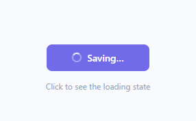
A loading button gives users immediate visual feedback that their action was received and is being processed. Without it, users click buttons multiple times assuming nothing happened — causing duplicate API calls, double submissions on a contact form, and double payments. This is one of the most impactful micro-interactions in web development: a single CSS animation and 15 lines of JavaScript that prevent real production bugs.
This snippet gives you a complete loading button in plain HTML, CSS, and vanilla JavaScript. Click it in the preview to see the full cycle: idle state → spinner + "Saving…" → green success + "✓ Saved!" → reset to idle.
How the CSS spinner works
The spinner element is a 14×14px div with border: 2px solid rgba(255,255,255,0.4) — a faded white border on all four sides. border-top-color: #fff overrides the top border to full opacity. A @keyframes spin animation rotates the element 360 degrees at 0.65s linear infinite. The three faded sides form the trailing arc and the full-opacity top border is the leading head. This technique requires no SVG, no icon library, and no images — just a div and a keyframe, the same approach as the standalone loading dots.
By default .spinner { display: none }. The selector .loading .spinner { display: block } activates it only when the parent button has the .loading class.
The three-state machine
The button cycles through three states managed by class names:
Idle (default): no extra class, normal background, label reads "Save changes", spinner hidden, cursor pointer.
Loading (.loading): spinner visible, label changes to "Saving…", opacity: 0.8, cursor: not-allowed. The function adds this class immediately on click so feedback is instant.
Done (.done): spinner hidden, background changes to green (#16a34a), label changes to "✓ Saved!". Applied after a 1.8-second timeout simulating an API response. For a more celebratory confirmation, trigger a confetti button instead.
After 2 seconds on the Done state the button resets to Idle. Both .loading and .done guard against re-triggering — the function returns early if either is present.
Why min-width prevents layout shift
The button has min-width: 150px. Without it, the button width would change as the label switches between "Save changes" (12 chars), "Saving…" (7 chars), and "✓ Saved!" (8 chars), causing the surrounding layout to shift on every state change. The min-width locks the button to its widest natural size and justify-content: center keeps the content centred within it.
Connecting to a real API call
Replace the setTimeout in triggerLoad() with your actual fetch() call. Move the success code block into .then() and add a .catch() handler with an error state. For async/await, wrap the fetch in a try/catch and place the success/error logic in the respective branches.
Adding a fourth error state
Add .btn.error { background: #dc2626; } to the CSS. In the catch block, add btn.classList.add('error') and set the label to "Error — try again". Reset to idle after 3 seconds with setTimeout.
Saving your customised version
After editing, click "Save as" in the editor header, type a name, and press Enter. Saves to IndexedDB and appears in the Saved tab.
Build with AI
Build, Understand, Optimize, and Extend It With AI
You do not need to stare at the border properties to see how the spinner works. Paste this snippet's HTML, CSS, and JS into an AI coding assistant like Claude and ask it to explain exactly why setting border-top-color separately from the base border on the same element is enough to produce a spinning arc illusion, and why the early-return guard checking for the loading and done classes is what prevents duplicate submissions on rapid clicks. The same assistant can help optimize it, for instance asking whether the fixed 1800ms and 2000ms setTimeout durations should instead be driven by the real fetch promise resolving, so the button never shows a false success before the server actually responds. It is also useful for extending the button: ask it to add a fourth error state with a distinct color and retry affordance, generalize triggerLoad() to accept any button element instead of one hardcoded id, or wire it to an AbortController so a slow request can be cancelled mid-spin. Treat the code less like a finished artifact and more like a starting point for a conversation.
Prompt to recreate it
Copy this into your AI assistant of choice to build the effect from scratch, or as a jumping-off point for your own variant:
Build a "loading button" state machine in plain HTML, CSS, and JavaScript with no libraries.

Requirements:
- A single button element containing a spinner element and a text label span, where the spinner is a div with a solid low-opacity border on all sides and a full-opacity border-top-color, animated with a CSS keyframe that rotates it 360 degrees linearly and continuously — no SVG, no icon font.
- The spinner must be hidden by default (display: none) and shown only when the button carries a specific loading CSS class, via a descendant selector, not an inline style toggle.
- The button must cycle through exactly three states driven by class names: an idle state with the default label and no spinner, a loading state that shows the spinner, changes the label text, sets cursor: not-allowed, and dims the button slightly, and a done state that hides the spinner, changes the background to a distinct success color, and shows a checkmark-style success label.
- Clicking the button while it is already in the loading or done state must do nothing (an early return), so rapid repeat clicks cannot re-trigger the cycle or fire duplicate submissions.
- The button must have a fixed minimum width sized to fit its widest possible label across all three states, with its content horizontally centered, so switching labels never shifts the surrounding page layout.
- Structure the state-transition logic (the loading-to-done timeout) so it is a drop-in replacement point: swapping the setTimeout for a real fetch call's .then()/.catch() should require touching only that one block, not the class-toggling or label logic elsewhere.
Want to tighten it up first? Run this prompt through the AI Prompt Studio to score it across 8 quality dimensions, catch anti-patterns, and tune the wording for Claude, ChatGPT, or Gemini before you paste it in.
Step by step
How to Use
- 1Click the button in the previewClick "Save changes" to see the full idle → spinner + Saving → green Saved! → reset cycle play out in real time.
- 2Change the labelsIn the JS panel, find "Save changes", "Saving…", and "✓ Saved!" and replace with your own action-specific labels.
- 3Adjust the timingChange 1800 (loading duration in ms) and 2000 (success display duration) to match your expected API response time.
- 4Connect to a real API callReplace the setTimeout in triggerLoad() with your fetch() call. Move the success block into .then() and add .catch() with an error state.
- 5Customise the coloursUpdate the button background (#6366f1), hover colour (#4f46e5), and success colour (#16a34a) in the CSS panel to match your brand.
- 6Export in your formatClick "HTML" for a standalone file, "JSX" for a React component, or "Tailwind" for a React + Tailwind version.
Real-world uses
Common Use Cases
Got questions?
Frequently Asked Questions
The spinner div has border: 2px solid rgba(255,255,255,0.4) on all four sides — a faded ring. border-top-color: #fff overrides the top to full opacity. A @keyframes animation rotates the element 360 degrees. The three faded sides form the trailing arc and the bright top side is the spinning head. No SVG, no image — just a div and a keyframe.
In triggerLoad(), replace the outer setTimeout with your fetch() call. Move btn.classList.remove("loading"); btn.classList.add("done") into the .then() handler. Add a .catch() block that removes .loading, sets a .error class, and updates the label to an error message.
Add .btn.error { background: #dc2626; } to the CSS. In the .catch() block, add btn.classList.add("error") and set label.textContent to "Error — try again". Use setTimeout to remove .error and reset the label after 3 seconds so the user can retry.
The function starts with: if (btn.classList.contains("loading") || btn.classList.contains("done")) return; This exits immediately if the button is already loading or showing success, blocking all subsequent clicks until the cycle completes and the classes are removed.
The label changes between "Save changes", "Saving…", and "✓ Saved!" — three strings of different lengths. Without min-width: 150px, the button width would change with each label, shifting surrounding layout elements. The fixed minimum width locks the button to its widest natural size.
Yes. The current implementation uses document.getElementById("btn") which targets a specific element. To reuse across multiple buttons, refactor triggerLoad() to accept the button element as a parameter, or use event delegation with this inside an onclick handler.
Yes. Click "JSX" to download a React component. Replace the class-based state machine with useState — const [state, setState] = useState("idle"). Set state to "loading" on click, await your fetch call, then setState to "success" or "error". Use the state value to control the className, label text, and spinner visibility.