Learn Coding Visually
Learn to code with interactive, live-preview playgrounds — HTML, CSS, JavaScript, React & more.
 HTML Playground42 lessons · Click-based · Live preview
 CSS PlaygroundLearn CSS with a live editor
 JavaScript Playground60 lessons · DOM · Async · Canvas
 React PlaygroundLearn React with a live code editor
 GSAP PlaygroundLearn GSAP animation interactively
 SVG Playground44 lessons · shapes · paths · animation
 SCSS Playground45 lessons · Sass modules · tokens
 Tailwind PlaygroundLearn Tailwind CSS with a live editor
 Bootstrap 5 Playground50 lessons · live preview
Contact Form — Floating Labels & Validation HTML CSS JS
Contact Form · Forms · Plain HTML, CSS & JS · Live preview
What's included
Features
input — no full-form re-validation needed for corrections.<select> with appearance: none + custom SVG arrow — preserves keyboard navigation and native option list while giving full visual control.maxlength attribute..check-box div with :checked + .check-box selector — indigo fill and ✓ checkmark. Keyboard and screen reader accessible..loading class fades out label/icon and fades in spinner — button stays the same size, preventing layout shift during the async delay.translateY(-8px) → 0) after successful submission. Auto-hides after 5 seconds and re-enables the form.About this UI Snippet
Contact Form — Field-Level Validation, Character Counter & Two-Panel Layout
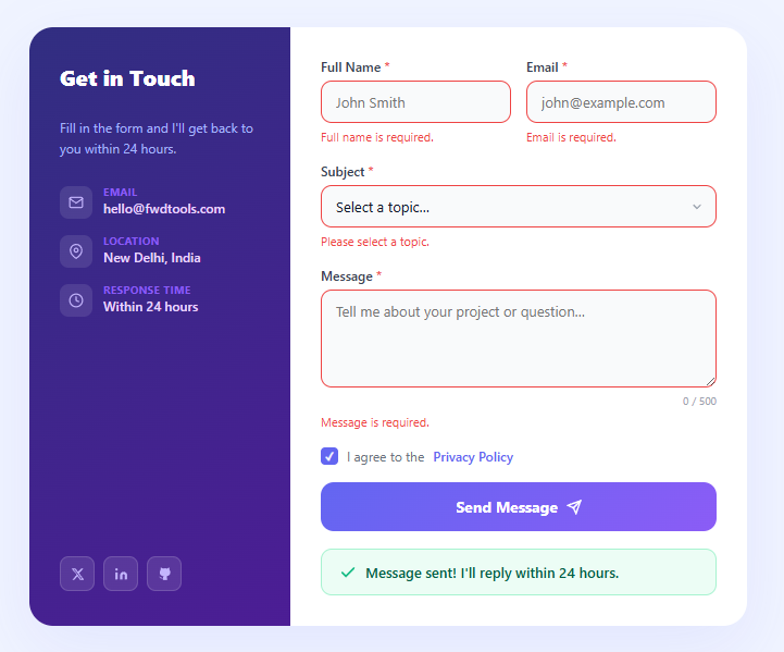
A contact form is often the most critical conversion element on a freelancer or agency website, yet most implementations lack the validation, loading states, and success feedback that users expect. This snippet builds a production-quality two-panel contact form: a purple contact details panel on the left, and a validated form on the right with name, email, subject dropdown, message textarea with character counter, privacy checkbox, loading button, and an animated success banner.
Contact forms must handle five key UX concerns simultaneously: preventing empty submission, validating email format, providing immediate per-field feedback, communicating async submission state, and confirming success clearly. This snippet solves all five.
Per-field validation with immediate error clearing
Each field has a sibling <p class="field-error"> element that displays the validation error. The validate() function runs on submit and populates each error paragraph with a message (or clears it if valid). The is-error class adds a red border to the field. Crucially, each field's input event (or change for the checkbox) clears the error immediately — users get confirmation that their correction is accepted without waiting for re-submit.
Subject dropdown with custom arrow
The subject is a <select> element with appearance: none to remove the browser's native arrow. A custom SVG chevron is absolutely positioned over the right side. This technique gives full control over the select's visual appearance while preserving its native focus, keyboard navigation, and option list behaviour.
Character counter for the textarea
The message textarea has a maxlength-style counter implemented in JavaScript: the input event updates charCount.textContent and enforces the 500-character limit by slicing e.target.value. This is more user-friendly than a native maxlength attribute because the counter shows remaining characters rather than silently refusing input.
Privacy checkbox with custom styling
The privacy checkbox uses position: absolute; opacity: 0 to hide the native input while keeping it focusable. A sibling .check-box div shows the visual state via :checked + .check-box CSS — filling with indigo and showing a ✓ character when checked. This is the standard CSS-only custom checkbox pattern that works with keyboard, mouse, and screen reader.
Loading and success states
The submit button switches to a spinner during the async call (same CSS opacity technique as the newsletter form). On success, the form resets to empty, a green success banner slides in from above, and after 5 seconds the banner hides and the button re-enables for another submission. Pair with a toast notification if you want a site-wide confirmation that persists across navigation.
Build with AI
Build, Understand, Optimize, and Extend It With AI
You don't have to reconstruct the validation and error-clearing flow by re-reading the JS twice. Paste this snippet's HTML, CSS, and JS into an AI coding assistant like Claude and ask it to explain exactly how the fields object ties each input to its own error paragraph, and why the input/change listener that clears errors is attached separately from the validate function that sets them. The same assistant can help optimize it — for instance asking whether the character-count enforcement that slices the textarea's value on every keystroke could cause cursor-position glitches when a user pastes text over the limit. It's also useful for extending the form: ask it to add real-time email format checking as the user types instead of only on submit, wire the setTimeout stand-in to an actual fetch call with proper error-state handling, or add a file attachment field that participates in the same validation and error-clearing pattern as the other fields. Treat the code less like a finished artifact and more like a starting point for a conversation.
Prompt to recreate it
Copy this into your AI assistant of choice to build the effect from scratch, or as a jumping-off point for your own variant:
Build a validated contact form in plain HTML, CSS, and JavaScript with a two-panel layout — no form library, no frameworks.

Requirements:
- A two-panel card: a left panel with contact details and social links, and a right panel containing a form with name, email, a subject select, a message textarea, and a required privacy-policy checkbox.
- Represent every validated field as an object mapping a field key to both its input element and its own dedicated error-message element, so validation and error-clearing logic can iterate the fields generically instead of repeating per-field code.
- A validate function that checks all fields at once on submit: required-ness for name, subject, and message (with a minimum message length), a regex-based email format check, and a required checkbox — writing a specific message into each field's own error element and toggling an error-styling class on invalid fields, only allowing submission when every check passes.
- Every field must clear its own error message and error styling immediately on its next input or change event, independent of the other fields, so correcting one mistake doesn't require re-submitting the whole form to see feedback.
- A live character counter under the message textarea that updates on every keystroke and hard-enforces a maximum length by truncating the value if exceeded, rather than silently relying on the native maxlength attribute alone.
- A custom-styled checkbox built by visually hiding the native input (not removing it from the accessibility tree) and using a sibling element plus a checked-state CSS selector to render the checked appearance, so it stays keyboard- and screen-reader-operable.
- A submit handler that prevents default, runs validation, and only if valid shows a loading state on the button (label and icon hidden, a spinner shown) sized so the button doesn't change dimensions, awaits a stand-in async delay, then resets the form, shows a success banner that animates in, and auto-hides that banner after several seconds while re-enabling the form for another submission.
Want to tighten it up first? Run this prompt through the AI Prompt Studio to score it across 8 quality dimensions, catch anti-patterns, and tune the wording for Claude, ChatGPT, or Gemini before you paste it in.
Step by step
How to Use
- 1Paste HTML, CSS, and JSA two-panel card renders — purple left panel with contact details and social links, white right panel with the full form.
- 2Try submitting emptyClick "Send Message" without filling anything — all five fields show inline error messages and red borders simultaneously.
- 3Fill in the form and type in the messageThe character counter below the textarea updates with each keystroke. Errors clear field-by-field as you fill them in correctly.
- 4Check the privacy box and submitA loading spinner appears in the button for 1.5 seconds. Then the form resets and a green success banner slides in.
- 5Connect your backendReplace the
setTimeoutin JS with a realfetchcall to your API, Formspree endpoint, or email service. Handle errors by re-enabling the button and callingvalidate()with a server error message. - 6Update contact detailsEdit the email, location, and response time in the HTML left panel. Swap the social links to your actual profiles. Change the gradient colours in CSS
.card-left.
Real-world uses
Common Use Cases
Got questions?
Frequently Asked Questions
Set action="https://formspree.io/f/{your-id}" and method="POST" on the form, and remove the JS submit handler. Or keep the JS handler and use fetch('https://formspree.io/f/{id}', { method:'POST', body: new FormData(form), headers:{Accept:'application/json'} }).
Add <div class="field"><label>Phone</label><input type="tel" class="input" /></div> in the form HTML. Validation: /^[+\d\s\-\(\)]{7,}$/.test(value). Phone is typically optional, so no required check.
Use useState for { values, errors, loading, success }. Each input uses value={values.name} and onChange={e => setValues({...values, name: e.target.value})}. The submit handler calls the validate function, sets loading, awaits the API, then sets success. Render the success banner conditionally.
Add <input type="file" accept=".pdf,.doc,.docx,.png,.jpg" />. Use FormData for submission: const fd = new FormData(form). File inputs work natively with FormData — the file is included in the POST body automatically.