Source Code
<div class="demo">
  <button class="btn success" onclick="showToast('success','Changes saved successfully')">Success</button>
  <button class="btn error" onclick="showToast('error','Something went wrong')">Error</button>
  <button class="btn info" onclick="showToast('info','Update available')">Info</button>
</div>
<div id="toasts" class="toasts"></div>
* { box-sizing: border-box; margin: 0; padding: 0; }
body { font-family: system-ui, sans-serif; background: #f8fafc; display: flex; align-items: center; justify-content: center; min-height: 100vh; }
.demo { display: flex; gap: 10px; flex-wrap: wrap; justify-content: center; padding: 20px; }
.btn {
padding: 9px 18px;
font-size: 13px;
font-weight: 600;
border: none;
border-radius: 8px;
cursor: pointer;
font-family: inherit;
transition: opacity 0.15s;
}
.btn:hover { opacity: 0.85; }
.btn.success { background: #dcfce7; color: #16a34a; }
.btn.error { background: #fee2e2; color: #dc2626; }
.btn.info { background: #dbeafe; color: #2563eb; }
.toasts {
position: fixed;
bottom: 20px;
right: 20px;
display: flex;
flex-direction: column;
gap: 8px;
z-index: 999;
}
.toast {
display: flex;
align-items: center;
gap: 10px;
padding: 12px 16px;
border-radius: 10px;
font-size: 13px;
font-weight: 500;
box-shadow: 0 4px 20px rgba(0,0,0,0.12);
animation: slideIn 0.3s ease;
min-width: 220px;
max-width: 320px;
}
.toast.out { animation: slideOut 0.3s ease forwards; }
.toast.success { background: #f0fdf4; color: #166534; border-left: 3px solid #16a34a; }
.toast.error { background: #fef2f2; color: #991b1b; border-left: 3px solid #dc2626; }
.toast.info { background: #eff6ff; color: #1e40af; border-left: 3px solid #2563eb; }
@keyframes slideIn { from { transform: translateX(110%); opacity: 0; } to { transform: translateX(0); opacity: 1; } }
@keyframes slideOut { from { transform: translateX(0); opacity: 1; } to { transform: translateX(110%); opacity: 0; } }function showToast(type, msg) {
const icons = { success: '✓', error: '✕', info: 'i' };
const wrap = document.getElementById('toasts');
const t = document.createElement('div');
t.className = 'toast ' + type;
t.innerHTML = '<strong>' + icons[type] + '</strong> ' + msg;
wrap.appendChild(t);
setTimeout(() => {
t.classList.add('out');
t.addEventListener('animationend', () => t.remove());
}, 2800);
}Learn Coding Visually
Learn to code with interactive, live-preview playgrounds — HTML, CSS, JavaScript, React & more.
 HTML Playground42 lessons · Click-based · Live preview
 CSS PlaygroundLearn CSS with a live editor
 JavaScript Playground60 lessons · DOM · Async · Canvas
 React PlaygroundLearn React with a live code editor
 GSAP PlaygroundLearn GSAP animation interactively
 SVG Playground44 lessons · shapes · paths · animation
 SCSS Playground45 lessons · Sass modules · tokens
 Tailwind PlaygroundLearn Tailwind CSS with a live editor
 Bootstrap 5 Playground50 lessons · live preview
Toast Notification — Free HTML CSS JS Snippet
Toast Notification · Modals · Plain HTML, CSS & JS · Live preview
What's included
Features
About this UI Snippet
Toast Notification — Dynamic DOM, CSS Slide Animation & animationend Cleanup
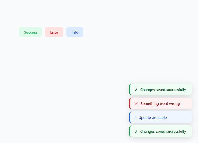
Toast notifications are temporary messages that appear in a corner of the screen to confirm actions (for an undoable confirmation, see the snackbar with undo), report errors, or signal background operation results. Unlike modal dialogs, they do not interrupt the user — they slide in, display their message, and dismiss themselves automatically. This snippet implements a complete toast system: dynamic DOM creation, CSS keyframe animation, three semantic types, and automatic element cleanup.
How the slide animation works
The .toasts container is position: fixed; bottom: 20px; right: 20px with display: flex; flex-direction: column; gap: 8px. Each toast slides in via a slideIn keyframe: transform: translateX(110%) to translateX(0). Using 110% (rather than 100%) ensures the toast starts completely off-screen, accounting for any visible shadow or border. The slide-out reverses with a slideOut keyframe.
Dynamic DOM creation
showToast(type, msg) creates a <div> element, assigns the type class (t success, t error, or t info), sets the innerHTML with an icon and message, and appends it to the #toasts container. No pre-rendered HTML is needed. After 2800ms, it adds the .out class which triggers slideOut. An animationend listener fires t.remove() when the animation completes, preventing orphaned elements from accumulating in the DOM.
The three semantic variants
Success uses a tinted green background with a green border-left: 3px solid and a ✓ icon. Error uses red. Info uses blue. The tinted background is rgba so the toast works on both light and dark page backgrounds. Each type communicates the nature of the message at a glance before the user reads the text.
Stacking behaviour
Multiple toasts append to the flex column container automatically. The gap: 8px spaces them. Toasts dismiss in order, with each remove() call shrinking the stack naturally. Rapid clicking creates a queue of stacked notifications — for a managed FIFO queue with a max-visible limit, see the toast queue snippet.
Positioning options
Change .toasts from bottom: 20px; right: 20px to any corner: top: 20px; right: 20px for top-right (common for success notifications), bottom: 20px; left: 20px for bottom-left. For top positions, change flex-direction to column-reverse so new toasts appear below existing ones rather than pushing them down.
Dynamic element creation
Each toast is created via document.createElement rather than cloning a hidden template. This approach allows unlimited simultaneous toasts without ID conflicts. The toast receives its type class (success, error, info), message text, and is appended to the .toasts container. A setTimeout then triggers the exit animation and removes the element.
The animationend cleanup pattern
After the hide animation plays, the toast must be removed from the DOM — otherwise invisible elements accumulate and intercept pointer events. The pattern: toast.classList.add('hiding'); toast.addEventListener('animationend', () => toast.remove(), { once: true }). The once: true option auto-removes the event listener after it fires once, preventing memory leaks from lingering listeners on removed elements.
Toast stacking with flex
The .toasts container uses display: flex; flex-direction: column; gap: 8px at the bottom-right of the viewport. New toasts append to the bottom of the column. For a "newest on top" stack, use flex-direction: column-reverse or prepend instead of append. The gap provides visual separation between simultaneous toasts.
Build with AI
Build, Understand, Optimize, and Extend It With AI
Ask an AI coding assistant like Claude to explain exactly why the animationend listener, not a second setTimeout, is what actually removes the toast from the DOM after slideOut plays — and what would go visibly wrong (invisible elements blocking clicks) if that cleanup step were skipped. It's worth a quick scaling conversation too: this version has no cap on simultaneous toasts, so ask what happens if ten actions fire in a burst, and whether a max-visible limit like the toast queue snippet's is worth adding here. For extending it, ask for a manual dismiss button, a warning type alongside success/error/info, or a way to pause the auto-dismiss timer while the user is hovering the toast. Treat the code less like a finished artifact and more like a starting point for a conversation.
Prompt to recreate it
Copy this into your AI assistant of choice to build the effect from scratch, or as a jumping-off point for your own variant:
Build a toast notification system in plain HTML, CSS, and JavaScript that creates elements dynamically and cleans itself up — no pre-rendered toast markup, no library.

Requirements:
- A single function that accepts a type (such as success, error, or info) and a message, creates a new toast element via document.createElement, assigns a type-specific class, sets its icon and message content, and appends it into a fixed-position container — never reuse or clone a hidden template element.
- The container must be positioned fixed in a corner of the viewport using flexbox in a column direction with a gap, so multiple toasts stack automatically as more are appended.
- Each toast must slide in from off-screen using a CSS keyframe animation that starts fully translated off the visible edge (with enough overshoot, such as 110%, to clear any shadow or border) and animates to its resting position with a fade-in.
- After a fixed display duration (make it a single easily-changeable constant), add an "exit" class that triggers a mirrored slide-out keyframe animation.
- Only remove the toast element from the DOM inside an animationend event listener fired by the exit animation — never remove it with a plain timeout — so the element is guaranteed to be gone only after its exit animation has visually finished, preventing invisible leftover elements from blocking clicks.
- Support at least three semantic type variants (success, error, info), each with a distinct left-border accent color, tinted background, and icon, so the message's nature is readable before the text is.
Want to tighten it up first? Run this prompt through the AI Prompt Studio to score it across 8 quality dimensions, catch anti-patterns, and tune the wording for Claude, ChatGPT, or Gemini before you paste it in.
Step by step
How to Use
- 1Trigger all three typesClick Success, Error, and Info in the preview. Each slides in from the right and auto-dismisses. Click multiple times to see toasts stack vertically.
- 2Change the message textIn the HTML panel, update the string arguments in the onclick showToast() calls to your own messages.
- 3Adjust the auto-dismiss timingIn the JS panel, find 2800 and change it to your preferred display duration in milliseconds.
- 4Change the toast positionIn the CSS panel, update bottom: 20px; right: 20px on .toasts to move it to any corner. Use top: 20px for top-right placement.
- 5Add a new typeAdd a new icon entry in the icons object, create a .t.warning CSS class with yellow colours, and call showToast("warning", "message").
- 6Export in your formatClick "HTML" for a standalone file, "JSX" for a React component, or "Tailwind" for a React + Tailwind version.
Real-world uses
Common Use Cases
Got questions?
Frequently Asked Questions
showToast() appends the toast element to #toasts. After 2800ms, it adds the .out class which triggers the slideOut CSS animation. An animationend event listener calls t.remove() when the animation finishes, removing the element from the DOM. This prevents orphaned toast elements from accumulating when many notifications are triggered.
The .toasts container uses display: flex; flex-direction: column; gap: 8px. Each showToast() call appends a new div to the container. The flex column layout stacks them automatically. When a toast is removed, the flex layout closes the gap.
In the CSS panel, change .toasts from bottom: 20px to top: 20px and keep right: 20px. For top positioning, also change flex-direction to column-reverse so new toasts appear below existing ones rather than pushing them downward off-screen.
Add t.style.cursor = "pointer" and t.onclick = () => { t.classList.add("out"); t.addEventListener("animationend", () => t.remove()); } inside showToast() before appending the element. This makes every toast manually dismissable in addition to auto-dismissing.
In plain JS, the function is globally scoped. In a module system, export it: export function showToast(...) and import it where needed. In React, lift the toast state to a context provider or use a library like react-hot-toast for the same pattern with React state management.
Yes. Click "JSX" to download a React component. In React, manage toasts as an array in useState. Each toast has an id, type, and message. A useEffect sets a timeout to remove each toast by id after 2.8s. Render the array as positioned fixed elements with the same CSS animations.