More Buttons Snippets
CSS Gradient Button — Animated Hover Snippet
Gradient Button · Buttons · Plain HTML, CSS & JS · Live preview
What's included
Features
About this UI Snippet
CSS Gradient Button — Moving Gradient, Shine Sweep & Gradient Border on Hover
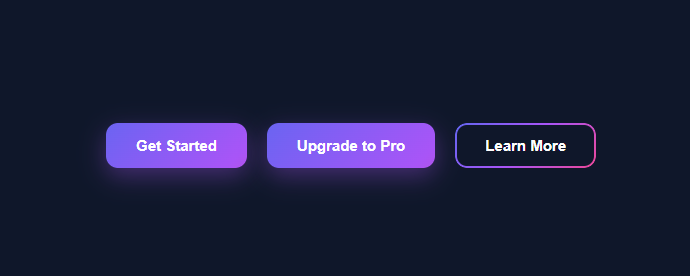
A gradient button is one of the most-searched UI snippets because a well-made gradient instantly makes a call-to-action feel modern and premium without any images or libraries. This snippet ships three production-ready variants built entirely with CSS: a button whose gradient slides on hover, a button with an animated shine sweep, and a button with an animated gradient border (outline) and a transparent fill. All three are pure CSS — the JavaScript is optional and only logs clicks.
The moving-gradient technique
The base .grad-btn uses background: linear-gradient(135deg, #6366f1, #a855f7, #ec4899) with the crucial pair background-size: 200% 200% and background-position: 0% 50%. Because the gradient is drawn at twice the button's size, only part of it is visible at a time. On hover, background-position: 100% 50% shifts which slice of that oversized gradient is shown, and transition: background-position 0.5s ease animates the slide. This is the canonical CSS trick for animating a gradient — you cannot transition the gradient's color stops directly, so instead you make the gradient larger than its box and move the viewport across it.
The hover lift and shadow
Each button adds transform: translateY(-2px) on hover for a subtle lift, paired with a deeper, color-matched box-shadow (0 12px 32px rgba(236, 72, 153, 0.45)). The shadow uses the same pink as the gradient's end stop so the glow looks like it belongs to the button rather than a generic drop shadow. :active resets translateY(0) so the button presses back down when clicked, giving tactile feedback. The text sits in a <span> with position: relative; z-index: 1 so it always stays above the pseudo-element effects.
The shine sweep (::after) variant
The .sweep button has overflow: hidden and an ::after pseudo-element absolutely positioned to fill the button. Its background is a diagonal linear-gradient(120deg, transparent 30%, rgba(255,255,255,0.45) 50%, transparent 70%) — a thin band of semi-transparent white. It starts off-screen with transform: translateX(-120%). On hover, transform: translateX(120%) slides the band across the button and transition: transform 0.6s ease animates the sweep. This is the glossy "light reflection" effect you see on premium and gaming UI buttons (pair it with a neon glow for a fuller arcade look), and it costs nothing — no images, no JavaScript, just one pseudo-element.
The gradient-border (outline) variant
The hardest gradient effect — a gradient *border* with a solid or transparent center — is done with the CSS mask trick. The .outline button has a dark fill matching the page background and an ::before pseudo-element that fills the button, has padding: 2px, and is painted with the gradient. The two masks linear-gradient(#000 0 0) content-box and linear-gradient(#000 0 0) combined with mask-composite: exclude (and the -webkit- prefix for Safari/Chrome) punch out the center, leaving only the 2px padding ring filled with gradient. The result is a crisp gradient border that no border-image rounding bug can ruin. On hover, the fill becomes the gradient and the border fades, so the button "fills in."
Why CSS instead of an SVG or image
Image-based gradient buttons do not scale crisply, cannot animate, and add HTTP requests. A CSS gradient button is resolution-independent, animates on the GPU (transform and background-position are cheap to animate), and is trivially themeable — change three hex values in the linear-gradient and every variant updates. It also inherits accessibility for free because it is a real <button> element: it is focusable, keyboard-activatable, and announced correctly by screen readers.
Customizing the colors and angle
Every gradient in the snippet uses linear-gradient(135deg, #6366f1, #a855f7, #ec4899) (indigo → purple → pink). Change the angle (135deg) to rotate the gradient, add or remove color stops, or swap to brand colors. For a two-color gradient, delete the middle stop. To match the shadow to your new palette, update the rgba() color in box-shadow to your gradient's end color. Because all three variants reference the same gradient, a single find-and-replace re-themes the entire set.
Performance and accessibility
The animations only use transform, background-position, and box-shadow, all of which the browser can composite smoothly at 60fps. There is no layout thrash because nothing changes width, height, or top/left. For accessibility, keep sufficient contrast between the white label and the gradient (the indigo-to-pink range here passes AA for bold text), add a visible :focus-visible outline if your design removes the default, and wrap motion in @media (prefers-reduced-motion: reduce) to disable the sweep for users who prefer less animation. Because these are native buttons, they already work with keyboard and assistive tech.
Step by step
How to Use
- 1Copy a button variantPick the plain gradient, the .sweep shine, or the .outline gradient border. Each is a self-contained <button> with a <span> label.
- 2Change the labelEdit the text inside the <span> — keep it in the span so it stays above the pseudo-element effects.
- 3Re-theme the gradientReplace the three hex stops in every linear-gradient(135deg, …) with your brand colors, and update the box-shadow rgba() to match the end color.
- 4Tune the hover speedAdjust transition: background-position 0.5s for the slide, or the 0.6s on .sweep::after for the shine.
- 5Add a focus ringAdd a :focus-visible outline if your reset removes default focus styling, for keyboard accessibility.
- 6Export in your formatClick "HTML" for a standalone file, "JSX" for a React component, or "Tailwind" for a React + Tailwind version.
Real-world uses
Common Use Cases
Got questions?
Frequently Asked Questions
You cannot transition a gradient's color stops directly. Instead set background-size: 200% 200% so the gradient is larger than the button, then animate background-position from 0% 50% to 100% 50% on hover with transition: background-position. This slides the visible slice of the oversized gradient.
The .outline button uses a ::before painted with the gradient and a 2px padding ring. Two masks combined with -webkit-mask-composite: xor / mask-composite: exclude punch out the center, leaving only the padding ring filled with the gradient — a crisp gradient border that border-image cannot match on rounded corners.
Replace the three hex values in every linear-gradient(135deg, #6366f1, #a855f7, #ec4899) with your brand colors, and update the rgba() in box-shadow to your gradient's end color so the glow matches.
No. All three buttons are pure CSS — the gradient slide, shine sweep, and gradient border all run on hover with no scripts. The included JavaScript is optional and only logs which button was clicked.
Wrap the hover animations in @media (prefers-reduced-motion: no-preference) or disable them in @media (prefers-reduced-motion: reduce) so users who prefer less motion get an instant color change instead of the sweep and slide.
Yes. Click "JSX" for a React component or "Tailwind" for a React + Tailwind version. In React, render a <button> with the gradient classes; the CSS works identically. You can also pass the label and an onClick handler as props.
Gradient Button — Export as HTML, React, Vue, Angular & Tailwind
<!DOCTYPE html>
<html lang="en">
<head>
<meta charset="UTF-8" />
<meta name="viewport" content="width=device-width, initial-scale=1.0" />
<title>Gradient Button</title>
<style>
* { box-sizing: border-box; margin: 0; padding: 0; }
body {
font-family: system-ui, sans-serif;
background: #0f172a;
min-height: 100vh;
display: flex; align-items: center; justify-content: center;
}
.wrap { display: flex; flex-wrap: wrap; gap: 20px; padding: 24px; }
/* Base gradient button */
.grad-btn {
position: relative;
border: none;
border-radius: 12px;
padding: 14px 30px;
font-size: 15px;
font-weight: 700;
color: #fff;
cursor: pointer;
background: linear-gradient(135deg, #6366f1, #a855f7, #ec4899);
background-size: 200% 200%;
background-position: 0% 50%;
box-shadow: 0 8px 24px rgba(168, 85, 247, 0.35);
transition: background-position 0.5s ease, transform 0.15s ease, box-shadow 0.3s ease;
}
.grad-btn span { position: relative; z-index: 1; }
.grad-btn:hover {
background-position: 100% 50%;
transform: translateY(-2px);
box-shadow: 0 12px 32px rgba(236, 72, 153, 0.45);
}
.grad-btn:active { transform: translateY(0); }
/* Animated shine sweep variant */
.grad-btn.sweep { overflow: hidden; }
.grad-btn.sweep::after {
content: "";
position: absolute;
inset: 0;
background: linear-gradient(120deg, transparent 30%, rgba(255,255,255,0.45) 50%, transparent 70%);
transform: translateX(-120%);
transition: transform 0.6s ease;
}
.grad-btn.sweep:hover::after { transform: translateX(120%); }
/* Gradient outline (border) variant */
.grad-btn.outline {
background: #0f172a;
box-shadow: none;
z-index: 0;
}
.grad-btn.outline::before {
content: "";
position: absolute;
inset: 0;
border-radius: 12px;
padding: 2px;
background: linear-gradient(135deg, #6366f1, #a855f7, #ec4899);
-webkit-mask: linear-gradient(#000 0 0) content-box, linear-gradient(#000 0 0);
-webkit-mask-composite: xor;
mask-composite: exclude;
}
.grad-btn.outline:hover {
background: linear-gradient(135deg, #6366f1, #a855f7, #ec4899);
transform: translateY(-2px);
}
.grad-btn.outline:hover::before { opacity: 0; }
</style>
</head>
<body>
<div class="wrap">
<button class="grad-btn">
<span>Get Started</span>
</button>
<button class="grad-btn sweep">
<span>Upgrade to Pro</span>
</button>
<button class="grad-btn outline">
<span>Learn More</span>
</button>
</div>
<script>
// Pure CSS — no JavaScript needed. Hover any button to see the gradient shift.
// Optional: log clicks
document.querySelectorAll('.grad-btn').forEach(btn => {
btn.addEventListener('click', () => console.log('Clicked:', btn.textContent.trim()));
});
</script>
</body>
</html><!DOCTYPE html>
<html lang="en">
<head>
<meta charset="UTF-8" />
<meta name="viewport" content="width=device-width, initial-scale=1.0" />
<title>Gradient Button</title>
<!-- Tailwind CSS v3+ — arbitrary value classes (e.g. bg-[#0f172a]) are valid -->
<script src="https://cdn.tailwindcss.com"></script>
<style>
* {
box-sizing: border-box; margin: 0; padding: 0;
}
body {
font-family: system-ui, sans-serif;
background: #0f172a;
min-height: 100vh;
display: flex; align-items: center; justify-content: center;
}
.grad-btn span {
position: relative; z-index: 1;
}
.grad-btn.sweep {
overflow: hidden;
}
.grad-btn.sweep::after {
content: "";
position: absolute;
inset: 0;
background: linear-gradient(120deg, transparent 30%, rgba(255,255,255,0.45) 50%, transparent 70%);
transform: translateX(-120%);
transition: transform 0.6s ease;
}
.grad-btn.sweep:hover::after {
transform: translateX(120%);
}
.grad-btn.outline {
background: #0f172a;
box-shadow: none;
z-index: 0;
}
.grad-btn.outline::before {
content: "";
position: absolute;
inset: 0;
border-radius: 12px;
padding: 2px;
background: linear-gradient(135deg, #6366f1, #a855f7, #ec4899);
-webkit-mask: linear-gradient(#000 0 0) content-box, linear-gradient(#000 0 0);
-webkit-mask-composite: xor;
mask-composite: exclude;
}
.grad-btn.outline:hover {
background: linear-gradient(135deg, #6366f1, #a855f7, #ec4899);
transform: translateY(-2px);
}
.grad-btn.outline:hover::before {
opacity: 0;
}
</style>
</head>
<body>
<div class="flex flex-wrap gap-5 p-6">
<button class="grad-btn relative border-0 rounded-xl py-3.5 px-[30px] text-[15px] font-bold text-[#fff] cursor-pointer [background:linear-gradient(135deg,_#6366f1,_#a855f7,_#ec4899)] bg-[size:200%_200%] bg-[position:0%_50%] shadow-[0_8px_24px_rgba(168,_85,_247,_0.35)] [transition:background-position_0.5s_ease,_transform_0.15s_ease,_box-shadow_0.3s_ease] hover:bg-[position:100%_50%] hover:[transform:translateY(-2px)] hover:shadow-[0_12px_32px_rgba(236,_72,_153,_0.45)] active:[transform:translateY(0)]">
<span>Get Started</span>
</button>
<button class="grad-btn relative border-0 rounded-xl py-3.5 px-[30px] text-[15px] font-bold text-[#fff] cursor-pointer [background:linear-gradient(135deg,_#6366f1,_#a855f7,_#ec4899)] bg-[size:200%_200%] bg-[position:0%_50%] shadow-[0_8px_24px_rgba(168,_85,_247,_0.35)] [transition:background-position_0.5s_ease,_transform_0.15s_ease,_box-shadow_0.3s_ease] hover:bg-[position:100%_50%] hover:[transform:translateY(-2px)] hover:shadow-[0_12px_32px_rgba(236,_72,_153,_0.45)] active:[transform:translateY(0)] sweep">
<span>Upgrade to Pro</span>
</button>
<button class="grad-btn relative border-0 rounded-xl py-3.5 px-[30px] text-[15px] font-bold text-[#fff] cursor-pointer [background:linear-gradient(135deg,_#6366f1,_#a855f7,_#ec4899)] bg-[size:200%_200%] bg-[position:0%_50%] shadow-[0_8px_24px_rgba(168,_85,_247,_0.35)] [transition:background-position_0.5s_ease,_transform_0.15s_ease,_box-shadow_0.3s_ease] hover:bg-[position:100%_50%] hover:[transform:translateY(-2px)] hover:shadow-[0_12px_32px_rgba(236,_72,_153,_0.45)] active:[transform:translateY(0)] outline">
<span>Learn More</span>
</button>
</div>
<script>
// Pure CSS — no JavaScript needed. Hover any button to see the gradient shift.
// Optional: log clicks
document.querySelectorAll('.grad-btn').forEach(btn => {
btn.addEventListener('click', () => console.log('Clicked:', btn.textContent.trim()));
});
</script>
</body>
</html>import React, { useEffect } from 'react';
// CSS — optionally move to GradientButton.module.css
const css = `
* { box-sizing: border-box; margin: 0; padding: 0; }
body {
font-family: system-ui, sans-serif;
background: #0f172a;
min-height: 100vh;
display: flex; align-items: center; justify-content: center;
}
.wrap { display: flex; flex-wrap: wrap; gap: 20px; padding: 24px; }
/* Base gradient button */
.grad-btn {
position: relative;
border: none;
border-radius: 12px;
padding: 14px 30px;
font-size: 15px;
font-weight: 700;
color: #fff;
cursor: pointer;
background: linear-gradient(135deg, #6366f1, #a855f7, #ec4899);
background-size: 200% 200%;
background-position: 0% 50%;
box-shadow: 0 8px 24px rgba(168, 85, 247, 0.35);
transition: background-position 0.5s ease, transform 0.15s ease, box-shadow 0.3s ease;
}
.grad-btn span { position: relative; z-index: 1; }
.grad-btn:hover {
background-position: 100% 50%;
transform: translateY(-2px);
box-shadow: 0 12px 32px rgba(236, 72, 153, 0.45);
}
.grad-btn:active { transform: translateY(0); }
/* Animated shine sweep variant */
.grad-btn.sweep { overflow: hidden; }
.grad-btn.sweep::after {
content: "";
position: absolute;
inset: 0;
background: linear-gradient(120deg, transparent 30%, rgba(255,255,255,0.45) 50%, transparent 70%);
transform: translateX(-120%);
transition: transform 0.6s ease;
}
.grad-btn.sweep:hover::after { transform: translateX(120%); }
/* Gradient outline (border) variant */
.grad-btn.outline {
background: #0f172a;
box-shadow: none;
z-index: 0;
}
.grad-btn.outline::before {
content: "";
position: absolute;
inset: 0;
border-radius: 12px;
padding: 2px;
background: linear-gradient(135deg, #6366f1, #a855f7, #ec4899);
-webkit-mask: linear-gradient(#000 0 0) content-box, linear-gradient(#000 0 0);
-webkit-mask-composite: xor;
mask-composite: exclude;
}
.grad-btn.outline:hover {
background: linear-gradient(135deg, #6366f1, #a855f7, #ec4899);
transform: translateY(-2px);
}
.grad-btn.outline:hover::before { opacity: 0; }
`;
export default function GradientButton() {
// Auto-generated escape hatch: the original snippet's vanilla JS runs once
// after mount and queries the rendered DOM. For idiomatic React, lift this
// into state + handlers.
useEffect(() => {
const _listeners = [];
const _originalAddEventListener = EventTarget.prototype.addEventListener;
EventTarget.prototype.addEventListener = function(type, listener, options) {
_listeners.push({ target: this, type, listener, options });
return _originalAddEventListener.call(this, type, listener, options);
};
// Pure CSS — no JavaScript needed. Hover any button to see the gradient shift.
// Optional: log clicks
document.querySelectorAll('.grad-btn').forEach(btn => {
btn.addEventListener('click', () => console.log('Clicked:', btn.textContent.trim()));
});
// Cleanup: restore addEventListener and remove all listeners
return () => {
EventTarget.prototype.addEventListener = _originalAddEventListener;
for (const { target, type, listener, options } of _listeners) {
target.removeEventListener(type, listener, options);
}
};
}, []);
return (
<>
<style>{css}</style>
<div className="wrap">
<button className="grad-btn">
<span>Get Started</span>
</button>
<button className="grad-btn sweep">
<span>Upgrade to Pro</span>
</button>
<button className="grad-btn outline">
<span>Learn More</span>
</button>
</div>
</>
);
}import React, { useEffect } from 'react';
// Requires Tailwind CSS v3+ — https://tailwindcss.com/docs/installation
// Arbitrary value classes (e.g. bg-[#0f172a]) are valid Tailwind v3+
export default function GradientButton() {
// Auto-generated escape hatch: the original snippet's vanilla JS runs once
// after mount and queries the rendered DOM. For idiomatic React, lift this
// into state + handlers.
useEffect(() => {
const _listeners = [];
const _originalAddEventListener = EventTarget.prototype.addEventListener;
EventTarget.prototype.addEventListener = function(type, listener, options) {
_listeners.push({ target: this, type, listener, options });
return _originalAddEventListener.call(this, type, listener, options);
};
// Pure CSS — no JavaScript needed. Hover any button to see the gradient shift.
// Optional: log clicks
document.querySelectorAll('.grad-btn').forEach(btn => {
btn.addEventListener('click', () => console.log('Clicked:', btn.textContent.trim()));
});
// Cleanup: restore addEventListener and remove all listeners
return () => {
EventTarget.prototype.addEventListener = _originalAddEventListener;
for (const { target, type, listener, options } of _listeners) {
target.removeEventListener(type, listener, options);
}
};
}, []);
return (
<>
<style>{`
* {
box-sizing: border-box; margin: 0; padding: 0;
}
body {
font-family: system-ui, sans-serif;
background: #0f172a;
min-height: 100vh;
display: flex; align-items: center; justify-content: center;
}
.grad-btn span {
position: relative; z-index: 1;
}
.grad-btn.sweep {
overflow: hidden;
}
.grad-btn.sweep::after {
content: "";
position: absolute;
inset: 0;
background: linear-gradient(120deg, transparent 30%, rgba(255,255,255,0.45) 50%, transparent 70%);
transform: translateX(-120%);
transition: transform 0.6s ease;
}
.grad-btn.sweep:hover::after {
transform: translateX(120%);
}
.grad-btn.outline {
background: #0f172a;
box-shadow: none;
z-index: 0;
}
.grad-btn.outline::before {
content: "";
position: absolute;
inset: 0;
border-radius: 12px;
padding: 2px;
background: linear-gradient(135deg, #6366f1, #a855f7, #ec4899);
-webkit-mask: linear-gradient(#000 0 0) content-box, linear-gradient(#000 0 0);
-webkit-mask-composite: xor;
mask-composite: exclude;
}
.grad-btn.outline:hover {
background: linear-gradient(135deg, #6366f1, #a855f7, #ec4899);
transform: translateY(-2px);
}
.grad-btn.outline:hover::before {
opacity: 0;
}
`}</style>
<div className="flex flex-wrap gap-5 p-6">
<button className="grad-btn relative border-0 rounded-xl py-3.5 px-[30px] text-[15px] font-bold text-[#fff] cursor-pointer [background:linear-gradient(135deg,_#6366f1,_#a855f7,_#ec4899)] bg-[size:200%_200%] bg-[position:0%_50%] shadow-[0_8px_24px_rgba(168,_85,_247,_0.35)] [transition:background-position_0.5s_ease,_transform_0.15s_ease,_box-shadow_0.3s_ease] hover:bg-[position:100%_50%] hover:[transform:translateY(-2px)] hover:shadow-[0_12px_32px_rgba(236,_72,_153,_0.45)] active:[transform:translateY(0)]">
<span>Get Started</span>
</button>
<button className="grad-btn relative border-0 rounded-xl py-3.5 px-[30px] text-[15px] font-bold text-[#fff] cursor-pointer [background:linear-gradient(135deg,_#6366f1,_#a855f7,_#ec4899)] bg-[size:200%_200%] bg-[position:0%_50%] shadow-[0_8px_24px_rgba(168,_85,_247,_0.35)] [transition:background-position_0.5s_ease,_transform_0.15s_ease,_box-shadow_0.3s_ease] hover:bg-[position:100%_50%] hover:[transform:translateY(-2px)] hover:shadow-[0_12px_32px_rgba(236,_72,_153,_0.45)] active:[transform:translateY(0)] sweep">
<span>Upgrade to Pro</span>
</button>
<button className="grad-btn relative border-0 rounded-xl py-3.5 px-[30px] text-[15px] font-bold text-[#fff] cursor-pointer [background:linear-gradient(135deg,_#6366f1,_#a855f7,_#ec4899)] bg-[size:200%_200%] bg-[position:0%_50%] shadow-[0_8px_24px_rgba(168,_85,_247,_0.35)] [transition:background-position_0.5s_ease,_transform_0.15s_ease,_box-shadow_0.3s_ease] hover:bg-[position:100%_50%] hover:[transform:translateY(-2px)] hover:shadow-[0_12px_32px_rgba(236,_72,_153,_0.45)] active:[transform:translateY(0)] outline">
<span>Learn More</span>
</button>
</div>
</>
);
}<template>
<div class="wrap">
<button class="grad-btn">
<span>Get Started</span>
</button>
<button class="grad-btn sweep">
<span>Upgrade to Pro</span>
</button>
<button class="grad-btn outline">
<span>Learn More</span>
</button>
</div>
</template>
<script setup>
import { onMounted } from 'vue';
onMounted(() => {
// Pure CSS — no JavaScript needed. Hover any button to see the gradient shift.
// Optional: log clicks
document.querySelectorAll('.grad-btn').forEach(btn => {
btn.addEventListener('click', () => console.log('Clicked:', btn.textContent.trim()));
});
});
</script>
<style scoped>
* { box-sizing: border-box; margin: 0; padding: 0; }
body {
font-family: system-ui, sans-serif;
background: #0f172a;
min-height: 100vh;
display: flex; align-items: center; justify-content: center;
}
.wrap { display: flex; flex-wrap: wrap; gap: 20px; padding: 24px; }
/* Base gradient button */
.grad-btn {
position: relative;
border: none;
border-radius: 12px;
padding: 14px 30px;
font-size: 15px;
font-weight: 700;
color: #fff;
cursor: pointer;
background: linear-gradient(135deg, #6366f1, #a855f7, #ec4899);
background-size: 200% 200%;
background-position: 0% 50%;
box-shadow: 0 8px 24px rgba(168, 85, 247, 0.35);
transition: background-position 0.5s ease, transform 0.15s ease, box-shadow 0.3s ease;
}
.grad-btn span { position: relative; z-index: 1; }
.grad-btn:hover {
background-position: 100% 50%;
transform: translateY(-2px);
box-shadow: 0 12px 32px rgba(236, 72, 153, 0.45);
}
.grad-btn:active { transform: translateY(0); }
/* Animated shine sweep variant */
.grad-btn.sweep { overflow: hidden; }
.grad-btn.sweep::after {
content: "";
position: absolute;
inset: 0;
background: linear-gradient(120deg, transparent 30%, rgba(255,255,255,0.45) 50%, transparent 70%);
transform: translateX(-120%);
transition: transform 0.6s ease;
}
.grad-btn.sweep:hover::after { transform: translateX(120%); }
/* Gradient outline (border) variant */
.grad-btn.outline {
background: #0f172a;
box-shadow: none;
z-index: 0;
}
.grad-btn.outline::before {
content: "";
position: absolute;
inset: 0;
border-radius: 12px;
padding: 2px;
background: linear-gradient(135deg, #6366f1, #a855f7, #ec4899);
-webkit-mask: linear-gradient(#000 0 0) content-box, linear-gradient(#000 0 0);
-webkit-mask-composite: xor;
mask-composite: exclude;
}
.grad-btn.outline:hover {
background: linear-gradient(135deg, #6366f1, #a855f7, #ec4899);
transform: translateY(-2px);
}
.grad-btn.outline:hover::before { opacity: 0; }
</style>// @ts-nocheck
// Note: vanilla JS DOM manipulation is preserved as-is inside ngAfterViewInit().
// For idiomatic Angular, replace document.getElementById() with @ViewChild() refs
// and move state into component properties with two-way binding.
import { Component, AfterViewInit, ViewEncapsulation } from '@angular/core';
import { CommonModule } from '@angular/common';
@Component({
selector: 'app-gradient-button',
standalone: true,
imports: [CommonModule],
encapsulation: ViewEncapsulation.None,
template: `
<div class="wrap">
<button class="grad-btn">
<span>Get Started</span>
</button>
<button class="grad-btn sweep">
<span>Upgrade to Pro</span>
</button>
<button class="grad-btn outline">
<span>Learn More</span>
</button>
</div>
`,
styles: [`
* { box-sizing: border-box; margin: 0; padding: 0; }
body {
font-family: system-ui, sans-serif;
background: #0f172a;
min-height: 100vh;
display: flex; align-items: center; justify-content: center;
}
.wrap { display: flex; flex-wrap: wrap; gap: 20px; padding: 24px; }
/* Base gradient button */
.grad-btn {
position: relative;
border: none;
border-radius: 12px;
padding: 14px 30px;
font-size: 15px;
font-weight: 700;
color: #fff;
cursor: pointer;
background: linear-gradient(135deg, #6366f1, #a855f7, #ec4899);
background-size: 200% 200%;
background-position: 0% 50%;
box-shadow: 0 8px 24px rgba(168, 85, 247, 0.35);
transition: background-position 0.5s ease, transform 0.15s ease, box-shadow 0.3s ease;
}
.grad-btn span { position: relative; z-index: 1; }
.grad-btn:hover {
background-position: 100% 50%;
transform: translateY(-2px);
box-shadow: 0 12px 32px rgba(236, 72, 153, 0.45);
}
.grad-btn:active { transform: translateY(0); }
/* Animated shine sweep variant */
.grad-btn.sweep { overflow: hidden; }
.grad-btn.sweep::after {
content: "";
position: absolute;
inset: 0;
background: linear-gradient(120deg, transparent 30%, rgba(255,255,255,0.45) 50%, transparent 70%);
transform: translateX(-120%);
transition: transform 0.6s ease;
}
.grad-btn.sweep:hover::after { transform: translateX(120%); }
/* Gradient outline (border) variant */
.grad-btn.outline {
background: #0f172a;
box-shadow: none;
z-index: 0;
}
.grad-btn.outline::before {
content: "";
position: absolute;
inset: 0;
border-radius: 12px;
padding: 2px;
background: linear-gradient(135deg, #6366f1, #a855f7, #ec4899);
-webkit-mask: linear-gradient(#000 0 0) content-box, linear-gradient(#000 0 0);
-webkit-mask-composite: xor;
mask-composite: exclude;
}
.grad-btn.outline:hover {
background: linear-gradient(135deg, #6366f1, #a855f7, #ec4899);
transform: translateY(-2px);
}
.grad-btn.outline:hover::before { opacity: 0; }
`]
})
export class GradientButtonComponent implements AfterViewInit {
ngAfterViewInit(): void {
// Pure CSS — no JavaScript needed. Hover any button to see the gradient shift.
// Optional: log clicks
document.querySelectorAll('.grad-btn').forEach(btn => {
btn.addEventListener('click', () => console.log('Clicked:', btn.textContent.trim()));
});
}
}