Learn Coding Visually
Learn to code with interactive, live-preview playgrounds — HTML, CSS, JavaScript, React & more.
 HTML Playground42 lessons · Click-based · Live preview
 CSS PlaygroundLearn CSS with a live editor
 JavaScript Playground60 lessons · DOM · Async · Canvas
 React PlaygroundLearn React with a live code editor
 GSAP PlaygroundLearn GSAP animation interactively
 SVG Playground44 lessons · shapes · paths · animation
 SCSS Playground45 lessons · Sass modules · tokens
 Tailwind PlaygroundLearn Tailwind CSS with a live editor
 Bootstrap 5 Playground50 lessons · live preview
Emoji Reaction Bar — HTML CSS JS Snippet
Emoji Reaction Bar · Buttons · Plain HTML, CSS & JS · Live preview
What's included
Features
.open class toggled by tap for touch, so it works on every device.scale(.9) with a bottom-right origin, appearing to grow out of the React button.content: attr(data-label) on a pseudo-element labels each emoji on hover — no tooltip library or extra markup.pickReaction enforces one reaction at a time and removes it when re-clicked, matching real social platforms.updateReact rewrites the trigger to your emoji and label and adjusts the total by one in a single pass.stopPropagation keeping the trigger from self-closing.About this UI Snippet
Emoji Reaction Bar — Hover-Reveal Popover, Tooltip Reactions & Overlapping Count Cluster
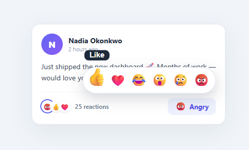
A single "Like" button is binary; a reaction bar lets people respond with nuance — love, laughter, surprise, sadness, anger. Popularised by Facebook, the hover-reveal reaction picker is now a standard pattern in social feeds, comment threads, and chat. This snippet implements it in plain HTML, CSS, and vanilla JavaScript: a trigger that reveals a popover of emoji reactions on hover or tap, scale-and-tooltip animations on each emoji, single-reaction toggle logic, and an overlapping count cluster that reflects your choice.
Hover-reveal popover that also works on touch
The reactions live in an .er-pop popover positioned above the trigger. On devices with a pointer it appears on hover via .er-react:hover .er-pop, springing up from scale(.9) with its transform origin at the bottom-right. Hover does not exist on touch screens, so the trigger also has an onclick calling togglePop, which toggles an .open class that reveals the same popover — and a document click listener closes it when tapping elsewhere. stopPropagation on the trigger keeps that outside-click handler from immediately re-closing it.
Tactile emoji interactions
Each reaction is a button that scales to 1.45× and lifts on hover (transform: scale(1.45) translateY(-4px)), the playful "bounce" that makes the picker feel alive. A CSS-only tooltip — content: attr(data-label) on the ::after — shows the reaction name ("Love", "Haha") above the emoji on hover, so the meaning is never ambiguous. No tooltip library, no extra markup.
Single-reaction toggle
Real reaction systems let you have exactly one reaction at a time, and clicking your current reaction removes it. pickReaction implements this with one line: myReaction = (myReaction === emoji) ? null : emoji. updateReact then rewrites the trigger to show your chosen emoji and its label (or reverts to the neutral "React"), adjusts the total count by one, and rebuilds the summary cluster.
Overlapping count cluster
The summary shows the familiar overlapping circle cluster of top reactions with a total count. updateReact builds it from a base set of reactions; when you react with something not already shown, your emoji is unshifted to the front and highlighted with a ring and a spring er-bub animation, so you can immediately see your contribution. The overlap is pure CSS — negative margin-left with white borders to fake the stacked-coins look.
Everything is driven by a single myReaction variable and the updateReact function, so wiring it to a backend is a matter of POSTing the reaction and seeding real counts. Pair this with a favorite button for simple likes, a comment thread for discussions, or a social post card feed.
Build with AI
Build, Understand, Optimize, and Extend It With AI
Rather than tracing the toggle logic by hand, paste this snippet's HTML, CSS, and JS into an AI coding assistant like Claude and ask it to explain exactly how the one-line ternary in pickReaction turns clicking the same emoji twice into a way to remove your reaction, and how updateReact() decides whether to unshift your reaction to the front of the cluster or leave the base list untouched. The same assistant can help you optimize it, for instance checking whether relying on both a CSS hover rule and a JS-toggled open class for the popover could ever get out of sync on devices that support both touch and a mouse. It's also useful for extending the bar: ask it to wire pickReaction to a real backend so reactions persist and reflect other users' counts, add keyboard accessibility so the popover opens on focus and closes on Escape, or support showing a tooltip listing which specific people reacted with each emoji. Treat the code less like a finished artifact and more like a starting point for a conversation.
Prompt to recreate it
Copy this into your AI assistant of choice to build the effect from scratch, or as a jumping-off point for your own variant:
Build a Facebook-style emoji reaction bar in plain HTML, CSS, and JavaScript with no library.

Requirements:
- A "React" trigger button that reveals a row of six emoji reaction buttons in a popover positioned above it, showing the popover both on CSS hover (for pointer devices) and via a JavaScript-toggled open class from a click (for touch devices), so both interaction methods work without conflicting.
- Each emoji button in the popover must visually scale up and lift slightly on hover, and show a small tooltip label naming the reaction (e.g. "Love", "Haha") built purely from a CSS pseudo-element reading a data attribute, with no separate tooltip markup or library.
- Track the current user's reaction as a single value (not a set), and clicking an emoji must toggle it: clicking a different emoji than the current one switches to it, and clicking the same emoji the user already picked removes the reaction entirely, all with one compact conditional rather than separate add/remove code paths.
- Whenever the reaction changes, rewrite the trigger button's label and icon to reflect the current reaction (or revert to a neutral default icon and label when no reaction is set), adjust a total reaction count by exactly one in the corresponding direction, and close the popover.
- Render a small cluster of overlapping circular avatars representing the top reactions using negative margins and white borders (not flexbox gap) to create the stacked-coin visual effect, and when the current user's reaction is not already among the displayed top reactions, insert it at the front of that cluster with a distinct highlighted ring and a brief spring-in scale animation.
- Close the popover automatically on any click outside the whole reaction control, using a single document-level click listener with a containment check, while making sure a click on the trigger button itself does not immediately re-close the popover it just opened.
Want to tighten it up first? Run this prompt through the AI Prompt Studio to score it across 8 quality dimensions, catch anti-patterns, and tune the wording for Claude, ChatGPT, or Gemini before you paste it in.
Step by step
How to Use
- 1Paste HTML, CSS, and JSA social post card appears with a reaction summary (24 reactions) and a "🙂 React" button in the footer.
- 2Reveal the reactionsHover the React button (or tap it on touch) — a rounded popover of six emoji springs up above it.
- 3Hover an emojiEach emoji scales up and lifts, and a tooltip shows its name ("Love", "Haha", "Wow") above it.
- 4Pick a reactionClick one — the trigger changes to that emoji and label, the count ticks to 25, and your reaction joins the cluster with a highlighted ring.
- 5Change or remove itPick a different emoji to switch, or click your current reaction again to remove it — the count and cluster update accordingly.
- 6Dismiss the popoverClick anywhere outside to close the picker without changing your reaction.
Real-world uses
Common Use Cases
Got questions?
Frequently Asked Questions
In pickReaction, after updating myReaction, POST the change to your API (the post id and the new reaction, or null to remove). Update optimistically as the snippet does, and reconcile with the server's authoritative counts on response. Seed BASE_COUNT and the cluster from real data on load so the UI reflects everyone's reactions, not just yours.
Replace the static BASE array and BASE_COUNT with data from your API: sort reaction types by count, take the top three for the cluster, and use the true total. Rebuild the cluster in updateReact from that data, still unshifting and highlighting the current user's reaction so it stands out.
Hover is fast and discoverable on desktop, but touch devices have no hover state — relying on it alone makes the picker unusable on phones. The snippet shows the popover on hover via CSS and also toggles it with a tap via togglePop, so both input types get a natural way to open it.
Make the emoji buttons keyboard-reachable (they are real <button>s) and give each an aria-label matching its data-label, since an emoji alone is not descriptive. Open the popover on focus as well as hover, support Escape to close, and announce reaction/count changes via an aria-live region so screen-reader users get feedback.
In React, hold myReaction and open in useState, derive the trigger label and cluster from myReaction, and add a click-outside effect. In Vue, use refs with @click/@mouseenter and a computed cluster. In Angular, track state on the component and bind [class.open]/[class.reacted]. The popover and emoji-hover CSS port unchanged.