Learn Coding Visually
Learn to code with interactive, live-preview playgrounds — HTML, CSS, JavaScript, React & more.
 HTML Playground42 lessons · Click-based · Live preview
 CSS PlaygroundLearn CSS with a live editor
 JavaScript Playground60 lessons · DOM · Async · Canvas
 React PlaygroundLearn React with a live code editor
 GSAP PlaygroundLearn GSAP animation interactively
 SVG Playground44 lessons · shapes · paths · animation
 SCSS Playground45 lessons · Sass modules · tokens
 Tailwind PlaygroundLearn Tailwind CSS with a live editor
 Bootstrap 5 Playground50 lessons · live preview
Social Post Card — Free HTML CSS JS Snippet
Social Post Card · Cards · Plain HTML, CSS & JS · Live preview
What's included
Features
About this UI Snippet
Social Post Card — Like Toggle, Optimistic Count Update & Follow State
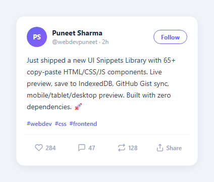
A social post card is the core unit of any social feed — Twitter, LinkedIn, and every social platform uses this pattern. This snippet implements the full card with avatar, name, handle, post content, and an interactive action row (the replies below it use the comment thread pattern).
Optimistic like toggle
toggleLike() flips a liked boolean and toggles .active on the heart button — the same interaction as the standalone favorite button. The count shows 284 or 285 immediately — before any API call. This optimistic UI update is standard practice for responsiveness.
Follow state
The Follow button toggles between "Follow" and "Following" with different visual states via .following class — the same toggle as the profile card and user stats card.
Content styling
Hashtags and mentions use inline <span class="tag"> and <span class="mention"> elements with CSS colour and hover underline — standard social post rendering.
The optimistic like counter
Clicking the like button immediately increments the displayed count without waiting for an API response — this is the optimistic update pattern used by every major social platform. The .liked class toggles to fill the heart icon. If the API call fails in a real implementation, decrement the count and show an error toast notification (see the Toast Notification snippet in this library).
Hashtag and mention styling
Post text containing hashtags and mentions uses distinct colours — blue for mentions, indigo for hashtags — making them visually scannable in a dense feed. In a real feed, these render as anchor links pointing to the hashtag search results page or the mentioned user profile page.
The card action row
Three action buttons (like, comment, share) follow the standard social platform layout. Add a bookmark as a fourth action using the same toggle pattern. All states manage identically: a class toggle on the button icon and a counter update on click. Keep actions icon-only or icon+count depending on the card width and density requirements.
Building a full feed from multiple cards
Render multiple social post cards in a flex-direction: column container with gap: 12px for a feed. Add infinite scroll by observing the last card with IntersectionObserver and fetching the next page when it enters the viewport: const obs = new IntersectionObserver(([e]) => { if(e.isIntersecting) fetchNextPage(); }); obs.observe(lastCard).
The optimistic like counter
Clicking the like button immediately increments the displayed count without waiting for an API response — this is the optimistic update pattern used by every major social platform. The .liked class toggles to fill the heart icon. If the API call fails in a real implementation, decrement the count and show an error toast notification (see the Toast Notification snippet in this library).
Hashtag and mention styling
Post text containing hashtags and mentions uses distinct colours — blue for mentions, indigo for hashtags — making them visually scannable in a dense feed. In a real feed, these render as anchor links pointing to the hashtag search results page or the mentioned user profile page.
The card action row
Three action buttons (like, comment, share) follow the standard social platform layout. Add a bookmark as a fourth action using the same toggle pattern. All states manage identically: a class toggle on the button icon and a counter update on click. Keep actions icon-only or icon+count depending on the card width and density requirements.
Building a full feed from multiple cards
Render multiple social post cards in a flex-direction: column container with gap: 12px for a feed. Add infinite scroll by observing the last card with IntersectionObserver and fetching the next page when it enters the viewport: const obs = new IntersectionObserver(([e]) => { if(e.isIntersecting) fetchNextPage(); }); obs.observe(lastCard).
Build with AI
Build, Understand, Optimize, and Extend It With AI
You don't have to trace the optimistic-update logic by hand. Paste this snippet's HTML, CSS, and JS into an AI coding assistant like Claude and ask it to explain exactly why toggleLike hardcodes the count as 284 versus 285 instead of incrementing or decrementing a variable, and what real-world bug that hardcoded approach would cause if the initial like count varied per post. The same assistant can help optimize it, for instance checking whether the follow button's toggle logic, which mutates textContent directly through an inline onclick, would scale to a feed of fifty post cards without becoming hard to maintain. It is just as useful for extending the card: ask it to add proper rollback-on-failure logic that reverts the like state if a real API call fails, wire up an IntersectionObserver for infinite-scroll loading of more posts, or add a quote-repost flow that opens a composer pre-filled with this post's text. Treat the code less like a finished artifact and more like a starting point for a conversation.
Prompt to recreate it
Copy this into your AI assistant of choice to build the effect from scratch, or as a jumping-off point for your own variant:
Build a Twitter/X-style "social post card" in plain HTML, CSS, and JavaScript — no framework, no libraries.

Requirements:
- A card with a header row containing an avatar (initials on a gradient background), display name, handle, relative timestamp, and a Follow button on the opposite side.
- The Follow button must toggle between two distinct states on click: an outlined "Follow" state and a filled "Following" state, changing both its text content and its background/border styling via a single toggled CSS class.
- Post body text containing inline hashtag spans, styled in a distinct color from the body text and underlined on hover.
- An action row with like, comment (reply), repost, and share buttons, each rendered as an icon plus a count, laid out with equal flexible widths so they distribute evenly regardless of button count.
- Clicking the like button must toggle a liked boolean state, fill the heart icon with a color, and update the displayed count using an actual increment/decrement calculation based on the previous count value (not two hardcoded numbers) — the count must correctly handle being clicked in rapid succession (like, unlike, like again) without drifting from the true value.
- Clicking the repost button must independently toggle its own active visual state (a different accent color from the like button) without affecting the like state.
- Explain in a comment why this immediate, before-the-network-response update is called an "optimistic" UI update, and what should happen to the like state and count if a real API call behind it were to fail.
Want to tighten it up first? Run this prompt through the AI Prompt Studio to score it across 8 quality dimensions, catch anti-patterns, and tune the wording for Claude, ChatGPT, or Gemini before you paste it in.
Source Code
<div class="scene">
  <div class="card">
    <div class="header">
      <div class="user-info">
        <div class="avatar">PS</div>
        <div>
          <div class="name">Puneet Sharma</div>
          <div class="meta">@webdevpuneet · 2h</div>
        </div>
      </div>
      <button class="follow-btn" onclick="this.textContent=this.textContent==='Follow'?'Following':'Follow';this.classList.toggle('active')">Follow</button>
    </div>
    <p class="post-text">Just shipped a new UI Snippets Library with 65+ copy-paste HTML/CSS/JS components. Live preview, save to IndexedDB, GitHub Gist sync, mobile/tablet/desktop preview. Built with zero dependencies. 🚀</p>
    <div class="tags">
      <span>#webdev</span><span>#css</span><span>#frontend</span>
    </div>
    <div class="actions">
      <button class="action" id="like-btn" onclick="toggleLike()">
        <svg width="16" height="16" viewBox="0 0 24 24" fill="none" stroke="currentColor" stroke-width="2"><path d="M20.84 4.61a5.5 5.5 0 0 0-7.78 0L12 5.67l-1.06-1.06a5.5 5.5 0 0 0-7.78 7.78l1.06 1.06L12 21.23l7.78-7.78 1.06-1.06a5.5 5.5 0 0 0 0-7.78z"/></svg>
        <span id="like-count">284</span>
      </button>
      <button class="action">
        <svg width="16" height="16" viewBox="0 0 24 24" fill="none" stroke="currentColor" stroke-width="2"><path d="M21 15a2 2 0 0 1-2 2H8l-5 4V5a2 2 0 0 1 2-2h14a2 2 0 0 1 2 2z"/></svg>
        <span>47</span>
      </button>
      <button class="action" id="repost" onclick="this.classList.toggle('active')">
        <svg width="16" height="16" viewBox="0 0 24 24" fill="none" stroke="currentColor" stroke-width="2"><polyline points="17 1 21 5 17 9"/><path d="M3 11V9a4 4 0 0 1 4-4h14"/><polyline points="7 23 3 19 7 15"/><path d="M21 13v2a4 4 0 0 1-4 4H3"/></svg>
        <span>128</span>
      </button>
      <button class="action">
        <svg width="16" height="16" viewBox="0 0 24 24" fill="none" stroke="currentColor" stroke-width="2"><path d="M4 12v8a2 2 0 0 0 2 2h12a2 2 0 0 0 2-2v-8"/><polyline points="16 6 12 2 8 6"/><line x1="12" y1="2" x2="12" y2="15"/></svg>
        <span>Share</span>
      </button>
    </div>
  </div>
</div>
* { box-sizing: border-box; margin: 0; padding: 0; }
body { font-family: system-ui, sans-serif; background: #f1f5f9; display: flex; align-items: center; justify-content: center; min-height: 100vh; padding: 20px; }
.card { background: #fff; border-radius: 16px; padding: 20px; width: 360px; box-shadow: 0 4px 20px rgba(0,0,0,0.07); border: 1px solid #f1f5f9; display: flex; flex-direction: column; gap: 14px; }
.header { display: flex; align-items: center; justify-content: space-between; }
.user-info { display: flex; align-items: center; gap: 10px; }
.avatar { width: 40px; height: 40px; border-radius: 50%; background: linear-gradient(135deg,#6366f1,#8b5cf6); color: #fff; font-size: 13px; font-weight: 700; display: flex; align-items: center; justify-content: center; }
.name { font-size: 14px; font-weight: 700; color: #1e293b; }
.meta { font-size: 12px; color: #94a3b8; }
.follow-btn { padding: 5px 14px; font-size: 12px; font-weight: 700; border-radius: 20px; border: 1.5px solid #6366f1; color: #6366f1; background: none; cursor: pointer; font-family: inherit; transition: all 0.15s; }
.follow-btn.active { background: #6366f1; color: #fff; }
.post-text { font-size: 14px; color: #334155; line-height: 1.65; }
.tags { display: flex; gap: 6px; flex-wrap: wrap; }
.tags span { font-size: 12px; color: #6366f1; font-weight: 500; cursor: pointer; }
.tags span:hover { text-decoration: underline; }
.actions { display: flex; gap: 0; border-top: 1px solid #f1f5f9; padding-top: 10px; margin: 0 -4px; }
.action { flex: 1; display: flex; align-items: center; justify-content: center; gap: 5px; padding: 7px 4px; font-size: 12px; font-weight: 500; color: #94a3b8; background: none; border: none; cursor: pointer; border-radius: 8px; transition: background 0.1s, color 0.1s; font-family: inherit; }
.action:hover { background: #f8fafc; color: #475569; }
.action#like-btn.active { color: #ef4444; }
.action#like-btn.active svg { fill: #ef4444; }
.action#repost.active { color: #10b981; }let liked = false;
function toggleLike() {
const btn = document.getElementById('like-btn');
const cnt = document.getElementById('like-count');
liked = !liked;
btn.classList.toggle('active', liked);
cnt.textContent = liked ? 285 : 284;
}Step by step
How to Use
- 1Click the Like buttonClick the heart icon to toggle the like state — the heart fills red and the count updates between 284 and 285.
- 2Click FollowClick the Follow button to toggle between Follow and Following states.
- 3Update post contentIn the HTML panel, change the post text, hashtags, mentions, avatar initials, username, and handle.
- 4Update the action countsChange the Repost and Share count numbers in the HTML panel.
- 5Add a media attachmentAdd an <img> or video element inside .post-body to show a media attachment below the text.
- 6Export in your formatClick "HTML" for a standalone file, "JSX" for a React component, or "Tailwind" for a React + Tailwind version.
Real-world uses
Common Use Cases
Got questions?
Frequently Asked Questions
An optimistic update applies the state change in the UI immediately — before the API call confirms success. The like count changes from 284 to 285 the instant the user clicks, without waiting for a server round-trip. If the API fails, the state reverts. This makes social interactions feel instant even on slow connections.
The Follow button has a clicked handler that toggles .following class on the button element. CSS .follow-btn.following changes background from filled accent to transparent with an accent border, and the text changes from "Follow" to "Following". Clicking again removes .following and resets.
Wrap hashtag text in <span class="tag">#hashtag</span> and mentions in <span class="mention">@handle</span> in the HTML. CSS .tag { color: #6366f1; } and .mention { color: #6366f1; text-decoration: underline; } apply the social platform styling convention.
Add below .post-text: <div class="post-media"><img src="url" alt="Post image" class="post-img"></div>. CSS .post-img { width: 100%; border-radius: 12px; margin-top: 10px; display: block; max-height: 280px; object-fit: cover; } The image clips to the border-radius without overflow.
Calculate the difference from now: const diff = Date.now() - postTimestamp; const mins = Math.floor(diff/60000); const label = mins < 60 ? mins + "m ago" : Math.floor(mins/60) + "h ago". Update the timestamp span on mount and every 60 seconds. For production, use a library like dayjs for edge cases.
Yes. Manage liked and following in useState. Pass post data (author, content, timestamp, initialLikes) as props. Wire API calls inside the handlers: const handleLike = async () => { setLiked(!liked); setCount(c => liked ? c-1 : c+1); try { await api.toggleLike(postId); } catch { setLiked(liked); setCount(c => liked ? c+1 : c-1); } }