Source Code
<div class="card">
  <div class="avatar">PS</div>
  <h2>Puneet Sharma</h2>
  <p class="role">Frontend Engineer</p>
  <div class="stats">
    <div class="stat">
      <strong>128</strong>
      <span>Projects</span>
    </div>
    <div class="stat">
      <strong>4.9</strong>
      <span>Rating</span>
    </div>
    <div class="stat">
      <strong>2.1k</strong>
      <span>Followers</span>
    </div>
  </div>
  <button class="btn">Follow</button>
</div>
* { box-sizing: border-box; margin: 0; padding: 0; }
body { font-family: system-ui, sans-serif; background: #f1f5f9; display: flex; align-items: center; justify-content: center; min-height: 100vh; padding: 20px; }
.card {
background: #fff;
border-radius: 16px;
padding: 32px 24px;
text-align: center;
width: 260px;
box-shadow: 0 4px 24px rgba(0,0,0,0.08);
}
.avatar {
width: 72px;
height: 72px;
border-radius: 50%;
background: linear-gradient(135deg, #6366f1, #8b5cf6);
color: #fff;
font-size: 22px;
font-weight: 800;
display: flex;
align-items: center;
justify-content: center;
margin: 0 auto 14px;
}
h2 { font-size: 17px; font-weight: 700; color: #1e293b; }
.role { font-size: 13px; color: #64748b; margin-top: 4px; margin-bottom: 20px; }
.stats {
display: flex;
justify-content: space-around;
border-top: 1px solid #f1f5f9;
border-bottom: 1px solid #f1f5f9;
padding: 16px 0;
margin-bottom: 20px;
}
.stat strong { display: block; font-size: 16px; font-weight: 700; color: #1e293b; }
.stat span { font-size: 11px; color: #94a3b8; }
.btn {
width: 100%;
padding: 10px;
background: #6366f1;
color: #fff;
border: none;
border-radius: 8px;
font-size: 14px;
font-weight: 600;
cursor: pointer;
transition: background 0.15s;
}
.btn:hover { background: #4f46e5; }Learn Coding Visually
Learn to code with interactive, live-preview playgrounds — HTML, CSS, JavaScript, React & more.
 HTML Playground42 lessons · Click-based · Live preview
 CSS PlaygroundLearn CSS with a live editor
 JavaScript Playground60 lessons · DOM · Async · Canvas
 React PlaygroundLearn React with a live code editor
 GSAP PlaygroundLearn GSAP animation interactively
 SVG Playground44 lessons · shapes · paths · animation
 SCSS Playground45 lessons · Sass modules · tokens
 Tailwind PlaygroundLearn Tailwind CSS with a live editor
 Bootstrap 5 Playground50 lessons · live preview
What's included
Features
About this UI Snippet
Profile Card — HTML & CSS User Card with Avatar, Stats & Follow Button
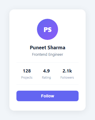
A profile card is one of the most reused UI components in web development. You need it on team pages, social apps, marketplaces, dashboards, and anywhere you display a person or entity with key metrics. The pattern is always the same: an avatar, a name, a role or tagline, some stats, and a call-to-action button.
This snippet gives you a complete, production-ready profile card in plain HTML and CSS — no JavaScript required. It is centred on the page, has a soft drop shadow, a gradient avatar circle with initials, a three-stat row, and a full-width follow button with hover state.
The avatar circle
The avatar uses a div with border-radius: 50% and a linear-gradient(135deg, #6366f1, #8b5cf6) background — an indigo-to-violet gradient. The initials inside are centred with flexbox (display: flex; align-items: center; justify-content: center). To use a real photo instead, replace the div with an <img> tag and keep border-radius: 50%; width: 72px; height: 72px; object-fit: cover to maintain the circular crop. For a presence dot or stacked avatars, see the status avatar and avatar group.
The stats row
The three-stat row uses display: flex; justify-content: space-around to distribute the stats evenly. Each stat has a <strong> for the number and a <span> for the label. The row sits between two horizontal rules created with border-top and border-bottom on the container — a clean way to separate sections without adding extra elements.
The follow button
The button uses width: 100% to span the full card width and has a background transition on hover from #6366f1 to #4f46e5 (a slightly deeper indigo). To change the button label, update the text in the HTML panel. To add a second button (for example, a Message button alongside Follow), change the button to width: calc(50% - 4px) and add a second button with an outlined style.
Replacing initials with a profile photo
In the HTML panel, replace <div class="avatar">PS</div> with <img class="avatar" src="your-photo.jpg" alt="Name" />. In the CSS panel, add object-fit: cover to the .avatar rule and remove the background and color properties. The border-radius and dimensions stay the same.
Adapting to dark mode
To add dark mode support, add a [data-theme="dark"] or @media (prefers-color-scheme: dark) block in the CSS panel and override the background, color, and box-shadow values. The card background #fff becomes a dark surface, the stat text #1e293b becomes near-white, and the shadow becomes a subtle border instead.
Saving your customised version
After editing the snippet to match your project, click "Save as" in the editor header, type a name, and press Enter. Saves to IndexedDB and appears in the Saved tab in the sidebar.
Build with AI
Build, Understand, Optimize, and Extend It With AI
You don't have to figure out the layout mechanics by trial and error. Paste this snippet's HTML, CSS, and JS into an AI coding assistant like Claude and ask it to explain exactly how flexbox centers the avatar's initials text within its circular div, and why the stats row's border-top and border-bottom on the container are a cleaner separator technique here than adding extra divider elements between each stat. The same assistant can help you optimize it, for example checking whether the fixed 260px card width holds up well at very small viewport sizes, or whether the gradient avatar's color stops would need adjusting for accessible contrast against the white initials text. It's also useful for extending the effect: ask it to turn the static initials avatar into one that gracefully falls back from a real photo if the image fails to load, add a second outlined button alongside Follow (like Message), or convert the whole card into a reusable template driven by a single data object instead of hardcoded text. Treat the code less like a finished artifact and more like a starting point for a conversation.
Prompt to recreate it
Copy this into your AI assistant of choice to build the effect from scratch, or as a jumping-off point for your own variant:
Build a user profile card in plain HTML and CSS only, with no JavaScript required.

Requirements:
- A centered card containing, in order: a circular gradient avatar showing two-letter initials, a name heading, a role/tagline line beneath it, a row of exactly three stats (each a number and a label stacked vertically), and a full-width call-to-action button at the bottom.
- The avatar must be a perfect circle built with border-radius 50 percent, filled with a two-color diagonal linear-gradient background, with its initials text centered both horizontally and vertically using flexbox — no absolute positioning or manual padding tricks for the centering.
- The three-stat row must be evenly distributed across the card's width, visually separated from the name/role section above it and the button below it using top and bottom border lines on the row's container itself, rather than adding separate divider elements between each stat.
- The call-to-action button must span the full width of the card, use a solid accent background color, and have a distinct hover state where the background darkens slightly with a smooth color transition.
- Structure the HTML so that swapping the avatar for a real photograph only requires replacing the initials div with an img element sharing the same class, without needing to touch the sizing, border-radius, or margin CSS already applied to that class.
- Keep the overall card a fixed comfortable width, centered on the page both horizontally and vertically using flexbox on the body, with a soft, non-harsh box-shadow giving it a raised appearance against the page background.
Want to tighten it up first? Run this prompt through the AI Prompt Studio to score it across 8 quality dimensions, catch anti-patterns, and tune the wording for Claude, ChatGPT, or Gemini before you paste it in.
Step by step
How to Use
- 1Load the snippetClick "Profile Card" in the sidebar Library tab. The HTML and CSS panels load instantly and the preview shows the centred card.
- 2Update name, role, and initialsIn the HTML panel, replace "Puneet Sharma", "Frontend Engineer", and the "PS" initials with your own values. The card layout adjusts automatically.
- 3Update the statsReplace the 128 / 4.9 / 2.1k numbers and Projects / Rating / Followers labels with your own metrics. Add or remove stat divs as needed.
- 4Change the avatar gradient and button colourIn the CSS panel, update linear-gradient in .avatar and the background in .btn to match your brand palette. The preview updates as you type.
- 5Export in your formatClick "HTML" for a standalone file, "JSX" for a React component, or "Tailwind" for a React + Tailwind CSS version.
- 6Save your versionClick "Save as", type a name, and press Enter. Your profile card saves to IndexedDB and appears in the Saved tab.
Real-world uses
Common Use Cases
Got questions?
Frequently Asked Questions
A profile card is a compact UI component that displays a user or entity summary — typically an avatar, name, role, key stats, and a call-to-action button. Profile cards are used on social apps, marketplaces, team pages, dashboards, and anywhere users or entities need to be displayed in a grid or feed.
In the HTML panel, replace the avatar div with an img tag: give it class="avatar", set src to your image URL, and add alt text. In the CSS panel, add object-fit: cover to the .avatar rule and remove the background and color declarations. The border-radius: 50% and dimensions keep the circular shape.
In the HTML panel, add a new div with class="stat" inside the .stats container. Add a strong for the number and a span for the label. The justify-content: space-around CSS distributes all stat items evenly regardless of how many there are.
In the HTML panel, add a second button element after the first. In the CSS panel, change .btn { width: 100% } to width: calc(50% - 4px) and add a gap between them with a flex container. Give the second button a different style — for example, background: none with a border and the same text colour as the primary button.
Find linear-gradient(135deg, #6366f1, #8b5cf6) in the .avatar CSS rule and update the hex values to your brand colours. You can also use a solid background colour by replacing the gradient with background: #yourcolour.
Yes. Click "JSX" to download a React component or "Tailwind" for a React + Tailwind CSS version. For Vue or Svelte, paste the HTML into a template block and the CSS into a style block. Replace static text with props to make the card reusable across multiple users.
Add a @media (prefers-color-scheme: dark) block in the CSS panel and override the background, color, and box-shadow values. Change .card background from #fff to a dark surface colour, stat text from #1e293b to near-white, and the shadow to a subtle 1px border instead.