Source Code
<div class="page">

  <!-- Basic overlap stack -->
  <div class="demo-row">
    <div class="demo-label">Team</div>
    <div class="av-group" id="ag-basic">
      <div class="av" style="--bg:linear-gradient(135deg,#6366f1,#a78bfa)" title="Alex Johnson">AJ</div>
      <div class="av" style="--bg:linear-gradient(135deg,#ec4899,#f97316)" title="Sara Miller">SM</div>
      <div class="av" style="--bg:linear-gradient(135deg,#10b981,#0ea5e9)" title="Raj Patel">RP</div>
      <div class="av" style="--bg:linear-gradient(135deg,#f59e0b,#ef4444)" title="Maya Kim">MK</div>
      <div class="av-more">+8</div>
    </div>
    <span class="group-label">12 members</span>
  </div>

  <!-- With tooltip names on hover -->
  <div class="demo-row">
    <div class="demo-label">Viewers</div>
    <div class="av-group tooltipped">
      <div class="av-wrap" title="Chris Lee">
        <div class="av" style="--bg:linear-gradient(135deg,#8b5cf6,#ec4899)">CL</div>
        <span class="av-tip">Chris Lee</span>
      </div>
      <div class="av-wrap" title="Emma Davis">
        <div class="av" style="--bg:linear-gradient(135deg,#0ea5e9,#10b981)">ED</div>
        <span class="av-tip">Emma Davis</span>
      </div>
      <div class="av-wrap" title="Tom Brown">
        <div class="av" style="--bg:linear-gradient(135deg,#f59e0b,#6366f1)">TB</div>
        <span class="av-tip">Tom Brown</span>
      </div>
      <div class="av-more small">+5</div>
    </div>
  </div>

  <!-- Reaction / contributor count -->
  <div class="demo-row">
    <div class="demo-label">Reactions</div>
    <div class="reaction-row">
      <div class="av-group small">
        <div class="av sm" style="--bg:linear-gradient(135deg,#6366f1,#a78bfa)">J</div>
        <div class="av sm" style="--bg:linear-gradient(135deg,#ec4899,#f97316)">S</div>
        <div class="av sm" style="--bg:linear-gradient(135deg,#10b981,#0ea5e9)">R</div>
      </div>
      <span class="reaction-text"><strong>Jordan, Sara</strong> and 14 others liked this</span>
    </div>
  </div>

  <!-- Interactive add member -->
  <div class="demo-row">
    <div class="demo-label">Add</div>
    <div class="av-group" id="ag-add">
      <div class="av" style="--bg:linear-gradient(135deg,#6366f1,#a78bfa)">AJ</div>
      <div class="av" style="--bg:linear-gradient(135deg,#10b981,#0ea5e9)">RP</div>
      <button class="av-add" onclick="addMember()" aria-label="Add member" title="Add member">
        <svg width="14" height="14" viewBox="0 0 24 24" fill="none" stroke="currentColor" stroke-width="2.5" stroke-linecap="round"><line x1="12" y1="5" x2="12" y2="19"/><line x1="5" y1="12" x2="19" y2="12"/></svg>
      </button>
    </div>
  </div>

</div>
* { box-sizing: border-box; margin: 0; padding: 0; }
body { font-family: system-ui, sans-serif; background: #f8fafc; min-height: 100vh; display: flex; align-items: center; justify-content: center; padding: 32px 24px; }
.page { width: 100%; max-width: 420px; background: #fff; border-radius: 16px; padding: 24px; border: 1px solid #e2e8f0; display: flex; flex-direction: column; gap: 22px; }
.demo-row { display: flex; align-items: center; gap: 12px; }
.demo-label { font-size: 11px; font-weight: 600; text-transform: uppercase; letter-spacing: 0.6px; color: #94a3b8; width: 56px; flex-shrink: 0; }
.group-label { font-size: 12px; color: #64748b; font-weight: 500; }
/* Avatar group */
.av-group { display: flex; align-items: center; }
.av-group .av { margin-left: -8px; }
.av-group .av:first-child { margin-left: 0; }
/* Base avatar */
.av { width: 36px; height: 36px; border-radius: 50%; background: var(--bg); color: #fff; font-size: 11px; font-weight: 800; display: flex; align-items: center; justify-content: center; border: 2.5px solid #fff; flex-shrink: 0; cursor: default; transition: transform 0.15s, z-index 0.15s; z-index: 1; }
.av:hover { transform: translateY(-3px); z-index: 10; }
/* Small variant */
.av.sm { width: 26px; height: 26px; font-size: 9px; border-width: 2px; }
.av-group.small .av { margin-left: -6px; }
/* Overflow count */
.av-more { height: 36px; min-width: 36px; padding: 0 8px; border-radius: 999px; background: #f1f5f9; color: #64748b; font-size: 11px; font-weight: 800; display: flex; align-items: center; justify-content: center; border: 2.5px solid #fff; margin-left: -8px; }
.av-more.small { height: 26px; min-width: 26px; padding: 0 6px; font-size: 9px; border-width: 2px; }
/* Tooltip variant */
.av-wrap { position: relative; margin-left: -8px; }
.av-wrap:first-child { margin-left: 0; }
.av-tip { position: absolute; bottom: calc(100% + 6px); left: 50%; transform: translateX(-50%); background: #1e293b; color: #f1f5f9; font-size: 11px; font-weight: 600; padding: 4px 9px; border-radius: 7px; white-space: nowrap; opacity: 0; pointer-events: none; transition: opacity 0.15s; }
.av-wrap:hover .av-tip { opacity: 1; }
.av-wrap:hover .av { z-index: 10; transform: translateY(-3px); }
/* Reaction row */
.reaction-row { display: flex; align-items: center; gap: 8px; }
.reaction-text { font-size: 12px; color: #475569; }
.reaction-text strong { color: #0f172a; }
/* Add button */
.av-add { width: 36px; height: 36px; border-radius: 50%; border: 2px dashed #cbd5e1; background: #f8fafc; color: #94a3b8; cursor: pointer; display: flex; align-items: center; justify-content: center; margin-left: -8px; transition: all 0.15s; }
.av-add:hover { border-color: #6366f1; color: #6366f1; background: rgba(99,102,241,0.06); }const NAMES = [
{init:'MK',bg:'linear-gradient(135deg,#f59e0b,#ef4444)'},
{init:'CL',bg:'linear-gradient(135deg,#8b5cf6,#ec4899)'},
{init:'ED',bg:'linear-gradient(135deg,#0ea5e9,#10b981)'},
];
let added = 0;
function addMember() {
if (added >= NAMES.length) return;
const group = document.getElementById('ag-add');
const addBtn = group.querySelector('.av-add');
const member = NAMES[added++];
const av = document.createElement('div');
av.className = 'av';
av.style.cssText = '--bg:' + member.bg;
av.textContent = member.init;
av.style.transform = 'scale(0)';
av.style.transition = 'transform 0.25s cubic-bezier(0.34,1.56,0.64,1)';
group.insertBefore(av, addBtn);
requestAnimationFrame(() => { av.style.transform = ''; });
if (added >= NAMES.length) addBtn.style.display = 'none';
}Learn Coding Visually
Learn to code with interactive, live-preview playgrounds — HTML, CSS, JavaScript, React & more.
 HTML Playground42 lessons · Click-based · Live preview
 CSS PlaygroundLearn CSS with a live editor
 JavaScript Playground60 lessons · DOM · Async · Canvas
 React PlaygroundLearn React with a live code editor
 GSAP PlaygroundLearn GSAP animation interactively
 SVG Playground44 lessons · shapes · paths · animation
 SCSS Playground45 lessons · Sass modules · tokens
 Tailwind PlaygroundLearn Tailwind CSS with a live editor
 Bootstrap 5 Playground50 lessons · live preview
What's included
Features
About this UI Snippet
Avatar Group — Overlapping Stack, Tooltip Names, +N Overflow, Hover Lift & Add Member
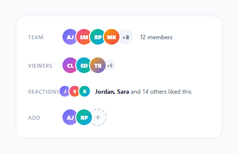
An avatar group (also called an avatar stack) shows multiple user avatars overlapping horizontally — a compact way to communicate who is involved in a project, who liked a post, who is viewing a document, or who is on a team (the team presence list shows the same data expanded). This snippet provides four avatar group variants: a basic overlap stack with +N overflow count, a tooltipped version showing names on hover, a small reaction row for post likes, and an interactive add-member button with a spring-entrance animation for newly added avatars.
The negative margin-left overlap
The overlap effect uses margin-left: -8px on all avatars except the first. This pulls each avatar 8px under the previous one. The border: 2.5px solid #fff creates a white ring that separates each avatar from the one behind it. Together these create the classic stacked avatar appearance. The negative margin value controls the overlap amount — -8px gives moderate overlap; -12px creates tighter stacking.
The hover lift effect
Each .av has transition: transform 0.15s, z-index 0.15s. On :hover, transform: translateY(-3px) lifts the hovered avatar up slightly, and z-index: 10 brings it to the front. This interactivity communicates that each avatar is distinct and hoverable — useful when tooltips or click handlers are attached.
The tooltip name on hover
The .tooltipped variant wraps each avatar in .av-wrap. Inside, a .av-tip span sits above the avatar via position: absolute; bottom: calc(100% + 6px). It starts at opacity: 0 and transitions to opacity: 1 on .av-wrap:hover. No JavaScript needed — the same pure CSS tooltip pattern triggered by the parent hover. For per-user presence dots, see the status avatar.
The +N overflow count
The .av-more element shows how many additional members are not displayed. It uses a pill shape (border-radius: 999px) with the same border and dimensions as the avatars, so it blends seamlessly into the stack. Update the text to reflect the actual count: '+' + (totalMembers - shownAvatars).
The spring add-member animation
When a new avatar is added, it starts at scale(0) and transitions to scale(1) using cubic-bezier(0.34,1.56,0.64,1) — a spring curve with overshoot. requestAnimationFrame ensures the scale(0) state is painted before the transition starts, triggering the spring entrance.
Using real images with initials fallback
Replace the .av div with an img element: <img class="av" src="user.jpg" alt="Alex Johnson">. The border, border-radius, hover, and negative margin styles apply automatically. For error handling when the image fails to load, use the onerror attribute: onerror="this.outerHTML='<div class='av' style='--bg:linear-gradient(135deg,#6366f1,#a78bfa)'>AJ</div>'". This replaces the broken image with the gradient initials fallback without JavaScript setup.
Build with AI
Build, Understand, Optimize, and Extend It With AI
Rather than working out the overlap math by eye, paste this snippet's HTML, CSS, and JS into an AI coding assistant like Claude and ask it to explain exactly why the overlap uses negative margin-left instead of absolute positioning, and why that choice matters when an avatar is removed from the group. The same assistant is useful for optimizing it — ask whether the addMember() function's requestAnimationFrame-before-transition pattern is really necessary here, and what would happen visually if it were removed. It's also a good partner for extending the component: ask it to add a remove animation that mirrors the spring-in entrance, wire the +N overflow bubble to open a full member list on click, or swap the gradient initials for real photos with a graceful onerror fallback. Treat the code less like a finished artifact and more like a starting point for a conversation.
Prompt to recreate it
Copy this into your AI assistant of choice to build the effect from scratch, or as a jumping-off point for your own variant:
Build an "overlapping avatar group" in plain HTML, CSS, and JavaScript — no libraries.

Requirements:
- A row of circular avatars where every avatar after the first uses a negative margin-left to overlap the previous one, with a solid white border ring on each avatar so overlapping circles stay visually distinct against each other, and where removing an avatar from the DOM should shrink the group's total width automatically because the layout is based on normal document flow (not absolute positioning).
- Every avatar should lift up slightly and rise to the front (via a CSS transform and a higher z-index) on hover, without disturbing the layout of neighboring avatars.
- A final "+N" pill styled to match the avatar dimensions and border, showing the count of members not otherwise displayed.
- A separate tooltip variant where each avatar is wrapped in its own relatively-positioned container with an absolutely positioned name label above it that fades in and slides up on hover, driven entirely by CSS opacity and transform on a parent hover selector — no JavaScript mouseenter/mouseleave listeners for this part.
- An "add member" interactive button that, when clicked, creates and inserts a new avatar element starting at scale(0), forces a style flush with requestAnimationFrame before removing that inline transform so a CSS transition with a bounce/overshoot easing curve animates it in, and hides the add button once a fixed list of candidate members is exhausted.
Want to tighten it up first? Run this prompt through the AI Prompt Studio to score it across 8 quality dimensions, catch anti-patterns, and tune the wording for Claude, ChatGPT, or Gemini before you paste it in.
Step by step
How to Use
- 1Hover over avatars to see the lift and tooltip effectsEach avatar in the tooltipped row shows a name tooltip above it on hover. All avatars lift slightly on hover with a translateY(-3px) transition, bringing them to the front via z-index.
- 2Click the + button to add members with a spring animationThe + dashed button adds avatars one by one with a spring bounce entrance (cubic-bezier overshoot). After 3 additions, the button hides — update NAMES array and the added limit for your use case.
- 3Change the overlap amountUpdate margin-left: -8px on .av-group .av to control overlap. Use -6px for less overlap (more breathing room), -12px for tighter stacking, -16px for heavy overlap like GitHub contributor groups.
- 4Update the +N overflow countEdit the .av-more text to reflect your actual count: totalMembers - shownAvatars. Show it only when there are hidden members. For 12 total with 4 shown: <div class="av-more">+8</div>.
- 5Use real images instead of initialsReplace the .av div with <img class="av" src="avatar.jpg" alt="Name" style="object-fit:cover">. The border, border-radius, and hover styles apply automatically. Add a fallback initials div for when images fail to load.
- 6Export in your formatClick "HTML" for a standalone file, "JSX" for a React component mapping a users array to avatar elements, or "Tailwind" for a React + Tailwind CSS version.
Real-world uses
Common Use Cases
Got questions?
Frequently Asked Questions
margin-left: -8px on each .av (except the first) pulls the avatar 8px to the left, overlapping the previous avatar. Unlike absolute positioning, this keeps the avatars in the normal document flow — the group's total width shrinks accordingly. The border: 2.5px solid #fff ring on each avatar creates a white separation band that makes each avatar visually distinct despite the overlap. The negative margin value controls overlap: -6px gives light overlap, -16px gives heavy overlap like GitHub contributor grids.
Wrap each .av in a .av-wrap div and add a .av-tip span: <div class="av-wrap"><div class="av">AJ</div><span class="av-tip">Alex Johnson</span></div>. CSS: .av-tip { position:absolute; bottom:calc(100%+6px); left:50%; transform:translateX(-50%); opacity:0; transition:opacity 0.15s; } .av-wrap:hover .av-tip { opacity:1; }. This is a pure CSS tooltip — no JavaScript hover handlers needed.
Add a .removing class to the avatar: av.classList.add("removing"); with CSS .av.removing { transform: scale(0); opacity: 0; transition: transform 0.25s, opacity 0.25s, margin-left 0.25s; margin-left: 0; width: 0; border: none; padding: 0; }. After the transition, call av.remove(). The margin-left: 0 and width: 0 collapse the avatar's space in the flow after it shrinks, preventing a gap. Use transitionend to fire the removal.
Click "JSX" to download. Accept a users prop (array of { name, initials, gradient }) and maxVisible (default 4). Map the first maxVisible users to .av elements. Show the overflow count if users.length > maxVisible: {users.length > maxVisible && <div className="av-more">+{users.length - maxVisible}</div>}. For the add-member button, manage a showingMembers state array and add to it on click. Derive the gradient from the user object or compute from the user id for consistent colours.