Source Code
<div class="row">
  <span class="avatar online" role="img" aria-label="Maya — online">
    <img src="https://i.pravatar.cc/120?img=47" alt="">
    <span class="dot"></span>
  </span>

  <span class="avatar away" role="img" aria-label="Leo — away">
    <img src="https://i.pravatar.cc/120?img=12" alt="">
    <span class="dot"></span>
  </span>

  <span class="avatar busy" role="img" aria-label="Ada — busy">
    <img src="https://i.pravatar.cc/120?img=32" alt="">
    <span class="dot"></span>
  </span>

  <span class="avatar offline" role="img" aria-label="Sam — offline">
    <span class="initials">SK</span>
    <span class="dot"></span>
  </span>
</div>
* { box-sizing: border-box; margin: 0; padding: 0; }
body {
font-family: system-ui, sans-serif;
background: #0f172a;
min-height: 100vh;
display: flex; align-items: center; justify-content: center;
}
.row { display: flex; gap: 26px; padding: 24px; }
.avatar {
position: relative;
display: inline-grid; place-items: center;
width: 60px; height: 60px;
border-radius: 50%;
background: #334155;
overflow: visible;
}
.avatar img {
width: 100%; height: 100%;
border-radius: 50%;
object-fit: cover;
}
.avatar .initials {
font-size: 18px; font-weight: 700; color: #e2e8f0;
}
/* Status dot — bottom-right, with a ring matching the page background */
.dot {
position: absolute;
right: 1px; bottom: 1px;
width: 15px; height: 15px;
border-radius: 50%;
border: 3px solid #0f172a; /* match page bg so it looks "cut out" */
background: #94a3b8;
}
/* Status colors */
.avatar.online .dot { background: #22c55e; }
.avatar.away .dot { background: #f59e0b; }
.avatar.busy .dot { background: #ef4444; }
.avatar.offline .dot { background: #64748b; }
/* Live pulse for the online state */
.avatar.online .dot::after {
content: "";
position: absolute; inset: -3px;
border-radius: 50%;
border: 2px solid #22c55e;
animation: pulse 1.8s ease-out infinite;
}
@keyframes pulse {
0% { transform: scale(0.8); opacity: 0.8; }
100% { transform: scale(1.8); opacity: 0; }
}
/* Busy uses a minus bar instead of a solid dot for clarity */
.avatar.busy .dot::after {
content: "";
position: absolute; left: 3px; right: 3px; top: 50%; height: 2px;
transform: translateY(-50%);
background: #fff; border-radius: 2px;
}// Pure CSS status avatars — no JavaScript needed.
// To change a status in code: el.className = 'avatar ' + status; // online|away|busy|offlineLearn Coding Visually
Learn to code with interactive, live-preview playgrounds — HTML, CSS, JavaScript, React & more.
 HTML Playground42 lessons · Click-based · Live preview
 CSS PlaygroundLearn CSS with a live editor
 JavaScript Playground60 lessons · DOM · Async · Canvas
 React PlaygroundLearn React with a live code editor
 GSAP PlaygroundLearn GSAP animation interactively
 SVG Playground44 lessons · shapes · paths · animation
 SCSS Playground45 lessons · Sass modules · tokens
 Tailwind PlaygroundLearn Tailwind CSS with a live editor
 Bootstrap 5 Playground50 lessons · live preview
Avatar with Status — Online Presence Dot Snippet
Avatar with Status · Cards · Plain HTML, CSS & JS · Live preview
What's included
Features
About this UI Snippet
Avatar with Status — Presence Dot, Pulsing Online Ring & Initials Fallback
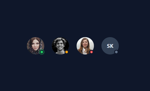
An avatar with a status indicator is one of the most-searched UI snippets because every chat, team, dashboard, and collaboration app needs to show whether a person is online, away, busy, or offline at a glance — stack several into an avatar group or list them in a team presence list. This snippet is a complete presence avatar set: a circular avatar (photo or initials fallback, as on the profile card), a color-coded status dot in the corner, a pulsing ring for the online state, and a distinct shape for "busy" — all done with pure CSS so the status is driven entirely by a single class.
Positioning the status dot correctly
The status dot is an absolutely positioned .dot element pinned to the bottom-right of the avatar (right: 1px; bottom: 1px). The detail that makes it look professional is the border: border: 3px solid #0f172a where that color matches the page background. This creates a "cut-out" effect — the dot appears to punch a hole through the avatar's edge rather than sitting on top of it, which is exactly how Slack, Discord, and Teams render presence dots. If you place an avatar on a different background, you change the dot's border color to match that surface. The avatar uses overflow: visible so the dot (and its pulse) can extend slightly past the circular edge.
Color-coding the four states
Presence is communicated by both position and color. A single class on the avatar (.online, .away, .busy, .offline) sets the dot color: green for online, amber for away, red for busy, gray for offline. These are the conventional presence colors users already recognize, so the meaning is instant. Because the state is a class, changing someone's status in code is one line — el.className = 'avatar ' + status — which maps perfectly to a real app where presence comes from a websocket or polling.
The pulsing online ring
To make "online" feel alive, the online dot has an ::after pseudo-element — a green ring that scales up and fades out on a 1.8s loop (@keyframes pulse). It starts small and slightly transparent, then expands to 1.8× and fades to zero, like a radar ping or a heartbeat. This subtle animation draws the eye to active users without being distracting, and because it only animates transform and opacity, it is GPU-cheap even with many avatars on screen. Only the online state pulses; the others are static, which reinforces that online means "active right now."
Not relying on color alone (the busy shape)
Color-only status indicators fail for color-blind users — red (busy) and green (online) are the classic confusable pair. This snippet addresses that for the most critical distinction by giving "busy" a different *shape*: its dot shows a white horizontal bar (a "do not disturb" minus), so busy is distinguishable from online by form, not just hue. This is a small but meaningful accessibility improvement; you could extend the same idea with a clock glyph for away and a hollow ring for offline so every state is identifiable without color.
The initials fallback
Not every user has a photo, so the fourth avatar demonstrates an initials fallback: instead of an <img>, it shows centered initials ("SK") on a neutral background. This is the standard graceful degradation for missing avatars and is handled purely with markup and CSS — no broken image icon, no layout shift. In a real app you would render initials when there is no avatarUrl, often with a background color derived from the user's name so each person gets a consistent, distinct color.
Accessibility
Each avatar is wrapped in a role="img" element with an aria-label that includes both the name and the status ("Maya — online"), so screen readers announce the person and their presence together. The <img> has an empty alt because the labeled wrapper already provides the accessible name (avoiding a double announcement). This is the correct pattern for an image-plus-status composite: label the whole unit, not just the photo. Combined with the busy shape distinction, the component conveys status to users who cannot perceive the colors.
Customizing the avatars
Resize by changing the avatar width/height and scaling the dot proportionally (keep the dot roughly a quarter of the avatar size). Re-theme the status colors to your brand while keeping them conventional enough to be understood. Change the dot border color to match whatever background the avatar sits on. To stack avatars into a group, overlap them with negative margins and a background-colored ring on each. To add a tooltip with the full status text on hover, wrap the name/status in a title attribute or a CSS tooltip. The whole component is class-driven, so wiring it to live presence data is just updating the avatar's class.
Build with AI
Build, Understand, Optimize, and Extend It With AI
You don't need to work out the cut-out dot trick or the accessibility layering by hand. Paste this snippet's HTML, CSS, and JS into an AI coding assistant like Claude and ask it to explain exactly why the status dot's border color must match the page background to create the "punched through" look, or how the busy state's minus-bar pseudo-element makes that status distinguishable from online without relying on color alone. The same assistant can help optimize it, for example checking whether the online pulse ring's animation (transform and opacity only) truly stays cheap when dozens of presence avatars are visible in a long team list at once. It's also useful for extending the feature: ask it to add a fifth "in a meeting" state with its own distinct shape, derive each initials-fallback avatar's background color deterministically from the person's name, or wire the whole component to live presence updates over a websocket instead of a static class. Treat the code less like a finished artifact and more like a starting point for a conversation.
Prompt to recreate it
Copy this into your AI assistant of choice to build the effect from scratch, or as a jumping-off point for your own variant:
Build an avatar component with an online-presence status indicator in plain HTML, CSS, and a documented one-line JavaScript update pattern, no framework, no libraries.

Requirements:
- A circular avatar container that can show either a photo (an img cropped to a circle via object-fit) or, when no photo is available, centered initials text on a neutral background as a fallback — with no broken-image icon and no layout shift between the two cases.
- A small circular status dot absolutely positioned at the avatar's bottom-right corner, whose border color exactly matches the page background so it visually appears to be "cut out" of the avatar's edge rather than sitting on top of it.
- Exactly four status states (online, away, busy, offline), each triggered by a single class name on the avatar element, each mapping to its own conventional dot color (green, amber, red, gray) via CSS alone — no per-status JavaScript logic beyond swapping the class.
- The online status must add a pulsing ring effect around the dot using a pseudo-element that scales up and fades out on an infinite loop, animating only transform and opacity for GPU efficiency, and it must be the only state that pulses.
- The busy status must be visually distinguishable from the other states by shape, not color alone: render a small horizontal bar inside or over its dot (a "do not disturb" mark), so color-blind users can tell it apart from the online state.
- Wrap each avatar in an element with role img and an aria-label that includes both the person's name and their current status word, and if the avatar uses a real img element, that inner image must have an empty alt attribute so screen readers don't announce the image twice.
- Document, in a code comment, the exact one-line pattern for changing a person's status from live data: setting the avatar element's className to include the new status word.
Want to tighten it up first? Run this prompt through the AI Prompt Studio to score it across 8 quality dimensions, catch anti-patterns, and tune the wording for Claude, ChatGPT, or Gemini before you paste it in.
Step by step
How to Use
- 1Copy an avatarEach avatar is a .avatar span with an <img> (or .initials), a .dot, and a status class (online/away/busy/offline). Keep the role="img" and aria-label.
- 2Match the dot border to the backgroundSet the .dot border color to the surface the avatar sits on, so the dot looks cut out of the avatar edge. Change it per background.
- 3Set status from dataChange the status in code with one line: el.className = "avatar " + status. Wire this to your presence websocket or API.
- 4Use initials when there is no photoRender a .initials span instead of an <img> for users without an avatar; optionally derive the background color from their name.
- 5Keep status distinguishable without colorThe busy state uses a bar shape, not just red. Extend the idea (clock for away, etc.) so color-blind users can tell states apart.
- 6Export in your formatClick "HTML" for a standalone file, "JSX" for a React component, or "Tailwind" for a React + Tailwind version.
Real-world uses
Common Use Cases
Got questions?
Frequently Asked Questions
Make the avatar position: relative and add an absolutely positioned dot pinned to the bottom-right corner. Give the dot a border whose color matches the page background so it looks cut out of the avatar edge, and set its background color from a status class (green online, amber away, red busy, gray offline).
The matching border creates a "cut-out" effect — the dot appears to punch through the avatar's edge rather than float on top, which is how Slack, Discord, and Teams render presence. On a different background, change the dot border to match that surface.
Status is a single class on the avatar, so set el.className = "avatar " + status where status is online, away, busy, or offline. This maps directly to live presence from a websocket or polling — update the class when the server sends a new status.
Each avatar has a role="img" and an aria-label that includes the name and status, so screen readers announce both. For visual users, the busy state uses a distinct bar shape (not just red) so it is distinguishable from green online by form; you can extend the idea to the other states.
Render an .initials span instead of an <img>. The avatar centers the initials on a neutral background, avoiding a broken-image icon. In a real app, derive the background color from the user's name so each person gets a consistent color.
Yes. Click "JSX" for a React component or "Tailwind" for a React + Tailwind version. In React, pass the status as a prop and apply it as a class, render an <img> or initials based on whether an avatar URL exists, and update the status from your presence state.