




Learn Coding Visually
Learn to code with interactive, live-preview playgrounds — HTML, CSS, JavaScript, React & more.
 HTML Playground42 lessons · Click-based · Live preview
 CSS PlaygroundLearn CSS with a live editor
 JavaScript Playground60 lessons · DOM · Async · Canvas
 React PlaygroundLearn React with a live code editor
 GSAP PlaygroundLearn GSAP animation interactively
 SVG Playground44 lessons · shapes · paths · animation
 SCSS Playground45 lessons · Sass modules · tokens
 Tailwind PlaygroundLearn Tailwind CSS with a live editor
 Bootstrap 5 Playground50 lessons · live preview
Neon Glow Buttons — Free HTML CSS Snippet
Neon Glow Buttons · Buttons · Plain HTML & CSS · Live preview
What's included
Features
About this UI Snippet
Neon Glow Buttons — CSS box-shadow and text-shadow Neon Effect
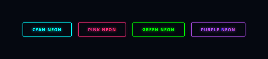
Neon glow buttons are a defining aesthetic of cyberpunk, gaming, crypto, and dark-themed interfaces — pair them with glitch text and a matrix rain background for the full effect. The glowing outline effect simulates the look of real neon tube signage — a coloured border with light spilling outward and inward. The entire effect is achieved with CSS box-shadow and text-shadow — no SVG, no canvas, no images.
How the neon effect works
Each button has a transparent background, a 2px solid coloured border, and multiple box-shadow layers. The default state uses: box-shadow: 0 0 8px color33, inset 0 0 8px color11 — a soft outer glow and a faint inner glow. The text-shadow: 0 0 8px color makes the text itself appear to emit light.
On :hover, the shadows intensify with three layers: 0 0 20px color8 (tight halo), 0 0 40px color5 (wider spread), and inset 0 0 20px color3 (inner fill). The text-shadow also doubles. The all: 0.2s transition makes both states animate smoothly.
The four colour variants
The four variants — cyan (#0ff), pink (#ff2d78), green (#39ff14), and purple (#bf5fff) — use the same shadow pattern with each variant's base colour. To add a new colour, copy a variant block and replace the colour value throughout.
Why the background is transparent
Neon tubes glow against a dark background — the contrast between the dark fill and the glowing edge is what creates the neon illusion. A solid fill would hide the inner glow and reduce the contrast that makes the effect work. The dark page background (#050810) is the minimum contrast needed for the glow to read.
Adding the effect to any button
Copy the .neon base CSS and one colour variant CSS block onto any button — including a gradient button. The only requirement is a dark background — the effect degrades on light backgrounds where glow is less visible.
The layered box-shadow technique
Neon glow is not a single box-shadow — it is three or four layers at increasing blur radii. Example for cyan: box-shadow: 0 0 4px #0ef, 0 0 12px #0ef, 0 0 28px #0ef, 0 0 56px rgba(0,238,255,0.4). The innermost shadow (4px) creates the bright core. Progressively larger radii create the mid-glow and outer ambient spread. Each layer uses the same hue but the outermost uses rgba with reduced opacity for a natural fade. The same layered technique applies to text-shadow for neon text effects.
Combining box-shadow and text-shadow
For fully neon-glowing buttons, apply layered box-shadow on the button element and layered text-shadow on the button's text content. text-shadow: 0 0 4px #0ef, 0 0 8px #0ef creates a glowing text inside the glowing button, adding depth.
Performance
Multiple box-shadow layers are rendered by the GPU on the compositor and do not trigger layout recalculation. However, very large blur radii (>60px) on many elements can cause paint performance issues on mobile. Test with Chrome DevTools Paint Flashing to verify.
Build with AI
Build, Understand, Optimize, and Extend It With AI
Since this whole effect lives in the box-shadow and text-shadow values, paste this snippet's HTML and CSS into an AI coding assistant like Claude and ask it to explain exactly why the default state layers an outer glow with an inset glow together, and what specifically changes in the hex opacity suffixes between the resting and hover shadow stacks. The same assistant can help you optimize it, for instance asking whether stacking four separate shadow layers per button noticeably affects paint cost on a page with dozens of neon buttons, or how large a blur radius can go before it becomes a mobile GPU performance concern. It's also useful for extending the effect: ask it to add a fifth color variant computed from a single CSS custom property instead of duplicating a whole rule block, animate a subtle flicker like a real failing neon tube, or make the glow intensity respond to a data attribute driven by button state (e.g. an active/selected variant). Treat the code less like a finished artifact and more like a starting point for a conversation.
Prompt to recreate it
Copy this into your AI assistant of choice to build the effect from scratch, or as a jumping-off point for your own variant:
Build a set of "neon glow" buttons in plain HTML and CSS only, using layered box-shadow and text-shadow — no SVG, no canvas, no JavaScript, no images.

Requirements:
- Several button variants (at least four different neon colors), each with a transparent background, a solid colored border matching its neon color, and text colored to match.
- Each button's resting state must combine two box-shadow layers on the same element: a soft outer glow (a small blur radius, low opacity) and an inset inner glow (also small blur, low opacity) using the same base color, plus a text-shadow on the label using that same color so the text itself appears to emit light.
- On hover, the box-shadow must expand to at least three layers (a tight bright halo, a wider softer spread, and a stronger inset fill) and the text-shadow must intensify to a doubled glow, with the whole transition animated smoothly rather than snapping.
- The page background must be a very dark, near-black color, and note in a comment that this dark backdrop is required for the glow effect to read as neon rather than as a faint colored outline.
- Structure the CSS so that adding a fifth color variant is just copying one class block and swapping every color reference to a new hex value, with the shadow layer structure staying identical across all variants.
Want to tighten it up first? Run this prompt through the AI Prompt Studio to score it across 8 quality dimensions, catch anti-patterns, and tune the wording for Claude, ChatGPT, or Gemini before you paste it in.
Source Code
<div class="scene">
  <button class="neon cyan">Cyan Neon</button>
  <button class="neon pink">Pink Neon</button>
  <button class="neon green">Green Neon</button>
  <button class="neon purple">Purple Neon</button>
</div>
* { box-sizing: border-box; margin: 0; padding: 0; }
body { font-family: system-ui, sans-serif; background: #050810; display: flex; align-items: center; justify-content: center; min-height: 100vh; }
.scene { display: flex; flex-wrap: wrap; gap: 20px; justify-content: center; padding: 40px; }
.neon {
padding: 12px 30px;
font-size: 13px; font-weight: 700;
text-transform: uppercase; letter-spacing: 2px;
border-radius: 4px;
background: transparent;
cursor: pointer; font-family: inherit;
position: relative;
transition: all 0.2s;
}
.neon.cyan {
color: #0ff;
border: 2px solid #0ff;
box-shadow: 0 0 8px #0ff3, inset 0 0 8px #0ff1;
text-shadow: 0 0 8px #0ff;
}
.neon.cyan:hover {
background: #0ff2;
box-shadow: 0 0 20px #0ff8, 0 0 40px #0ff5, inset 0 0 20px #0ff3;
text-shadow: 0 0 16px #0ff, 0 0 32px #0ff;
}
.neon.pink {
color: #ff2d78;
border: 2px solid #ff2d78;
box-shadow: 0 0 8px #ff2d7833, inset 0 0 8px #ff2d7811;
text-shadow: 0 0 8px #ff2d78;
}
.neon.pink:hover {
background: rgba(255,45,120,0.1);
box-shadow: 0 0 20px #ff2d78cc, 0 0 40px #ff2d7866, inset 0 0 20px #ff2d7833;
text-shadow: 0 0 16px #ff2d78, 0 0 32px #ff2d78;
}
.neon.green {
color: #0f0;
border: 2px solid #0f0;
box-shadow: 0 0 8px #0f03, inset 0 0 8px #0f01;
text-shadow: 0 0 8px #0f0;
}
.neon.green:hover {
background: #0f02;
box-shadow: 0 0 20px #0f08, 0 0 40px #0f05, inset 0 0 20px #0f03;
text-shadow: 0 0 16px #0f0, 0 0 32px #0f0;
}
.neon.purple {
color: #b44fef;
border: 2px solid #b44fef;
box-shadow: 0 0 8px #b44fef33, inset 0 0 8px #b44fef11;
text-shadow: 0 0 8px #b44fef;
}
.neon.purple:hover {
background: rgba(180,79,239,0.1);
box-shadow: 0 0 20px #b44fefcc, 0 0 40px #b44fef66, inset 0 0 20px #b44fef33;
text-shadow: 0 0 16px #b44fef, 0 0 32px #b44fef;
}Step by step
How to Use
- 1Hover each buttonHover over each of the four coloured buttons to see the box-shadow and text-shadow intensify. The transition is 0.2s for a smooth glow.
- 2Change a colourIn the CSS panel, find a colour variant (e.g. .neon.cyan) and replace all #0ff values with your colour hex.
- 3Add a new colour variantCopy a full .neon.colour block and rename the class. Replace the colour value throughout the block.
- 4Change the border radiusUpdate border-radius: 4px on .neon for sharper or rounder buttons. Neon signs are typically more angular.
- 5Apply to a light backgroundIf your background is lighter, increase the shadow opacity values for the glow to remain visible.
- 6Export in your formatClick "HTML" for a standalone file, "JSX" for a React component, or "Tailwind" for a React + Tailwind version.
Real-world uses
Common Use Cases
Got questions?
Frequently Asked Questions
box-shadow with multiple comma-separated values stacks an outer halo and an inner glow on a transparent button. text-shadow makes the text appear to emit light. On hover, all shadow values intensify simultaneously via transition: all 0.2s.
Neon glow is a light-on-dark effect. The glow values use semi-transparent colours — they only create visible contrast against a dark background. On a white background, the soft glows are invisible against the light surface.
Copy any .neon.colour block (e.g. .neon.cyan), rename it .neon.orange, and replace all colour values with your chosen hex. Use the same shadow pattern structure — outer glow, inner glow, and text-shadow.
The hex opacity suffixes (33, 11, 8, 5, 3) control glow intensity. Higher values (66, 44) make it brighter; lower values (22, 0a) make it dimmer. Edit them in the CSS panel while watching the preview.
Yes but the effect is weaker. Increase the shadow opacity values significantly and darken the page background slightly to maintain contrast. A pure white background with neon shadows reads as faint coloured borders rather than glowing neon.
Yes. Click "JSX" for a React component or "Tailwind" for a Tailwind version. In Tailwind, neon glow requires arbitrary shadow values: shadow-[0_0_20px_#0ff,0_0_40px_#0ff5]. The full effect is easier to maintain as a CSS class than inline Tailwind utilities.