Source Code
<div class="scene">
  <div class="card" onclick="this.classList.toggle('flipped')">
    <div class="face front">
      <div class="icon">🎨</div>
      <h3>UI Design</h3>
      <p>Hover or tap to reveal the back</p>
      <span class="hint">Click to flip →</span>
    </div>
    <div class="face back">
      <div class="icon">✨</div>
      <h3>What's inside</h3>
      <ul>
        <li>Figma components</li>
        <li>Design tokens</li>
        <li>Accessibility guide</li>
        <li>Animation specs</li>
      </ul>
      <button class="cta">Explore →</button>
    </div>
  </div>
</div>
* { box-sizing: border-box; margin: 0; padding: 0; }
body { font-family: system-ui, sans-serif; background: #0f172a; display: flex; align-items: center; justify-content: center; min-height: 100vh; }
.scene { perspective: 1000px; }
.card {
width: 260px; height: 320px;
position: relative;
transform-style: preserve-3d;
transition: transform 0.65s cubic-bezier(0.4, 0.2, 0.2, 1);
cursor: pointer;
}
.card:hover { transform: rotateY(8deg) rotateX(-4deg); }
.card.flipped { transform: rotateY(180deg); }
.card.flipped:hover { transform: rotateY(172deg) rotateX(-4deg); }
.face {
position: absolute; inset: 0;
border-radius: 20px;
backface-visibility: hidden;
display: flex; flex-direction: column;
align-items: center; justify-content: center;
padding: 28px 24px; text-align: center;
border: 1px solid rgba(255,255,255,0.08);
}
.front {
background: linear-gradient(135deg, #1e293b, #0f172a);
box-shadow: 0 20px 60px rgba(0,0,0,0.5);
}
.back {
background: linear-gradient(135deg, #312e81, #4c1d95);
transform: rotateY(180deg);
box-shadow: 0 20px 60px rgba(99,102,241,0.3);
}
.icon { font-size: 40px; margin-bottom: 16px; }
h3 { font-size: 18px; font-weight: 700; color: #f1f5f9; margin-bottom: 8px; }
p { font-size: 13px; color: #64748b; line-height: 1.6; }
.hint { font-size: 11px; color: #6366f1; margin-top: 16px; font-weight: 600; }
.back ul { list-style: none; text-align: left; width: 100%; margin: 12px 0 20px; display: flex; flex-direction: column; gap: 8px; }
.back li { font-size: 13px; color: #c4b5fd; display: flex; align-items: center; gap: 8px; }
.back li::before { content: '✓'; color: #a78bfa; font-weight: 700; }
.cta { padding: 9px 22px; background: #fff; color: #4c1d95; font-size: 13px; font-weight: 700; border: none; border-radius: 8px; cursor: pointer; transition: opacity 0.15s; }
.cta:hover { opacity: 0.9; }Learn Coding Visually
Learn to code with interactive, live-preview playgrounds — HTML, CSS, JavaScript, React & more.
 HTML Playground42 lessons · Click-based · Live preview
 CSS PlaygroundLearn CSS with a live editor
 JavaScript Playground60 lessons · DOM · Async · Canvas
 React PlaygroundLearn React with a live code editor
 GSAP PlaygroundLearn GSAP animation interactively
 SVG Playground44 lessons · shapes · paths · animation
 SCSS Playground45 lessons · Sass modules · tokens
 Tailwind PlaygroundLearn Tailwind CSS with a live editor
 Bootstrap 5 Playground50 lessons · live preview
3D Flip Card — Free HTML CSS Snippet
3D Flip Card · Cards · Plain HTML & CSS · Live preview
What's included
Features
About this UI Snippet
3D Flip Card — preserve-3d, backface-visibility & Perspective
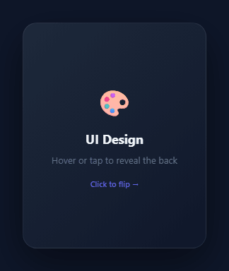
The 3D flip card reveals a back face when clicked — the front rotates away in 3D space and the back rotates into view. The effect simulates a physical card turning over. It is used for product showcases with front/back information, flashcard learning apps (see the quiz card), team member cards with bio on the back, and any card where two screens of content need to coexist. For a hover-tilt instead of a flip, see the 3D card tilt.
The four CSS properties that make it work
.scene { perspective: 1000px } establishes a 3D perspective context for all children. Without perspective, 3D transforms look flat — there is no vanishing point. 1000px is a natural-looking perspective distance for a card of this size.
.card { transform-style: preserve-3d } tells the browser to render the card's children in the same 3D space as the card itself — the same property that powers the CSS 3D cube. Without this, child elements with 3D transforms are flattened to 2D.
.face { backface-visibility: hidden } hides a face when it is rotated more than 90 degrees away from the viewer. Without this, both faces would be visible simultaneously — you would see the back face showing through the front.
The front face has no initial rotation. The back face has transform: rotateY(180deg) — it starts pre-rotated 180 degrees so it is invisible initially (backface hidden). When the card gains .flipped, both the card and back face together make the back face face the viewer.
The flip animation
.card.flipped { transform: rotateY(180deg) } rotates the entire card 180 degrees around the Y axis. The front face (at 0deg) now faces away and is hidden by backface-visibility. The back face (pre-rotated to 180deg, now at 0deg effective rotation) faces the viewer and becomes visible.
The hover tilt
.card:hover { transform: rotateY(8deg) rotateX(-4deg) } adds a subtle perspective tilt on hover. When flipped, .card.flipped:hover uses rotateY(172deg) rotateX(-4deg) — 180 minus 8 — to apply the same tilt offset from the flipped position.
Pure CSS — the toggle uses one onclick attribute
onclick="this.classList.toggle('flipped')" is the entire JavaScript. The CSS handles the animation.
The preserve-3d and backface-visibility pair
Two CSS properties make the 3D flip work: transform-style: preserve-3d on the container tells the browser to render children in 3D space. backface-visibility: hidden on each face hides that face when it is rotated more than 90° away from the viewer. Without preserve-3d, the faces collapse to 2D. Without backface-visibility: hidden, both faces are visible simultaneously (front shows through back).
The rotation setup
The .card-inner rotates on hover: transform: rotateY(180deg). The front face starts at rotateY(0deg) — no transform needed. The back face starts at rotateY(180deg) (already flipped). When .card-inner rotates 180°, front goes to 180° (hidden by backface-visibility) and back goes to 360° = 0° (now facing the viewer). The perspective on the outer container (1000px) controls the 3D depth.
Click vs hover trigger
The snippet uses CSS :hover by default. For a click-triggered flip (card that stays flipped after click), add JavaScript: card.addEventListener('click', () => card.classList.toggle('flipped')) and use the .flipped class with rotateY(180deg) in CSS instead of :hover.
Build with AI
Build, Understand, Optimize, and Extend It With AI
You don't have to puzzle out the rotation math on your own — paste this snippet's HTML and CSS into an AI coding assistant like Claude and ask it to explain exactly why the back face is pre-rotated to rotateY(180deg) at rest, and what would visibly go wrong if backface-visibility: hidden were removed from the faces. The same assistant is useful for optimizing it — asking whether the 0.65s cubic-bezier transition duration holds up on lower-powered mobile GPUs, or whether preserve-3d on multiple nested flip cards on one page could cause unexpected stacking issues. It's just as good for extending the card: ask it to add a third face that appears after a second click using an intermediate rotation state, drive the flip from a data attribute so many cards can share one click handler, or swap the click trigger for a hover-based flip with a delay before flipping back. Treat the code less like a finished artifact and more like a starting point for a conversation.
Prompt to recreate it
Copy this into your AI assistant of choice to build the effect from scratch, or as a jumping-off point for your own variant:
Build a "3D flip card" in plain HTML and CSS, with a single inline onclick attribute as the only JavaScript — no external scripts, no animation libraries.

Requirements:
- An outer "scene" wrapper with CSS perspective set (around 1000px) so the flip reads as real 3D rotation rather than a flat mirror-flip.
- A card element with transform-style: preserve-3d and a transition on transform using a duration around 0.6s with a custom cubic-bezier easing curve, sized with a fixed width and height.
- Two face elements (front and back) both absolutely positioned to fill the card exactly, each with backface-visibility: hidden so a face rotated past 90 degrees away from the viewer becomes invisible instead of showing through.
- The back face must start pre-rotated with transform: rotateY(180deg) so it faces directly away from the viewer and is hidden at rest, while the front face has no rotation.
- Toggling a single CSS class on the card (e.g. "flipped") via onclick="this.classList.toggle(...)" must rotate the entire card 180 degrees on the Y axis, which simultaneously rotates the front face out of view and brings the back face's pre-rotated 180 degrees around to 0-degrees-effective, making it the one now facing the viewer.
- Add a subtle hover tilt (a small combined rotateY/rotateX offset) on both the unflipped and flipped states, where the flipped hover state uses 180 degrees minus the same offset so the tilt direction stays consistent whichever face is showing.
- Confirm and explain in comments why removing either preserve-3d or backface-visibility: hidden breaks the illusion.
Want to tighten it up first? Run this prompt through the AI Prompt Studio to score it across 8 quality dimensions, catch anti-patterns, and tune the wording for Claude, ChatGPT, or Gemini before you paste it in.
Step by step
How to Use
- 1Click the card in the previewClick the card to flip it to the back face. The rotateY(180deg) animation runs over 0.65s with a custom cubic-bezier. Click again to flip back.
- 2Update both facesIn the HTML panel, change the .front content (icon, title, subtitle) and the .back content (description, button) to your own text.
- 3Change flip directionChange rotateY(180deg) to rotateX(180deg) in .card.flipped for a vertical flip. Update the .back face pre-rotation to match.
- 4Change flip speed and easingUpdate 0.65s and the cubic-bezier values on .card transition in the CSS panel.
- 5Trigger on hover instead of clickRemove the onclick attribute and add .card:hover { transform: rotateY(180deg); } in the CSS. The card flips on hover instead of click.
- 6Export in your formatClick "HTML" for a standalone file, "JSX" for a React component, or "Tailwind" for a React + Tailwind version.
Real-world uses
Common Use Cases
Got questions?
Frequently Asked Questions
preserve-3d tells the browser to render child elements in the same 3D space as the parent. Without it, children with 3D transforms are flattened to 2D — the card children would lose their 3D positions and the flip would not work.
When a face is rotated more than 90 degrees away from the viewer, backface-visibility: hidden hides it. Without this, you would see the back of the front face (a mirrored view) and the front of the back face simultaneously.
The back face starts rotated 180deg, facing away from the viewer and therefore hidden by backface-visibility. When .flipped rotates the card 180deg, the card and back face together put the back face at 360deg (or 0deg effective) — facing the viewer and visible.
Remove the onclick attribute from the HTML. Add .card:hover { transform: rotateY(180deg); } in the CSS panel. Also add .card:hover.card { transform: rotateY(180deg) rotateX(-4deg); } to keep the tilt on the hover state.
Change rotateY(180deg) to rotateX(180deg) in .card.flipped. Change the .back pre-rotation from transform: rotateY(180deg) to transform: rotateX(180deg). Update the hover states to match.
Yes. Click "JSX" for a React component. In React, replace onclick with useState: const [flipped, setFlipped] = useState(false). Apply className={flipped ? "card flipped" : "card"} and onClick={() => setFlipped(!flipped)}.