Source Code
<div class="scene">
  <div class="stage">
    <div class="cube" id="cube">
      <div class="face front">Front</div>
      <div class="face back">Back</div>
      <div class="face left">Left</div>
      <div class="face right">Right</div>
      <div class="face top">Top</div>
      <div class="face bottom">Bottom</div>
    </div>
  </div>
  <div class="controls">
    <button class="btn" onclick="setCam(0,0)">Reset</button>
    <button class="btn" onclick="setCam(-20,45)">Perspective</button>
    <button class="btn" onclick="setCam(-90,0)">Top view</button>
    <button class="btn accent" onclick="toggleSpin()">Auto-spin</button>
  </div>
</div>
* { box-sizing: border-box; margin: 0; padding: 0; }
body { font-family: system-ui, sans-serif; background: #0f172a; display: flex; align-items: center; justify-content: center; min-height: 100vh; }
.scene { display: flex; flex-direction: column; align-items: center; gap: 32px; }
.stage { perspective: 600px; width: 160px; height: 160px; }
.cube {
width: 160px; height: 160px;
transform-style: preserve-3d;
transform: rotateX(-20deg) rotateY(45deg);
transition: transform 0.6s cubic-bezier(0.4,0,0.2,1);
}
.cube.spinning { animation: spin 6s linear infinite; }
@keyframes spin { to { transform: rotateX(-20deg) rotateY(405deg); } }
.face {
position: absolute; width: 160px; height: 160px;
display: flex; align-items: center; justify-content: center;
font-size: 13px; font-weight: 700; letter-spacing: 1px;
text-transform: uppercase; border-radius: 8px;
border: 2px solid rgba(255,255,255,0.15);
backface-visibility: visible;
}
.front { background: rgba(99,102,241,0.5); color: #c7d2fe; transform: rotateY(0deg) translateZ(80px); }
.back { background: rgba(139,92,246,0.5); color: #ddd6fe; transform: rotateY(180deg) translateZ(80px); }
.left { background: rgba(236,72,153,0.5); color: #fbcfe8; transform: rotateY(-90deg) translateZ(80px); }
.right { background: rgba(14,165,233,0.5); color: #bae6fd; transform: rotateY(90deg) translateZ(80px); }
.top { background: rgba(16,185,129,0.5); color: #a7f3d0; transform: rotateX(90deg) translateZ(80px); }
.bottom { background: rgba(245,158,11,0.5); color: #fde68a; transform: rotateX(-90deg) translateZ(80px); }
.controls { display: flex; gap: 8px; flex-wrap: wrap; justify-content: center; }
.btn { padding: 7px 14px; font-size: 12px; font-weight: 600; background: #1e293b; color: #64748b; border: 1px solid #334155; border-radius: 7px; cursor: pointer; font-family: inherit; transition: all 0.15s; }
.btn:hover { border-color: #6366f1; color: #6366f1; }
.btn.accent { background: #6366f1; color: #fff; border-color: #6366f1; }const cube = document.getElementById('cube');
let spinning = true;
cube.classList.add('spinning');
function setCam(rx, ry) {
spinning = false;
cube.classList.remove('spinning');
cube.style.transform = `rotateX(${rx}deg) rotateY(${ry}deg)`;
}
function toggleSpin() {
spinning = !spinning;
cube.classList.toggle('spinning', spinning);
if (spinning) cube.style.transform = '';
}
let isDrag = false, startX, startY, curX = -20, curY = 45;
cube.addEventListener('mousedown', e => { isDrag = true; startX = e.clientX; startY = e.clientY; cube.classList.remove('spinning'); spinning = false; });
window.addEventListener('mousemove', e => {
if (!isDrag) return;
curY += (e.clientX - startX) * 0.5;
curX -= (e.clientY - startY) * 0.5;
startX = e.clientX; startY = e.clientY;
cube.style.transform = `rotateX(${curX}deg) rotateY(${curY}deg)`;
});
window.addEventListener('mouseup', () => isDrag = false);Learn Coding Visually
Learn to code with interactive, live-preview playgrounds — HTML, CSS, JavaScript, React & more.
 HTML Playground42 lessons · Click-based · Live preview
 CSS PlaygroundLearn CSS with a live editor
 JavaScript Playground60 lessons · DOM · Async · Canvas
 React PlaygroundLearn React with a live code editor
 GSAP PlaygroundLearn GSAP animation interactively
 SVG Playground44 lessons · shapes · paths · animation
 SCSS Playground45 lessons · Sass modules · tokens
 Tailwind PlaygroundLearn Tailwind CSS with a live editor
 Bootstrap 5 Playground50 lessons · live preview
CSS 3D Cube — Free HTML CSS JS Snippet
CSS 3D Cube · Animations · Plain HTML, CSS & JS · Live preview
What's included
Features
About this UI Snippet
CSS 3D Cube — Six Faces via rotateY/X + translateZ, preserve-3d & Spin Animation
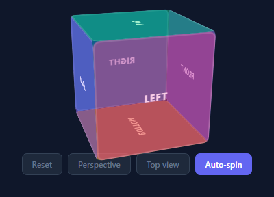
A CSS 3D cube renders all six faces of a cube using HTML divs and CSS 3D transforms — no WebGL, no canvas, no library. It uses the same preserve-3d technique as the 3D flip card and 3D card tilt. The cube spins continuously and can be clicked to pause and rotate manually.
The six faces
Each .face div is absolutely positioned inside the .cube container. The cube is a 140px box. Each face uses a combination of rotateY/rotateX and translateZ(70px) (half the cube size) to position it on the correct plane: .front { transform: rotateY(0deg) translateZ(70px) }, .back { transform: rotateY(180deg) translateZ(70px) }, .right { transform: rotateY(90deg) translateZ(70px) } etc.
preserve-3d
.cube { transform-style: preserve-3d } is required on the cube container. Without it, the child faces collapse to 2D and all appear stacked on the same plane.
Spin animation and click control
A @keyframes spin rotates the cube continuously. Clicking the cube toggles spinning and removes the CSS animation, allowing manual rotation via setCam(rx, ry).
Manual rotation controls
The snippet includes three view-preset buttons: Top view (rx=90, ry=0), Side view (rx=20, ry=-60), and Perspective (rx=20, ry=30). These call setCam(rx,ry) which stops the auto-spin animation and applies a specific rotateX + rotateY transform to the cube wrapper. An Auto-spin button restores the CSS keyframe animation.
The perspective container
The outer .scene div has perspective: 600px — this is the distance from the viewer to the 3D plane. A smaller value creates a more extreme fish-eye distortion; larger values produce flatter, more orthographic projections. The value 600px is close to the cube's display size (140px), giving a dramatic but not distorted 3D appearance.
Face labelling
Each face uses text labels (FRONT, BACK, LEFT, RIGHT, TOP, BOTTOM) and a distinct background colour. Replace the text and background with images using background-image: url() and background-size: cover for a textured or photographic cube.
Performance
All cube faces are hardware-accelerated via transform — no layout or paint is triggered by the rotation animation. The will-change: transform hint can be added to .cube for additional GPU compositor optimisation on animating elements.
Customising the cube appearance
Change the cube size by updating the 140px value in .cube, .scene, and translateZ(70px) — keep translateZ at exactly half the cube edge length. Each face can have a different background colour, gradient, or image. For a product showcase, place product screenshots on each face. For a game, use different textures. The cube container size and translateZ offset are the only two values you need to change to resize the cube cleanly.
Build with AI
Build, Understand, Optimize, and Extend It With AI
You don't have to work out the six-face rotation values yourself to see why each one uses exactly a 90-degree step. Paste this snippet's HTML, CSS, and JS into an AI coding assistant like Claude and ask it to explain exactly why every face needs both a rotate transform and a translateZ of half the cube's edge length, and what visually breaks if the translateZ value doesn't match half the cube size when you resize it. The same assistant can help optimize it — for instance asking whether toggling between the CSS keyframe spin and the drag-driven inline transform ever leaves the cube in an inconsistent state if a user starts dragging mid-animation. It's also useful for extending the cube: ask it to add touch drag support alongside the existing mouse drag so it works on mobile, replace the text-labeled faces with real images or product screenshots using background-image, or add momentum/inertia so releasing a drag continues spinning briefly before settling. Treat the code less like a finished artifact and more like a starting point for a conversation.
Prompt to recreate it
Copy this into your AI assistant of choice to build the effect from scratch, or as a jumping-off point for your own variant:
Build a draggable, spinning 3D cube in plain HTML, CSS, and JavaScript using only CSS 3D transforms — no WebGL, no canvas, no Three.js.

Requirements:
- Six face elements, each absolutely positioned inside a single cube container, where every face is placed onto its correct plane using a rotateX or rotateY value in exact 90-degree increments (0, 90, 180, -90) combined with a translateZ equal to exactly half the cube's edge length, so all six faces form a closed box with no gaps or overlaps.
- The cube's direct parent must set a CSS perspective value to establish the 3D viewing distance, and the cube itself must set transform-style preserve-3d so the child faces' 3D positioning isn't flattened into 2D.
- A continuous CSS keyframe animation that rotates the whole cube indefinitely, togglable on and off via a class, representing an "auto-spin" mode.
- Manual camera preset buttons that, when clicked, stop the auto-spin animation and directly set the cube's transform to a specific rotateX/rotateY combination (e.g. a reset front-facing view, an angled perspective view, and a top-down view).
- Mouse-drag rotation: pressing down on the cube stops any auto-spin, and dragging the mouse afterward continuously updates the cube's rotateX and rotateY based on the cumulative vertical and horizontal mouse movement since the last frame, releasing the mouse anywhere on the page (not just over the cube) to stop the drag.
- Ensure that switching between auto-spin, a camera preset, and manual dragging always leaves the cube's transform in a single consistent state with no leftover animation class conflicting with an inline transform.
Want to tighten it up first? Run this prompt through the AI Prompt Studio to score it across 8 quality dimensions, catch anti-patterns, and tune the wording for Claude, ChatGPT, or Gemini before you paste it in.
Step by step
How to Use
- 1Watch the cube spinThe cube spins continuously via CSS @keyframes. Click the cube to pause spinning and rotate manually.
- 2Move the cursor to rotate manuallyAfter clicking to pause, move the cursor over the cube to rotate it via mousemove and see all six faces.
- 3Update face contentIn the HTML panel, change the emoji, gradient background, or text inside each .face div.
- 4Change cube sizeUpdate width/height on .cube and .face (currently 140px) and translateZ to half the new size.
- 5Change spin speedUpdate the animation duration in @keyframes spin (currently 8s) in the CSS panel.
- 6Export in your formatClick "HTML" for a standalone file, "JSX" for a React component, or "Tailwind" for a React + Tailwind version.
Real-world uses
Common Use Cases
Got questions?
Frequently Asked Questions
Each face uses a combination of rotation and translation: .front { rotateY(0deg) translateZ(70px) }, .back { rotateY(180deg) translateZ(70px) }, .right { rotateY(90deg) translateZ(70px) }, .left { rotateY(-90deg) translateZ(70px) }, .top { rotateX(90deg) translateZ(70px) }, .bottom { rotateX(-90deg) translateZ(70px) }.
Without preserve-3d on the parent .cube, all child .face elements are flattened into the 2D plane of the parent — they lose their 3D positions and all appear stacked on the same surface.
perspective: 800px sets the distance from the viewer to the z=0 plane. Lower values (400px) create more dramatic foreshortening; higher values (1200px) give subtler depth. The perspective must be on the parent of the rotating element.
Update the width/height on .cube and .face (currently 140px). Update translateZ to half the new size: a 200px cube uses translateZ(100px). Update .stage perspective proportionally.
Yes. Click "JSX" for a React component. The CSS animations and 3D transforms work identically in React. Manage the spinning state in useState and apply/remove the spinning class.
Replace the gradient background on each .face with an image background-image, or add HTML content inside each face div. The 3D positioning applies to the face div and all its contents.