Source Code
<div class="scene">
  <div class="card" id="card">
    <div class="glow" id="glow"></div>
    <div class="tag">⭐ Featured</div>
    <h3>3D Tilt Card</h3>
    <p>Move your mouse over this card to see the 3D perspective tilt effect with a dynamic highlight.</p>
    <div class="footer">
      <div class="avatars">
        <span class="av" style="background:#6366f1">A</span>
        <span class="av" style="background:#8b5cf6">B</span>
        <span class="av" style="background:#ec4899">C</span>
      </div>
      <button class="cta">View project →</button>
    </div>
  </div>
</div>
* { box-sizing: border-box; margin: 0; padding: 0; }
body { font-family: system-ui, sans-serif; background: #0f172a; display: flex; align-items: center; justify-content: center; min-height: 100vh; }
.scene { perspective: 800px; }
.card {
width: 300px; padding: 28px 24px;
background: #1e293b;
border-radius: 20px;
border: 1px solid rgba(255,255,255,0.08);
box-shadow: 0 25px 60px rgba(0,0,0,0.5);
transform-style: preserve-3d;
transition: transform 0.1s ease, box-shadow 0.1s ease;
position: relative; overflow: hidden;
cursor: default;
}
.glow {
position: absolute;
width: 200px; height: 200px;
border-radius: 50%;
background: radial-gradient(circle, rgba(99,102,241,0.35) 0%, transparent 70%);
pointer-events: none;
transform: translate(-50%, -50%);
transition: opacity 0.3s;
opacity: 0;
}
.tag { font-size: 11px; font-weight: 700; color: #fbbf24; background: rgba(251,191,36,0.1); border: 1px solid rgba(251,191,36,0.2); border-radius: 20px; padding: 2px 10px; display: inline-block; margin-bottom: 14px; }
h3 { font-size: 20px; font-weight: 700; color: #f1f5f9; margin-bottom: 10px; transform: translateZ(20px); }
p { font-size: 13px; color: #64748b; line-height: 1.65; margin-bottom: 20px; }
.footer { display: flex; align-items: center; justify-content: space-between; }
.avatars { display: flex; }
.av { width: 28px; height: 28px; border-radius: 50%; display: flex; align-items: center; justify-content: center; font-size: 11px; font-weight: 700; color: #fff; margin-left: -6px; border: 2px solid #1e293b; }
.av:first-child { margin-left: 0; }
.cta { font-size: 12px; font-weight: 600; color: #6366f1; background: none; border: none; cursor: pointer; font-family: inherit; transition: color 0.15s; }
.cta:hover { color: #a78bfa; }const card = document.getElementById('card');
const glow = document.getElementById('glow');
card.addEventListener('mousemove', e => {
const rect = card.getBoundingClientRect();
const cx = rect.left + rect.width / 2;
const cy = rect.top + rect.height / 2;
const dx = e.clientX - cx;
const dy = e.clientY - cy;
const rotX = -(dy / rect.height) * 20;
const rotY = (dx / rect.width) * 20;
card.style.transform = `rotateX(${rotX}deg) rotateY(${rotY}deg) scale(1.02)`;
card.style.boxShadow = `${-dx * 0.05}px ${-dy * 0.05 + 25}px 60px rgba(0,0,0,0.6)`;
const gx = e.clientX - rect.left;
const gy = e.clientY - rect.top;
glow.style.left = gx + 'px';
glow.style.top = gy + 'px';
glow.style.opacity = '1';
});
card.addEventListener('mouseleave', () => {
card.style.transform = 'rotateX(0) rotateY(0) scale(1)';
card.style.boxShadow = '';
glow.style.opacity = '0';
});Learn Coding Visually
Learn to code with interactive, live-preview playgrounds — HTML, CSS, JavaScript, React & more.
 HTML Playground42 lessons · Click-based · Live preview
 CSS PlaygroundLearn CSS with a live editor
 JavaScript Playground60 lessons · DOM · Async · Canvas
 React PlaygroundLearn React with a live code editor
 GSAP PlaygroundLearn GSAP animation interactively
 SVG Playground44 lessons · shapes · paths · animation
 SCSS Playground45 lessons · Sass modules · tokens
 Tailwind PlaygroundLearn Tailwind CSS with a live editor
 Bootstrap 5 Playground50 lessons · live preview
3D Card Tilt — Free HTML CSS JS Hover Snippet
3D Card Tilt · Animations · Plain HTML, CSS & JS · Live preview
What's included
Features
About this UI Snippet
3D Card Tilt — rotateX/Y from Mouse Offset, Glow Follow & Perspective Context
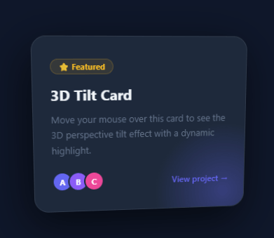
The 3D card tilt effect gives cards a physical presence — they rotate in perspective to face the cursor as the mouse moves over them, creating the illusion of a real object responding to light and viewpoint. Used on premium product cards, portfolio thumbnails, and feature showcases — for a flip-to-reveal interaction instead, see the 3D flip card.
The rotation calculation
The mousemove handler uses getBoundingClientRect() to get the card centre (cx, cy). The offsets dx = e.clientX - cx and dy = e.clientY - cy are normalised by card dimensions: rotX = -(dy / rect.height) * 20 and rotY = (dx / rect.width) * 20. This maps mouse position across the card surface to ±20 degrees of rotation. The negative on rotX flips the Y axis — moving the cursor up tilts the top of the card toward you.
The perspective context
.scene { perspective: 800px } establishes the 3D viewing context. 800px is the distance from the viewer to the card — lower values give more dramatic perspective foreshortening. The card has transform-style: preserve-3d so child elements can optionally be positioned in the same 3D space.
The following glow
A .glow div inside the card uses position: absolute; filter: blur() to create a light source. Its position is updated in the mousemove handler: glow.style.left and glow.style.top track the cursor position relative to the card, creating a highlight that follows the cursor.
mouseleave reset
On mouseleave, the card is reset to transform: rotateX(0) rotateY(0) scale(1) and the glow returns to centre. The CSS transition: transform 0.1s ease handles the snap-back smoothly.
The perspective transform calculation
On mousemove inside the card, the handler computes the cursor position relative to the card centre: const centerX = rect.left + rect.width/2; const centerY = rect.top + rect.height/2; const rotX = -(e.clientY - centerY) / (rect.height/2) * 10; const rotY = (e.clientX - centerX) / (rect.width/2) * 10. The division by half the card dimension normalises to a -1 to +1 range; multiplying by 10 gives a maximum 10-degree rotation. Negative rotX is needed because moving the cursor up should tilt the top of the card toward the viewer.
The glow highlight
A radial gradient overlay follows the cursor inside the card: background: radial-gradient(circle at X Y, rgba(255,255,255,0.15), transparent 70%). The X and Y values are the cursor position as a percentage of the card dimensions: ((e.clientX - rect.left) / rect.width * 100) + '% ' + ((e.clientY - rect.top) / rect.height * 100) + '%'. This creates a specular highlight that appears to move with the cursor, reinforcing the 3D illusion.
Reset on mouse leave
On mouseleave, rotX and rotY are reset to 0 with transition: transform 0.5s ease — a slower ease-out that lets the card settle back to flat gently, like a physical object returning to rest.
Build with AI
Build, Understand, Optimize, and Extend It With AI
You don't have to work through the trigonometry of the tilt yourself — paste this snippet's HTML, CSS, and JS into an AI coding assistant like Claude and ask it to explain exactly why rotX is negated while rotY isn't in the mousemove handler, and what would visually break if that sign were flipped. The same assistant is useful for optimizing it — asking whether writing card.style.transform directly on every mousemove event forces excessive layout work, and whether throttling with requestAnimationFrame would smooth it out on lower-end devices. It's just as good for extending the effect: ask it to make the glow's color shift with rotation direction, add an inertia-based settle animation instead of an instant mouseleave reset, or generalize the mousemove handler with querySelectorAll so it works across a whole grid of cards at once. Treat the code less like a finished artifact and more like a starting point for a conversation.
Prompt to recreate it
Copy this into your AI assistant of choice to build the effect from scratch, or as a jumping-off point for your own variant:
Build a "3D card tilt" hover effect in plain HTML, CSS, and JavaScript — no libraries, using only CSS perspective and rotateX/rotateY transforms driven by mouse position.

Requirements:
- A parent wrapper with CSS perspective set (roughly 800px) so child 3D rotations read as real depth, containing a card with transform-style: preserve-3d and a smooth, short transition on transform and box-shadow.
- On mousemove over the card, use getBoundingClientRect to find the card's center point, compute the cursor's horizontal and vertical offset from that center, then normalize each offset by the card's width or height and scale it to a maximum rotation of about 20 degrees.
- The vertical offset must be negated when computing the X-axis rotation (rotateX) so that moving the cursor toward the top of the card visually tilts the top of the card toward the viewer, while the horizontal offset drives rotateY directly (no negation).
- Apply the combined transform as rotateX(...) rotateY(...) scale(1.02) so the card also lifts slightly toward the viewer, and dynamically adjust the box-shadow offset based on the same cursor offset so the shadow appears to shift as the card tilts.
- Add a circular radial-gradient "glow" element absolutely positioned inside the card whose left/top values are updated every mousemove to track the cursor position relative to the card's top-left corner, fading in on enter and out on leave.
- On mouseleave, reset the card's transform to no rotation and scale(1), clear the custom box-shadow, and fade the glow's opacity back to 0, relying on the CSS transition for a smooth snap-back rather than an abrupt jump.
Want to tighten it up first? Run this prompt through the AI Prompt Studio to score it across 8 quality dimensions, catch anti-patterns, and tune the wording for Claude, ChatGPT, or Gemini before you paste it in.
Step by step
How to Use
- 1Move the cursor over the cardSlowly move the cursor across the card in the preview to see the 3D perspective tilt and the glow following the cursor.
- 2Change the tilt intensityIn the JS panel, update the * 20 multiplier on rotX and rotY calculations. Higher values create more dramatic tilt.
- 3Change the perspective distanceUpdate perspective: 800px on .scene in the CSS panel. Lower values (400px) give more dramatic 3D; higher (1200px) give subtler tilt.
- 4Update card contentIn the HTML panel, update the badge, heading, and description text inside .card.
- 5Disable the glowRemove the .glow element from the HTML and the glow.style lines from the JS panel for a cleaner tilt without the light effect.
- 6Export in your formatClick "HTML" for a standalone file, "JSX" for a React component, or "Tailwind" for a React + Tailwind version.
Real-world uses
Common Use Cases
Got questions?
Frequently Asked Questions
getBoundingClientRect gives the card position. dx = e.clientX - cx gives horizontal offset from centre (-width/2 to +width/2). Dividing by rect.height normalises to -0.5 to +0.5. Multiplying by 20 gives -10 to +10 degrees of tilt. The negative on rotX flips the Y axis.
perspective: 800px sets the virtual distance from the viewer to the card in pixels. Lower values (300-500px) create more dramatic foreshortening — the card appears to recede sharply. Higher values (1200px+) give subtle, realistic depth. The perspective property must be on the parent, not the card itself.
The .glow element is positioned absolutely inside the card. In mousemove, glow.style.left and glow.style.top are set to (e.clientX - rect.left) and (e.clientY - rect.top) — the cursor position relative to the card top-left corner.
Delete the <div class="glow"> from the HTML and remove all glow.style lines from the JS. The tilt works independently of the glow element.
Yes. Instead of targeting one element by ID, use querySelectorAll(".card") and addEventListener("mousemove") on each. Move the handler logic to a shared function that receives the card and glow elements as parameters.
Yes. Click "JSX" for a React component. In React, attach onMouseMove and onMouseLeave to the card div. Use useRef to access the card and glow elements directly to set style without state updates (avoiding rerenders on every mouse move).