Feature Highlight Cards — Icon Grid with Glow HTML CSS

Feature Highlight Cards · Cards · Plain HTML, CSS & JS · Live preview

Share & Support

What's included

Features

Mouse-tracking radial glow
--mx and --my CSS custom properties track the cursor percentage position within each card. The ::before gradient centres on these values — a spotlight that follows the cursor.
CSS custom property icon colours
--ic (background) and --stroke (icon colour) are set inline per card — one HTML attribute controls the entire icon colour palette for each card.
Wide card variant
.card-wide applies grid-column: span 2 — the hero feature card takes double width. Reverts to single column on mobile automatically.
Dark card variant
.card-dark uses a deep indigo gradient background with light text — the "Free Forever" standout card uses it to break the visual pattern.
Arrow link micro-interaction
.card-link:hover increases gap from 4px to 7px — the arrow nudges right on hover via CSS transition, indicating the link destination.
Tag chip system
Small grey pill tags below each description provide secondary metadata (technology, category) without cluttering the card's primary message.
Hover lift with border highlight
translateY(-3px) + box-shadow + border-color: #c7d2fe on hover — a three-property lift that makes cards feel interactive and slightly elevated.
Responsive CSS Grid
Three-column repeat(3, 1fr) on desktop, two-column on tablet, single-column on mobile — the wide card reverts gracefully at each breakpoint.

About this UI Snippet

Feature Cards — Mouse-Tracking Radial Glow, CSS Custom Property Grid & Icon Badge System
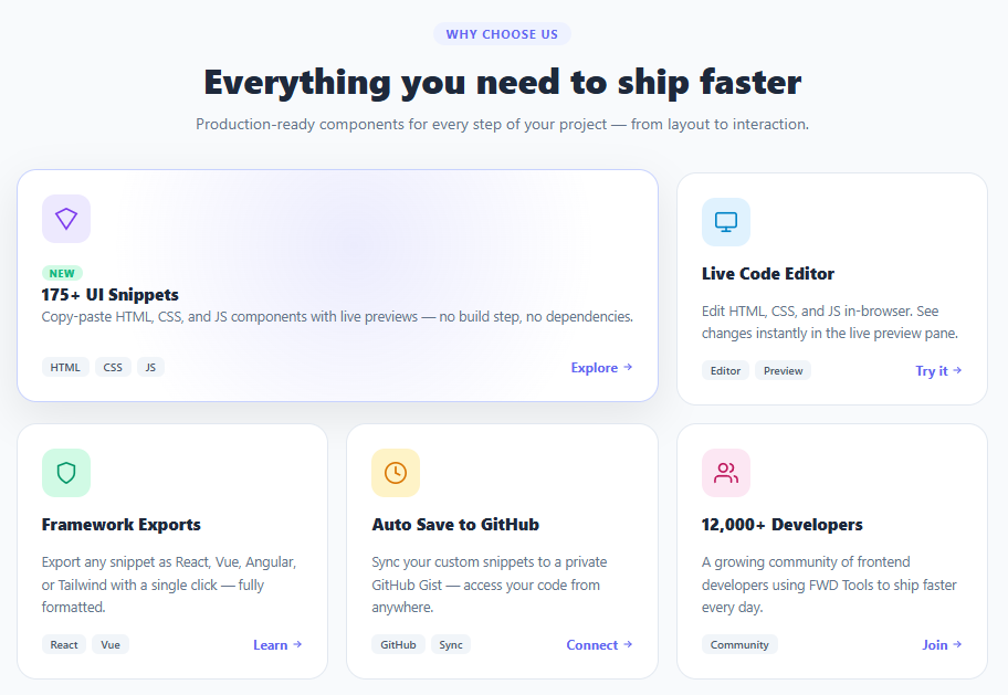
Screenshot of the Feature Highlight Cards snippet rendered live

Feature highlight cards are a cornerstone of SaaS landing pages — presenting product capabilities in a scannable, visually distinct grid. This snippet builds a six-card feature grid with a mouse-tracking radial glow effect, colour-coded icon badge system, tag chips, arrow CTA links, a wide (spanning two columns) card variant for the hero feature, and a dark gradient card for the standout "Free Forever" proposition.

Feature card grids appear on virtually every SaaS, developer tool, and product landing page. The design challenge is making each card feel distinct while maintaining visual cohesion. Icon colour coding, tag chips, and the CTA arrow link pattern solve this — plus the mouse-tracking glow adds a premium interactive feel that differentiates from static card grids.

Mouse-tracking radial glow per card

Each card's ::before pseudo-element renders a radial-gradient centred at CSS custom properties --mx and --my. The mousemove event listener reads the mouse position relative to the card's getBoundingClientRect and sets these properties as percentage values. The gradient appears at opacity: 0 by default and transitions to opacity: 1 on hover. The result is a "spotlight" effect that follows the cursor within each card — a pattern used in Linear, Vercel, and Raycast landing pages.

The key implementation detail is setting --mx and --my on the element (not in a stylesheet) — inline custom properties override the 50% 50% default set in CSS, placing the gradient precisely under the cursor. This requires only one getBoundingClientRect call per mousemove event and no requestAnimationFrame throttling for smooth 60fps behaviour.

Colour-coded icon badge system

Each card's icon container uses two CSS custom properties: --ic (background) and --stroke (icon colour). These are set inline on each card's .card-icon element. The palette — indigo, sky, emerald, amber, pink, indigo-dark — is drawn from a consistent design token system. This approach means adding a new colour variant is a one-line HTML change.

Wide card with `grid-column: span 2`

The "175+ UI Snippets" card spans two columns via grid-column: span 2. This creates visual hierarchy — the most important feature gets double the width. The card layout adapts without additional CSS because the flex column stretches naturally within the wider container. On mobile (max-width: 640px), the grid switches to single column and the wide card reverts to normal width. Pair with a bento grid for more complex asymmetric feature layouts.

Step by step

How to Use

  1. 1
    Paste HTML, CSS, and JSSix feature cards appear in a 3-column grid on a light background. The first card spans two columns. The last card has a dark gradient background.
  2. 2
    Move your mouse slowly across a cardA radial glow follows your cursor within the card boundary — the spotlight effect centres exactly under the pointer and fades out when you leave.
  3. 3
    Hover over the arrow linksThe gap between the link text and arrow icon increases on hover — a subtle micro-interaction that communicates interactivity.
  4. 4
    Inspect the icon colour systemEach card's icon has a different background and stroke colour defined via --ic and --stroke CSS custom properties inline on the element.
  5. 5
    Update card contentSwap icon SVGs, change titles, descriptions, and tag chips. Change the glow colour by adjusting the rgba in the ::before gradient in CSS.
  6. 6
    Add or remove cardsAdd <article class="card"> to the grid. Use card-wide for a card that spans 2 columns. Use card-dark for the dark variant. The grid adapts automatically.

Real-world uses

Common Use Cases

SaaS product feature sections
The primary use case — a "Why choose us" or "Features" section on a SaaS landing page. Each card covers one key capability with icon, description, and a learn-more link.
Developer tool and API landing pages
Code editors, deployment platforms, and API services use feature cards to communicate capabilities to technical buyers. Icon colour coding maps to feature categories.
Pricing page feature comparison
A feature card grid above or alongside a pricing table explains what each feature does in plain language, reducing support questions about plan differences.
Service offering pages for agencies
Agency "Services" pages use feature cards for each service offering: branding, web design, development, SEO. Each card links to the dedicated service page.
Onboarding feature tours
A feature grid shown during app onboarding gives users a map of what they can do. The wide card highlights the most important first action.
App store and download landing pages
Mobile app landing pages use feature cards to explain key capabilities below the hero section — the standard pattern for iOS/Android app download pages.

Got questions?

Frequently Asked Questions

The glow colour is hardcoded as rgba(99,102,241,.12) in the ::before gradient in CSS. To make it per-card, add a --glow CSS custom property to each card: card.style.setProperty('--glow', 'rgba(16,185,129,.12)'). In CSS: radial-gradient(circle..., var(--glow, rgba(99,102,241,.12))....

Use an IntersectionObserver: observe all cards and add an .in-view class when they enter the viewport. In CSS: .card { opacity:0; transform:translateY(20px); transition:opacity .5s,transform .5s } and .card.in-view { opacity:1; transform:none }. Add staggered delays based on the card index.

Define a FeatureCard component accepting {icon, iconBg, iconColor, title, desc, tags, link, wide, dark} props. The grid is the parent component mapping a features data array. The mouse-tracking uses onMouseMove and useRef to access the card's bounding rect.

Change grid-template-columns: repeat(3, 1fr) to repeat(2, 1fr) and remove the .card-wide class or change it to grid-column: span 1. Adjust card widths via max-width on the grid container.

Feature Highlight Cards — Export as HTML, React, Vue, Angular & Tailwind

HTML
<!DOCTYPE html>
<html lang="en">
<head>
  <meta charset="UTF-8" />
  <meta name="viewport" content="width=device-width, initial-scale=1.0" />
  <title>Feature Highlight Cards</title>
  <style>
    *{box-sizing:border-box;margin:0;padding:0}
    body{font-family:system-ui,sans-serif;background:#f8fafc;min-height:100vh;padding:36px 20px}
    .section-head{text-align:center;margin-bottom:32px;max-width:560px;margin-left:auto;margin-right:auto}
    .eyebrow{display:inline-block;font-size:11px;font-weight:700;letter-spacing:.08em;text-transform:uppercase;color:#6366f1;background:#eef2ff;border-radius:20px;padding:3px 12px;margin-bottom:12px}
    .section-title{font-size:clamp(22px,4vw,32px);font-weight:800;color:#1e293b;margin-bottom:10px;line-height:1.2}
    .section-sub{font-size:14px;color:#64748b;line-height:1.6}
    
    .grid{
      display:grid;
      grid-template-columns:repeat(3,1fr);
      gap:16px;
      max-width:880px;
      margin:0 auto;
    }
    .card-wide{grid-column:span 2}
    
    /* Card base */
    .card{
      background:#fff;
      border:1.5px solid #e2e8f0;
      border-radius:18px;
      padding:22px;
      display:flex;flex-direction:column;gap:14px;
      transition:transform .2s,box-shadow .2s,border-color .2s;
      cursor:pointer;
      position:relative;overflow:hidden;
    }
    .card::before{
      content:'';position:absolute;inset:-1px;border-radius:19px;
      background:radial-gradient(circle at var(--mx,50%) var(--my,50%), rgba(99,102,241,.12) 0%, transparent 65%);
      opacity:0;transition:opacity .35s;pointer-events:none;z-index:0;
    }
    .card:hover::before{opacity:1}
    .card:hover{transform:translateY(-3px);box-shadow:0 14px 40px rgba(0,0,0,.08);border-color:#c7d2fe}
    
    /* Dark card variant */
    .card-dark{background:linear-gradient(145deg,#1e1b4b,#312e81);border-color:transparent}
    .card-dark:hover{border-color:rgba(129,140,248,.4)}
    .card-dark::before{background:radial-gradient(circle at var(--mx,50%) var(--my,50%), rgba(255,255,255,.07) 0%, transparent 65%)}
    .card-dark .card-title{color:#f1f5f9}
    .card-dark .card-desc{color:#a5b4fc}
    .card-dark .card-link{color:#e0e7ff}
    .card-dark .card-link:hover{color:#fff}
    .tag-dark{background:rgba(255,255,255,.1)!important;color:rgba(255,255,255,.7)!important}
    
    .card-icon{
      width:44px;height:44px;border-radius:12px;
      background:var(--ic);color:var(--stroke);
      display:flex;align-items:center;justify-content:center;flex-shrink:0;
      position:relative;z-index:1;
    }
    .new-badge{display:inline-block;font-size:9px;font-weight:800;text-transform:uppercase;letter-spacing:.06em;color:#10b981;background:#d1fae5;border-radius:20px;padding:1px 7px;margin-bottom:2px}
    .card-title{font-size:15px;font-weight:800;color:#1e293b;position:relative;z-index:1}
    .card-desc{font-size:12.5px;color:#64748b;line-height:1.65;position:relative;z-index:1;flex:1}
    .card-footer{display:flex;align-items:center;justify-content:space-between;margin-top:auto;position:relative;z-index:1}
    .tags{display:flex;gap:5px;flex-wrap:wrap}
    .tag{font-size:10px;font-weight:600;color:#475569;background:#f1f5f9;border-radius:6px;padding:2px 8px}
    .card-link{display:flex;align-items:center;gap:4px;font-size:12px;font-weight:700;color:#6366f1;text-decoration:none;white-space:nowrap;transition:gap .15s}
    .card-link:hover{gap:7px}
    
    @media(max-width:640px){.grid{grid-template-columns:1fr}.card-wide{grid-column:span 1}}
  </style>
</head>
<body>
  <div class="page">
    <div class="section-head">
      <span class="eyebrow">Why choose us</span>
      <h2 class="section-title">Everything you need to ship faster</h2>
      <p class="section-sub">Production-ready components for every step of your project — from layout to interaction.</p>
    </div>
    <div class="grid">
      <article class="card card-wide" data-glow="#6366f1">
        <div class="card-icon" style="--ic:#ede9fe;--stroke:#7c3aed">
          <svg width="22" height="22" viewBox="0 0 24 24" fill="none" stroke="currentColor" stroke-width="1.8" stroke-linecap="round"><polygon points="12 2 2 7 12 22 22 7 12 2"/></svg>
        </div>
        <div>
          <div class="new-badge">New</div>
          <h3 class="card-title">175+ UI Snippets</h3>
          <p class="card-desc">Copy-paste HTML, CSS, and JS components with live previews — no build step, no dependencies.</p>
        </div>
        <div class="card-footer">
          <div class="tags"><span class="tag">HTML</span><span class="tag">CSS</span><span class="tag">JS</span></div>
          <a href="#" class="card-link">Explore <svg width="10" height="10" viewBox="0 0 24 24" fill="none" stroke="currentColor" stroke-width="2.5" stroke-linecap="round"><path d="M5 12h14"/><path d="m13 6 6 6-6 6"/></svg></a>
        </div>
      </article>
  
      <article class="card" data-glow="#0ea5e9">
        <div class="card-icon" style="--ic:#e0f2fe;--stroke:#0284c7">
          <svg width="22" height="22" viewBox="0 0 24 24" fill="none" stroke="currentColor" stroke-width="1.8" stroke-linecap="round"><rect x="2" y="3" width="20" height="14" rx="2"/><line x1="8" y1="21" x2="16" y2="21"/><line x1="12" y1="17" x2="12" y2="21"/></svg>
        </div>
        <h3 class="card-title">Live Code Editor</h3>
        <p class="card-desc">Edit HTML, CSS, and JS in-browser. See changes instantly in the live preview pane.</p>
        <div class="card-footer">
          <div class="tags"><span class="tag">Editor</span><span class="tag">Preview</span></div>
          <a href="#" class="card-link">Try it <svg width="10" height="10" viewBox="0 0 24 24" fill="none" stroke="currentColor" stroke-width="2.5" stroke-linecap="round"><path d="M5 12h14"/><path d="m13 6 6 6-6 6"/></svg></a>
        </div>
      </article>
  
      <article class="card" data-glow="#10b981">
        <div class="card-icon" style="--ic:#d1fae5;--stroke:#059669">
          <svg width="22" height="22" viewBox="0 0 24 24" fill="none" stroke="currentColor" stroke-width="1.8" stroke-linecap="round"><path d="M12 22s8-4 8-10V5l-8-3-8 3v7c0 6 8 10 8 10z"/></svg>
        </div>
        <h3 class="card-title">Framework Exports</h3>
        <p class="card-desc">Export any snippet as React, Vue, Angular, or Tailwind with a single click — fully formatted.</p>
        <div class="card-footer">
          <div class="tags"><span class="tag">React</span><span class="tag">Vue</span></div>
          <a href="#" class="card-link">Learn <svg width="10" height="10" viewBox="0 0 24 24" fill="none" stroke="currentColor" stroke-width="2.5" stroke-linecap="round"><path d="M5 12h14"/><path d="m13 6 6 6-6 6"/></svg></a>
        </div>
      </article>
  
      <article class="card" data-glow="#f59e0b">
        <div class="card-icon" style="--ic:#fef3c7;--stroke:#d97706">
          <svg width="22" height="22" viewBox="0 0 24 24" fill="none" stroke="currentColor" stroke-width="1.8" stroke-linecap="round"><circle cx="12" cy="12" r="10"/><polyline points="12 6 12 12 16 14"/></svg>
        </div>
        <h3 class="card-title">Auto Save to GitHub</h3>
        <p class="card-desc">Sync your custom snippets to a private GitHub Gist — access your code from anywhere.</p>
        <div class="card-footer">
          <div class="tags"><span class="tag">GitHub</span><span class="tag">Sync</span></div>
          <a href="#" class="card-link">Connect <svg width="10" height="10" viewBox="0 0 24 24" fill="none" stroke="currentColor" stroke-width="2.5" stroke-linecap="round"><path d="M5 12h14"/><path d="m13 6 6 6-6 6"/></svg></a>
        </div>
      </article>
  
      <article class="card" data-glow="#ec4899">
        <div class="card-icon" style="--ic:#fce7f3;--stroke:#be185d">
          <svg width="22" height="22" viewBox="0 0 24 24" fill="none" stroke="currentColor" stroke-width="1.8" stroke-linecap="round"><path d="M17 21v-2a4 4 0 0 0-4-4H5a4 4 0 0 0-4 4v2"/><circle cx="9" cy="7" r="4"/><path d="M23 21v-2a4 4 0 0 0-3-3.87"/><path d="M16 3.13a4 4 0 0 1 0 7.75"/></svg>
        </div>
        <h3 class="card-title">12,000+ Developers</h3>
        <p class="card-desc">A growing community of frontend developers using FWD Tools to ship faster every day.</p>
        <div class="card-footer">
          <div class="tags"><span class="tag">Community</span></div>
          <a href="#" class="card-link">Join <svg width="10" height="10" viewBox="0 0 24 24" fill="none" stroke="currentColor" stroke-width="2.5" stroke-linecap="round"><path d="M5 12h14"/><path d="m13 6 6 6-6 6"/></svg></a>
        </div>
      </article>
  
      <article class="card card-dark" data-glow="#818cf8">
        <div class="card-icon" style="--ic:rgba(99,102,241,.2);--stroke:#a5b4fc">
          <svg width="22" height="22" viewBox="0 0 24 24" fill="none" stroke="currentColor" stroke-width="1.8" stroke-linecap="round"><path d="M20.84 4.61a5.5 5.5 0 0 0-7.78 0L12 5.67l-1.06-1.06a5.5 5.5 0 0 0-7.78 7.78l1.06 1.06L12 21.23l7.78-7.78 1.06-1.06a5.5 5.5 0 0 0 0-7.78z"/></svg>
        </div>
        <h3 class="card-title">Free Forever</h3>
        <p class="card-desc">No paywalls. No subscriptions. Every snippet, tool, and export is 100% free — now and always.</p>
        <div class="card-footer">
          <div class="tags"><span class="tag tag-dark">Open</span><span class="tag tag-dark">Free</span></div>
          <a href="#" class="card-link">Start <svg width="10" height="10" viewBox="0 0 24 24" fill="none" stroke="currentColor" stroke-width="2.5" stroke-linecap="round"><path d="M5 12h14"/><path d="m13 6 6 6-6 6"/></svg></a>
        </div>
      </article>
    </div>
  </div>
  <script>
    // Mouse-tracking glow effect per card
    document.querySelectorAll('.card').forEach(card => {
      card.addEventListener('mousemove', e => {
        const rect = card.getBoundingClientRect();
        const x = ((e.clientX - rect.left) / rect.width) * 100;
        const y = ((e.clientY - rect.top) / rect.height) * 100;
        card.style.setProperty('--mx', x + '%');
        card.style.setProperty('--my', y + '%');
      });
    });
  </script>
</body>
</html>
Tailwind
<!DOCTYPE html>
<html lang="en">
<head>
  <meta charset="UTF-8" />
  <meta name="viewport" content="width=device-width, initial-scale=1.0" />
  <title>Feature Highlight Cards</title>
  <!-- Tailwind CSS v3+ — arbitrary value classes (e.g. bg-[#0f172a]) are valid -->
  <script src="https://cdn.tailwindcss.com"></script>
  <style>
    * {
      box-sizing:border-box;margin:0;padding:0
    }

    body {
      font-family:system-ui,sans-serif;background:#f8fafc;min-height:100vh;padding:36px 20px
    }

    .card::before {
      content:'';position:absolute;inset:-1px;border-radius:19px;
      background:radial-gradient(circle at var(--mx,50%) var(--my,50%), rgba(99,102,241,.12) 0%, transparent 65%);
      opacity:0;transition:opacity .35s;pointer-events:none;z-index:0;
    }

    .card:hover::before {
      opacity:1
    }

    .card-dark::before {
      background:radial-gradient(circle at var(--mx,50%) var(--my,50%), rgba(255,255,255,.07) 0%, transparent 65%)
    }

    .card-dark .card-title {
      color:#f1f5f9
    }

    .card-dark .card-desc {
      color:#a5b4fc
    }

    .card-dark .card-link {
      color:#e0e7ff
    }

    .card-dark .card-link:hover {
      color:#fff
    }
  </style>
</head>
<body>
  <div class="page">
    <div class="text-center mb-8 max-w-[560px] ml-auto mr-auto">
      <span class="inline-block text-[11px] font-bold tracking-[.08em] uppercase text-[#6366f1] bg-[#eef2ff] rounded-[20px] py-[3px] px-3 mb-3">Why choose us</span>
      <h2 class="text-[clamp(22px,4vw,32px)] font-extrabold text-[#1e293b] mb-2.5 leading-[1.2]">Everything you need to ship faster</h2>
      <p class="text-sm text-[#64748b] leading-[1.6]">Production-ready components for every step of your project — from layout to interaction.</p>
    </div>
    <div class="grid grid-cols-3 gap-4 max-w-[880px] my-0 mx-auto max-[640px]:grid-cols-1">
      <article class="card bg-[#fff] border rounded-[18px] p-[22px] flex flex-col gap-3.5 [transition:transform_.2s,box-shadow_.2s,border-color_.2s] cursor-pointer relative overflow-hidden hover:[transform:translateY(-3px)] hover:shadow-[0_14px_40px_rgba(0,0,0,.08)] hover:border-[#c7d2fe] col-span-2 max-[640px]:col-span-1" data-glow="#6366f1">
        <div class="w-11 h-11 rounded-xl [background:var(--ic)] text-[var(--stroke)] flex items-center justify-center shrink-0 relative z-[1]" style="--ic:#ede9fe;--stroke:#7c3aed">
          <svg width="22" height="22" viewBox="0 0 24 24" fill="none" stroke="currentColor" stroke-width="1.8" stroke-linecap="round"><polygon points="12 2 2 7 12 22 22 7 12 2"/></svg>
        </div>
        <div>
          <div class="inline-block text-[9px] font-extrabold uppercase tracking-[.06em] text-[#10b981] bg-[#d1fae5] rounded-[20px] py-px px-[7px] mb-0.5">New</div>
          <h3 class="card-title text-[15px] font-extrabold text-[#1e293b] relative z-[1]">175+ UI Snippets</h3>
          <p class="card-desc text-[12.5px] text-[#64748b] leading-[1.65] relative z-[1] flex-1">Copy-paste HTML, CSS, and JS components with live previews — no build step, no dependencies.</p>
        </div>
        <div class="flex items-center justify-between mt-auto relative z-[1]">
          <div class="flex gap-[5px] flex-wrap"><span class="text-xs font-semibold text-[#475569] bg-[#f1f5f9] rounded-md py-0.5 px-2">HTML</span><span class="text-xs font-semibold text-[#475569] bg-[#f1f5f9] rounded-md py-0.5 px-2">CSS</span><span class="text-xs font-semibold text-[#475569] bg-[#f1f5f9] rounded-md py-0.5 px-2">JS</span></div>
          <a href="#" class="card-link flex items-center gap-1 text-xs font-bold text-[#6366f1] no-underline whitespace-nowrap [transition:gap_.15s] hover:gap-[7px]">Explore <svg width="10" height="10" viewBox="0 0 24 24" fill="none" stroke="currentColor" stroke-width="2.5" stroke-linecap="round"><path d="M5 12h14"/><path d="m13 6 6 6-6 6"/></svg></a>
        </div>
      </article>
  
      <article class="card bg-[#fff] border rounded-[18px] p-[22px] flex flex-col gap-3.5 [transition:transform_.2s,box-shadow_.2s,border-color_.2s] cursor-pointer relative overflow-hidden hover:[transform:translateY(-3px)] hover:shadow-[0_14px_40px_rgba(0,0,0,.08)] hover:border-[#c7d2fe]" data-glow="#0ea5e9">
        <div class="w-11 h-11 rounded-xl [background:var(--ic)] text-[var(--stroke)] flex items-center justify-center shrink-0 relative z-[1]" style="--ic:#e0f2fe;--stroke:#0284c7">
          <svg width="22" height="22" viewBox="0 0 24 24" fill="none" stroke="currentColor" stroke-width="1.8" stroke-linecap="round"><rect x="2" y="3" width="20" height="14" rx="2"/><line x1="8" y1="21" x2="16" y2="21"/><line x1="12" y1="17" x2="12" y2="21"/></svg>
        </div>
        <h3 class="card-title text-[15px] font-extrabold text-[#1e293b] relative z-[1]">Live Code Editor</h3>
        <p class="card-desc text-[12.5px] text-[#64748b] leading-[1.65] relative z-[1] flex-1">Edit HTML, CSS, and JS in-browser. See changes instantly in the live preview pane.</p>
        <div class="flex items-center justify-between mt-auto relative z-[1]">
          <div class="flex gap-[5px] flex-wrap"><span class="text-xs font-semibold text-[#475569] bg-[#f1f5f9] rounded-md py-0.5 px-2">Editor</span><span class="text-xs font-semibold text-[#475569] bg-[#f1f5f9] rounded-md py-0.5 px-2">Preview</span></div>
          <a href="#" class="card-link flex items-center gap-1 text-xs font-bold text-[#6366f1] no-underline whitespace-nowrap [transition:gap_.15s] hover:gap-[7px]">Try it <svg width="10" height="10" viewBox="0 0 24 24" fill="none" stroke="currentColor" stroke-width="2.5" stroke-linecap="round"><path d="M5 12h14"/><path d="m13 6 6 6-6 6"/></svg></a>
        </div>
      </article>
  
      <article class="card bg-[#fff] border rounded-[18px] p-[22px] flex flex-col gap-3.5 [transition:transform_.2s,box-shadow_.2s,border-color_.2s] cursor-pointer relative overflow-hidden hover:[transform:translateY(-3px)] hover:shadow-[0_14px_40px_rgba(0,0,0,.08)] hover:border-[#c7d2fe]" data-glow="#10b981">
        <div class="w-11 h-11 rounded-xl [background:var(--ic)] text-[var(--stroke)] flex items-center justify-center shrink-0 relative z-[1]" style="--ic:#d1fae5;--stroke:#059669">
          <svg width="22" height="22" viewBox="0 0 24 24" fill="none" stroke="currentColor" stroke-width="1.8" stroke-linecap="round"><path d="M12 22s8-4 8-10V5l-8-3-8 3v7c0 6 8 10 8 10z"/></svg>
        </div>
        <h3 class="card-title text-[15px] font-extrabold text-[#1e293b] relative z-[1]">Framework Exports</h3>
        <p class="card-desc text-[12.5px] text-[#64748b] leading-[1.65] relative z-[1] flex-1">Export any snippet as React, Vue, Angular, or Tailwind with a single click — fully formatted.</p>
        <div class="flex items-center justify-between mt-auto relative z-[1]">
          <div class="flex gap-[5px] flex-wrap"><span class="text-xs font-semibold text-[#475569] bg-[#f1f5f9] rounded-md py-0.5 px-2">React</span><span class="text-xs font-semibold text-[#475569] bg-[#f1f5f9] rounded-md py-0.5 px-2">Vue</span></div>
          <a href="#" class="card-link flex items-center gap-1 text-xs font-bold text-[#6366f1] no-underline whitespace-nowrap [transition:gap_.15s] hover:gap-[7px]">Learn <svg width="10" height="10" viewBox="0 0 24 24" fill="none" stroke="currentColor" stroke-width="2.5" stroke-linecap="round"><path d="M5 12h14"/><path d="m13 6 6 6-6 6"/></svg></a>
        </div>
      </article>
  
      <article class="card bg-[#fff] border rounded-[18px] p-[22px] flex flex-col gap-3.5 [transition:transform_.2s,box-shadow_.2s,border-color_.2s] cursor-pointer relative overflow-hidden hover:[transform:translateY(-3px)] hover:shadow-[0_14px_40px_rgba(0,0,0,.08)] hover:border-[#c7d2fe]" data-glow="#f59e0b">
        <div class="w-11 h-11 rounded-xl [background:var(--ic)] text-[var(--stroke)] flex items-center justify-center shrink-0 relative z-[1]" style="--ic:#fef3c7;--stroke:#d97706">
          <svg width="22" height="22" viewBox="0 0 24 24" fill="none" stroke="currentColor" stroke-width="1.8" stroke-linecap="round"><circle cx="12" cy="12" r="10"/><polyline points="12 6 12 12 16 14"/></svg>
        </div>
        <h3 class="card-title text-[15px] font-extrabold text-[#1e293b] relative z-[1]">Auto Save to GitHub</h3>
        <p class="card-desc text-[12.5px] text-[#64748b] leading-[1.65] relative z-[1] flex-1">Sync your custom snippets to a private GitHub Gist — access your code from anywhere.</p>
        <div class="flex items-center justify-between mt-auto relative z-[1]">
          <div class="flex gap-[5px] flex-wrap"><span class="text-xs font-semibold text-[#475569] bg-[#f1f5f9] rounded-md py-0.5 px-2">GitHub</span><span class="text-xs font-semibold text-[#475569] bg-[#f1f5f9] rounded-md py-0.5 px-2">Sync</span></div>
          <a href="#" class="card-link flex items-center gap-1 text-xs font-bold text-[#6366f1] no-underline whitespace-nowrap [transition:gap_.15s] hover:gap-[7px]">Connect <svg width="10" height="10" viewBox="0 0 24 24" fill="none" stroke="currentColor" stroke-width="2.5" stroke-linecap="round"><path d="M5 12h14"/><path d="m13 6 6 6-6 6"/></svg></a>
        </div>
      </article>
  
      <article class="card bg-[#fff] border rounded-[18px] p-[22px] flex flex-col gap-3.5 [transition:transform_.2s,box-shadow_.2s,border-color_.2s] cursor-pointer relative overflow-hidden hover:[transform:translateY(-3px)] hover:shadow-[0_14px_40px_rgba(0,0,0,.08)] hover:border-[#c7d2fe]" data-glow="#ec4899">
        <div class="w-11 h-11 rounded-xl [background:var(--ic)] text-[var(--stroke)] flex items-center justify-center shrink-0 relative z-[1]" style="--ic:#fce7f3;--stroke:#be185d">
          <svg width="22" height="22" viewBox="0 0 24 24" fill="none" stroke="currentColor" stroke-width="1.8" stroke-linecap="round"><path d="M17 21v-2a4 4 0 0 0-4-4H5a4 4 0 0 0-4 4v2"/><circle cx="9" cy="7" r="4"/><path d="M23 21v-2a4 4 0 0 0-3-3.87"/><path d="M16 3.13a4 4 0 0 1 0 7.75"/></svg>
        </div>
        <h3 class="card-title text-[15px] font-extrabold text-[#1e293b] relative z-[1]">12,000+ Developers</h3>
        <p class="card-desc text-[12.5px] text-[#64748b] leading-[1.65] relative z-[1] flex-1">A growing community of frontend developers using FWD Tools to ship faster every day.</p>
        <div class="flex items-center justify-between mt-auto relative z-[1]">
          <div class="flex gap-[5px] flex-wrap"><span class="text-xs font-semibold text-[#475569] bg-[#f1f5f9] rounded-md py-0.5 px-2">Community</span></div>
          <a href="#" class="card-link flex items-center gap-1 text-xs font-bold text-[#6366f1] no-underline whitespace-nowrap [transition:gap_.15s] hover:gap-[7px]">Join <svg width="10" height="10" viewBox="0 0 24 24" fill="none" stroke="currentColor" stroke-width="2.5" stroke-linecap="round"><path d="M5 12h14"/><path d="m13 6 6 6-6 6"/></svg></a>
        </div>
      </article>
  
      <article class="card bg-[#fff] border rounded-[18px] p-[22px] flex flex-col gap-3.5 [transition:transform_.2s,box-shadow_.2s,border-color_.2s] cursor-pointer relative overflow-hidden hover:[transform:translateY(-3px)] hover:shadow-[0_14px_40px_rgba(0,0,0,.08)] hover:border-[#c7d2fe] card-dark [background:linear-gradient(145deg,#1e1b4b,#312e81)] border-transparent hover:border-[rgba(129,140,248,.4)]" data-glow="#818cf8">
        <div class="w-11 h-11 rounded-xl [background:var(--ic)] text-[var(--stroke)] flex items-center justify-center shrink-0 relative z-[1]" style="--ic:rgba(99,102,241,.2);--stroke:#a5b4fc">
          <svg width="22" height="22" viewBox="0 0 24 24" fill="none" stroke="currentColor" stroke-width="1.8" stroke-linecap="round"><path d="M20.84 4.61a5.5 5.5 0 0 0-7.78 0L12 5.67l-1.06-1.06a5.5 5.5 0 0 0-7.78 7.78l1.06 1.06L12 21.23l7.78-7.78 1.06-1.06a5.5 5.5 0 0 0 0-7.78z"/></svg>
        </div>
        <h3 class="card-title text-[15px] font-extrabold text-[#1e293b] relative z-[1]">Free Forever</h3>
        <p class="card-desc text-[12.5px] text-[#64748b] leading-[1.65] relative z-[1] flex-1">No paywalls. No subscriptions. Every snippet, tool, and export is 100% free — now and always.</p>
        <div class="flex items-center justify-between mt-auto relative z-[1]">
          <div class="flex gap-[5px] flex-wrap"><span class="text-xs font-semibold text-[#475569] bg-[#f1f5f9] rounded-md py-0.5 px-2 bg-[rgba(255,255,255,.1)!important] text-[rgba(255,255,255,.7)!important]">Open</span><span class="text-xs font-semibold text-[#475569] bg-[#f1f5f9] rounded-md py-0.5 px-2 bg-[rgba(255,255,255,.1)!important] text-[rgba(255,255,255,.7)!important]">Free</span></div>
          <a href="#" class="card-link flex items-center gap-1 text-xs font-bold text-[#6366f1] no-underline whitespace-nowrap [transition:gap_.15s] hover:gap-[7px]">Start <svg width="10" height="10" viewBox="0 0 24 24" fill="none" stroke="currentColor" stroke-width="2.5" stroke-linecap="round"><path d="M5 12h14"/><path d="m13 6 6 6-6 6"/></svg></a>
        </div>
      </article>
    </div>
  </div>
  <script>
    // Mouse-tracking glow effect per card
    document.querySelectorAll('.card').forEach(card => {
      card.addEventListener('mousemove', e => {
        const rect = card.getBoundingClientRect();
        const x = ((e.clientX - rect.left) / rect.width) * 100;
        const y = ((e.clientY - rect.top) / rect.height) * 100;
        card.style.setProperty('--mx', x + '%');
        card.style.setProperty('--my', y + '%');
      });
    });
  </script>
</body>
</html>
React
import React, { useEffect } from 'react';

// CSS — optionally move to FeatureHighlightCards.module.css
const css = `
*{box-sizing:border-box;margin:0;padding:0}
body{font-family:system-ui,sans-serif;background:#f8fafc;min-height:100vh;padding:36px 20px}
.section-head{text-align:center;margin-bottom:32px;max-width:560px;margin-left:auto;margin-right:auto}
.eyebrow{display:inline-block;font-size:11px;font-weight:700;letter-spacing:.08em;text-transform:uppercase;color:#6366f1;background:#eef2ff;border-radius:20px;padding:3px 12px;margin-bottom:12px}
.section-title{font-size:clamp(22px,4vw,32px);font-weight:800;color:#1e293b;margin-bottom:10px;line-height:1.2}
.section-sub{font-size:14px;color:#64748b;line-height:1.6}

.grid{
  display:grid;
  grid-template-columns:repeat(3,1fr);
  gap:16px;
  max-width:880px;
  margin:0 auto;
}
.card-wide{grid-column:span 2}

/* Card base */
.card{
  background:#fff;
  border:1.5px solid #e2e8f0;
  border-radius:18px;
  padding:22px;
  display:flex;flex-direction:column;gap:14px;
  transition:transform .2s,box-shadow .2s,border-color .2s;
  cursor:pointer;
  position:relative;overflow:hidden;
}
.card::before{
  content:'';position:absolute;inset:-1px;border-radius:19px;
  background:radial-gradient(circle at var(--mx,50%) var(--my,50%), rgba(99,102,241,.12) 0%, transparent 65%);
  opacity:0;transition:opacity .35s;pointer-events:none;z-index:0;
}
.card:hover::before{opacity:1}
.card:hover{transform:translateY(-3px);box-shadow:0 14px 40px rgba(0,0,0,.08);border-color:#c7d2fe}

/* Dark card variant */
.card-dark{background:linear-gradient(145deg,#1e1b4b,#312e81);border-color:transparent}
.card-dark:hover{border-color:rgba(129,140,248,.4)}
.card-dark::before{background:radial-gradient(circle at var(--mx,50%) var(--my,50%), rgba(255,255,255,.07) 0%, transparent 65%)}
.card-dark .card-title{color:#f1f5f9}
.card-dark .card-desc{color:#a5b4fc}
.card-dark .card-link{color:#e0e7ff}
.card-dark .card-link:hover{color:#fff}
.tag-dark{background:rgba(255,255,255,.1)!important;color:rgba(255,255,255,.7)!important}

.card-icon{
  width:44px;height:44px;border-radius:12px;
  background:var(--ic);color:var(--stroke);
  display:flex;align-items:center;justify-content:center;flex-shrink:0;
  position:relative;z-index:1;
}
.new-badge{display:inline-block;font-size:9px;font-weight:800;text-transform:uppercase;letter-spacing:.06em;color:#10b981;background:#d1fae5;border-radius:20px;padding:1px 7px;margin-bottom:2px}
.card-title{font-size:15px;font-weight:800;color:#1e293b;position:relative;z-index:1}
.card-desc{font-size:12.5px;color:#64748b;line-height:1.65;position:relative;z-index:1;flex:1}
.card-footer{display:flex;align-items:center;justify-content:space-between;margin-top:auto;position:relative;z-index:1}
.tags{display:flex;gap:5px;flex-wrap:wrap}
.tag{font-size:10px;font-weight:600;color:#475569;background:#f1f5f9;border-radius:6px;padding:2px 8px}
.card-link{display:flex;align-items:center;gap:4px;font-size:12px;font-weight:700;color:#6366f1;text-decoration:none;white-space:nowrap;transition:gap .15s}
.card-link:hover{gap:7px}

@media(max-width:640px){.grid{grid-template-columns:1fr}.card-wide{grid-column:span 1}}
`;

export default function FeatureHighlightCards() {
  // Auto-generated escape hatch: the original snippet's vanilla JS runs once
  // after mount and queries the rendered DOM. For idiomatic React, lift this
  // into state + handlers.
  useEffect(() => {
    const _listeners = [];
    const _originalAddEventListener = EventTarget.prototype.addEventListener;
    EventTarget.prototype.addEventListener = function(type, listener, options) {
      _listeners.push({ target: this, type, listener, options });
      return _originalAddEventListener.call(this, type, listener, options);
    };
    // Mouse-tracking glow effect per card
    document.querySelectorAll('.card').forEach(card => {
      card.addEventListener('mousemove', e => {
        const rect = card.getBoundingClientRect();
        const x = ((e.clientX - rect.left) / rect.width) * 100;
        const y = ((e.clientY - rect.top) / rect.height) * 100;
        card.style.setProperty('--mx', x + '%');
        card.style.setProperty('--my', y + '%');
      });
    });
    // Cleanup: restore addEventListener and remove all listeners
    return () => {
      EventTarget.prototype.addEventListener = _originalAddEventListener;
      for (const { target, type, listener, options } of _listeners) {
        target.removeEventListener(type, listener, options);
      }
    };
  }, []);

  return (
    <>
      <style>{css}</style>
      <div className="page">
        <div className="section-head">
          <span className="eyebrow">Why choose us</span>
          <h2 className="section-title">Everything you need to ship faster</h2>
          <p className="section-sub">Production-ready components for every step of your project — from layout to interaction.</p>
        </div>
        <div className="grid">
          <article className="card card-wide" data-glow="#6366f1">
            <div className="card-icon" style={{ '--ic': '#ede9fe', '--stroke': '#7c3aed' }}>
              <svg width="22" height="22" viewBox="0 0 24 24" fill="none" stroke="currentColor" strokeWidth="1.8" strokeLinecap="round"><polygon points="12 2 2 7 12 22 22 7 12 2"/></svg>
            </div>
            <div>
              <div className="new-badge">New</div>
              <h3 className="card-title">175+ UI Snippets</h3>
              <p className="card-desc">Copy-paste HTML, CSS, and JS components with live previews — no build step, no dependencies.</p>
            </div>
            <div className="card-footer">
              <div className="tags"><span className="tag">HTML</span><span className="tag">CSS</span><span className="tag">JS</span></div>
              <a href="#" className="card-link">Explore <svg width="10" height="10" viewBox="0 0 24 24" fill="none" stroke="currentColor" strokeWidth="2.5" strokeLinecap="round"><path d="M5 12h14"/><path d="m13 6 6 6-6 6"/></svg></a>
            </div>
          </article>
      
          <article className="card" data-glow="#0ea5e9">
            <div className="card-icon" style={{ '--ic': '#e0f2fe', '--stroke': '#0284c7' }}>
              <svg width="22" height="22" viewBox="0 0 24 24" fill="none" stroke="currentColor" strokeWidth="1.8" strokeLinecap="round"><rect x="2" y="3" width="20" height="14" rx="2"/><line x1="8" y1="21" x2="16" y2="21"/><line x1="12" y1="17" x2="12" y2="21"/></svg>
            </div>
            <h3 className="card-title">Live Code Editor</h3>
            <p className="card-desc">Edit HTML, CSS, and JS in-browser. See changes instantly in the live preview pane.</p>
            <div className="card-footer">
              <div className="tags"><span className="tag">Editor</span><span className="tag">Preview</span></div>
              <a href="#" className="card-link">Try it <svg width="10" height="10" viewBox="0 0 24 24" fill="none" stroke="currentColor" strokeWidth="2.5" strokeLinecap="round"><path d="M5 12h14"/><path d="m13 6 6 6-6 6"/></svg></a>
            </div>
          </article>
      
          <article className="card" data-glow="#10b981">
            <div className="card-icon" style={{ '--ic': '#d1fae5', '--stroke': '#059669' }}>
              <svg width="22" height="22" viewBox="0 0 24 24" fill="none" stroke="currentColor" strokeWidth="1.8" strokeLinecap="round"><path d="M12 22s8-4 8-10V5l-8-3-8 3v7c0 6 8 10 8 10z"/></svg>
            </div>
            <h3 className="card-title">Framework Exports</h3>
            <p className="card-desc">Export any snippet as React, Vue, Angular, or Tailwind with a single click — fully formatted.</p>
            <div className="card-footer">
              <div className="tags"><span className="tag">React</span><span className="tag">Vue</span></div>
              <a href="#" className="card-link">Learn <svg width="10" height="10" viewBox="0 0 24 24" fill="none" stroke="currentColor" strokeWidth="2.5" strokeLinecap="round"><path d="M5 12h14"/><path d="m13 6 6 6-6 6"/></svg></a>
            </div>
          </article>
      
          <article className="card" data-glow="#f59e0b">
            <div className="card-icon" style={{ '--ic': '#fef3c7', '--stroke': '#d97706' }}>
              <svg width="22" height="22" viewBox="0 0 24 24" fill="none" stroke="currentColor" strokeWidth="1.8" strokeLinecap="round"><circle cx="12" cy="12" r="10"/><polyline points="12 6 12 12 16 14"/></svg>
            </div>
            <h3 className="card-title">Auto Save to GitHub</h3>
            <p className="card-desc">Sync your custom snippets to a private GitHub Gist — access your code from anywhere.</p>
            <div className="card-footer">
              <div className="tags"><span className="tag">GitHub</span><span className="tag">Sync</span></div>
              <a href="#" className="card-link">Connect <svg width="10" height="10" viewBox="0 0 24 24" fill="none" stroke="currentColor" strokeWidth="2.5" strokeLinecap="round"><path d="M5 12h14"/><path d="m13 6 6 6-6 6"/></svg></a>
            </div>
          </article>
      
          <article className="card" data-glow="#ec4899">
            <div className="card-icon" style={{ '--ic': '#fce7f3', '--stroke': '#be185d' }}>
              <svg width="22" height="22" viewBox="0 0 24 24" fill="none" stroke="currentColor" strokeWidth="1.8" strokeLinecap="round"><path d="M17 21v-2a4 4 0 0 0-4-4H5a4 4 0 0 0-4 4v2"/><circle cx="9" cy="7" r="4"/><path d="M23 21v-2a4 4 0 0 0-3-3.87"/><path d="M16 3.13a4 4 0 0 1 0 7.75"/></svg>
            </div>
            <h3 className="card-title">12,000+ Developers</h3>
            <p className="card-desc">A growing community of frontend developers using FWD Tools to ship faster every day.</p>
            <div className="card-footer">
              <div className="tags"><span className="tag">Community</span></div>
              <a href="#" className="card-link">Join <svg width="10" height="10" viewBox="0 0 24 24" fill="none" stroke="currentColor" strokeWidth="2.5" strokeLinecap="round"><path d="M5 12h14"/><path d="m13 6 6 6-6 6"/></svg></a>
            </div>
          </article>
      
          <article className="card card-dark" data-glow="#818cf8">
            <div className="card-icon" style={{ '--ic': 'rgba(99,102,241,.2)', '--stroke': '#a5b4fc' }}>
              <svg width="22" height="22" viewBox="0 0 24 24" fill="none" stroke="currentColor" strokeWidth="1.8" strokeLinecap="round"><path d="M20.84 4.61a5.5 5.5 0 0 0-7.78 0L12 5.67l-1.06-1.06a5.5 5.5 0 0 0-7.78 7.78l1.06 1.06L12 21.23l7.78-7.78 1.06-1.06a5.5 5.5 0 0 0 0-7.78z"/></svg>
            </div>
            <h3 className="card-title">Free Forever</h3>
            <p className="card-desc">No paywalls. No subscriptions. Every snippet, tool, and export is 100% free — now and always.</p>
            <div className="card-footer">
              <div className="tags"><span className="tag tag-dark">Open</span><span className="tag tag-dark">Free</span></div>
              <a href="#" className="card-link">Start <svg width="10" height="10" viewBox="0 0 24 24" fill="none" stroke="currentColor" strokeWidth="2.5" strokeLinecap="round"><path d="M5 12h14"/><path d="m13 6 6 6-6 6"/></svg></a>
            </div>
          </article>
        </div>
      </div>
    </>
  );
}
React + Tailwind
import React, { useEffect } from 'react';
// Requires Tailwind CSS v3+ — https://tailwindcss.com/docs/installation
// Arbitrary value classes (e.g. bg-[#0f172a]) are valid Tailwind v3+

export default function FeatureHighlightCards() {
  // Auto-generated escape hatch: the original snippet's vanilla JS runs once
  // after mount and queries the rendered DOM. For idiomatic React, lift this
  // into state + handlers.
  useEffect(() => {
    const _listeners = [];
    const _originalAddEventListener = EventTarget.prototype.addEventListener;
    EventTarget.prototype.addEventListener = function(type, listener, options) {
      _listeners.push({ target: this, type, listener, options });
      return _originalAddEventListener.call(this, type, listener, options);
    };
    // Mouse-tracking glow effect per card
    document.querySelectorAll('.card').forEach(card => {
      card.addEventListener('mousemove', e => {
        const rect = card.getBoundingClientRect();
        const x = ((e.clientX - rect.left) / rect.width) * 100;
        const y = ((e.clientY - rect.top) / rect.height) * 100;
        card.style.setProperty('--mx', x + '%');
        card.style.setProperty('--my', y + '%');
      });
    });
    // Cleanup: restore addEventListener and remove all listeners
    return () => {
      EventTarget.prototype.addEventListener = _originalAddEventListener;
      for (const { target, type, listener, options } of _listeners) {
        target.removeEventListener(type, listener, options);
      }
    };
  }, []);

  return (
    <>
      <style>{`
* {
  box-sizing:border-box;margin:0;padding:0
}

body {
  font-family:system-ui,sans-serif;background:#f8fafc;min-height:100vh;padding:36px 20px
}

.card::before {
  content:'';position:absolute;inset:-1px;border-radius:19px;
  background:radial-gradient(circle at var(--mx,50%) var(--my,50%), rgba(99,102,241,.12) 0%, transparent 65%);
  opacity:0;transition:opacity .35s;pointer-events:none;z-index:0;
}

.card:hover::before {
  opacity:1
}

.card-dark::before {
  background:radial-gradient(circle at var(--mx,50%) var(--my,50%), rgba(255,255,255,.07) 0%, transparent 65%)
}

.card-dark .card-title {
  color:#f1f5f9
}

.card-dark .card-desc {
  color:#a5b4fc
}

.card-dark .card-link {
  color:#e0e7ff
}

.card-dark .card-link:hover {
  color:#fff
}
      `}</style>
      <div className="page">
        <div className="text-center mb-8 max-w-[560px] ml-auto mr-auto">
          <span className="inline-block text-[11px] font-bold tracking-[.08em] uppercase text-[#6366f1] bg-[#eef2ff] rounded-[20px] py-[3px] px-3 mb-3">Why choose us</span>
          <h2 className="text-[clamp(22px,4vw,32px)] font-extrabold text-[#1e293b] mb-2.5 leading-[1.2]">Everything you need to ship faster</h2>
          <p className="text-sm text-[#64748b] leading-[1.6]">Production-ready components for every step of your project — from layout to interaction.</p>
        </div>
        <div className="grid grid-cols-3 gap-4 max-w-[880px] my-0 mx-auto max-[640px]:grid-cols-1">
          <article className="card bg-[#fff] border rounded-[18px] p-[22px] flex flex-col gap-3.5 [transition:transform_.2s,box-shadow_.2s,border-color_.2s] cursor-pointer relative overflow-hidden hover:[transform:translateY(-3px)] hover:shadow-[0_14px_40px_rgba(0,0,0,.08)] hover:border-[#c7d2fe] col-span-2 max-[640px]:col-span-1" data-glow="#6366f1">
            <div className="w-11 h-11 rounded-xl [background:var(--ic)] text-[var(--stroke)] flex items-center justify-center shrink-0 relative z-[1]" style={{ '--ic': '#ede9fe', '--stroke': '#7c3aed' }}>
              <svg width="22" height="22" viewBox="0 0 24 24" fill="none" stroke="currentColor" strokeWidth="1.8" strokeLinecap="round"><polygon points="12 2 2 7 12 22 22 7 12 2"/></svg>
            </div>
            <div>
              <div className="inline-block text-[9px] font-extrabold uppercase tracking-[.06em] text-[#10b981] bg-[#d1fae5] rounded-[20px] py-px px-[7px] mb-0.5">New</div>
              <h3 className="card-title text-[15px] font-extrabold text-[#1e293b] relative z-[1]">175+ UI Snippets</h3>
              <p className="card-desc text-[12.5px] text-[#64748b] leading-[1.65] relative z-[1] flex-1">Copy-paste HTML, CSS, and JS components with live previews — no build step, no dependencies.</p>
            </div>
            <div className="flex items-center justify-between mt-auto relative z-[1]">
              <div className="flex gap-[5px] flex-wrap"><span className="text-xs font-semibold text-[#475569] bg-[#f1f5f9] rounded-md py-0.5 px-2">HTML</span><span className="text-xs font-semibold text-[#475569] bg-[#f1f5f9] rounded-md py-0.5 px-2">CSS</span><span className="text-xs font-semibold text-[#475569] bg-[#f1f5f9] rounded-md py-0.5 px-2">JS</span></div>
              <a href="#" className="card-link flex items-center gap-1 text-xs font-bold text-[#6366f1] no-underline whitespace-nowrap [transition:gap_.15s] hover:gap-[7px]">Explore <svg width="10" height="10" viewBox="0 0 24 24" fill="none" stroke="currentColor" strokeWidth="2.5" strokeLinecap="round"><path d="M5 12h14"/><path d="m13 6 6 6-6 6"/></svg></a>
            </div>
          </article>
      
          <article className="card bg-[#fff] border rounded-[18px] p-[22px] flex flex-col gap-3.5 [transition:transform_.2s,box-shadow_.2s,border-color_.2s] cursor-pointer relative overflow-hidden hover:[transform:translateY(-3px)] hover:shadow-[0_14px_40px_rgba(0,0,0,.08)] hover:border-[#c7d2fe]" data-glow="#0ea5e9">
            <div className="w-11 h-11 rounded-xl [background:var(--ic)] text-[var(--stroke)] flex items-center justify-center shrink-0 relative z-[1]" style={{ '--ic': '#e0f2fe', '--stroke': '#0284c7' }}>
              <svg width="22" height="22" viewBox="0 0 24 24" fill="none" stroke="currentColor" strokeWidth="1.8" strokeLinecap="round"><rect x="2" y="3" width="20" height="14" rx="2"/><line x1="8" y1="21" x2="16" y2="21"/><line x1="12" y1="17" x2="12" y2="21"/></svg>
            </div>
            <h3 className="card-title text-[15px] font-extrabold text-[#1e293b] relative z-[1]">Live Code Editor</h3>
            <p className="card-desc text-[12.5px] text-[#64748b] leading-[1.65] relative z-[1] flex-1">Edit HTML, CSS, and JS in-browser. See changes instantly in the live preview pane.</p>
            <div className="flex items-center justify-between mt-auto relative z-[1]">
              <div className="flex gap-[5px] flex-wrap"><span className="text-xs font-semibold text-[#475569] bg-[#f1f5f9] rounded-md py-0.5 px-2">Editor</span><span className="text-xs font-semibold text-[#475569] bg-[#f1f5f9] rounded-md py-0.5 px-2">Preview</span></div>
              <a href="#" className="card-link flex items-center gap-1 text-xs font-bold text-[#6366f1] no-underline whitespace-nowrap [transition:gap_.15s] hover:gap-[7px]">Try it <svg width="10" height="10" viewBox="0 0 24 24" fill="none" stroke="currentColor" strokeWidth="2.5" strokeLinecap="round"><path d="M5 12h14"/><path d="m13 6 6 6-6 6"/></svg></a>
            </div>
          </article>
      
          <article className="card bg-[#fff] border rounded-[18px] p-[22px] flex flex-col gap-3.5 [transition:transform_.2s,box-shadow_.2s,border-color_.2s] cursor-pointer relative overflow-hidden hover:[transform:translateY(-3px)] hover:shadow-[0_14px_40px_rgba(0,0,0,.08)] hover:border-[#c7d2fe]" data-glow="#10b981">
            <div className="w-11 h-11 rounded-xl [background:var(--ic)] text-[var(--stroke)] flex items-center justify-center shrink-0 relative z-[1]" style={{ '--ic': '#d1fae5', '--stroke': '#059669' }}>
              <svg width="22" height="22" viewBox="0 0 24 24" fill="none" stroke="currentColor" strokeWidth="1.8" strokeLinecap="round"><path d="M12 22s8-4 8-10V5l-8-3-8 3v7c0 6 8 10 8 10z"/></svg>
            </div>
            <h3 className="card-title text-[15px] font-extrabold text-[#1e293b] relative z-[1]">Framework Exports</h3>
            <p className="card-desc text-[12.5px] text-[#64748b] leading-[1.65] relative z-[1] flex-1">Export any snippet as React, Vue, Angular, or Tailwind with a single click — fully formatted.</p>
            <div className="flex items-center justify-between mt-auto relative z-[1]">
              <div className="flex gap-[5px] flex-wrap"><span className="text-xs font-semibold text-[#475569] bg-[#f1f5f9] rounded-md py-0.5 px-2">React</span><span className="text-xs font-semibold text-[#475569] bg-[#f1f5f9] rounded-md py-0.5 px-2">Vue</span></div>
              <a href="#" className="card-link flex items-center gap-1 text-xs font-bold text-[#6366f1] no-underline whitespace-nowrap [transition:gap_.15s] hover:gap-[7px]">Learn <svg width="10" height="10" viewBox="0 0 24 24" fill="none" stroke="currentColor" strokeWidth="2.5" strokeLinecap="round"><path d="M5 12h14"/><path d="m13 6 6 6-6 6"/></svg></a>
            </div>
          </article>
      
          <article className="card bg-[#fff] border rounded-[18px] p-[22px] flex flex-col gap-3.5 [transition:transform_.2s,box-shadow_.2s,border-color_.2s] cursor-pointer relative overflow-hidden hover:[transform:translateY(-3px)] hover:shadow-[0_14px_40px_rgba(0,0,0,.08)] hover:border-[#c7d2fe]" data-glow="#f59e0b">
            <div className="w-11 h-11 rounded-xl [background:var(--ic)] text-[var(--stroke)] flex items-center justify-center shrink-0 relative z-[1]" style={{ '--ic': '#fef3c7', '--stroke': '#d97706' }}>
              <svg width="22" height="22" viewBox="0 0 24 24" fill="none" stroke="currentColor" strokeWidth="1.8" strokeLinecap="round"><circle cx="12" cy="12" r="10"/><polyline points="12 6 12 12 16 14"/></svg>
            </div>
            <h3 className="card-title text-[15px] font-extrabold text-[#1e293b] relative z-[1]">Auto Save to GitHub</h3>
            <p className="card-desc text-[12.5px] text-[#64748b] leading-[1.65] relative z-[1] flex-1">Sync your custom snippets to a private GitHub Gist — access your code from anywhere.</p>
            <div className="flex items-center justify-between mt-auto relative z-[1]">
              <div className="flex gap-[5px] flex-wrap"><span className="text-xs font-semibold text-[#475569] bg-[#f1f5f9] rounded-md py-0.5 px-2">GitHub</span><span className="text-xs font-semibold text-[#475569] bg-[#f1f5f9] rounded-md py-0.5 px-2">Sync</span></div>
              <a href="#" className="card-link flex items-center gap-1 text-xs font-bold text-[#6366f1] no-underline whitespace-nowrap [transition:gap_.15s] hover:gap-[7px]">Connect <svg width="10" height="10" viewBox="0 0 24 24" fill="none" stroke="currentColor" strokeWidth="2.5" strokeLinecap="round"><path d="M5 12h14"/><path d="m13 6 6 6-6 6"/></svg></a>
            </div>
          </article>
      
          <article className="card bg-[#fff] border rounded-[18px] p-[22px] flex flex-col gap-3.5 [transition:transform_.2s,box-shadow_.2s,border-color_.2s] cursor-pointer relative overflow-hidden hover:[transform:translateY(-3px)] hover:shadow-[0_14px_40px_rgba(0,0,0,.08)] hover:border-[#c7d2fe]" data-glow="#ec4899">
            <div className="w-11 h-11 rounded-xl [background:var(--ic)] text-[var(--stroke)] flex items-center justify-center shrink-0 relative z-[1]" style={{ '--ic': '#fce7f3', '--stroke': '#be185d' }}>
              <svg width="22" height="22" viewBox="0 0 24 24" fill="none" stroke="currentColor" strokeWidth="1.8" strokeLinecap="round"><path d="M17 21v-2a4 4 0 0 0-4-4H5a4 4 0 0 0-4 4v2"/><circle cx="9" cy="7" r="4"/><path d="M23 21v-2a4 4 0 0 0-3-3.87"/><path d="M16 3.13a4 4 0 0 1 0 7.75"/></svg>
            </div>
            <h3 className="card-title text-[15px] font-extrabold text-[#1e293b] relative z-[1]">12,000+ Developers</h3>
            <p className="card-desc text-[12.5px] text-[#64748b] leading-[1.65] relative z-[1] flex-1">A growing community of frontend developers using FWD Tools to ship faster every day.</p>
            <div className="flex items-center justify-between mt-auto relative z-[1]">
              <div className="flex gap-[5px] flex-wrap"><span className="text-xs font-semibold text-[#475569] bg-[#f1f5f9] rounded-md py-0.5 px-2">Community</span></div>
              <a href="#" className="card-link flex items-center gap-1 text-xs font-bold text-[#6366f1] no-underline whitespace-nowrap [transition:gap_.15s] hover:gap-[7px]">Join <svg width="10" height="10" viewBox="0 0 24 24" fill="none" stroke="currentColor" strokeWidth="2.5" strokeLinecap="round"><path d="M5 12h14"/><path d="m13 6 6 6-6 6"/></svg></a>
            </div>
          </article>
      
          <article className="card bg-[#fff] border rounded-[18px] p-[22px] flex flex-col gap-3.5 [transition:transform_.2s,box-shadow_.2s,border-color_.2s] cursor-pointer relative overflow-hidden hover:[transform:translateY(-3px)] hover:shadow-[0_14px_40px_rgba(0,0,0,.08)] hover:border-[#c7d2fe] card-dark [background:linear-gradient(145deg,#1e1b4b,#312e81)] border-transparent hover:border-[rgba(129,140,248,.4)]" data-glow="#818cf8">
            <div className="w-11 h-11 rounded-xl [background:var(--ic)] text-[var(--stroke)] flex items-center justify-center shrink-0 relative z-[1]" style={{ '--ic': 'rgba(99,102,241,.2)', '--stroke': '#a5b4fc' }}>
              <svg width="22" height="22" viewBox="0 0 24 24" fill="none" stroke="currentColor" strokeWidth="1.8" strokeLinecap="round"><path d="M20.84 4.61a5.5 5.5 0 0 0-7.78 0L12 5.67l-1.06-1.06a5.5 5.5 0 0 0-7.78 7.78l1.06 1.06L12 21.23l7.78-7.78 1.06-1.06a5.5 5.5 0 0 0 0-7.78z"/></svg>
            </div>
            <h3 className="card-title text-[15px] font-extrabold text-[#1e293b] relative z-[1]">Free Forever</h3>
            <p className="card-desc text-[12.5px] text-[#64748b] leading-[1.65] relative z-[1] flex-1">No paywalls. No subscriptions. Every snippet, tool, and export is 100% free — now and always.</p>
            <div className="flex items-center justify-between mt-auto relative z-[1]">
              <div className="flex gap-[5px] flex-wrap"><span className="text-xs font-semibold text-[#475569] bg-[#f1f5f9] rounded-md py-0.5 px-2 bg-[rgba(255,255,255,.1)!important] text-[rgba(255,255,255,.7)!important]">Open</span><span className="text-xs font-semibold text-[#475569] bg-[#f1f5f9] rounded-md py-0.5 px-2 bg-[rgba(255,255,255,.1)!important] text-[rgba(255,255,255,.7)!important]">Free</span></div>
              <a href="#" className="card-link flex items-center gap-1 text-xs font-bold text-[#6366f1] no-underline whitespace-nowrap [transition:gap_.15s] hover:gap-[7px]">Start <svg width="10" height="10" viewBox="0 0 24 24" fill="none" stroke="currentColor" strokeWidth="2.5" strokeLinecap="round"><path d="M5 12h14"/><path d="m13 6 6 6-6 6"/></svg></a>
            </div>
          </article>
        </div>
      </div>
    </>
  );
}
Vue
<template>
  <div class="page">
    <div class="section-head">
      <span class="eyebrow">Why choose us</span>
      <h2 class="section-title">Everything you need to ship faster</h2>
      <p class="section-sub">Production-ready components for every step of your project — from layout to interaction.</p>
    </div>
    <div class="grid">
      <article class="card card-wide" data-glow="#6366f1">
        <div class="card-icon" style="--ic:#ede9fe;--stroke:#7c3aed">
          <svg width="22" height="22" viewBox="0 0 24 24" fill="none" stroke="currentColor" stroke-width="1.8" stroke-linecap="round"><polygon points="12 2 2 7 12 22 22 7 12 2"/></svg>
        </div>
        <div>
          <div class="new-badge">New</div>
          <h3 class="card-title">175+ UI Snippets</h3>
          <p class="card-desc">Copy-paste HTML, CSS, and JS components with live previews — no build step, no dependencies.</p>
        </div>
        <div class="card-footer">
          <div class="tags"><span class="tag">HTML</span><span class="tag">CSS</span><span class="tag">JS</span></div>
          <a href="#" class="card-link">Explore <svg width="10" height="10" viewBox="0 0 24 24" fill="none" stroke="currentColor" stroke-width="2.5" stroke-linecap="round"><path d="M5 12h14"/><path d="m13 6 6 6-6 6"/></svg></a>
        </div>
      </article>
  
      <article class="card" data-glow="#0ea5e9">
        <div class="card-icon" style="--ic:#e0f2fe;--stroke:#0284c7">
          <svg width="22" height="22" viewBox="0 0 24 24" fill="none" stroke="currentColor" stroke-width="1.8" stroke-linecap="round"><rect x="2" y="3" width="20" height="14" rx="2"/><line x1="8" y1="21" x2="16" y2="21"/><line x1="12" y1="17" x2="12" y2="21"/></svg>
        </div>
        <h3 class="card-title">Live Code Editor</h3>
        <p class="card-desc">Edit HTML, CSS, and JS in-browser. See changes instantly in the live preview pane.</p>
        <div class="card-footer">
          <div class="tags"><span class="tag">Editor</span><span class="tag">Preview</span></div>
          <a href="#" class="card-link">Try it <svg width="10" height="10" viewBox="0 0 24 24" fill="none" stroke="currentColor" stroke-width="2.5" stroke-linecap="round"><path d="M5 12h14"/><path d="m13 6 6 6-6 6"/></svg></a>
        </div>
      </article>
  
      <article class="card" data-glow="#10b981">
        <div class="card-icon" style="--ic:#d1fae5;--stroke:#059669">
          <svg width="22" height="22" viewBox="0 0 24 24" fill="none" stroke="currentColor" stroke-width="1.8" stroke-linecap="round"><path d="M12 22s8-4 8-10V5l-8-3-8 3v7c0 6 8 10 8 10z"/></svg>
        </div>
        <h3 class="card-title">Framework Exports</h3>
        <p class="card-desc">Export any snippet as React, Vue, Angular, or Tailwind with a single click — fully formatted.</p>
        <div class="card-footer">
          <div class="tags"><span class="tag">React</span><span class="tag">Vue</span></div>
          <a href="#" class="card-link">Learn <svg width="10" height="10" viewBox="0 0 24 24" fill="none" stroke="currentColor" stroke-width="2.5" stroke-linecap="round"><path d="M5 12h14"/><path d="m13 6 6 6-6 6"/></svg></a>
        </div>
      </article>
  
      <article class="card" data-glow="#f59e0b">
        <div class="card-icon" style="--ic:#fef3c7;--stroke:#d97706">
          <svg width="22" height="22" viewBox="0 0 24 24" fill="none" stroke="currentColor" stroke-width="1.8" stroke-linecap="round"><circle cx="12" cy="12" r="10"/><polyline points="12 6 12 12 16 14"/></svg>
        </div>
        <h3 class="card-title">Auto Save to GitHub</h3>
        <p class="card-desc">Sync your custom snippets to a private GitHub Gist — access your code from anywhere.</p>
        <div class="card-footer">
          <div class="tags"><span class="tag">GitHub</span><span class="tag">Sync</span></div>
          <a href="#" class="card-link">Connect <svg width="10" height="10" viewBox="0 0 24 24" fill="none" stroke="currentColor" stroke-width="2.5" stroke-linecap="round"><path d="M5 12h14"/><path d="m13 6 6 6-6 6"/></svg></a>
        </div>
      </article>
  
      <article class="card" data-glow="#ec4899">
        <div class="card-icon" style="--ic:#fce7f3;--stroke:#be185d">
          <svg width="22" height="22" viewBox="0 0 24 24" fill="none" stroke="currentColor" stroke-width="1.8" stroke-linecap="round"><path d="M17 21v-2a4 4 0 0 0-4-4H5a4 4 0 0 0-4 4v2"/><circle cx="9" cy="7" r="4"/><path d="M23 21v-2a4 4 0 0 0-3-3.87"/><path d="M16 3.13a4 4 0 0 1 0 7.75"/></svg>
        </div>
        <h3 class="card-title">12,000+ Developers</h3>
        <p class="card-desc">A growing community of frontend developers using FWD Tools to ship faster every day.</p>
        <div class="card-footer">
          <div class="tags"><span class="tag">Community</span></div>
          <a href="#" class="card-link">Join <svg width="10" height="10" viewBox="0 0 24 24" fill="none" stroke="currentColor" stroke-width="2.5" stroke-linecap="round"><path d="M5 12h14"/><path d="m13 6 6 6-6 6"/></svg></a>
        </div>
      </article>
  
      <article class="card card-dark" data-glow="#818cf8">
        <div class="card-icon" style="--ic:rgba(99,102,241,.2);--stroke:#a5b4fc">
          <svg width="22" height="22" viewBox="0 0 24 24" fill="none" stroke="currentColor" stroke-width="1.8" stroke-linecap="round"><path d="M20.84 4.61a5.5 5.5 0 0 0-7.78 0L12 5.67l-1.06-1.06a5.5 5.5 0 0 0-7.78 7.78l1.06 1.06L12 21.23l7.78-7.78 1.06-1.06a5.5 5.5 0 0 0 0-7.78z"/></svg>
        </div>
        <h3 class="card-title">Free Forever</h3>
        <p class="card-desc">No paywalls. No subscriptions. Every snippet, tool, and export is 100% free — now and always.</p>
        <div class="card-footer">
          <div class="tags"><span class="tag tag-dark">Open</span><span class="tag tag-dark">Free</span></div>
          <a href="#" class="card-link">Start <svg width="10" height="10" viewBox="0 0 24 24" fill="none" stroke="currentColor" stroke-width="2.5" stroke-linecap="round"><path d="M5 12h14"/><path d="m13 6 6 6-6 6"/></svg></a>
        </div>
      </article>
    </div>
  </div>
</template>

<script setup>
import { onMounted } from 'vue';

onMounted(() => {
  // Mouse-tracking glow effect per card
  document.querySelectorAll('.card').forEach(card => {
    card.addEventListener('mousemove', e => {
      const rect = card.getBoundingClientRect();
      const x = ((e.clientX - rect.left) / rect.width) * 100;
      const y = ((e.clientY - rect.top) / rect.height) * 100;
      card.style.setProperty('--mx', x + '%');
      card.style.setProperty('--my', y + '%');
    });
  });
});
</script>

<style scoped>
*{box-sizing:border-box;margin:0;padding:0}
body{font-family:system-ui,sans-serif;background:#f8fafc;min-height:100vh;padding:36px 20px}
.section-head{text-align:center;margin-bottom:32px;max-width:560px;margin-left:auto;margin-right:auto}
.eyebrow{display:inline-block;font-size:11px;font-weight:700;letter-spacing:.08em;text-transform:uppercase;color:#6366f1;background:#eef2ff;border-radius:20px;padding:3px 12px;margin-bottom:12px}
.section-title{font-size:clamp(22px,4vw,32px);font-weight:800;color:#1e293b;margin-bottom:10px;line-height:1.2}
.section-sub{font-size:14px;color:#64748b;line-height:1.6}

.grid{
  display:grid;
  grid-template-columns:repeat(3,1fr);
  gap:16px;
  max-width:880px;
  margin:0 auto;
}
.card-wide{grid-column:span 2}

/* Card base */
.card{
  background:#fff;
  border:1.5px solid #e2e8f0;
  border-radius:18px;
  padding:22px;
  display:flex;flex-direction:column;gap:14px;
  transition:transform .2s,box-shadow .2s,border-color .2s;
  cursor:pointer;
  position:relative;overflow:hidden;
}
.card::before{
  content:'';position:absolute;inset:-1px;border-radius:19px;
  background:radial-gradient(circle at var(--mx,50%) var(--my,50%), rgba(99,102,241,.12) 0%, transparent 65%);
  opacity:0;transition:opacity .35s;pointer-events:none;z-index:0;
}
.card:hover::before{opacity:1}
.card:hover{transform:translateY(-3px);box-shadow:0 14px 40px rgba(0,0,0,.08);border-color:#c7d2fe}

/* Dark card variant */
.card-dark{background:linear-gradient(145deg,#1e1b4b,#312e81);border-color:transparent}
.card-dark:hover{border-color:rgba(129,140,248,.4)}
.card-dark::before{background:radial-gradient(circle at var(--mx,50%) var(--my,50%), rgba(255,255,255,.07) 0%, transparent 65%)}
.card-dark .card-title{color:#f1f5f9}
.card-dark .card-desc{color:#a5b4fc}
.card-dark .card-link{color:#e0e7ff}
.card-dark .card-link:hover{color:#fff}
.tag-dark{background:rgba(255,255,255,.1)!important;color:rgba(255,255,255,.7)!important}

.card-icon{
  width:44px;height:44px;border-radius:12px;
  background:var(--ic);color:var(--stroke);
  display:flex;align-items:center;justify-content:center;flex-shrink:0;
  position:relative;z-index:1;
}
.new-badge{display:inline-block;font-size:9px;font-weight:800;text-transform:uppercase;letter-spacing:.06em;color:#10b981;background:#d1fae5;border-radius:20px;padding:1px 7px;margin-bottom:2px}
.card-title{font-size:15px;font-weight:800;color:#1e293b;position:relative;z-index:1}
.card-desc{font-size:12.5px;color:#64748b;line-height:1.65;position:relative;z-index:1;flex:1}
.card-footer{display:flex;align-items:center;justify-content:space-between;margin-top:auto;position:relative;z-index:1}
.tags{display:flex;gap:5px;flex-wrap:wrap}
.tag{font-size:10px;font-weight:600;color:#475569;background:#f1f5f9;border-radius:6px;padding:2px 8px}
.card-link{display:flex;align-items:center;gap:4px;font-size:12px;font-weight:700;color:#6366f1;text-decoration:none;white-space:nowrap;transition:gap .15s}
.card-link:hover{gap:7px}

@media(max-width:640px){.grid{grid-template-columns:1fr}.card-wide{grid-column:span 1}}
</style>
Angular
// @ts-nocheck
// Note: vanilla JS DOM manipulation is preserved as-is inside ngAfterViewInit().
// For idiomatic Angular, replace document.getElementById() with @ViewChild() refs
// and move state into component properties with two-way binding.
import { Component, AfterViewInit, ViewEncapsulation } from '@angular/core';
import { CommonModule } from '@angular/common';

@Component({
  selector: 'app-feature-highlight-cards',
  standalone: true,
  imports: [CommonModule],
  encapsulation: ViewEncapsulation.None,
  template: `
    <div class="page">
      <div class="section-head">
        <span class="eyebrow">Why choose us</span>
        <h2 class="section-title">Everything you need to ship faster</h2>
        <p class="section-sub">Production-ready components for every step of your project — from layout to interaction.</p>
      </div>
      <div class="grid">
        <article class="card card-wide" data-glow="#6366f1">
          <div class="card-icon" style="--ic:#ede9fe;--stroke:#7c3aed">
            <svg width="22" height="22" viewBox="0 0 24 24" fill="none" stroke="currentColor" stroke-width="1.8" stroke-linecap="round"><polygon points="12 2 2 7 12 22 22 7 12 2"/></svg>
          </div>
          <div>
            <div class="new-badge">New</div>
            <h3 class="card-title">175+ UI Snippets</h3>
            <p class="card-desc">Copy-paste HTML, CSS, and JS components with live previews — no build step, no dependencies.</p>
          </div>
          <div class="card-footer">
            <div class="tags"><span class="tag">HTML</span><span class="tag">CSS</span><span class="tag">JS</span></div>
            <a href="#" class="card-link">Explore <svg width="10" height="10" viewBox="0 0 24 24" fill="none" stroke="currentColor" stroke-width="2.5" stroke-linecap="round"><path d="M5 12h14"/><path d="m13 6 6 6-6 6"/></svg></a>
          </div>
        </article>
    
        <article class="card" data-glow="#0ea5e9">
          <div class="card-icon" style="--ic:#e0f2fe;--stroke:#0284c7">
            <svg width="22" height="22" viewBox="0 0 24 24" fill="none" stroke="currentColor" stroke-width="1.8" stroke-linecap="round"><rect x="2" y="3" width="20" height="14" rx="2"/><line x1="8" y1="21" x2="16" y2="21"/><line x1="12" y1="17" x2="12" y2="21"/></svg>
          </div>
          <h3 class="card-title">Live Code Editor</h3>
          <p class="card-desc">Edit HTML, CSS, and JS in-browser. See changes instantly in the live preview pane.</p>
          <div class="card-footer">
            <div class="tags"><span class="tag">Editor</span><span class="tag">Preview</span></div>
            <a href="#" class="card-link">Try it <svg width="10" height="10" viewBox="0 0 24 24" fill="none" stroke="currentColor" stroke-width="2.5" stroke-linecap="round"><path d="M5 12h14"/><path d="m13 6 6 6-6 6"/></svg></a>
          </div>
        </article>
    
        <article class="card" data-glow="#10b981">
          <div class="card-icon" style="--ic:#d1fae5;--stroke:#059669">
            <svg width="22" height="22" viewBox="0 0 24 24" fill="none" stroke="currentColor" stroke-width="1.8" stroke-linecap="round"><path d="M12 22s8-4 8-10V5l-8-3-8 3v7c0 6 8 10 8 10z"/></svg>
          </div>
          <h3 class="card-title">Framework Exports</h3>
          <p class="card-desc">Export any snippet as React, Vue, Angular, or Tailwind with a single click — fully formatted.</p>
          <div class="card-footer">
            <div class="tags"><span class="tag">React</span><span class="tag">Vue</span></div>
            <a href="#" class="card-link">Learn <svg width="10" height="10" viewBox="0 0 24 24" fill="none" stroke="currentColor" stroke-width="2.5" stroke-linecap="round"><path d="M5 12h14"/><path d="m13 6 6 6-6 6"/></svg></a>
          </div>
        </article>
    
        <article class="card" data-glow="#f59e0b">
          <div class="card-icon" style="--ic:#fef3c7;--stroke:#d97706">
            <svg width="22" height="22" viewBox="0 0 24 24" fill="none" stroke="currentColor" stroke-width="1.8" stroke-linecap="round"><circle cx="12" cy="12" r="10"/><polyline points="12 6 12 12 16 14"/></svg>
          </div>
          <h3 class="card-title">Auto Save to GitHub</h3>
          <p class="card-desc">Sync your custom snippets to a private GitHub Gist — access your code from anywhere.</p>
          <div class="card-footer">
            <div class="tags"><span class="tag">GitHub</span><span class="tag">Sync</span></div>
            <a href="#" class="card-link">Connect <svg width="10" height="10" viewBox="0 0 24 24" fill="none" stroke="currentColor" stroke-width="2.5" stroke-linecap="round"><path d="M5 12h14"/><path d="m13 6 6 6-6 6"/></svg></a>
          </div>
        </article>
    
        <article class="card" data-glow="#ec4899">
          <div class="card-icon" style="--ic:#fce7f3;--stroke:#be185d">
            <svg width="22" height="22" viewBox="0 0 24 24" fill="none" stroke="currentColor" stroke-width="1.8" stroke-linecap="round"><path d="M17 21v-2a4 4 0 0 0-4-4H5a4 4 0 0 0-4 4v2"/><circle cx="9" cy="7" r="4"/><path d="M23 21v-2a4 4 0 0 0-3-3.87"/><path d="M16 3.13a4 4 0 0 1 0 7.75"/></svg>
          </div>
          <h3 class="card-title">12,000+ Developers</h3>
          <p class="card-desc">A growing community of frontend developers using FWD Tools to ship faster every day.</p>
          <div class="card-footer">
            <div class="tags"><span class="tag">Community</span></div>
            <a href="#" class="card-link">Join <svg width="10" height="10" viewBox="0 0 24 24" fill="none" stroke="currentColor" stroke-width="2.5" stroke-linecap="round"><path d="M5 12h14"/><path d="m13 6 6 6-6 6"/></svg></a>
          </div>
        </article>
    
        <article class="card card-dark" data-glow="#818cf8">
          <div class="card-icon" style="--ic:rgba(99,102,241,.2);--stroke:#a5b4fc">
            <svg width="22" height="22" viewBox="0 0 24 24" fill="none" stroke="currentColor" stroke-width="1.8" stroke-linecap="round"><path d="M20.84 4.61a5.5 5.5 0 0 0-7.78 0L12 5.67l-1.06-1.06a5.5 5.5 0 0 0-7.78 7.78l1.06 1.06L12 21.23l7.78-7.78 1.06-1.06a5.5 5.5 0 0 0 0-7.78z"/></svg>
          </div>
          <h3 class="card-title">Free Forever</h3>
          <p class="card-desc">No paywalls. No subscriptions. Every snippet, tool, and export is 100% free — now and always.</p>
          <div class="card-footer">
            <div class="tags"><span class="tag tag-dark">Open</span><span class="tag tag-dark">Free</span></div>
            <a href="#" class="card-link">Start <svg width="10" height="10" viewBox="0 0 24 24" fill="none" stroke="currentColor" stroke-width="2.5" stroke-linecap="round"><path d="M5 12h14"/><path d="m13 6 6 6-6 6"/></svg></a>
          </div>
        </article>
      </div>
    </div>
  `,
  styles: [`
    *{box-sizing:border-box;margin:0;padding:0}
    body{font-family:system-ui,sans-serif;background:#f8fafc;min-height:100vh;padding:36px 20px}
    .section-head{text-align:center;margin-bottom:32px;max-width:560px;margin-left:auto;margin-right:auto}
    .eyebrow{display:inline-block;font-size:11px;font-weight:700;letter-spacing:.08em;text-transform:uppercase;color:#6366f1;background:#eef2ff;border-radius:20px;padding:3px 12px;margin-bottom:12px}
    .section-title{font-size:clamp(22px,4vw,32px);font-weight:800;color:#1e293b;margin-bottom:10px;line-height:1.2}
    .section-sub{font-size:14px;color:#64748b;line-height:1.6}
    
    .grid{
      display:grid;
      grid-template-columns:repeat(3,1fr);
      gap:16px;
      max-width:880px;
      margin:0 auto;
    }
    .card-wide{grid-column:span 2}
    
    /* Card base */
    .card{
      background:#fff;
      border:1.5px solid #e2e8f0;
      border-radius:18px;
      padding:22px;
      display:flex;flex-direction:column;gap:14px;
      transition:transform .2s,box-shadow .2s,border-color .2s;
      cursor:pointer;
      position:relative;overflow:hidden;
    }
    .card::before{
      content:'';position:absolute;inset:-1px;border-radius:19px;
      background:radial-gradient(circle at var(--mx,50%) var(--my,50%), rgba(99,102,241,.12) 0%, transparent 65%);
      opacity:0;transition:opacity .35s;pointer-events:none;z-index:0;
    }
    .card:hover::before{opacity:1}
    .card:hover{transform:translateY(-3px);box-shadow:0 14px 40px rgba(0,0,0,.08);border-color:#c7d2fe}
    
    /* Dark card variant */
    .card-dark{background:linear-gradient(145deg,#1e1b4b,#312e81);border-color:transparent}
    .card-dark:hover{border-color:rgba(129,140,248,.4)}
    .card-dark::before{background:radial-gradient(circle at var(--mx,50%) var(--my,50%), rgba(255,255,255,.07) 0%, transparent 65%)}
    .card-dark .card-title{color:#f1f5f9}
    .card-dark .card-desc{color:#a5b4fc}
    .card-dark .card-link{color:#e0e7ff}
    .card-dark .card-link:hover{color:#fff}
    .tag-dark{background:rgba(255,255,255,.1)!important;color:rgba(255,255,255,.7)!important}
    
    .card-icon{
      width:44px;height:44px;border-radius:12px;
      background:var(--ic);color:var(--stroke);
      display:flex;align-items:center;justify-content:center;flex-shrink:0;
      position:relative;z-index:1;
    }
    .new-badge{display:inline-block;font-size:9px;font-weight:800;text-transform:uppercase;letter-spacing:.06em;color:#10b981;background:#d1fae5;border-radius:20px;padding:1px 7px;margin-bottom:2px}
    .card-title{font-size:15px;font-weight:800;color:#1e293b;position:relative;z-index:1}
    .card-desc{font-size:12.5px;color:#64748b;line-height:1.65;position:relative;z-index:1;flex:1}
    .card-footer{display:flex;align-items:center;justify-content:space-between;margin-top:auto;position:relative;z-index:1}
    .tags{display:flex;gap:5px;flex-wrap:wrap}
    .tag{font-size:10px;font-weight:600;color:#475569;background:#f1f5f9;border-radius:6px;padding:2px 8px}
    .card-link{display:flex;align-items:center;gap:4px;font-size:12px;font-weight:700;color:#6366f1;text-decoration:none;white-space:nowrap;transition:gap .15s}
    .card-link:hover{gap:7px}
    
    @media(max-width:640px){.grid{grid-template-columns:1fr}.card-wide{grid-column:span 1}}
  `]
})
export class FeatureHighlightCardsComponent implements AfterViewInit {
  ngAfterViewInit(): void {
    // Mouse-tracking glow effect per card
    document.querySelectorAll('.card').forEach(card => {
      card.addEventListener('mousemove', e => {
        const rect = card.getBoundingClientRect();
        const x = ((e.clientX - rect.left) / rect.width) * 100;
        const y = ((e.clientY - rect.top) / rect.height) * 100;
        card.style.setProperty('--mx', x + '%');
        card.style.setProperty('--my', y + '%');
      });
    });
  }
}