Source Code
<div class="wrap">
<div class="claim-card">
<div class="claim-head">
<div>
<h3>Claim #CLM-77291</h3>
<p>Auto collision · Filed Aug 12, 2026</p>
</div>
<span class="claim-amount">$3,420.00</span>
</div>
<div class="claim-stepper" id="claimStepper">
<div class="claim-step done" data-step="0">
<span class="claim-dot"></span>
<span class="claim-step-label">Submitted</span>
</div>
<div class="claim-step done" data-step="1">
<span class="claim-dot"></span>
<span class="claim-step-label">Under review</span>
</div>
<div class="claim-step active" data-step="2">
<span class="claim-dot"></span>
<span class="claim-step-label">Approved</span>
</div>
<div class="claim-step" data-step="3">
<span class="claim-dot"></span>
<span class="claim-step-label">Paid</span>
</div>
</div>
<button class="claim-toggle" id="claimToggle">View timeline <svg width="13" height="13" viewBox="0 0 24 24" fill="none" stroke="currentColor" stroke-width="2.5"><polyline points="6 9 12 15 18 9"/></svg></button>
<div class="claim-timeline" id="claimTimeline">
<div class="claim-event">
<span class="claim-event-date">Aug 22</span>
<p>Claim approved for $3,420.00 — payout scheduled.</p>
</div>
<div class="claim-event">
<span class="claim-event-date">Aug 18</span>
<p>Adjuster inspection completed, damages confirmed.</p>
</div>
<div class="claim-event">
<span class="claim-event-date">Aug 14</span>
<p>Assigned to adjuster Maria Chen for review.</p>
</div>
<div class="claim-event">
<span class="claim-event-date">Aug 12</span>
<p>Claim submitted with photos and police report.</p>
</div>
</div>
</div>
</div>* { box-sizing: border-box; margin: 0; padding: 0; }
body { font-family: system-ui, -apple-system, sans-serif; background: #f8fafc; min-height: 100vh; display: flex; align-items: center; justify-content: center; padding: 32px 20px; }
.wrap { width: 100%; max-width: 380px; }
.claim-card { background: #fff; border-radius: 20px; padding: 22px; box-shadow: 0 18px 44px rgba(15,23,42,0.1); border: 1px solid #f1f5f9; }
.claim-head { display: flex; align-items: flex-start; justify-content: space-between; gap: 10px; margin-bottom: 22px; }
.claim-head h3 { font-size: 15px; font-weight: 800; color: #0f172a; }
.claim-head p { font-size: 12px; color: #94a3b8; margin-top: 2px; }
.claim-amount { font-size: 16px; font-weight: 800; color: #16a34a; white-space: nowrap; }
.claim-stepper { display: flex; align-items: flex-start; margin-bottom: 20px; }
.claim-step { flex: 1; display: flex; flex-direction: column; align-items: center; position: relative; }
.claim-step:not(:last-child)::after { content: ''; position: absolute; top: 8px; left: 50%; width: 100%; height: 2px; background: #e2e8f0; z-index: 0; }
.claim-step.done:not(:last-child)::after { background: #6366f1; }
.claim-dot { width: 17px; height: 17px; border-radius: 50%; background: #fff; border: 2px solid #e2e8f0; z-index: 1; margin-bottom: 8px; transition: background 0.3s, border-color 0.3s; }
.claim-step.done .claim-dot { background: #6366f1; border-color: #6366f1; }
.claim-step.active .claim-dot { background: #fff; border-color: #6366f1; box-shadow: 0 0 0 4px rgba(99,102,241,0.15); }
.claim-step-label { font-size: 10.5px; font-weight: 700; color: #94a3b8; text-align: center; }
.claim-step.done .claim-step-label, .claim-step.active .claim-step-label { color: #1e293b; }
.claim-toggle { width: 100%; display: flex; align-items: center; justify-content: center; gap: 6px; border: none; background: none; color: #6366f1; font-size: 12.5px; font-weight: 700; padding: 10px; cursor: pointer; font-family: inherit; }
.claim-toggle svg { transition: transform 0.25s ease; }
.claim-toggle.open svg { transform: rotate(180deg); }
.claim-timeline { max-height: 0; overflow: hidden; transition: max-height 0.35s ease; border-top: 1px solid #f1f5f9; }
.claim-timeline.open { max-height: 400px; padding-top: 4px; }
.claim-event { display: flex; gap: 14px; padding: 12px 4px; }
.claim-event-date { font-size: 11px; font-weight: 700; color: #94a3b8; flex-shrink: 0; width: 44px; padding-top: 1px; }
.claim-event p { font-size: 12.5px; color: #334155; line-height: 1.5; }var toggleBtn = document.getElementById('claimToggle');
var timeline = document.getElementById('claimTimeline');
toggleBtn.addEventListener('click', function () {
var open = timeline.classList.toggle('open');
toggleBtn.classList.toggle('open', open);
toggleBtn.firstChild.textContent = open ? 'Hide timeline ' : 'View timeline ';
});
// Demo: advance the claim from "Approved" to "Paid" after a short delay to
// show the stepper filling in and the connecting line animating, without
// requiring any real backend event.
setTimeout(function () {
var approvedStep = document.querySelector('.claim-step[data-step="2"]');
var paidStep = document.querySelector('.claim-step[data-step="3"]');
approvedStep.classList.remove('active');
approvedStep.classList.add('done');
paidStep.classList.add('active');
var event = document.createElement('div');
event.className = 'claim-event';
event.style.opacity = '0';
event.innerHTML = '<span class="claim-event-date">Aug 25</span><p>Payout of $3,420.00 sent to your account on file.</p>';
timeline.insertBefore(event, timeline.firstChild);
requestAnimationFrame(function () {
event.style.transition = 'opacity 0.4s ease';
event.style.opacity = '1';
});
}, 3200);Learn Coding Visually
Learn to code with interactive, live-preview playgrounds — HTML, CSS, JavaScript, React & more.
 HTML Playground42 lessons · Click-based · Live preview
 CSS PlaygroundLearn CSS with a live editor
 JavaScript Playground60 lessons · DOM · Async · Canvas
 React PlaygroundLearn React with a live code editor
 GSAP PlaygroundLearn GSAP animation interactively
 SVG Playground44 lessons · shapes · paths · animation
 SCSS Playground45 lessons · Sass modules · tokens
 Tailwind PlaygroundLearn Tailwind CSS with a live editor
 Bootstrap 5 Playground50 lessons · live preview
Insurance Claim Status Card — Free HTML CSS JS Snippet
Insurance Claim Status Card · Cards · Plain HTML, CSS & JS · Live preview
What's included
Features
About this UI Snippet
Insurance Claim Status Card — Connected Step Tracker & Collapsible Event Timeline
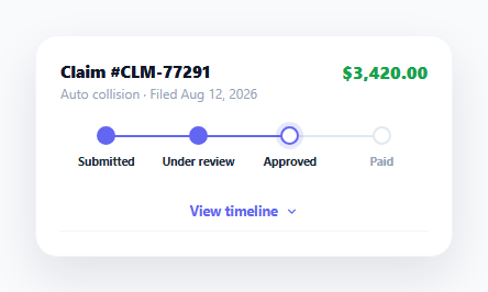
An insurance claim can sit open for weeks, and the person waiting on it usually just wants one question answered without calling anyone: where is my claim right now, and what happened before that. This card answers both — a connected four-step stepper shows the current stage at a glance, and a collapsible timeline underneath holds the full history for anyone who wants the detail without cluttering the default view.
A stepper whose connecting line encodes progress, not just the dots
Each .claim-step has a ::after pseudo-element line connecting it to the next step, and that line only turns indigo when the *current* step carries the .done class — so the filled-in portion of the connecting line always tracks exactly how many steps are complete, not just which dot is currently highlighted. The active step gets a distinct halo (box-shadow: 0 0 0 4px) around an otherwise-empty dot, visually distinguishing "in progress right now" from "already completed," a distinction a claimant genuinely cares about — approved-but-not-yet-paid is a meaningfully different state from paid.
The timeline as a collapsible companion, not the default view
#claimTimeline starts collapsed via max-height: 0; overflow: hidden, the same max-height transition technique used in the accordion FAQ pattern, expanding to max-height: 400px when .open is toggled. Defaulting to collapsed keeps the card's primary information (current stage, claim amount) uncluttered for someone who just wants a quick status check, while still making the full adjuster-by-adjuster history one click away for someone who wants to understand exactly what happened and when.
A live status change to demonstrate the pattern, not a real backend
The setTimeout block three seconds into the page's life simulates a claim genuinely advancing: it moves the .active class from the "Approved" step to "Paid," marks "Approved" as .done, and prepends a new timeline event describing the payout — all without any real backend push. This exists purely to demonstrate the visual mechanics (the stepper filling in, the connecting line recoloring, a new event fading into the timeline) that a real integration would trigger from a webhook or polling call; remove it and drive the same class changes from your claims-management API's actual status field instead.
A newly inserted timeline event fades in rather than appearing instantly
The dynamically created .claim-event element starts at opacity: 0 and is only animated to opacity: 1 inside a requestAnimationFrame callback after being inserted into the DOM — the extra frame delay is necessary because setting opacity and immediately transitioning it in the same synchronous block would have the browser coalesce both style writes before painting, skipping the transition entirely. This is the standard technique for animating a freshly-inserted element's entrance.
Claim amount kept visually separate from the status information
The dollar amount sits in the card header, styled in green and right-aligned, distinct from the stepper and timeline below it — a claimant's two top concerns (how much, and how far along) are answered in the first half-second of looking at the card, with supporting detail available but not demanding attention.
Build with AI
Build, Understand, Optimize, and Extend It With AI
Paste this snippet's HTML, CSS, and JS into an AI coding assistant like Claude and ask it to explain exactly why the connecting line between two stepper steps is tied to the earlier step's "done" class rather than the later step's "active" class, and what would look wrong if that logic were reversed. The same assistant can help optimize it — for instance asking whether the requestAnimationFrame-based fade-in for new timeline events would still work reliably if multiple events were inserted in rapid succession. It's also useful for extending the card: ask it to add a "claim denied" branch state with its own stepper styling, support an arbitrary number of steps driven from a data array instead of hardcoded HTML, or add estimated-completion-date text for the current step. Treat the code less like a finished artifact and more like a starting point for a conversation.
Prompt to recreate it
Copy this into your AI assistant of choice to build the effect from scratch, or as a jumping-off point for your own variant:
Build an "insurance claim status" card in plain HTML, CSS, and JavaScript — no framework, no library.

Requirements:
- Show a claim number, claim type, filed date, and dollar amount, plus a horizontal connected step tracker with at least four stages (for example Submitted, Under Review, Approved, Paid).
- Each step must render as a dot connected to the next step by a horizontal line; a step that is fully complete gets a filled dot and its connecting line to the next step recolored to indicate progress, while the current in-progress step gets a distinct hollow-dot-with-glow style different from both the completed and the not-yet-started styles.
- Include a collapsible "timeline" section below the stepper, closed by default, that expands via a max-height CSS transition (not a JavaScript height calculation) when a toggle button is clicked, revealing a dated list of past claim events; the toggle button's icon must rotate and its label text must change between an open and closed wording.
- Include a JavaScript-driven demonstration (using a timer, not real backend data) that, after a few seconds, advances the claim to its next stage: moves the "active" styling to the next step, marks the previous step "done" so its connecting line updates, and inserts a brand-new event at the top of the timeline that fades in from transparent rather than appearing instantly — explain in a comment why a fade-in on a freshly inserted DOM element needs an extra animation frame before its opacity transition will actually run.
Want to tighten it up first? Run this prompt through the AI Prompt Studio to score it across 8 quality dimensions, catch anti-patterns, and tune the wording for Claude, ChatGPT, or Gemini before you paste it in.
Step by step
How to Use
- 1Watch the demo advanceAfter about 3 seconds the claim automatically moves from "Approved" to "Paid," with the stepper and a new timeline event animating in to show the mechanics.
- 2Click "View timeline"Expands a collapsible history of claim events with dates, using the same max-height transition as an accordion.
- 3Replace claim detailsUpdate the claim number, type, filed date, and dollar amount in the HTML header.
- 4Set the real current stepGive the correct .claim-step elements the .done or .active class based on your claim's actual current stage instead of the hardcoded demo state.
- 5Wire step changes to your claims APIReplace the setTimeout demo block with real status-change handling — for example a webhook or polling result — that moves .active and .done classes and prepends a new timeline event.
- 6Export in your formatClick "HTML" for a standalone file, "JSX" for a React component, or "Tailwind" for a Tailwind CSS version.
Real-world uses
Common Use Cases
Got questions?
Frequently Asked Questions
Each .claim-step has a ::after pseudo-element line to the next step, and that line is only recolored to indigo via the CSS rule .claim-step.done:not(:last-child)::after — so the line only fills in when the step it belongs to has the .done class, keeping the visual progress line in sync with actually-completed steps rather than just the currently active one.
A .done step has a fully filled indigo dot. An .active step has an empty white dot with an indigo border plus a soft glow ring (box-shadow) around it — distinguishing "this step is finished" from "this step is currently in progress," which matters because a claim that is approved-but-not-yet-paid is meaningfully different from one that has been fully paid out.
The card's primary information — current stage and claim amount — is meant to be readable in the first glance. The full event-by-event history is useful detail but not something every viewer needs immediately, so it is tucked behind a toggle using the same max-height accordion transition technique, expanding to a generous max-height only when explicitly requested.
Setting an element's opacity to 0, inserting it into the DOM, and then immediately setting its transition and opacity to 1 in the same synchronous code block risks the browser batching both style changes together before ever painting the initial state, which would skip the fade entirely. Wrapping the transition-in step in requestAnimationFrame forces the browser to paint the initial opacity: 0 state first, guaranteeing the fade actually animates.
Replace the setTimeout demo block with your own event handling — for example a webhook payload or a polling response — that moves the .active class to the new current step, adds .done to any steps that are now complete, and calls the same insertBefore-plus-fade-in logic to prepend a new event to the timeline with real event copy and a real date.
Yes — add or remove .claim-step elements inside #claimStepper with sequential data-step values. The CSS uses flex: 1 on each step so any number of steps distributes evenly across the stepper's width, and the connecting-line and done/active styling applies per-step regardless of the total count.