
Learn Coding Visually
Learn to code with interactive, live-preview playgrounds — HTML, CSS, JavaScript, React & more.
 HTML Playground42 lessons · Click-based · Live preview
 CSS PlaygroundLearn CSS with a live editor
 JavaScript Playground60 lessons · DOM · Async · Canvas
 React PlaygroundLearn React with a live code editor
 GSAP PlaygroundLearn GSAP animation interactively
 SVG Playground44 lessons · shapes · paths · animation
 SCSS Playground45 lessons · Sass modules · tokens
 Tailwind PlaygroundLearn Tailwind CSS with a live editor
 Bootstrap 5 Playground50 lessons · live preview
CSS View Timeline Stagger List Items — Native animation-timeline: view()
CSS View Timeline Stagger List Items · Scroll · Plain HTML, CSS & JS · Live preview
What's included
Features
About this UI Snippet
CSS View Timeline Stagger List Items — A Convincing Stagger With No Orchestration Code
A staggered list reveal is normally built with JavaScript computing a transition-delay or animation-delay per item, usually as index * 80ms, tied to an IntersectionObserver watching the whole list. This snippet produces the same staggered feel from a completely different mechanism: every row has its own fully independent animation-timeline: view(), and a slightly different animation-range per item does the work a hand-written delay normally would.
Independent timelines, not a shared delay sequence
Unlike a JS stagger, where every item's delay is relative to when the *list* entered view, each .vsl-item here has view-timeline-name: --row-in and is timed purely by *its own* transit through the viewport — a row further down the page naturally animates later simply because the user has to scroll further to reach it. There is no shared "list entered" moment being fanned out across items at all.
animation-range as the stagger mechanism
Because every row's timeline is independent, giving them all the identical animation-range would make each row's reveal look mechanically identical, just offset by scroll position — visually fine, but not distinctly "staggered." Nudging animation-range's entry and cover percentages slightly per item (for example entry 0% cover 30% versus entry 8% cover 42%) varies how early each row starts and how long it takes to settle, producing the same kind of irregular, hand-tuned rhythm a JS stagger achieves with delay values, but expressed entirely as CSS ranges instead of timing offsets.
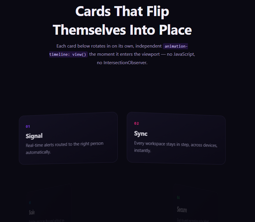
Why this differs from [CSS View Timeline Card Flip In](/ui-snippets/css-view-timeline-card-flip-in/)
That snippet varies *keyframe direction* per card (alternating left/right hinges) while keeping animation-range uniform. This snippet keeps the keyframes identical across every row and instead varies *animation-range* per row — two different ways of using per-element view timelines to avoid a mechanically uniform reveal.
Browser support
Chromium-based browsers (Chrome, Edge, Opera, Brave) support animation-timeline: view() today; Firefox and Safari support is still landing. The @supports not (animation-timeline: view()) block removes the animation entirely, so unsupported browsers see a fully visible, static list rather than rows stuck invisible.
Customizing it
Add more variation to the per-item animation-range values for a more pronounced stagger, or make the variation systematic (entry calc(var(--i) * 2%)) if you have many list items and don't want to hand-tune each one. Pair it with CSS View Timeline Card Flip In directly below a hero for a full scroll-driven page.
Build with AI
Build, Understand, Optimize, and Extend It With AI
You don't have to hand-tune per-row animation ranges from scratch. Paste this snippet's HTML, CSS, and JS into an AI coding assistant like Claude and ask it to explain exactly why varying animation-range per item produces a staggered feel even though every row's view timeline is completely independent, and how this differs from a traditional JavaScript animation-delay: index * ms stagger. The same assistant is useful for extending the effect: ask it to generate the animation-range variation programmatically using a CSS custom property and calc() so a long, dynamically-rendered list doesn't need per-item nth-child rules, or combine the stagger with a subtle per-item hue shift. Treat the code less like a finished artifact and more like a starting point for a conversation.
Prompt to recreate it
Copy this into your AI assistant of choice to build the effect from scratch, or as a jumping-off point for your own variant:
Build a vertical list where each row fades and slides in independently as it enters the viewport, reading as a deliberate stagger, using only native CSS animation-timeline: view() — no JavaScript index-based delay calculation, no IntersectionObserver.

Requirements:
- A vertical list of at least six row elements, each containing an index label and a heading/description.
- Every row must declare its own view-timeline-name (rows can share the same custom-ident name since each gets an independent timeline instance) and view-timeline-axis: block, then reference that timeline via animation-timeline on a single shared @keyframes animation (fading in from opacity 0 and a downward translateY offset, to opacity 1 and translateY(0)) applied identically to every row.
- Instead of varying the keyframes or adding a JavaScript-computed animation-delay per row, give each row a slightly different animation-range (varying the entry and cover percentages by a few percentage points per item) so the reveal timing itself differs subtly row to row, producing a staggered feel purely from the CSS range values.
- Set the animation's fill mode to both so rows correctly reverse their reveal when scrolled back out of view and re-play it when scrolled back in.
- Add an @supports not (animation-timeline: view()) fallback that removes the animation entirely so rows render fully visible and unmoved in unsupported browsers instead of stuck invisible.
- Keep any JavaScript limited to a feature-support check (CSS.supports('animation-timeline: view()')) logged to the console — it must not compute or apply any per-item delay itself.
Want to tighten it up first? Run this prompt through the AI Prompt Studio to score it across 8 quality dimensions, catch anti-patterns, and tune the wording for Claude, ChatGPT, or Gemini before you paste it in.
Source Code
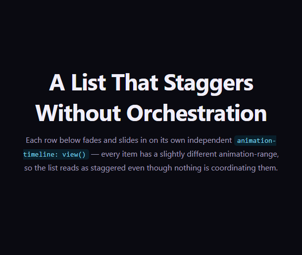
<section class="vsl-intro"><h1>A List That Staggers Without Orchestration</h1><p>Each row below fades and slides in on its own independent <code>animation-timeline: view()</code> — every item has a slightly different animation-range, so the list reads as staggered even though nothing is coordinating them.</p></section>
<ul class="vsl-list">
  <li class="vsl-item"><span class="vsl-index">01</span><div><h3>Draft the brief</h3><p>Define scope, audience, and success criteria before any design work begins.</p></div></li>
  <li class="vsl-item"><span class="vsl-index">02</span><div><h3>Sketch the flows</h3><p>Rough wireframes to validate structure before visual polish.</p></div></li>
  <li class="vsl-item"><span class="vsl-index">03</span><div><h3>Design the system</h3><p>Typography, color, spacing — a small reusable toolkit, not one-off screens.</p></div></li>
  <li class="vsl-item"><span class="vsl-index">04</span><div><h3>Prototype and test</h3><p>Put it in front of five real users before writing a line of production code.</p></div></li>
  <li class="vsl-item"><span class="vsl-index">05</span><div><h3>Build and ship</h3><p>Incremental releases behind a flag, measured against the original brief.</p></div></li>
  <li class="vsl-item"><span class="vsl-index">06</span><div><h3>Measure and iterate</h3><p>Close the loop — the brief was a hypothesis, not a promise.</p></div></li>
</ul>
<section class="vsl-outro"><p>Every row above entered on its own schedule — no JavaScript ever computed a stagger delay.</p></section>*{box-sizing:border-box;margin:0;padding:0}
body{font-family:system-ui,-apple-system,sans-serif;background:#0a0a11;color:#f1eff9}
code{background:rgba(8,145,178,.16);color:#7dd3ec;padding:2px 6px;border-radius:5px;font-size:.9em;font-family:ui-monospace,Consolas,monospace}
.vsl-intro,.vsl-outro{min-height:54vh;display:flex;flex-direction:column;justify-content:center;align-items:center;text-align:center;gap:12px;padding:24px;max-width:580px;margin:0 auto}
.vsl-intro h1{font-size:clamp(28px,5.2vw,46px);letter-spacing:-.02em}
.vsl-intro p,.vsl-outro p{color:#a29fbf;font-size:16px;line-height:1.75}
.vsl-list{list-style:none;max-width:620px;margin:0 auto;padding:8vh 24px 22vh;display:flex;flex-direction:column;gap:14vh}
.vsl-item{
display:flex;gap:18px;align-items:flex-start;
background:linear-gradient(155deg,#12101d,#0b0a13);
border:1px solid #201d2e;border-radius:16px;padding:22px 24px;
view-timeline-name:--row-in;
view-timeline-axis:block;
animation:vsl-rise linear both;
animation-timeline:--row-in;
}
@keyframes vsl-rise{
from{ opacity:0; transform:translateY(46px) scale(.97) }
to{ opacity:1; transform:translateY(0) scale(1) }
}
/* Each item gets a slightly different animation-range so, even though every
row is driven by an entirely independent view() timeline, the reveal
reads as a deliberate stagger rather than six identical mechanical pops. */
.vsl-item:nth-child(1){ animation-range:entry 0% cover 30% }
.vsl-item:nth-child(2){ animation-range:entry 4% cover 36% }
.vsl-item:nth-child(3){ animation-range:entry 8% cover 42% }
.vsl-item:nth-child(4){ animation-range:entry 2% cover 32% }
.vsl-item:nth-child(5){ animation-range:entry 6% cover 40% }
.vsl-item:nth-child(6){ animation-range:entry 0% cover 34% }
.vsl-index{font-size:13px;font-weight:800;color:#22d3ee;letter-spacing:.06em;padding-top:3px;flex-shrink:0}
.vsl-item h3{font-size:19px;letter-spacing:-.01em}
.vsl-item p{color:#9b97b6;font-size:14.5px;line-height:1.65;margin-top:6px}
@supports not (animation-timeline: view()){
.vsl-item{opacity:1;transform:none;animation:none}
}// Every row above fades and slides in via CSS animation-timeline: view() --
// each .vsl-item declares its own named view-timeline, and each gets its
// own slightly different animation-range so the reveal reads as staggered
// with zero JavaScript orchestration. This script only reports feature
// support for the demo.
const supportsView = typeof CSS !== 'undefined' && CSS.supports('animation-timeline: view()');
console.log('[stagger-list-items] animation-timeline: view() supported:', supportsView);
if (!supportsView) {
console.log('[stagger-list-items] falling back to fully visible, unanimated rows via @supports.');
}Step by step
How to Use
- 1Paste the HTML, CSS, and JSAn intro, a six-row list, and an outro render — no CDN needed.
- 2Scroll down slowlyEach row fades and slides in independently as it enters the viewport, reading as a deliberate stagger.
- 3Compare the timing between rowsNotice each row starts and settles on a very slightly different animation-range.
- 4Scroll back upRows animate in reverse as they re-exit downward (animation both).
- 5Tune the stagger feelWiden or narrow the differences between each nth-child’s animation-range values.
- 6Export in your formatClick "HTML" for a standalone file, "JSX" for a React component, or "Tailwind" for a React + Tailwind version.
Real-world uses
Common Use Cases
Got questions?
Frequently Asked Questions
Each item has its own fully independent animation-timeline: view() tracking only that item’s own transit through the viewport. A row further down the page naturally animates later purely because reaching it requires more scrolling — there is no shared list-level trigger being fanned out with delays at all.
If every row used an identical animation-range, each would reveal in an identical manner relative to its own entry — fine, but mechanically uniform. Nudging the entry and cover percentages slightly per item varies how early each row starts and how long it takes to settle, producing an irregular, hand-tuned rhythm similar to what a JavaScript stagger delay would achieve.
Card Flip In keeps animation-range uniform across cards and instead varies the keyframe rule (alternating rotation direction) per card. This snippet keeps the keyframes identical for every row and instead varies animation-range per row — two different ways of using per-element view timelines to avoid a mechanically uniform reveal.
The @supports not (animation-timeline: view()) block removes the animation and transform entirely, so unsupported browsers see a fully visible, static list rather than rows stuck invisible or mid-slide.
Yes — for a list with many items, define animation-range using a CSS custom property set inline per item (for example style="--i: 3") and reference it with calc(), such as animation-range: entry calc(var(--i) * 1.5%) cover calc(30% + var(--i) * 2%), instead of hand-writing an nth-child rule for every row.