

Learn Coding Visually
Learn to code with interactive, live-preview playgrounds — HTML, CSS, JavaScript, React & more.
 HTML Playground42 lessons · Click-based · Live preview
 CSS PlaygroundLearn CSS with a live editor
 JavaScript Playground60 lessons · DOM · Async · Canvas
 React PlaygroundLearn React with a live code editor
 GSAP PlaygroundLearn GSAP animation interactively
 SVG Playground44 lessons · shapes · paths · animation
 SCSS Playground45 lessons · Sass modules · tokens
 Tailwind PlaygroundLearn Tailwind CSS with a live editor
 Bootstrap 5 Playground50 lessons · live preview
CSS Scroll Timeline Image Zoom Parallax — Native animation-timeline: scroll()
CSS Scroll Timeline Image Zoom Parallax · Scroll · Plain HTML, CSS & JS · Live preview
What's included
Features
About this UI Snippet
CSS Scroll Timeline Image Zoom Parallax — Sticky Layers Driven by scroll(root)
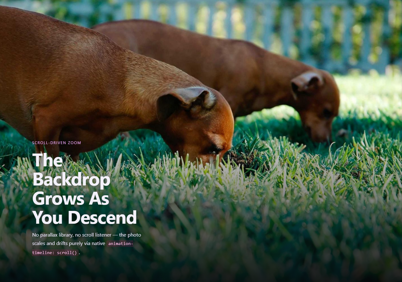
Zoom-and-drift hero backgrounds are usually built with a parallax library reading scroll offset and writing a transform every frame. This snippet gets the same visual — a backdrop that scales up and shifts as the hero scrolls past — from three stacked, independently animated position: sticky layers, all timed by native animation-timeline: scroll(root).
A tall hero, a sticky media layer
.izp-hero is 180vh tall, but .izp-media inside it is position: sticky; top: 0; height: 100vh, so the backdrop stays pinned to the viewport for the entire time the hero section is scrolling past — exactly the sticky trick behind CSS Scroll Timeline Section Counter, applied here to a full-bleed image layer instead of a counter panel.
animation-range confines the zoom to the hero's own transit
animation-range: 0% 100% on .izp-media's keyframes maps the whole scale(1) → scale(1.35) zoom to exactly the hero's own scroll distance (the 180vh minus the pinned 100vh), so the transform finishes precisely as the hero finishes scrolling away — it does not keep zooming into unrelated content further down the page.
Two layers, two independent ranges
The background media zooms across its full 0%–100% range, while the overlaid copy fades and lifts across a shorter animation-range: 0% 60%, so the text disappears well before the backdrop has finished its zoom — two animation-timeline: scroll(root)-bound layers with independently tuned ranges, composited together with nothing but stacked position: sticky and negative margins.
Why not background-position parallax
Animating background-position percentage-based parallax is comparatively cheap, but a true zoom needs a scaling transform, and transform is compositor-friendly in a way raw background-size changes are not — keeping the effect smooth even on a fast fling-scroll.
Browser support
Chromium-based browsers (Chrome, Edge, Opera, Brave) support animation-timeline: scroll() today; Firefox and Safari support is still landing. The @supports not (animation-timeline: scroll()) fallback locks the backdrop at a fixed enlarged scale and keeps the copy fully visible, rather than leaving it stuck unscaled or invisible.
Customizing it
Widen scale(1.35) for a more dramatic zoom, change translateY(-4%) for more vertical drift, or shorten animation-range on .izp-copy to make the text disappear even earlier. Pair it with CSS View Timeline Stagger List Items for content directly below the hero.
Build with AI
Build, Understand, Optimize, and Extend It With AI
You don't have to work out sticky-layer compositing and animation-range math by hand. Paste this snippet's HTML, CSS, and JS into an AI coding assistant like Claude and ask it to explain exactly why the backdrop needs position: sticky inside a taller container rather than position: fixed, and how animation-range confines the zoom to only the hero's own scroll distance. The same assistant is useful for extending the effect: ask it to add a third sticky layer with its own independent animation-range for a floating badge or logo, swap the zoom direction so the image shrinks instead of grows, or add a subtle brightness dip synced to the same timeline as the copy fades out. Treat the code less like a finished artifact and more like a starting point for a conversation.
Prompt to recreate it
Copy this into your AI assistant of choice to build the effect from scratch, or as a jumping-off point for your own variant:
Build a hero section with a background image that scales up and drifts as the user scrolls past it, using only native CSS animation-timeline: scroll() on sticky layers — no JavaScript parallax library, no scroll event listeners.

Requirements:
- A hero wrapper element significantly taller than the viewport (for example 180vh) containing a background/media layer set to position: sticky; top: 0; height: 100vh, so it stays pinned to the viewport for the wrapper's entire scroll distance.
- A @keyframes animation on that sticky media layer animating transform (for example scale from 1 to roughly 1.35, combined with a small translateY drift), bound to animation-timeline: scroll(root) and scoped with animation-range so the animation's 0%-to-100% progress corresponds exactly to the hero wrapper's own scroll distance rather than the whole document.
- A second sticky layer stacked on top (using a negative top margin equal to the viewport height to overlap the media layer) holding heading and paragraph copy, animated with its own @keyframes (opacity and a small upward translateY) bound to the same animation-timeline: scroll(root) but with a shorter animation-range so the text fades out before the backdrop zoom finishes.
- A radial vignette overlay layer for text legibility, also sticky-positioned to stay aligned with the media layer.
- Ordinary content sections before and after the hero so the sticky pinning behavior is demonstrated clearly.
- Add an @supports not (animation-timeline: scroll()) fallback that fixes the backdrop at a static enlarged scale and keeps the copy fully visible and unmoved, rather than leaving either stuck at its un-zoomed or invisible starting state.
- Keep any JavaScript limited to a one-time CSS.supports('animation-timeline: scroll()') feature check logged to the console — it must never drive or read scroll position itself.
Want to tighten it up first? Run this prompt through the AI Prompt Studio to score it across 8 quality dimensions, catch anti-patterns, and tune the wording for Claude, ChatGPT, or Gemini before you paste it in.
Source Code
<section class="izp-hero">
  <div class="izp-media" aria-hidden="true"></div>
  <div class="izp-vignette" aria-hidden="true"></div>
  <div class="izp-copy">
    <span class="izp-eyebrow">Scroll-driven zoom</span>
    <h1>The Backdrop Grows As You Descend</h1>
    <p>No parallax library, no scroll listener — the hero image scales and drifts purely via native <code>animation-timeline: scroll()</code>.</p>
  </div>
</section>
<section class="izp-after"><h2>Below the Fold</h2><p>Once the hero has fully scrolled past, ordinary content resumes — the zoom effect was entirely confined to the hero's own transit through the viewport.</p></section>*{box-sizing:border-box;margin:0;padding:0}
body{font-family:system-ui,-apple-system,sans-serif;background:#0a0a10;color:#f3f1fa}
code{background:rgba(219,39,119,.16);color:#f5b8e0;padding:2px 6px;border-radius:5px;font-size:.9em;font-family:ui-monospace,Consolas,monospace}
.izp-hero{position:relative;height:180vh;overflow:hidden}
.izp-media{
position:sticky;top:0;height:100vh;width:100%;
background:
radial-gradient(circle at 30% 20%, rgba(219,39,119,.55), transparent 55%),
radial-gradient(circle at 75% 70%, rgba(124,58,237,.5), transparent 55%),
linear-gradient(160deg,#1a1030,#05040a 70%);
background-size:cover;
transform:scale(1) translateY(0);
animation:izp-zoom linear both;
animation-timeline:scroll(root);
animation-range:0% 100%;
will-change:transform;
}
@keyframes izp-zoom{
from{ transform:scale(1) translateY(0) }
to{ transform:scale(1.35) translateY(-4%) }
}
.izp-vignette{
position:sticky;top:0;height:100vh;width:100%;margin-top:-100vh;
background:radial-gradient(ellipse at center, transparent 40%, #05040a 92%);
pointer-events:none;
}
.izp-copy{
position:sticky;top:0;height:100vh;width:100%;margin-top:-100vh;
display:flex;flex-direction:column;justify-content:center;gap:14px;
max-width:560px;padding:0 8vw;
animation:izp-fade-copy linear both;
animation-timeline:scroll(root);
animation-range:0% 60%;
}
@keyframes izp-fade-copy{ to{ opacity:0; transform:translateY(-24px) } }
.izp-eyebrow{font-size:12px;letter-spacing:.14em;text-transform:uppercase;color:#f0abfc}
.izp-copy h1{font-size:clamp(32px,6vw,58px);letter-spacing:-.02em;line-height:1.05}
.izp-copy p{color:#cfc9e6;font-size:16px;line-height:1.7;max-width:440px}
.izp-after{min-height:70vh;display:flex;flex-direction:column;justify-content:center;align-items:center;gap:10px;text-align:center;padding:24px;max-width:520px;margin:0 auto}
.izp-after h2{font-size:28px}
.izp-after p{color:#a79fc4;font-size:15.5px;line-height:1.75}
@supports not (animation-timeline: scroll()){
.izp-media{animation:none;transform:scale(1.15)}
.izp-copy{animation:none;opacity:1;transform:none}
}// The hero background's zoom-and-drift transform and the copy's fade-out
// are both driven purely by CSS animation-timeline: scroll(root) on sticky
// layers -- there is no scroll listener and no requestAnimationFrame loop
// anywhere in this file. This script only reports feature support.
const supportsScrollTimeline = typeof CSS !== 'undefined' && CSS.supports('animation-timeline: scroll()');
console.log('[image-zoom-parallax] animation-timeline: scroll() supported:', supportsScrollTimeline);
if (!supportsScrollTimeline) {
console.log('[image-zoom-parallax] falling back to a static enlarged backdrop via @supports.');
}Step by step
How to Use
- 1Paste the HTML, CSS, and JSA 180vh hero with a sticky zooming backdrop renders, followed by a normal content section.
- 2Scroll through the heroWatch the backdrop scale up and drift while the heading and paragraph fade out ahead of it.
- 3Scroll back upBoth layers rewind to their starting scale and full opacity exactly, since they read a live scroll timeline.
- 4Swap in a real imageReplace the gradient background on .izp-media with a background-image of your choice.
- 5Tune the zoom amountChange scale(1.35) in @keyframes izp-zoom for a subtler or more dramatic effect.
- 6Export in your formatClick "HTML" for a standalone file, "JSX" for a React component, or "Tailwind" for a React + Tailwind version.
Real-world uses
Common Use Cases
Got questions?
Frequently Asked Questions
A fixed layer would stay pinned for the entire document, not just for the hero’s own scroll distance. A sticky layer inside the 180vh .izp-hero container stays pinned only while that container is scrolling past, then scrolls away naturally with the rest of the page once the hero has fully passed.
It maps the keyframe animation’s full 0%-to-100% progress onto the element’s own scroll(root) timeline range that corresponds to the hero’s scroll distance, so the zoom finishes exactly when the hero finishes scrolling past rather than continuing to animate against unrelated scroll distance further down the page.
Using a shorter range (0% 60%) for the copy than the backdrop (0% 100%) makes the text fade out well before the zoom finishes, creating a layered, staggered feel instead of every element animating in perfect unison for the full transit.
The @supports not (animation-timeline: scroll()) block fixes the backdrop at a static enlarged scale and keeps the copy fully visible and unmoved, so Firefox and Safari users see a complete, intentional-looking hero rather than one stuck at its un-zoomed starting state.
Yes — replace the background gradients on .izp-media with a background-image pointing at your own photo (keeping background-size: cover) and the scroll-driven scale/translate animation applies identically, since the animated property is transform, not the background image itself.