Learn Coding Visually
Learn to code with interactive, live-preview playgrounds — HTML, CSS, JavaScript, React & more.
 HTML Playground42 lessons · Click-based · Live preview
 CSS PlaygroundLearn CSS with a live editor
 JavaScript Playground60 lessons · DOM · Async · Canvas
 React PlaygroundLearn React with a live code editor
 GSAP PlaygroundLearn GSAP animation interactively
 SVG Playground44 lessons · shapes · paths · animation
 SCSS Playground45 lessons · Sass modules · tokens
 Tailwind PlaygroundLearn Tailwind CSS with a live editor
 Bootstrap 5 Playground50 lessons · live preview
CSS Scroll Timeline Gauge Needle — Native animation-timeline: scroll()
CSS Scroll Timeline Gauge Needle · Scroll · Plain HTML, CSS & JS · Live preview
What's included
Features
About this UI Snippet
CSS Scroll Timeline Gauge Needle — A Conic-Gradient Dial Driven by scroll(root)
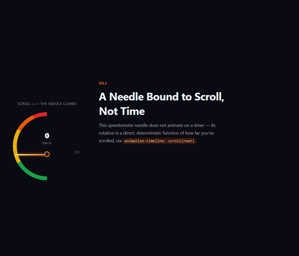
A gauge needle that sweeps as you scroll is a distinctive way to show progress that reads as physical and analog rather than as a flat bar. This snippet builds the whole dial — arc, needle, and numeric readout — from a masked conic-gradient, a single rotating div, and native animation-timeline: scroll(root), with no JavaScript touching the needle's angle.
The arc is a masked conic-gradient, not an SVG path
.gng-arc paints four colored zones (green, yellow, orange, red) with a single conic-gradient, then a radial mask punches out the center so only a ring remains — a half-circle "dial" built with zero SVG markup and zero draw calls, just two stacked CSS gradients.
A rotating div is the needle
The needle itself is a plain, narrow div with transform-origin: bottom center, so rotating it with transform: rotate() pivots it exactly around its base like a real gauge needle mounted on a hub. @keyframes gng-sweep rotates it from -90deg (pointing left, the "0" reading) to 90deg (pointing right, the "220" reading), and binding that animation to animation-timeline: scroll(root) means the needle's angle at any moment is a direct, deterministic function of scroll position — not of elapsed time.
A stepped counter for the numeric readout, matching the needle
The digits below the needle use the same multi-stop CSS-counter steps() technique as CSS Scroll Timeline Progress Ring: twenty-one keyframe stops incrementing by 11 each (0 to 220), wrapped in steps(20), bound to the identical scroll(root) timeline the needle uses — so the number and the needle angle can never drift apart, since both read the same source of truth.
Why rotate() and not clip-path for the dial fill
Unlike the progress ring's stroke-dashoffset unwind, a needle is a single pointer rather than a filling arc, so a rotating transform is the natural primitive — no dash array or path length calculation is needed at all.
Browser support
Chromium-based browsers (Chrome, Edge, Opera, Brave) support animation-timeline: scroll() today; Firefox and Safari support is still landing. The @supports not (animation-timeline: scroll()) fallback fixes the needle at a static mid-dial angle and the readout at a matching static number, rather than leaving either pinned at zero.
Customizing it
Change the conic-gradient zone angles to reflect different thresholds, adjust the rotate(-90deg) to rotate(90deg) sweep range for a narrower or wider dial, or relabel the unit and max value for a different metric entirely (battery percentage, temperature, load). Pair it with CSS Scroll Timeline Progress Ring for a related scroll-bound readout using a different visual metaphor.
Build with AI
Build, Understand, Optimize, and Extend It With AI
You don't have to work out the conic-gradient masking or the rotation math by hand. Paste this snippet's HTML, CSS, and JS into an AI coding assistant like Claude and ask it to explain exactly how the masked conic-gradient produces a colored arc without any SVG, and why transform-origin: bottom center is essential for the needle to pivot correctly. The same assistant is useful for extending the effect: ask it to add tick marks radiating from the hub, change the color zone boundaries to reflect different thresholds, or add a subtle needle-wobble easing so the motion feels slightly more mechanical rather than perfectly linear. Treat the code less like a finished artifact and more like a starting point for a conversation.
Prompt to recreate it
Copy this into your AI assistant of choice to build the effect from scratch, or as a jumping-off point for your own variant:
Build a speedometer-style gauge with a needle that sweeps across a colored dial purely from native CSS animation-timeline: scroll(root) — no JavaScript scroll listener, no requestAnimationFrame loop.

Requirements:
- A dial face built from a single conic-gradient with several distinct colored angle ranges (for example green, yellow, orange, red zones), with a radial mask applied to remove the center so only a ring-shaped arc remains — no SVG.
- A needle element (a narrow div) positioned with its base at the dial's pivot point and transform-origin set to that base, so rotating it with transform: rotate() pivots it exactly like a real gauge needle.
- A @keyframes animation rotating the needle from one extreme angle (for example -90deg, pointing at the dial's minimum) to the opposite extreme (for example 90deg, pointing at the dial's maximum), bound to animation-timeline: scroll(root) so the needle's angle at any moment is a direct function of scroll position, not elapsed time.
- A numeric readout built from a native CSS counter (counter-reset / counter-increment / content: counter()) animated with a steps() timing function across at least fifteen to twenty explicit keyframe stops, bound to the exact same animation-timeline: scroll(root) as the needle so the displayed number and the needle's angle can never drift out of sync with each other.
- A sticky-positioned stage that pins the gauge in the viewport while several full-height content sections scroll past beside it.
- Add an @supports not (animation-timeline: scroll()) fallback that fixes the needle at a reasonable static mid-dial angle and the readout at a matching static number, rather than leaving either stuck at the minimum in unsupported browsers.
- Keep any JavaScript limited to a one-time CSS.supports('animation-timeline: scroll()') feature check logged to the console — it must never drive or read scroll position itself.
Want to tighten it up first? Run this prompt through the AI Prompt Studio to score it across 8 quality dimensions, catch anti-patterns, and tune the wording for Claude, ChatGPT, or Gemini before you paste it in.
Source Code
<div class="gng-page">
  <aside class="gng-stage">
    <p class="gng-hint">Scroll ↓ — the needle climbs</p>
    <div class="gng-gauge">
      <div class="gng-arc"></div>
      <div class="gng-needle"></div>
      <div class="gng-hub"></div>
      <div class="gng-reading"><span class="gng-num"></span><span class="gng-unit">km/h</span></div>
      <span class="gng-lo">0</span><span class="gng-hi">220</span>
    </div>
  </aside>
  <main class="gng-sections">
    <section class="gng-block"><span class="gng-tag">Idle</span><h2>A Needle Bound to Scroll, Not Time</h2><p>This speedometer needle does not animate on a timer — its rotation is a direct, deterministic function of how far you've scrolled, via <code>animation-timeline: scroll(root)</code>.</p></section>
    <section class="gng-block"><span class="gng-tag">Accelerating</span><h2>Keep Going</h2><p>The needle sweeps across the dial exactly in step with your scroll position — pause scrolling and it stops dead, instantly.</p></section>
    <section class="gng-block"><span class="gng-tag">Redline</span><h2>Top of the Dial</h2><p>By the bottom of the page the needle has swept to its maximum reading — scroll back up and watch it fall in perfect reverse.</p></section>
  </main>
</div>*{box-sizing:border-box;margin:0;padding:0}
body{font-family:system-ui,-apple-system,sans-serif;background:#0a0b12;color:#eef0f9}
code{background:rgba(234,88,12,.18);color:#fdba8c;padding:2px 6px;border-radius:5px;font-size:.9em;font-family:ui-monospace,Consolas,monospace}
.gng-page{display:flex;max-width:1020px;margin:0 auto}
.gng-stage{position:sticky;top:0;height:100vh;width:300px;flex-shrink:0;display:flex;flex-direction:column;align-items:center;justify-content:center;gap:22px;padding:0 24px}
.gng-hint{font-size:12.5px;letter-spacing:.06em;color:#8f8ba0;text-align:center;text-transform:uppercase}
.gng-gauge{position:relative;width:240px;height:150px}
.gng-arc{
position:absolute;inset:0 0 auto 0;width:240px;height:240px;border-radius:50%;
background:conic-gradient(from 180deg,
#16a34a 0deg, #16a34a 60deg,
#eab308 60deg, #eab308 120deg,
#ea580c 120deg, #ea580c 155deg,
#dc2626 155deg, #dc2626 180deg,
transparent 180deg, transparent 360deg);
-webkit-mask:radial-gradient(circle,transparent 62%,#000 63%,#000 100%);
mask:radial-gradient(circle,transparent 62%,#000 63%,#000 100%);
}
.gng-needle{
position:absolute;left:50%;bottom:0;width:5px;height:112px;
background:linear-gradient(to top,#f97316,#fde68a);
border-radius:4px;transform-origin:bottom center;
transform:translateX(-50%) rotate(-90deg);
box-shadow:0 0 10px rgba(249,115,22,.6);
animation:gng-sweep linear both;
animation-timeline:scroll(root);
}
@keyframes gng-sweep{ to{ transform:translateX(-50%) rotate(90deg) } }
.gng-hub{position:absolute;left:50%;bottom:-8px;width:20px;height:20px;border-radius:50%;background:#1c1e2c;border:3px solid #f97316;transform:translateX(-50%)}
.gng-reading{position:absolute;left:50%;bottom:34px;transform:translateX(-50%);display:flex;flex-direction:column;align-items:center;gap:2px}
.gng-num{font-size:26px;font-weight:800;font-variant-numeric:tabular-nums}
.gng-num::before{content:counter(gng-count)}
.gng-num{counter-reset:gng-count 0;animation:gng-count-up steps(20) both;animation-timeline:scroll(root)}
@keyframes gng-count-up{
0%{counter-increment:gng-count 0}
5%{counter-increment:gng-count 11}
10%{counter-increment:gng-count 11}
15%{counter-increment:gng-count 11}
20%{counter-increment:gng-count 11}
25%{counter-increment:gng-count 11}
30%{counter-increment:gng-count 11}
35%{counter-increment:gng-count 11}
40%{counter-increment:gng-count 11}
45%{counter-increment:gng-count 11}
50%{counter-increment:gng-count 11}
55%{counter-increment:gng-count 11}
60%{counter-increment:gng-count 11}
65%{counter-increment:gng-count 11}
70%{counter-increment:gng-count 11}
75%{counter-increment:gng-count 11}
80%{counter-increment:gng-count 11}
85%{counter-increment:gng-count 11}
90%{counter-increment:gng-count 11}
95%{counter-increment:gng-count 11}
100%{counter-increment:gng-count 11}
}
.gng-unit{font-size:11px;color:#8f8ba0;letter-spacing:.08em;text-transform:uppercase}
.gng-lo,.gng-hi{position:absolute;bottom:2px;font-size:11px;color:#6d6a80;font-variant-numeric:tabular-nums}
.gng-lo{left:6px}
.gng-hi{right:6px}
.gng-sections{flex:1;min-width:0}
.gng-block{min-height:88vh;display:flex;flex-direction:column;justify-content:center;gap:12px;padding:0 32px;max-width:520px}
.gng-tag{font-size:12px;font-weight:700;letter-spacing:.08em;text-transform:uppercase;color:#f97316}
.gng-block h2{font-size:clamp(26px,4.4vw,38px);letter-spacing:-.02em}
.gng-block p{color:#a3a1b4;font-size:15.5px;line-height:1.75}
@media (max-width:760px){
.gng-page{flex-direction:column}
.gng-stage{position:static;height:auto;padding:40px 24px}
}
@supports not (animation-timeline: scroll()){
.gng-needle{transform:translateX(-50%) rotate(20deg);animation:none}
.gng-num::before{content:"143"}
}// The needle's rotation and the numeric readout are both driven entirely
// by CSS animation-timeline: scroll(root) -- there is no scroll listener
// and no requestAnimationFrame loop in this file. This script only reports
// feature support for the demo readout.
const supportsScrollTimeline = typeof CSS !== 'undefined' && CSS.supports('animation-timeline: scroll()');
console.log('[gauge-needle] animation-timeline: scroll() supported:', supportsScrollTimeline);
if (!supportsScrollTimeline) {
console.log('[gauge-needle] falling back to a static mid-dial reading via @supports.');
}Step by step
How to Use
- 1Paste the HTML, CSS, and JSA sticky gauge and numeric readout render beside three full-height content blocks.
- 2Scroll from top to bottomWatch the needle sweep across the dial and the readout climb in sync, purely via animation-timeline: scroll(root).
- 3Scroll back upThe needle and readout rewind exactly, since they read a live scroll timeline, not a one-shot trigger.
- 4Change the dial rangeAdjust the rotate(-90deg) to rotate(90deg) sweep in @keyframes gng-sweep for a different angular range.
- 5Relabel the metricSwap gng-unit’s text and the counter’s max value for a different gauge (battery, temperature, load).
- 6Export in your formatClick "HTML" for a standalone file, "JSX" for a React component, or "Tailwind" for a React + Tailwind version.
Real-world uses
Common Use Cases
Got questions?
Frequently Asked Questions
A single conic-gradient paints four colored zones around a full circle, then a radial mask (mask: radial-gradient(circle, transparent 62%, #000 63%, #000 100%)) removes the center, leaving only a colored ring visible — no SVG path or stroke is involved.
The needle div is positioned so its bottom edge sits at the gauge’s pivot hub. Setting transform-origin: bottom center makes rotate() pivot the needle exactly around that base point, the same way a real gauge needle rotates around its mounting pin rather than around its own visual center.
No — both are bound to the identical animation-timeline: scroll(root), so any given scroll position always produces the same needle angle and the same counter value; there is no separate JavaScript computation that could drift from the CSS-driven rotation.
The dial’s maximum reading is 220 and the counter uses twenty 5%-wide steps to reach it, so 220 divided by 20 steps is 11 per step — chosen to land exactly on the stated maximum rather than leaving a rounding gap at the top of the dial.
The @supports not (animation-timeline: scroll()) block fixes the needle at a static mid-dial angle and the readout at a matching static number, so Firefox and Safari users see an intentional, complete-looking gauge rather than one stuck pointing at zero.