Learn Coding Visually
Learn to code with interactive, live-preview playgrounds — HTML, CSS, JavaScript, React & more.
 HTML Playground42 lessons · Click-based · Live preview
 CSS PlaygroundLearn CSS with a live editor
 JavaScript Playground60 lessons · DOM · Async · Canvas
 React PlaygroundLearn React with a live code editor
 GSAP PlaygroundLearn GSAP animation interactively
 SVG Playground44 lessons · shapes · paths · animation
 SCSS Playground45 lessons · Sass modules · tokens
 Tailwind PlaygroundLearn Tailwind CSS with a live editor
 Bootstrap 5 Playground50 lessons · live preview
CSS-Only Saturation Scroll Gallery — animation-timeline: view()
Saturation Gallery (view-timeline) · Scroll · Plain HTML, CSS & JS · Live preview
What's included
Features
About this UI Snippet
Saturation Scroll Gallery — Native CSS view() Timeline on the Inline Axis
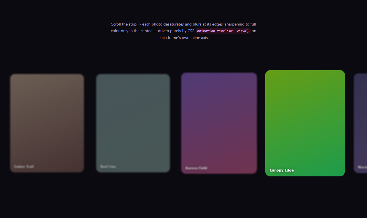
Photo apps and editorial sites often use a "focus" effect in a horizontal filmstrip: whichever image is centered in view is shown at full color and sharpness, while images at the edges fade toward grayscale and softness. Traditionally that requires a scroll or intersection listener computing each image's distance from center on every frame. This gallery reproduces the effect with zero JavaScript, using a native CSS view timeline bound to each frame's own horizontal transit through the scroll container.
view-timeline-axis: inline is the key difference
Most view-timeline demos — including View Timeline Image Reveal — use view-timeline-axis: block, tracking an element's vertical position as the page scrolls down. This gallery instead sets view-timeline-axis: inline on every .vsg-frame, so each frame's timeline tracks its own horizontal position as the .vsg-track container scrolls sideways — the same primitive, just aimed at the axis this layout actually scrolls on.
A symmetric filter sweep, not a one-way reveal
The vsg-focus keyframes are symmetric: from and to both apply saturate(.15) blur(3px) brightness(.7) scale(.92), while 50% applies full saturate(1) blur(0) brightness(1) scale(1). Combined with animation-range: cover 0% cover 50%, cover 50% cover 100% — two ranges covering the first and second half of the frame's transit — each frame desaturates on the way in, sharpens exactly when centered, then desaturates again on the way out. The effect is continuous and reversible in both scroll directions because it is driven by a live timeline, not a one-shot trigger.
Why filter and transform, not layout properties
filter (saturate, blur, brightness) and transform: scale() are both compositor-friendly — the browser can animate them without triggering layout recalculation, which matters here because up to seven frames can be mid-animation simultaneously during a fast horizontal scroll. Animating something like width instead would force expensive layout work on every scroll tick even without a JS listener involved.
scroll-snap-type is layered on top, not required
.vsg-track also declares scroll-snap-type: x proximity, which gently pulls the scroll position toward each frame's scroll-snap-align: center when the user stops scrolling near it — this is unrelated to the view-timeline effect and purely a native CSS convenience so the gallery settles on a frame rather than stopping mid-scroll. Removing it does not affect the saturation sweep at all.
Browser support
Chromium-based browsers (Chrome, Edge, Opera, Brave) support animation-timeline: view() on both block and inline axes today. Firefox and Safari support is still landing, so an @supports not (animation-timeline: view()) block removes the filter and transform animation entirely, leaving every frame shown at full color and full size as a safe fallback.
Customizing it
Swap the gradient swatches for real <img> elements with no structural changes, adjust the blur(3px)/saturate(.15) edge values for a subtler or more dramatic effect, or change view-timeline-axis back to block and stack the frames vertically for a page-scroll version of the same focus effect. Pair it with a Photo Gallery or Scroll Snap Gallery layout for a real image set.
Build with AI
Build, Understand, Optimize, and Extend It With AI
You don't have to work through the inline-axis timeline math by hand. Paste this snippet's HTML, CSS, and JS into an AI coding assistant like Claude and ask it to explain exactly how view-timeline-axis: inline changes what a frame's 0%-100% progress represents compared to the default block axis, and why the animation-range is split into two comma-separated halves rather than one continuous range. The same assistant is useful for extending the effect: ask it to make the edge blur intensity vary per frame using individual CSS custom properties, add a subtle rotateY tilt alongside the saturation sweep for extra depth, or convert the gallery to use real <img> elements with object-fit: cover and lazy loading. Treat the code less like a finished artifact and more like a starting point for a conversation.
Prompt to recreate it
Copy this into your AI assistant of choice to build the effect from scratch, or as a jumping-off point for your own variant:
Build a horizontally scrolling image gallery where each frame is desaturated and blurred at the edges of the scroll container and sharpens to full color and full clarity only when centered — using only native CSS scroll-driven animations with per-element view timelines on the inline axis (animation-timeline: view() via view-timeline-name and view-timeline-axis: inline). No JavaScript, no scroll event listeners.

Requirements:
- A horizontally scrollable track containing several frame elements (image or gradient swatch plus a caption), each sized with a fixed flex-basis so multiple frames are visible at once.
- Every frame must declare view-timeline-axis: inline (not the default block) and its own view-timeline-name, then reference that timeline via animation-timeline on a keyframe animation applied to the same element.
- The keyframes must be symmetric: fully desaturated, blurred, dimmed, and slightly scaled down at both the 0% and 100% keyframe steps, and fully saturated, unblurred, and at normal scale and brightness at the 50% keyframe step — so each frame reaches peak clarity once during its transit, roughly when centered in the viewport.
- Use a comma-separated animation-range with two ranges covering the first half and second half of each frame's cover range, so the entering half and exiting half of the transit are shaped independently by the same keyframe animation.
- Only animate compositor-friendly properties (filter functions like saturate/blur/brightness, and transform: scale()) so the effect stays smooth with several frames animating during a fast scroll.
- Add scroll-snap-type: x proximity and scroll-snap-align: center on the track and frames as an optional convenience so the gallery settles near a frame after scrolling, independent of the saturation effect.
- Add an @supports not (animation-timeline: view()) fallback that removes the filter and transform animation entirely, showing every frame at full color and full size in unsupported browsers.
- Keep any JavaScript limited to a CSS.supports('animation-timeline: view()') feature check — it must not drive or trigger the sweep itself.
Want to tighten it up first? Run this prompt through the AI Prompt Studio to score it across 8 quality dimensions, catch anti-patterns, and tune the wording for Claude, ChatGPT, or Gemini before you paste it in.
Step by step
How to Use
- 1Paste the HTML, CSS, and JSA horizontally scrolling strip of seven gradient frames renders — no library needed.
- 2Scroll the strip left and rightEach frame sharpens to full color only near the horizontal center.
- 3Swap in real imagesReplace each .vsg-frame's gradient background with an <img> — the timeline logic needs no changes.
- 4Adjust the edge intensityTune saturate(.15), blur(3px), and brightness(.7) in the from/to keyframe steps.
- 5Try the vertical axis insteadChange view-timeline-axis to block and stack frames vertically for a page-scroll version.
- 6Export in your formatClick "HTML" for a standalone file, "JSX" for a React component, or "Tailwind" for a React + Tailwind version.
Real-world uses
Common Use Cases
Got questions?
Frequently Asked Questions
It makes the element's view timeline follow its position along the inline (horizontal, in left-to-right writing modes) axis of its nearest scrollable ancestor, instead of the default block (vertical) axis. Here that means each frame's 0%-100% progress is defined by its transit across the horizontally scrolling .vsg-track, not by the page's vertical scroll.
cover 0% cover 50% and cover 50% cover 100% split the frame's full horizontal transit into an entering half and an exiting half. The keyframes are written to match — desaturated at from and to, fully saturated at 50% — so the frame reaches full color exactly once, roughly when it is centered, rather than staying saturated across its entire visible window.
filter properties (saturate, blur, brightness) and transform: scale() are both handled by the compositor without triggering layout recalculation, which keeps the effect smooth even with several frames mid-animation during a fast horizontal scroll. Layout-affecting properties would be far more expensive to animate at this frequency.
No, they are independent. scroll-snap-type: x proximity only nudges the scroll position toward the nearest frame once the user stops scrolling; the saturation sweep is driven continuously by the live view timeline regardless of whether snapping is enabled or removed.
The @supports not (animation-timeline: view()) block removes the animation and resets filter and transform, so every frame renders at full color, full sharpness, and full size — a safe, fully usable fallback rather than frames stuck blurred or desaturated.
Yes. Replace each .vsg-frame's background gradient with a nested <img style="width:100%;height:100%;object-fit:cover"> — the view-timeline-name, view-timeline-axis, animation, and animation-range rules all stay on the .vsg-frame element itself and require no changes.