Learn Coding Visually
Learn to code with interactive, live-preview playgrounds — HTML, CSS, JavaScript, React & more.
 HTML Playground42 lessons · Click-based · Live preview
 CSS PlaygroundLearn CSS with a live editor
 JavaScript Playground60 lessons · DOM · Async · Canvas
 React PlaygroundLearn React with a live code editor
 GSAP PlaygroundLearn GSAP animation interactively
 SVG Playground44 lessons · shapes · paths · animation
 SCSS Playground45 lessons · Sass modules · tokens
 Tailwind PlaygroundLearn Tailwind CSS with a live editor
 Bootstrap 5 Playground50 lessons · live preview
Photo Gallery with Lightbox — Free HTML CSS JS Snippet
Photo Gallery with Lightbox · Layouts · Plain HTML, CSS & JS · Live preview
What's included
Features
.item-wide spans 2 columns and .item-tall spans 2 rows — creating an editorial mosaic layout without JavaScript or a third-party masonry library.position:fixed; inset:0 and backdrop:rgba(0,0,0,.92). The photo fades in from scale 0.95 using a @keyframes lbIn animation.touchstart + touchend listeners detect left/right swipes with a 50px threshold — no touch library needed.data-cap and a position counter ("1 / 7") display below the lightbox image. Both update instantly on navigation.<img> elements have loading="lazy" — the browser defers loading off-screen thumbnails until they're about to scroll into view.About this UI Snippet
Photo Gallery with Lightbox — CSS Grid Layout, Hover Overlays & Keyboard-Navigable Lightbox in Vanilla JS
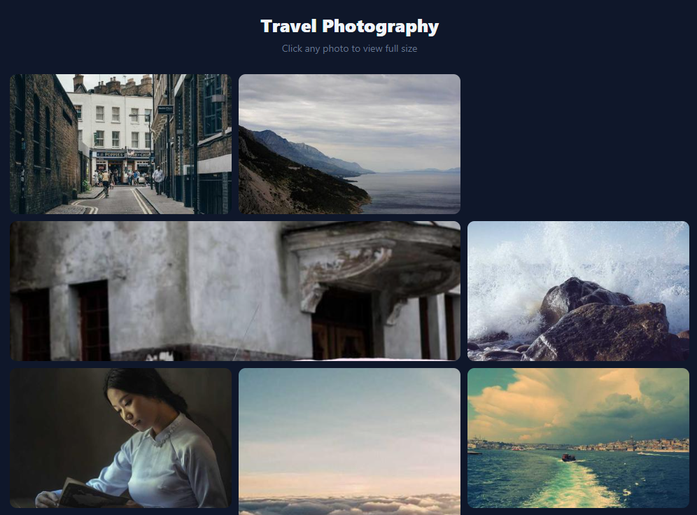
A professional photo gallery needs two layers: a compact grid that shows thumbnails at a glance, and a full-screen lightbox for focused viewing. This snippet delivers both — a CSS grid with wide and tall spanning items, smooth hover overlays with a zoom-in icon, and a full-screen lightbox with fade-in animation, prev/next arrows, keyboard navigation (Escape, arrow keys), touch swipe, caption display, and position counter — all in pure HTML, CSS, and vanilla JavaScript.
A well-built photo gallery is one of the most complex layout challenges in UI development: it must present many images compactly without reflow jank, handle images of different aspect ratios gracefully, provide a fast path to full-screen viewing, and remain accessible on both desktop and mobile. This snippet covers the complete stack — CSS grid layout, hover overlays, full-screen lightbox, keyboard navigation, swipe gestures, and lazy loading — in pure HTML, CSS, and vanilla JavaScript with no dependencies.
CSS grid with spanning items
The gallery uses display: grid with grid-template-columns: repeat(3, 1fr) and grid-auto-rows: 200px. Items span multiple columns or rows using .item-wide { grid-column: span 2 } and .item-tall { grid-row: span 2 }. This produces a masonry-like layout where feature images can be wider or taller than thumbnails without JavaScript. The key technique for making images fill their grid cell regardless of intrinsic dimensions is width: 100%; height: 100%; object-fit: cover on the <img> element — cover scales the image to fill the container while cropping rather than stretching or leaving whitespace.
Hover overlay animation
Each grid item has a <div class="overlay"> absolutely positioned over the image. On hover, the overlay's background transitions from rgba(0,0,0,0) to rgba(0,0,0,0.45) and a zoom icon SVG transitions from opacity:0; transform:scale(0.7) to opacity:1; transform:scale(1). Simultaneously, the image itself scales up to scale(1.06) via a transform on img:hover, but because overflow:hidden is set on the parent .item, the scaled image stays within the card boundary — the zoom-in feels like you're pushing through the frame.
Lightbox open/close and focus management
Clicking a gallery item calls openLightbox(index) which sets lb.hidden = false, locks the scroll with document.body.style.overflow = 'hidden', and moves keyboard focus to the close button. Closing calls closeLightbox() which sets lb.hidden = true, unlocks scroll, and returns focus to the thumbnail that was clicked (items[current].querySelector('img').focus()). This focus-return pattern is required for screen reader compatibility — without it, keyboard users lose their place in the document after closing the modal.
Photo switching and animation restart
showPhoto() updates lbImg.src, lbImg.alt, the caption, and the counter. To restart the fade-in animation on each photo change, it sets lbImg.style.animation = 'none', forces a reflow with void lbImg.offsetWidth (a sync layout read that flushes the pending style), then clears the inline animation style inside a requestAnimationFrame — this causes the browser to re-apply the keyframe from the stylesheet on the next frame. Without the forced reflow, the browser batches the style change and the animation doesn't restart.
Keyboard and touch navigation
A document.keydown handler checks whether the lightbox is open before acting: Escape closes, ArrowLeft decrements current, ArrowRight increments it. Touch navigation uses touchstart (passive listener for scroll performance) to record startX, and touchend to compute dx. A 50px threshold filters accidental taps.
Build with AI
Build, Understand, Optimize, and Extend It With AI
You don't have to work out the grid spanning or the focus-management details by hand. Paste this snippet's HTML, CSS, and JS into an AI coding assistant like Claude and ask it to explain exactly how the item-wide and item-tall classes combine with CSS grid's grid-auto-rows to create the masonry-like layout, and why closeLightbox deliberately returns focus to the thumbnail image that was clicked rather than just hiding the modal. The same assistant can help optimize it, for example checking whether lazy-loading the full-resolution lightbox images ahead of time (prefetching the next/previous photo) would make arrow navigation feel snappier, or whether the touch-swipe threshold of 50px is well tuned against accidental scroll gestures. It's also useful for extending the effect: ask it to add pinch-to-zoom on the lightbox image, a thumbnail filmstrip along the bottom, or lazy-load the grid itself with an IntersectionObserver for very large photo sets. Treat the code less like a finished artifact and more like a starting point for a conversation.
Prompt to recreate it
Copy this into your AI assistant of choice to build the effect from scratch, or as a jumping-off point for your own variant:
Build a photo gallery grid with a full-screen lightbox in plain HTML, CSS, and vanilla JavaScript, with no third-party masonry or lightbox library.

Requirements:
- A CSS grid gallery with a fixed number of columns and a fixed grid-auto-rows height, where individual items can span two columns or two rows via dedicated classes to create a mosaic/masonry look, and every thumbnail image uses object-fit: cover so it fills its cell regardless of its native aspect ratio.
- On hover, each grid item must reveal a semi-transparent overlay with a centered zoom icon that fades and scales in, while the underlying image simultaneously scales up slightly, clipped by the item's overflow: hidden so the zoomed image never escapes its cell.
- A full-screen lightbox (position: fixed, covering the viewport) that opens when a grid item is clicked, showing the full-resolution image, a caption, and a "current / total" counter, with previous/next arrow buttons that disable themselves at the first and last photo.
- The lightbox image must play a fade-and-scale-in entrance animation every time the displayed photo changes, correctly restarted via the animation:none plus forced-reflow plus requestAnimationFrame technique rather than relying on the browser to replay an already-finished CSS animation.
- Keyboard support while the lightbox is open: Escape closes it, ArrowLeft/ArrowRight navigate to the previous/next photo, and closing the lightbox must return keyboard focus to the thumbnail that originally opened it (not just hide the modal).
- Touch swipe support using passive touchstart/touchend listeners that compute the horizontal drag distance and navigate photos when it exceeds roughly 50 pixels, ignoring shorter accidental swipes.
- Give every thumbnail image loading="lazy" so off-screen images defer loading, and make the whole gallery responsive by dropping to fewer grid columns and a shorter row height below a mobile breakpoint.
Want to tighten it up first? Run this prompt through the AI Prompt Studio to score it across 8 quality dimensions, catch anti-patterns, and tune the wording for Claude, ChatGPT, or Gemini before you paste it in.
Step by step
How to Use
- 1Load the snippetPaste the HTML, CSS, and JS into your page. A 3-column dark grid appears with photos from Picsum — wide and tall items create an editorial mosaic layout.
- 2Hover over any photoA semi-transparent dark overlay fades in with a magnifier "+" icon. The photo simultaneously scales up slightly, constrained by the cell's overflow:hidden.
- 3Click to open the lightboxThe lightbox opens full-screen with the photo fading in at scale. Caption and position counter ("2 / 7") appear below the image.
- 4Navigate with arrows or keyboardClick the ← / → arrows or press the keyboard arrow keys to move between photos. The Escape key closes the lightbox.
- 5Swipe on mobileTouch-swipe left or right in the lightbox to navigate between photos. A 50px threshold prevents accidental swipes during scrolling.
- 6Swap in your own imagesReplace each
data-src(full image URL),src(thumbnail URL),alt, anddata-capattributes on the.itemdivs. Add or remove.itemdivs to change the gallery size.
Real-world uses
Common Use Cases
Got questions?
Frequently Asked Questions
Add a .item div for each photo with data-src (full URL), src (thumbnail), alt, and data-cap attributes. Copy the overlay SVG from an existing item. Add .item-wide or .item-tall for spanning cells. The JS uses querySelectorAll(".gallery .item") so new items are picked up automatically.
Replace the src and data-src attributes with your own image paths. Thumbnails can be the same image as the full version — object-fit:cover crops them to the grid cell size. For production, generate separate thumbnail sizes to reduce load time.
Remove the .item-wide and .item-tall classes from the HTML and their CSS rules. Change grid-template-columns to repeat(auto-fill, minmax(200px,1fr)) for a fully responsive equal-height grid.
Yes. Use the JSX, Vue, Angular, or Tailwind export buttons on this page. In React, keep currentIndex and lightboxOpen in useState. Render the lightbox conditionally with a portal (ReactDOM.createPortal) so it sits outside the gallery DOM tree. Attach keyboard listeners in useEffect with cleanup. In Vue, use v-if on the lightbox and handle keyboard events in mounted/beforeUnmount. In Angular, use *ngIf and @HostListener.
Setting animation: none then immediately removing it in the same JS tick doesn't restart the animation because the browser batches style changes. Reading offsetWidth forces a synchronous layout flush, committing the animation:none state before the next style is applied. The requestAnimationFrame callback then removes the inline style, letting the CSS animation re-apply from frame 0.