Learn Coding Visually
Learn to code with interactive, live-preview playgrounds — HTML, CSS, JavaScript, React & more.
 HTML Playground42 lessons · Click-based · Live preview
 CSS PlaygroundLearn CSS with a live editor
 JavaScript Playground60 lessons · DOM · Async · Canvas
 React PlaygroundLearn React with a live code editor
 GSAP PlaygroundLearn GSAP animation interactively
 SVG Playground44 lessons · shapes · paths · animation
 SCSS Playground45 lessons · Sass modules · tokens
 Tailwind PlaygroundLearn Tailwind CSS with a live editor
 Bootstrap 5 Playground50 lessons · live preview
Hue-Rotating Scroll Background — Native CSS animation-timeline
Hue-Rotating Scroll Background · Scroll · Plain HTML, CSS & JS · Live preview
What's included
Features
About this UI Snippet
Hue-Rotating Scroll Background — animation-timeline: scroll() on a Fixed Backdrop Layer
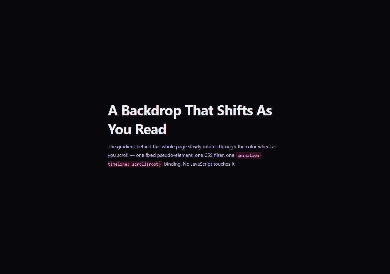
A background that shifts color as the reader scrolls is a common device in long-form storytelling and landing pages — it signals progress ambiently, without a visible progress bar or counter. This snippet builds a continuous, full-page version of that effect using a single fixed backdrop layer whose CSS filter: hue-rotate() value is driven directly by animation-timeline: scroll(root) — there is no JavaScript scroll listener, no per-section trigger, and no requestAnimationFrame loop.
A fixed layer behind everything
.hrb-bg is a single position: fixed; inset: 0 element with z-index: -1, painted once behind all page content and never re-created or repositioned as the user scrolls. It holds a static conic-gradient — the color values in that gradient never change; only a filter: hue-rotate() value applied to the whole layer shifts, rotating every color in the gradient uniformly around the color wheel at once.
animation-timeline: scroll(root) versus a per-section discrete effect
Scroll Color Sections changes the page's theme discretely, section by section, using GSAP ScrollTrigger's onToggle to detect which section currently owns the viewport center. This snippet is a different kind of effect entirely: a single continuous hue-rotate() sweep bound to the whole document's scroll range via scroll(root), with no concept of "sections" at all — the hue at any scroll position is a pure, deterministic function of how far down the page you are, not of which <section> happens to be nearby.
Why filter and not changing the gradient's color stops directly
CSS cannot smoothly interpolate between two different conic-gradient() color-stop lists without @property-registered custom properties and per-stop <color> transitions, which quickly becomes verbose for a five-color gradient. Animating a single filter: hue-rotate() value instead rotates every stop in the gradient together with one animatable number, and filter is a compositor-friendly property, so the shift stays smooth even during fast or inertial scrolling.
Scroll speed does not change the mapping, only the pace
Because the animation's playback position is bound to scroll offset rather than to elapsed time, scrolling through the page in one second or one minute produces the exact same hue at the exact same scroll position — a genuinely different guarantee than a duration-based CSS animation or a requestAnimationFrame loop keyed to time, which would have no relationship to scroll position at all without manual event-based math.
Browser support
Chromium-based browsers (Chrome, Edge, Opera, Brave) support animation-timeline: scroll() today. Firefox and Safari support is still landing, so an @supports not (animation-timeline: scroll()) block fixes the backdrop at a static mid-rotation hue rather than leaving it stuck at the unrotated starting color.
Customizing it
Widen or narrow the hue-rotate(0deg) to hue-rotate(280deg) range in @keyframes hrb-shift for a subtler or more dramatic sweep, swap the conic-gradient for a radial-gradient or linear-gradient (the hue-rotate filter works identically on any gradient type), or add a second animation-timeline: view()-bound layer on top for section-specific accents layered over the continuous base sweep. Pair it with a Parallax Hero or Aurora BG for a more elaborate backdrop treatment.
Build with AI
Build, Understand, Optimize, and Extend It With AI
You don't have to work out the filter and scroll-timeline wiring by hand. Paste this snippet's HTML, CSS, and JS into an AI coding assistant like Claude and ask it to explain exactly why filter: hue-rotate() is used to shift the whole backdrop's colors instead of animating the gradient's individual color stops, and why binding that filter to animation-timeline: scroll(root) guarantees the same hue always appears at the same scroll position regardless of scroll speed. The same assistant is useful for extending the effect: ask it to layer a second view()-timeline-bound accent element for section-specific highlights on top of the continuous sweep, add a subtle brightness pulse synced to the same timeline, or swap the conic-gradient for a radial or linear one for a different backdrop shape. Treat the code less like a finished artifact and more like a starting point for a conversation.
Prompt to recreate it
Copy this into your AI assistant of choice to build the effect from scratch, or as a jumping-off point for your own variant:
Build a full-page background that continuously hue-rotates as the user scrolls, using only the native CSS animation-timeline: scroll() API on a single fixed backdrop layer — no JavaScript scroll listeners, no requestAnimationFrame loop.

Requirements:
- A single position: fixed, full-viewport (inset: 0) backdrop element with a negative z-index, placed behind several scrollable content sections, holding a static multi-color gradient (conic, radial, or linear).
- A @keyframes animation on that backdrop element that animates the CSS filter property's hue-rotate() function from 0deg to a value like 280deg, without changing the gradient's own color stops.
- Bind that keyframe animation via animation-timeline: scroll(root) so the hue-rotation amount is a direct, deterministic function of how far down the total page the user has scrolled — not of elapsed time — meaning scrolling faster or slower never changes which hue appears at which scroll position.
- The effect must be continuous across the whole document, not tied to individual sections or triggered discretely per section.
- Add an @supports not (animation-timeline: scroll()) fallback that fixes the backdrop's filter at a reasonable static mid-rotation hue value, rather than leaving it stuck at the unrotated starting color in unsupported browsers.
- Keep any JavaScript limited to a one-time CSS.supports('animation-timeline: scroll()') feature check logged to the console — it must never drive or read scroll position itself.
Want to tighten it up first? Run this prompt through the AI Prompt Studio to score it across 8 quality dimensions, catch anti-patterns, and tune the wording for Claude, ChatGPT, or Gemini before you paste it in.
Step by step
How to Use
- 1Paste the HTML, CSS, and JSFive full-height sections render over a fixed, hue-shifting gradient backdrop.
- 2Scroll from top to bottomWatch the backdrop sweep continuously through roughly 280 degrees of hue rotation.
- 3Scroll back upThe hue rewinds exactly, since it is driven by a live scroll(root) timeline, not a one-shot trigger.
- 4Adjust the rotation rangeChange hue-rotate(280deg) in @keyframes hrb-shift to widen or narrow the total color sweep.
- 5Swap the gradient shapeReplace conic-gradient with radial-gradient or linear-gradient — the hue-rotate filter works the same on any of them.
- 6Export in your formatClick "HTML" for a standalone file, "JSX" for a React component, or "Tailwind" for a React + Tailwind version.
Real-world uses
Common Use Cases
Got questions?
Frequently Asked Questions
CSS cannot smoothly interpolate between two different lists of gradient color stops without registering custom properties via @property for each stop, which is verbose for a multi-color gradient. Applying a single filter: hue-rotate() value to the whole layer rotates every color in the gradient together using one animatable number instead.
No. Because the animation's playback position is bound to scroll offset via animation-timeline: scroll(root) rather than to elapsed time, the hue at any given scroll position is always the same regardless of how fast or slow the user scrolls to get there — only the perceived speed of the color change differs.
Scroll Color Sections changes the page theme in discrete steps, one per section, triggered when a section's center crosses the viewport center. This snippet has no concept of sections at all — the hue is a single continuous function of total scroll position across the whole document, not tied to any individual section's boundaries.
Yes. Because filter: hue-rotate() is bound to a live scroll(root) timeline rather than triggered once, scrolling back toward the top of the page moves the timeline's playback position backward and the hue rotates back toward its starting value automatically.
The @supports not (animation-timeline: scroll()) block fixes the backdrop filter at a static mid-rotation hue value, so Firefox and Safari users see a stable, pleasant single-color backdrop rather than one stuck at the unrotated starting hue or a broken animation.
Yes. Layer a second element using animation-timeline: view() with its own filter or gradient, positioned above the continuous backdrop, to add section-specific highlights while the base layer keeps sweeping continuously underneath — the two timelines are entirely independent.