More Animations Snippets
Front-End Coding Playgrounds
Learn to code with interactive, live-preview playgrounds — HTML, CSS, JavaScript, React & more.
 HTML Playground42 lessons · Click-based · Live preview
 CSS PlaygroundLearn CSS with a live editor
 JavaScript Playground60 lessons · DOM · Async · Canvas
 React PlaygroundLearn React with a live code editor
 GSAP PlaygroundLearn GSAP animation interactively
 SVG Playground44 lessons · shapes · paths · animation
 SCSS Playground45 lessons · Sass modules · tokens
 Tailwind PlaygroundLearn Tailwind CSS with a live editor
 Bootstrap 5 Playground50 lessons · live preview
Aurora Background — Free HTML CSS Snippet
Aurora Background · Animations · Plain HTML & CSS · Live preview
What's included
Features
About this UI Snippet
Aurora Background — Blurred Radial Orbs, mix-blend-mode: screen & Drift Animation
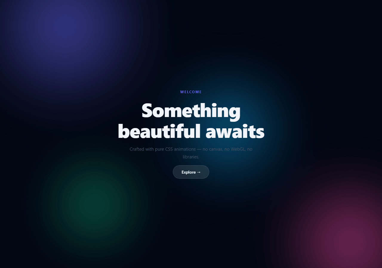
The aurora background simulates the appearance of the Northern Lights — large, softly glowing colour fields that shift and blend against a near-black sky. Used on AI product landing pages, SaaS hero sections, and dark premium interfaces to create depth and motion without images or video — see also the gradient mesh hero, floating particles, and liquid blob backgrounds.
The four-property technique
Each orb (.orb) is an absolutely-positioned div with four properties working together: border-radius: 50% makes it circular. background: radial-gradient(circle, #colour, transparent 70%) makes it fade from solid at the centre to transparent at the edges. filter: blur(80px) softens the entire orb into a diffuse glow. mix-blend-mode: screen makes overlapping orbs additively blend — wherever two orb colours overlap, their brightnesses combine rather than occluding each other.
Why mix-blend-mode: screen creates the aurora
screen blending mode works like projecting coloured light onto a wall — two beams add brightness rather than subtracting. On a near-black background (#030712), the orbs' colours appear in full saturation. Where an indigo orb and a pink orb overlap, the result is a bright magenta. This additive blending is what gives the aurora its characteristic shifting colour mixing.
The drift animation
@keyframes drift animates translateX and translateY across three keyframes: 0% → 33% → 66% → 100%. Each orb has a different animation-duration (14s, 18s, 22s) and the last orb uses animation-direction: reverse, so all orbs move at different speeds and directions — creating the organic, non-repeating flow of real aurora.
The blurred container
All orbs sit inside .aurora { position: absolute; inset: 0; filter: blur(80px); opacity: 0.65 } — a second layer of blur softens the orbs further. The opacity: 0.65 prevents the aurora from overpowering content placed above it.
The mix-blend-mode: screen effect
Each aurora orb uses mix-blend-mode: screen. Screen blending adds pixel colour values together — where two orbs overlap, their colours combine additively, creating brighter, more saturated intersection zones. This is why overlapping a purple orb and a pink orb creates a bright white-pink centre. Without mix-blend-mode, the orbs would simply overlap with the top layer obscuring the bottom one.
The drift animation
Each orb uses a @keyframes drift animation that moves via translate(x,y) and scale(). Three orbs have different animation-duration values (14s, 18s, 22s) and animation-delay values (-6s, -12s). Because they move at different rates and phases, they never synchronise — the pattern is always unique and organic-looking. Using translate (not left/top) keeps the animation on the GPU compositor.
Colour temperature variation
The three default colours (indigo, pink, cyan) were chosen to represent warm, cool, and neutral tones that blend well in screen mode. For a warmer aurora, shift toward amber and red. For a cooler aurora, shift toward blue and teal. Avoid very dark or very light colours — screen blending works best with mid-range saturated hues.
Build with AI
Build, Understand, Optimize, and Extend It With AI
There's no JavaScript to trace here, so the interesting part is understanding why the CSS choices combine the way they do. Paste the HTML and CSS into an AI coding assistant like Claude and ask it to explain exactly why mix-blend-mode: screen produces additive color mixing on this near-black background, or why the orbs need both an individual radial-gradient fade and a second blur pass on the shared .aurora container rather than just one blur. The same assistant can help you optimize it — ask whether animating four separately-blurred, screen-blended orbs is expensive to composite on lower-end GPUs, and whether reducing blur radius or orb count would help without losing the effect. It's also useful for extending the background: ask it to make the orb colors reactive to scroll position, add a subtle parallax tilt on mouse move, or generate the orb positions and durations procedurally instead of hardcoding four fixed divs. Treat the code less like a finished artifact and more like a starting point for a conversation.
Prompt to recreate it
Copy this into your AI assistant of choice to build the effect from scratch, or as a jumping-off point for your own variant:
Build an animated "aurora background" in plain HTML and CSS only — no JavaScript, no canvas, no WebGL, no images.

Requirements:
- Several absolutely positioned circular divs ("orbs"), each filled with a radial-gradient that fades from a saturated color at the center to fully transparent by about 70 percent of the radius.
- Every orb must use mix-blend-mode: screen so that overlapping orbs additively blend their colors (e.g. an indigo orb and a pink orb overlapping should visually produce a brighter magenta), against a near-black page background so the additive blending is clearly visible.
- Apply a heavy blur filter (e.g. 80px) both to each orb's shared container and rely on the radial gradient's own softness, so the orbs read as diffuse glowing light rather than hard-edged circles.
- Animate each orb with a keyframe animation that moves it through at least three translate/scale waypoints and loops infinitely, giving every orb a different animation-duration and a different animation-delay (or direction) so no two orbs are ever in sync — the combined motion must never look like a simple repeating loop.
- Keep all animated properties limited to transform (translate and scale) rather than left/top/width/height, so the motion stays on the GPU compositor.
- Place real foreground content (a heading, subtext, and a button) in a layer with position: relative and a higher z-index so it stays legible on top of the moving, blurred orbs.
Step by step
How to Use
- 1Watch the aurora driftThe preview shows three coloured orbs drifting at different speeds in different directions, blending at overlaps via mix-blend-mode: screen.
- 2Change orb coloursIn the CSS panel, update the radial-gradient colour on each .o1, .o2, .o3 rule to change the aurora palette.
- 3Add a fourth orbAdd a new .orb.o4 div to the HTML and CSS with a different colour, size, position, and animation-duration.
- 4Change animation speedUpdate the animation-duration values on each .o1, .o2, .o3 class for faster or slower drift.
- 5Add foreground contentPlace your hero content (headline, CTA buttons) inside a .hero-content div with position: relative; z-index: 1 to sit above the aurora.
- 6Export in your formatClick "HTML" for a standalone file, "JSX" for a React component, or "Tailwind" for a React + Tailwind version.
Real-world uses
Common Use Cases
Got questions?
Frequently Asked Questions
Screen blending mode adds brightness values rather than mixing pigments. On a dark background, each orb colour appears at full saturation. Where two orbs overlap, their brightness values add — an indigo and a pink orb overlap to produce bright magenta. The effect simulates coloured light beams on a dark surface.
Each orb has its own blur applied via the .aurora container filter: blur(80px). The .aurora element also has filter: blur(80px). This double blur creates the extremely soft, diffuse quality of real aurora borealis light.
Each orb has a different animation-duration (14s, 18s, 22s) and the third orb uses animation-direction: reverse. Since the durations are not simple multiples of each other, the orbs never perfectly synchronise and the pattern never exactly repeats.
The aurora container uses position: absolute; inset: 0 to fill its parent. Give the parent position: relative; overflow: hidden. Place your content inside a sibling div with position: relative; z-index: 1 to sit above the aurora layer.
Yes. Apply the same technique to a fixed nav: give the nav position: fixed; overflow: hidden. Add an absolutely-positioned aurora container inside and give the nav content position: relative; z-index: 1. The Hamburger Nav snippet uses a similar backdrop-filter approach.
Yes. Click "JSX" for a React component. The CSS animations and blend modes work identically in React. Import the CSS as a module or inline the styles as a styled component.