




Learn Coding Visually
Learn to code with interactive, live-preview playgrounds — HTML, CSS, JavaScript, React & more.
 HTML Playground42 lessons · Click-based · Live preview
 CSS PlaygroundLearn CSS with a live editor
 JavaScript Playground60 lessons · DOM · Async · Canvas
 React PlaygroundLearn React with a live code editor
 GSAP PlaygroundLearn GSAP animation interactively
 SVG Playground44 lessons · shapes · paths · animation
 SCSS Playground45 lessons · Sass modules · tokens
 Tailwind PlaygroundLearn Tailwind CSS with a live editor
 Bootstrap 5 Playground50 lessons · live preview
Animated Gradient Text — Free HTML CSS Snippet
Animated Gradient Text · Animations · Plain HTML & CSS · Live preview
What's included
Features
About this UI Snippet
Animated Gradient Text — background-clip: text, background-size 300% & Shimmer Keyframe

Animated gradient text is one of the most eye-catching CSS effects — a headline that continuously cycles through a rainbow of colours. It is used on AI product landing pages, developer tool homepages, design agency sites, and anywhere a headline needs to communicate motion and energy without a video or animation library — pair it with a typewriter, glitch text, or split text reveal.
The four CSS properties working together
The effect requires four declarations applied to the text element:
background: linear-gradient(90deg, #6366f1, #8b5cf6, #ec4899, #f97316, #6366f1) defines a horizontal gradient with five colour stops. The gradient starts and ends with the same colour so the loop is seamless.
background-size: 300% auto makes the gradient three times wider than the element. Only one third of it is visible at a time.
-webkit-background-clip: text; background-clip: text clips the background to the text shape — the gradient shows only through the letter outlines, not the surrounding element.
-webkit-text-fill-color: transparent; color: transparent makes the text fill transparent so the gradient background shows through instead of a solid colour.
The shimmer keyframe
@keyframes shimmer { 0% { background-position: 0% center } 100% { background-position: 300% center } } moves the background-position from left to right over 4 seconds. Since the gradient is 300% wide and the animation moves 300%, it scrolls through the full gradient and loops seamlessly. linear easing ensures constant velocity with no acceleration or deceleration.
Why the -webkit- prefix
-webkit-background-clip: text and -webkit-text-fill-color are still required for Safari and older Chrome builds. Always include both prefixed and unprefixed versions.
Applying to any text element
Add all four declarations to any <h1>, <span>, or <p> — the gradient clips to whatever text is inside. The technique works at any font size and with any linear gradient.
The background-clip: text technique
background-clip: text clips the element's background to the text shape, making the background visible only through the text characters. Setting -webkit-text-fill-color: transparent (and color: transparent for non-WebKit browsers) makes the text fill itself invisible so the background shows through. The standard background-clip: text is also required alongside the prefixed version. Both properties must be present — either alone produces no effect.
The animated shimmer
The gradient has background-size: 300% which makes the gradient three times the element width. A @keyframes animation shifts background-position from 0% to 200%. Because the gradient is three times wide, shifting by 200% sweeps the full gradient across the text while keeping the gradient colours continuous at both ends — no visible jump or restart.
Text selection
When text with background-clip: text is selected, the selection highlight may not be visible on some browsers because the text fill is transparent. Add ::selection { background: rgba(99,102,241,0.3); -webkit-text-fill-color: initial; } to restore visible selection highlighting.
Build with AI
Build, Understand, Optimize, and Extend It With AI
Instead of guessing why the text turns invisible without the gradient, ask an AI coding assistant like Claude — after pasting this snippet's HTML and CSS — to explain exactly how background-clip: text combined with a transparent text fill color reveals the gradient only through the glyph shapes, and why the gradient must repeat its first color at the end and be sized at 300% for the shimmer keyframe to loop without a visible seam. The same assistant can help optimize it — ask whether animating background-position on a large heading is expensive enough on low-power devices to warrant capping it behind a prefers-reduced-motion check, or gating the animation off entirely below a certain viewport width. It's also handy for extending the effect: ask it to make the gradient direction respond to scroll position, add a second, slower shimmer layer behind the text for depth, or apply the same technique to an inline span mid-sentence instead of a whole heading. Treat the code less like a finished artifact and more like a starting point for a conversation.
Prompt to recreate it
Copy this into your AI assistant of choice to build the effect from scratch, or as a jumping-off point for your own variant:
Build an animated shimmering gradient headline in plain HTML and CSS only, no JavaScript, no SVG.

Requirements:
- Apply a multi-stop linear-gradient background to the heading text, where the first and last color stops are identical so the gradient can loop seamlessly.
- Set background-size to something like 300% auto so the gradient is significantly wider than the text element, meaning only a fraction of it is visible at any moment.
- Apply both the prefixed -webkit-background-clip: text and the unprefixed background-clip: text so the gradient is clipped to exactly the shape of the text glyphs rather than the element's box.
- Apply both -webkit-text-fill-color: transparent and a transparent fallback color so the text's own solid fill is invisible and the clipped gradient shows through instead — both the clip and the fill-color declarations must be present together or the effect silently fails.
- Add a keyframe animation that shifts background-position from 0% center to 300% center (matching the 300% background-size) using linear timing over several seconds, set to loop infinitely, so the gradient continuously sweeps across the text with no visible restart jump.
- Apply the same four-declaration technique at a smaller scale to at least one secondary badge or tag element, using a lower-opacity gradient and a faster shimmer duration, to show the technique generalizes to any text-bearing element.
Want to tighten it up first? Run this prompt through the AI Prompt Studio to score it across 8 quality dimensions, catch anti-patterns, and tune the wording for Claude, ChatGPT, or Gemini before you paste it in.
Source Code
<div class="scene">
  <p class="sub">Introducing something new</p>
  <h1 class="gradient-text">Build beautiful<br>interfaces faster</h1>
  <p class="body-text">Modern CSS lets you animate gradients without a single line of JavaScript.</p>
  <div class="tags">
    <span class="shimmer-tag">CSS only</span>
    <span class="shimmer-tag">No JS</span>
    <span class="shimmer-tag">Pure magic</span>
  </div>
</div>
* { box-sizing: border-box; margin: 0; padding: 0; }
body { font-family: system-ui, sans-serif; }
.scene { min-height: 100vh; background: #0f172a; display: flex; flex-direction: column; align-items: center; justify-content: center; text-align: center; padding: 40px 24px; gap: 16px; }
.sub { font-size: 12px; font-weight: 700; text-transform: uppercase; letter-spacing: 1px; color: #475569; }
.gradient-text {
font-size: clamp(32px, 7vw, 56px); font-weight: 800; letter-spacing: -1px; line-height: 1.1;
background: linear-gradient(90deg, #6366f1, #8b5cf6, #ec4899, #f97316, #6366f1);
background-size: 300% auto;
-webkit-background-clip: text; -webkit-text-fill-color: transparent; background-clip: text;
animation: shimmer 4s linear infinite;
}
@keyframes shimmer { 0% { background-position: 0% center; } 100% { background-position: 300% center; } }
.body-text { font-size: 15px; color: #475569; max-width: 480px; line-height: 1.7; }
.tags { display: flex; gap: 10px; flex-wrap: wrap; justify-content: center; }
.shimmer-tag { font-size: 12px; font-weight: 600; padding: 5px 14px; border-radius: 20px; background: linear-gradient(90deg, rgba(99,102,241,0.2), rgba(236,72,153,0.2), rgba(99,102,241,0.2)); background-size: 200% auto; color: #a78bfa; border: 1px solid rgba(139,92,246,0.3); animation: shimmer 2.5s linear infinite; }Step by step
How to Use
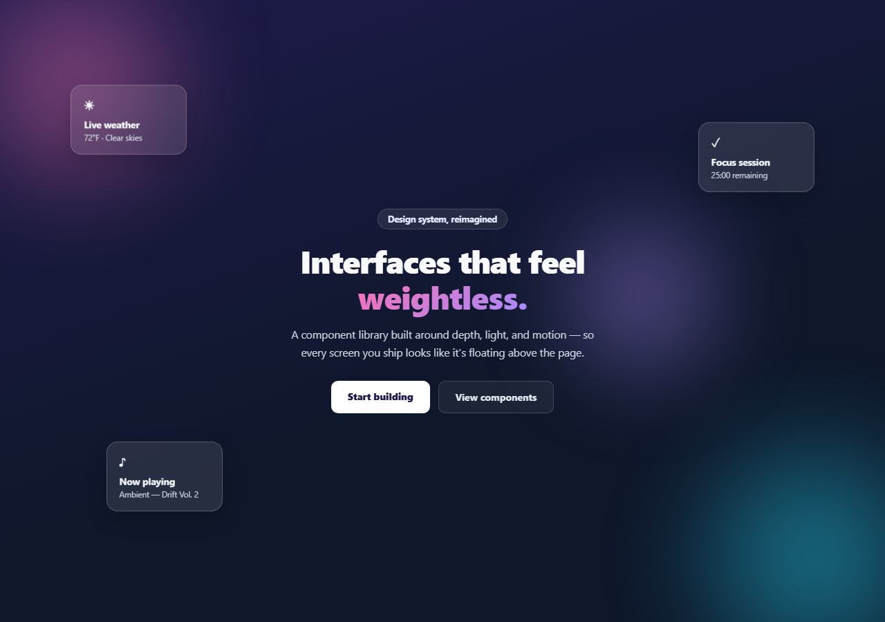
- 1Load the snippetClick "Animated Gradient Text" in the sidebar. The preview shows the headline cycling through indigo, violet, pink, and orange on a dark background.
- 2Change the gradient coloursIn the CSS panel, update the colour stops in linear-gradient on .gradient-text. Add or remove stops — all stops are valid.
- 3Change the animation speedUpdate 4s in animation: shimmer 4s linear infinite to speed up or slow down the shimmer.
- 4Apply to any text elementCopy the four CSS declarations (background, background-size, background-clip, text-fill-color) and paste onto any heading element in your project.
- 5Use on a light backgroundRemove the dark .scene background. The gradient text works on any background colour — the only requirement is that the gradient colours have sufficient contrast.
- 6Export in your formatClick "HTML" for a standalone file, "JSX" for a React component, or "Tailwind" for a React + Tailwind version.
Real-world uses
Common Use Cases
Got questions?
Frequently Asked Questions
background-clip: text restricts the background rendering to the text outline only. Combined with -webkit-text-fill-color: transparent (which hides the solid text colour), the background gradient shows through the letter shapes instead of behind them.
background-size: 300% auto makes the gradient three times wider than the element. The shimmer keyframe moves background-position from 0% to 300%, scrolling through the full gradient. If the gradient were 100% wide, the animation would just hold still.
background-clip: text is supported unprefixed in all modern browsers, but -webkit-background-clip: text and -webkit-text-fill-color: transparent are still required for Safari. Always include both prefixed and unprefixed declarations.
Remove the animation property. The text will show a static snapshot of the gradient at background-position: 0% center. Change the position to adjust which part of the gradient is visible.
Yes. Wrap the specific words in a <span> element and apply the gradient text styles to the span. The background-clip clips to just that span's text, leaving the surrounding paragraph text unstyled.
Yes. Use bg-gradient-to-r with from/via/to colour utilities. Add bg-clip-text text-transparent. For the animation, add a custom animation in tailwind.config.js or use the Tailwind export button which converts the CSS to utility classes.