

Learn Coding Visually
Learn to code with interactive, live-preview playgrounds — HTML, CSS, JavaScript, React & more.
 HTML Playground42 lessons · Click-based · Live preview
 CSS PlaygroundLearn CSS with a live editor
 JavaScript Playground60 lessons · DOM · Async · Canvas
 React PlaygroundLearn React with a live code editor
 GSAP PlaygroundLearn GSAP animation interactively
 SVG Playground44 lessons · shapes · paths · animation
 SCSS Playground45 lessons · Sass modules · tokens
 Tailwind PlaygroundLearn Tailwind CSS with a live editor
 Bootstrap 5 Playground50 lessons · live preview
Split Text Animation — Free HTML CSS JS Snippet
Split Text Animation · Animations · Plain HTML, CSS & JS · Live preview
What's included
Features
About this UI Snippet
Split Text Animation — Word Reveal, Character Slide-Up, Line Wipe & Scramble Decode
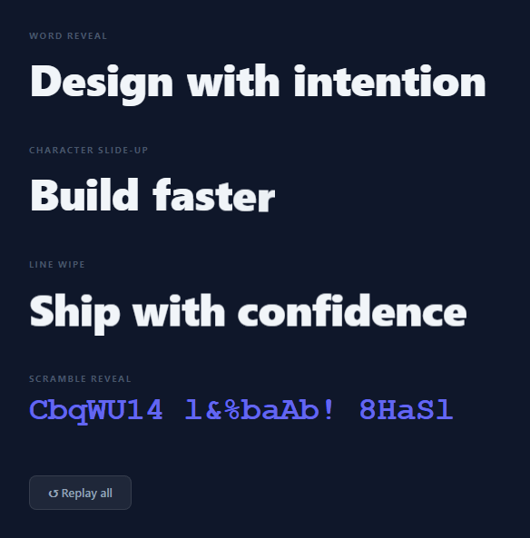
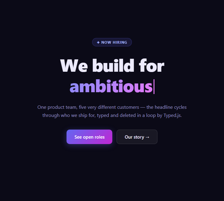
Split text animations are one of the most in-demand effects on modern landing pages and creative portfolios. They make large display headings (especially gradient text) feel dynamic and intentional — the text appears to emerge from below, one word or character at a time, creating a cinematic reveal that draws the eye and communicates design quality. This snippet provides four distinct split text animation variants: word-by-word reveal, character slide-up with rotation, single-line wipe, and a scramble decode effect — all in plain HTML, CSS, and vanilla JavaScript.
Word-by-word reveal
The text is split into words. Each word is wrapped in two spans: an outer .word-wrap with overflow: hidden, and an inner .word that starts at translateY(110%) — completely below the clip boundary. A CSS @keyframes animation moves each word to translateY(0). Staggered animation-delay (0, 0.09s, 0.18s...) per word creates the sequential reveal. The overflow: hidden on the wrapper makes the word appear to "wipe up" from below rather than fade in.
Character slide-up with rotation
Identical architecture to word reveal but split by character. Each character starts at translateY(110%) rotate(8deg) and animates to translateY(0) rotate(0). The 8° starting rotation adds a slight snap as each character lands upright. The stagger is 40ms per character — tight enough to feel unified, loose enough to see each character individually.
Line wipe reveal
The entire line starts at translateY(100%) inside an overflow: hidden container. A single animation moves the line from below the container to its natural position. No splitting needed — the overflow clip creates the wipe-up effect at the full line level. This is the fastest and most impactful variant for short display text.
Scramble decode
A requestAnimationFrame loop runs for 1200ms. Progress (0 to 1) determines how many characters have been "revealed" to their final value. Unrevealed characters show random characters from a 70-char pool each frame, creating the scramble effect. As progress increases, more characters lock into their final positions from left to right.
Combining multiple variants for a sequence
Chain all four variants with increasing base delays for a coordinated reveal sequence: splitWords(headline, 0); splitChars(subheading, 0.6); wipeReveal(tagline, 1.0); scramble(cta, 1.4). The scramble variant is the same effect as the standalone text scramble. The delays create a natural reading order — headline first, supporting text follows. Use this pattern for full-screen hero sections like the word-flip hero where each text element appears sequentially.
Build with AI
Build, Understand, Optimize, and Extend It With AI
You don't need to work out why four different reveal techniques all lean on the same clip trick by hand. Paste this snippet's HTML, CSS, and JS into an AI coding assistant like Claude and ask it to explain exactly why translateY(110%) inside an overflow hidden wrapper reads as a "wipe up" rather than a fade, or how the scramble function's requestAnimationFrame loop decides how many characters have locked in versus how many are still randomized based on elapsed time. The same assistant can help optimize it, for example checking whether the character-split variant's 40ms-per-character stagger becomes uncomfortably slow for long strings and whether it should switch to word-splitting past some length. It's also useful for extending the feature: ask it to trigger each variant via IntersectionObserver instead of only on page load or button click, respect prefers-reduced-motion by skipping straight to the final text, or add a fifth variant like a blur-to-sharp reveal. Treat the code less like a finished artifact and more like a starting point for a conversation.
Prompt to recreate it
Copy this into your AI assistant of choice to build the effect from scratch, or as a jumping-off point for your own variant:
Build four distinct text reveal animations in plain HTML, CSS, and JavaScript, no framework, no libraries: a word-by-word reveal, a character slide-up, a single-line wipe, and a scramble decode.

Requirements:
- For the word reveal, split an element's text content on whitespace into individual words, wrap each word in an outer span with overflow hidden and an inner span that starts transformed fully below the wrapper (translateY well over 100 percent), then animate the inner span to translateY(0) via a CSS keyframe, staggering each word's animation-delay by a fixed increment based on its index.
- For the character slide-up, do the same clip-and-slide technique per character instead of per word, but also start each character rotated a few degrees and animate both the rotation and the vertical position back to neutral together, using a shorter per-character stagger increment than the per-word one.
- For the line wipe, do not split the text at all — wrap the whole line in a single overflow hidden container and animate the entire line from translateY(100%) to 0 as one unit.
- For the scramble decode, run a requestAnimationFrame loop for a fixed duration that computes an elapsed-time-based progress fraction, reveals characters from the start of the string up to a count derived from that progress, and fills all not-yet-revealed character positions with a random character from a large character pool on every single frame (leaving actual space characters as spaces, never randomized).
- Provide a single function that resets and restarts all four animations together with staggered base delays so they play in a coordinated sequence rather than simultaneously, and make sure any in-flight scramble animation frame is properly cancelled before a restart.
- As a documented accessibility improvement in a code comment, show how checking prefers-reduced-motion would skip directly to each element's final text with no animation at all.
Want to tighten it up first? Run this prompt through the AI Prompt Studio to score it across 8 quality dimensions, catch anti-patterns, and tune the wording for Claude, ChatGPT, or Gemini before you paste it in.
Source Code
<div class="stage">
  <!-- Word-reveal animation -->
  <div class="demo-section">
    <p class="demo-label">Word reveal</p>
    <h2 class="split-words" id="split-words">
      Design with intention
    </h2>
  </div>

  <!-- Character slide-up animation -->
  <div class="demo-section">
    <p class="demo-label">Character slide-up</p>
    <h2 class="split-chars" id="split-chars">
      Build faster
    </h2>
  </div>

  <!-- Line wipe reveal -->
  <div class="demo-section">
    <p class="demo-label">Line wipe</p>
    <div class="line-wipe-wrap">
      <div class="line-wipe" id="line-wipe">Ship with confidence</div>
    </div>
  </div>

  <!-- Scramble-to-reveal -->
  <div class="demo-section">
    <p class="demo-label">Scramble reveal</p>
    <h2 class="scramble-text" id="scramble-text" data-text="Create. Iterate. Ship.">Create. Iterate. Ship.</h2>
  </div>

  <button class="replay-btn" onclick="replayAll()">↺ Replay all</button>
</div>
* { box-sizing: border-box; margin: 0; padding: 0; }
body { font-family: system-ui, sans-serif; background: #0f172a; min-height: 100vh; display: flex; align-items: center; justify-content: center; padding: 40px 24px; }
.stage { display: flex; flex-direction: column; gap: 40px; max-width: 520px; width: 100%; align-items: flex-start; }
.demo-section { display: flex; flex-direction: column; gap: 8px; }
.demo-label { font-size: 10px; font-weight: 700; letter-spacing: 1.5px; text-transform: uppercase; color: #475569; }
/* Word reveal */
.split-words { font-size: clamp(28px,5vw,48px); font-weight: 800; color: #f1f5f9; letter-spacing: -0.5px; display: flex; flex-wrap: wrap; gap: 0.3em; }
.word-wrap { overflow: hidden; display: inline-block; }
.word { display: inline-block; transform: translateY(110%); animation: wordReveal 0.6s cubic-bezier(0.16,1,0.3,1) forwards; }
@keyframes wordReveal { to { transform: translateY(0); } }
/* Character slide-up */
.split-chars { font-size: clamp(28px,5vw,48px); font-weight: 800; color: #f1f5f9; letter-spacing: -0.5px; display: flex; flex-wrap: wrap; }
.char-wrap { overflow: hidden; display: inline-block; }
.char-wrap.space { width: 0.3em; }
.char { display: inline-block; transform: translateY(110%) rotate(8deg); opacity: 0; animation: charReveal 0.5s cubic-bezier(0.16,1,0.3,1) forwards; }
@keyframes charReveal { to { transform: translateY(0) rotate(0deg); opacity: 1; } }
/* Line wipe */
.line-wipe-wrap { overflow: hidden; }
.line-wipe { font-size: clamp(28px,5vw,48px); font-weight: 800; color: #f1f5f9; letter-spacing: -0.5px; transform: translateY(100%); animation: lineReveal 0.7s cubic-bezier(0.16,1,0.3,1) forwards; }
@keyframes lineReveal { to { transform: translateY(0); } }
/* Scramble */
.scramble-text { font-size: clamp(20px,4vw,36px); font-weight: 800; color: #6366f1; letter-spacing: -0.3px; font-family: 'Courier New', monospace; min-height: 1.2em; }
.replay-btn { background: rgba(255,255,255,0.07); border: 1px solid rgba(255,255,255,0.1); color: #94a3b8; font-size: 13px; font-weight: 600; padding: 9px 20px; border-radius: 8px; cursor: pointer; transition: all 0.15s; font-family: inherit; margin-top: 8px; }
.replay-btn:hover { background: rgba(255,255,255,0.12); color: #e2e8f0; }const CHARS = 'ABCDEFGHIJKLMNOPQRSTUVWXYZabcdefghijklmnopqrstuvwxyz0123456789!@#$%^&*';
function splitWords(el, baseDelay = 0) {
const words = el.textContent.trim().split(/\s+/);
el.innerHTML = '';
words.forEach((word, i) => {
const wrap = document.createElement('span');
wrap.className = 'word-wrap';
const span = document.createElement('span');
span.className = 'word';
span.textContent = word;
span.style.animationDelay = (baseDelay + i * 0.09) + 's';
wrap.appendChild(span);
el.appendChild(wrap);
if (i < words.length - 1) el.appendChild(document.createTextNode(' '));
});
}
function splitChars(el, baseDelay = 0) {
const text = el.textContent.trim();
el.innerHTML = '';
let charIdx = 0;
[...text].forEach(char => {
const wrap = document.createElement('span');
wrap.className = 'char-wrap' + (char === ' ' ? ' space' : '');
if (char !== ' ') {
const span = document.createElement('span');
span.className = 'char';
span.textContent = char;
span.style.animationDelay = (baseDelay + charIdx * 0.04) + 's';
wrap.appendChild(span);
charIdx++;
}
el.appendChild(wrap);
});
}
function wipeReveal(el, delay = 0) {
el.style.animation = 'none';
el.style.animationDelay = delay + 's';
el.offsetHeight; // reflow
el.style.animation = '';
el.style.animationDelay = delay + 's';
}
function scramble(el, delay = 0) {
const target = el.dataset.text;
const duration = 1200;
const start = performance.now() + delay * 1000;
let frame;
function update(now) {
if (now < start) { frame = requestAnimationFrame(update); return; }
const elapsed = now - start;
const progress = Math.min(1, elapsed / duration);
const revealCount = Math.floor(progress * target.length);
let result = '';
for (let i = 0; i < target.length; i++) {
if (target[i] === ' ') { result += ' '; continue; }
if (i < revealCount) { result += target[i]; }
else { result += CHARS[Math.floor(Math.random() * CHARS.length)]; }
}
el.textContent = result;
if (progress < 1) frame = requestAnimationFrame(update);
else el.textContent = target;
}
frame = requestAnimationFrame(update);
return () => cancelAnimationFrame(frame);
}
let cancelScramble = null;
function replayAll() {
const words = document.getElementById('split-words');
const chars = document.getElementById('split-chars');
const line = document.getElementById('line-wipe');
const scram = document.getElementById('scramble-text');
if (cancelScramble) cancelScramble();
words.textContent = 'Design with intention';
chars.textContent = 'Build faster';
splitWords(words, 0);
splitChars(chars, 0.4);
wipeReveal(line, 0.7);
cancelScramble = scramble(scram, 1.0);
}
// Initial run
replayAll();Step by step
How to Use
- 1Click "↺ Replay all" to see all four animations restartThe word reveal, character slide-up, line wipe, and scramble decode all run in sequence with staggered starts. Each animation has a different timing — observe how each creates a different visual impression.
- 2Use the word reveal for hero headlinesCall splitWords(el, baseDelay) where el is your headline element. The function splits text into words, wraps each in overflow:hidden spans, and applies staggered CSS animation delays. Works for any text length.
- 3Use character split for short impact textCall splitChars(el, baseDelay) for 2-4 word text. Best for short, punchy text — "Bold. Fast. Free." The character rotation adds energy. Avoid for long text where 40ms×40 chars = 1.6s total before the last character lands.
- 4Trigger animations on scroll with IntersectionObserverWrap the replayAll() call in an IntersectionObserver: const obs = new IntersectionObserver(([e]) => { if(e.isIntersecting) { replayAll(); obs.disconnect(); } }, { threshold: 0.3 }); obs.observe(document.querySelector(".stage")).
- 5Change animation timing and easingUpdate cubic-bezier(0.16,1,0.3,1) in the @keyframes CSS for different feels. This is a spring-style ease-out. Use ease for softer, linear for mechanical. Change 0.6s duration to 0.4s for snappier or 1s for more dramatic reveals.
- 6Export in your formatClick "HTML" for a standalone file, "JSX" for a React component using useEffect to trigger on mount or scroll, or "Tailwind" for a React + Tailwind CSS version.
Real-world uses
Common Use Cases
Got questions?
Frequently Asked Questions
The .word-wrap (or .line-wipe-wrap for the line variant) has overflow: hidden. Inside it, the text element starts at transform: translateY(110%) — 110% of the element height, positioning it completely below the container's bottom edge. Because overflow is hidden, the text is invisible. As translateY animates to 0, the text rises from below the invisible clip boundary into view. The result looks like the text is wiping up from the baseline — a much more polished effect than a simple fade-in.
Use IntersectionObserver: const elements = document.querySelectorAll(".split-words, .split-chars"); const obs = new IntersectionObserver(entries => { entries.forEach(entry => { if (entry.isIntersecting) { if (entry.target.classList.contains("split-words")) splitWords(entry.target); else splitChars(entry.target); obs.unobserve(entry.target); } }); }, { threshold: 0.3 }); elements.forEach(el => obs.observe(el)). The obs.unobserve() prevents re-animating on scroll back.
Add: if (window.matchMedia("(prefers-reduced-motion: reduce)").matches) { document.getElementById("split-words").textContent = "Design with intention"; return; } at the top of replayAll(). For CSS: @media (prefers-reduced-motion: reduce) { .word, .char { animation: none; transform: none; opacity: 1; } .line-wipe { animation: none; transform: none; } }. This makes all text immediately visible without animation for users who have enabled the system accessibility setting.
Click "JSX" to download. Run the split functions in a useEffect on mount: useEffect(() => { splitWords(wordsRef.current, 0); splitChars(charsRef.current, 0.4); ... }, []). Use useRef for each animation target element. For scroll-triggered animations, add an IntersectionObserver inside the useEffect. Return a cleanup: return () => cancelAnimationFrame(scrambleFrame) to cancel any ongoing rAF loop when the component unmounts.