Learn Coding Visually
Learn to code with interactive, live-preview playgrounds — HTML, CSS, JavaScript, React & more.
 HTML Playground42 lessons · Click-based · Live preview
 CSS PlaygroundLearn CSS with a live editor
 JavaScript Playground60 lessons · DOM · Async · Canvas
 React PlaygroundLearn React with a live code editor
 GSAP PlaygroundLearn GSAP animation interactively
 SVG Playground44 lessons · shapes · paths · animation
 SCSS Playground45 lessons · Sass modules · tokens
 Tailwind PlaygroundLearn Tailwind CSS with a live editor
 Bootstrap 5 Playground50 lessons · live preview
Word Flip Hero — Animated Cycling Headline HTML CSS JS
Word Flip Hero · Heroes · Plain HTML, CSS & JS · Live preview
What's included
Features
overflow:hidden clip window. JS sets translateY(-idx * wordHeight) — runtime height measurement means variable word lengths work with zero config.background-clip: text + -webkit-text-fill-color: transparent for an indigo-to-violet gradient sweep — the standard cross-browser gradient typography technique.cubic-bezier(0.77,0,0.18,1) gives the slide an aggressive start and smooth landing — cinematic feel without being distracting during reading.box-shadow keyframe animation — a standard "live" or "status" indicator communicating product activity..flip-wrap has aria-live="polite" so screen readers announce each new word after it transitions in — accessible cycling animation.box-shadow glow that intensifies on hover. Ghost button uses a glass-style background for hierarchy differentiation.flex-wrap: wrap and min-width — on narrow screens they stack vertically. The headline uses clamp(36px,6vw,64px) for fluid font sizing.About this UI Snippet
Word Flip Hero — CSS Transform Word Cycling, Gradient Text Clip & Social Proof Layout
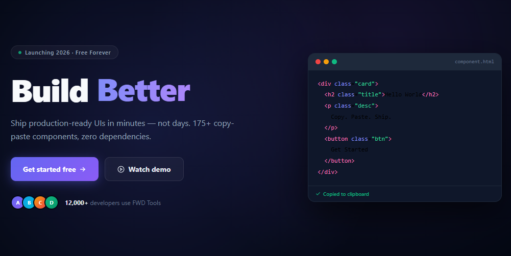
The word-flip hero is one of the most recognisable patterns in modern SaaS and startup landing pages — a headline where a single key word cycles through several alternatives, demonstrating the product's versatility without needing multiple pages. This snippet builds a production-quality word-flip hero: a stacked flex column of words animating vertically with translateY, gradient text clipping on the cycled words, a dual-CTA button row, social proof avatars, and a decorative code window — all in pure HTML, CSS, and minimal JavaScript.
The animated headline technique communicates product breadth in a single sentence: "Build Faster / Smarter / Better / Together" — each word reframes the same value proposition for a different user persona. The visual variety keeps the hero from feeling static while the core message stays readable between transitions.
The word column slide mechanism
All words are stacked in a vertical flex column (flex-direction: column) inside a overflow: hidden container sized to exactly one word's line height (1.1em). JavaScript measures one word's actual pixel height and sets translateY(-idx * height) on the column — shifting the visible window to show the current word. The CSS transition: transform .55s cubic-bezier(0.77,0,0.18,1) gives the slide an aggressive ease-in / smooth-out feel that matches the hero's energetic tone.
Unlike CSS @keyframes cycling approaches, this method works with variable-length words because the height is measured at runtime. Adding a new word to the cycle is a pure HTML change — no CSS or JS constants to update.
Gradient text clipping
The cycling words use background: linear-gradient(90deg, #818cf8, #c084fc) clipped to the text via -webkit-background-clip: text and -webkit-text-fill-color: transparent. This is the standard CSS technique for gradient typography — supported in all modern browsers. The gradient sweeps left-to-right from indigo to violet, matching the CTA button gradient for visual coherence.
Social proof avatar stack
Four overlapping avatar circles use negative margin-left: -6px to create the stacked overlap effect. Each avatar is a colour-coded <div> with a letter initial — a practical pattern for user-generated or developer-tool contexts where actual profile photos are rarely available at build time.
Decorative code window
The right side of the hero shows a dark code editor window with syntax-coloured HTML spans, a macOS-style traffic-light dot bar, and a "Copied to clipboard" success indicator. This communicates the product's developer focus without needing a screenshot and remains crisp at all screen densities. Pair with a parallax hero for a more visually dynamic full-screen background effect.
Build with AI
Build, Understand, Optimize, and Extend It With AI
Ask an AI coding assistant like Claude to explain why getWordHeight() measures a live word's offsetHeight at runtime rather than the code just hardcoding a pixel value for translateY, and why that runtime measurement is exactly what lets you add a much longer word to the WORDS array with zero CSS changes. It's also worth asking about the setInterval driving the cycle — since it never gets cleared, ask what happens to it if this component were unmounted in a single-page app, and how you'd fix that leak. For extending it, ask for a version that pauses when the tab is hidden using the Page Visibility API, one where the flip direction reverses on the last word to loop backward instead of jumping, or a variant that syncs the word change to a typing-sound effect. Treat the code less like a finished artifact and more like a starting point for a conversation.
Prompt to recreate it
Copy this into your AI assistant of choice to build the effect from scratch, or as a jumping-off point for your own variant:
Build a "word flip" cycling headline for a hero section in plain HTML, CSS, and JavaScript, where one word in a sentence cycles through alternatives via a vertical slide — no animation library, no CSS-only keyframe cycling.

Requirements:
- Stack all the cycling words vertically inside a fixed-height container (sized to exactly one line of text) with overflow hidden, using flex-direction: column so only one word is visible at a time inside the clipped window.
- On an interval, measure one word's actual rendered pixel height at runtime (not a hardcoded constant) and translate the whole stacked column upward by that height times the current word index, so the visible window slides to reveal the next word — this must work correctly even if words have different rendered widths, since only height matters for the vertical slide.
- Apply a CSS transition on the transform property using an aggressive ease-in, smooth ease-out cubic-bezier curve so the slide has energy without feeling jarring, and keep the transition duration shorter than the interval so each slide fully completes before the next one begins.
- Style the cycling word with a gradient text effect using background-clip: text so it visually stands out from the surrounding static headline text.
- Mark the cycling word's wrapping container with aria-live="polite" so screen readers announce each new word after it slides into view, without announcing it disruptively on every partial transition frame.
- Structure the word list as a plain array that the interval logic reads by index with modulo wrap-around, so adding or removing words from the rotation requires no changes to the interval or measurement logic.
Want to tighten it up first? Run this prompt through the AI Prompt Studio to score it across 8 quality dimensions, catch anti-patterns, and tune the wording for Claude, ChatGPT, or Gemini before you paste it in.
Step by step
How to Use
- 1Paste the three blocksA dark hero renders with the cycling headline "Build Faster / Smarter / Better / Together", a subheading, two CTA buttons, social proof avatars, and a code window decoration.
- 2Watch the word cycleEvery 2.2 seconds the highlighted word slides up and the next one appears with a smooth cubic-bezier transition. The gradient text colour adds visual contrast against the white headline.
- 3Change the word listEdit the
WORDSarray in JS and the corresponding.flip-wordspans in HTML. Add or remove words freely — the height measurement adapts automatically. - 4Update the headline textChange "Build" to any verb that matches your product ("Design", "Deploy", "Automate"). The
<span class="flip-wrap">sits inline so the static and dynamic parts flow together. - 5Customise CTAsUpdate the button text,
hrefvalues, and gradient colours to match your brand. The primary button uses an indigo-violet gradient — change via CSSbackgroundon.btn-primary. - 6Replace the code windowSwap the
.code-bodycontent with a screenshot, illustration, or product UI preview. The window frame (traffic-light dots, dark background, border) works as a generic content container.
Real-world uses
Common Use Cases
Got questions?
Frequently Asked Questions
Change the DURATION constant in the JS (default 2200ms). Also update the CSS transition duration on .flip-track to something shorter than DURATION so the animation completes before the next word arrives.
Replace the translateY approach with CSS animations: set each word to position: absolute in the container, opacity: 0, and apply a @keyframes that fades in, pauses, and fades out. Use animation-delay to stagger each word. The container height should be set to match one word's height.
Store the current index in const [idx, setIdx] = useState(0). The interval becomes useEffect(() => { const t = setInterval(() => setIdx(i => (i+1) % WORDS.length), 2200); return () => clearInterval(t); }, []). Apply style={{ transform: translateY(-${idx * wordHeight}px) }} to the track ref.
Use the Page Visibility API: document.addEventListener('visibilitychange', () => { if (document.hidden) clearInterval(timer); else startCycle(); }). This saves CPU when the user switches tabs.