


Learn Coding Visually
Learn to code with interactive, live-preview playgrounds — HTML, CSS, JavaScript, React & more.
 HTML Playground42 lessons · Click-based · Live preview
 CSS PlaygroundLearn CSS with a live editor
 JavaScript Playground60 lessons · DOM · Async · Canvas
 React PlaygroundLearn React with a live code editor
 GSAP PlaygroundLearn GSAP animation interactively
 SVG Playground44 lessons · shapes · paths · animation
 SCSS Playground45 lessons · Sass modules · tokens
 Tailwind PlaygroundLearn Tailwind CSS with a live editor
 Bootstrap 5 Playground50 lessons · live preview
Scroll Progress Bar — Free HTML CSS JS Snippet
Scroll Progress Bar · Scroll · Plain HTML, CSS & JS · Live preview
What's included
Features
About this UI Snippet
Scroll Progress Bar — scrollTop Formula, Gradient Bar & Fixed Position
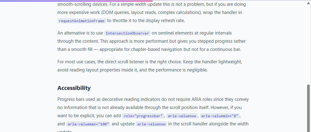
A scroll progress bar is a thin bar at the top of the page that fills from left to right as the user scrolls down — often combined with a sticky header and a scroll-to-top button. It communicates reading progress on long-form content — blog posts, documentation, articles, and terms pages. Users can see at a glance how far through the content they are and how much remains.
The scroll percentage formula
The JavaScript listener is two lines: document.addEventListener('scroll', () => { const pct = doc.scrollTop / (doc.scrollHeight - doc.clientHeight) * 100; bar.style.width = pct + '%'; }).
document.documentElement.scrollTop is the number of pixels scrolled from the top. document.documentElement.scrollHeight is the total height of the document. document.documentElement.clientHeight is the visible viewport height. Subtracting clientHeight from scrollHeight gives the maximum scrollable distance — the amount you can actually scroll before hitting the bottom. Dividing scrollTop by this and multiplying by 100 gives a percentage from 0 to 100 that maps directly to scroll position.
The CSS gradient bar
The bar uses background: linear-gradient(90deg, #6366f1, #8b5cf6, #ec4899) — an indigo-violet-pink gradient. As the width grows, the gradient fills proportionally from left to right. The bar is height: 3px; position: fixed; top: 0; left: 0; z-index: 999 — always pinned to the top of the viewport above all other content.
The transition smoothing
transition: width 0.1s linear smooths the width change between scroll events. Without it, the bar would jump discretely on each scroll event. The 0.1s linear duration is short enough that the bar feels responsive but long enough to hide any jitter between scroll events.
Using on a specific element
The current implementation tracks scroll on document.documentElement. To track scroll progress within a specific scrollable container (a div with overflow-y: auto), replace doc.scrollTop with container.scrollTop and doc.scrollHeight - doc.clientHeight with container.scrollHeight - container.clientHeight. Add the scroll listener to the container element instead of document.
Changing the gradient
Update the three colour values in linear-gradient(90deg, #6366f1, #8b5cf6, #ec4899) to any colours. Use two colours for a simpler gradient or a single solid colour by replacing the gradient with a plain background value.
The scrollTop / scrollHeight formula
The scroll progress is computed as: const pct = (window.scrollY / (document.documentElement.scrollHeight - window.innerHeight)) * 100. window.scrollY is the number of pixels scrolled from the top. scrollHeight - innerHeight is the maximum scrollable distance — the total page height minus the viewport height. This gives a 0–100% value that fills the bar from empty to full as the user scrolls from top to bottom.
Fixed positioning
The progress bar uses position: fixed; top: 0; left: 0; right: 0; height: 4px; z-index: 9999. Fixed positioning keeps the bar at the viewport top regardless of scroll position. A high z-index ensures it sits above the page navigation. The bar uses no border-radius at the right end (border-radius: 0 2px 2px 0) so it appears to extend from the left edge of the screen.
The gradient fill
The fill element uses background: linear-gradient(90deg, var(--accent), var(--accent-secondary)) for a two-tone gradient that sweeps from left to right as the user reads. The gradient adds visual interest compared to a flat colour while communicating direction (left = start, right = progress toward completion).
Build with AI
Build, Understand, Optimize, and Extend It With AI
You don't need to re-derive the scrollTop formula from scratch every time. Paste this snippet's HTML, CSS, and JS into an AI coding assistant like Claude and ask it to explain exactly why scrollHeight minus clientHeight (not scrollHeight alone) is the correct denominator, or why a raw scroll listener with no throttling is safe here when the handler only does one division and one style write. The same assistant can help optimize it — asking whether requestAnimationFrame throttling would matter if the bar's logic grew more expensive, or whether a ref-based update (versus React state) is the right call for avoiding re-renders on every scroll tick. It's also useful for extending the effect: ask it to scope the same formula to a specific scrollable container instead of the whole document, animate the gradient's hue as a function of scroll percentage, or add an aria-valuenow-driven progressbar role for accessibility. Treat the code less like a finished artifact and more like a starting point for a conversation.
Prompt to recreate it
Copy this into your AI assistant of choice to build the effect from scratch, or as a jumping-off point for your own variant:
Build a "scroll progress bar" in plain HTML, CSS, and JavaScript using only the native scroll event — no library, no requestAnimationFrame throttling needed given the handler's simplicity.

Requirements:
- A thin bar element fixed to the very top of the viewport, spanning the full width, starting at 0% width, with a left-to-right multi-color linear gradient background and a high z-index so it sits above all page content.
- A single scroll event listener on the document that, on every event, computes the scroll percentage as document.documentElement.scrollTop divided by (document.documentElement.scrollHeight minus document.documentElement.clientHeight), multiplied by 100.
- Apply that computed percentage directly to the bar's width as a percentage string on every scroll event, with a short CSS transition (e.g. width 0.1s linear) so the width change smooths out between scroll events instead of jumping in visible steps.
- Explain in a comment or accompanying note why subtracting clientHeight from scrollHeight is required — dividing scrollTop by scrollHeight alone would mean the bar never reaches 100% because scrollTop's maximum value is always scrollHeight minus clientHeight, never scrollHeight itself.
- Make the formula reusable against any specific scrollable container element instead of the whole document by substituting the container's own scrollTop, scrollHeight, and clientHeight, and attaching the listener to that container rather than to document.
Want to tighten it up first? Run this prompt through the AI Prompt Studio to score it across 8 quality dimensions, catch anti-patterns, and tune the wording for Claude, ChatGPT, or Gemini before you paste it in.
Source Code
<div class="progress-bar" id="progress"></div>

<article class="content">
  <h1>Scroll Progress Bar</h1>
  <p class="lead">Scroll down to see the gradient progress bar fill at the top of the page. It tracks how far through the article you are in real time.</p>

  <h2>Why reading progress matters</h2>
  <p>A scroll progress indicator gives readers immediate feedback on how far through a piece of content they are. On long-form articles, documentation pages, or tutorials, this single UI element reduces uncertainty — the reader always knows how much is left and is more likely to continue rather than abandon the page mid-way.</p>
  <p>Studies on reading behavior consistently show that users are more likely to complete content when they have a visible progress signal. The pattern is borrowed from e-readers and podcast apps, where progress has always been a first-class concern, and it translates naturally to the web.</p>

  <h2>How it works</h2>
  <p>The implementation listens to the <code>scroll</code> event on the document. On each scroll, it calculates the current percentage as <code>scrollTop / (scrollHeight - clientHeight) × 100</code>. The result is applied to the <code>width</code> of a fixed-position bar at the top of the viewport.</p>
  <p>The bar uses <code>position: fixed</code> with <code>top: 0</code> and a high <code>z-index</code> so it always sits above the page content. The gradient is applied via the <code>background</code> property — a linear gradient from indigo to violet to pink — which stays visually interesting as it grows.</p>
  <p>A subtle <code>transition: width 0.1s linear</code> smooths out the movement without introducing any perceivable lag. Without the transition, the bar can feel jittery on trackpad scrolling where events fire in small increments.</p>

  <h2>Performance considerations</h2>
  <p>The <code>scroll</code> event fires at very high frequency — potentially hundreds of times per second on smooth-scrolling devices. For a simple width update this is not a problem, but if you are doing more expensive work (DOM queries, layout reads, complex calculations), wrap the handler in <code>requestAnimationFrame</code> to throttle it to the display refresh rate.</p>
  <p>An alternative is to use <code>IntersectionObserver</code> on sentinel elements at regular intervals through the content. This approach is more performant but gives you stepped progress rather than a smooth fill — appropriate for chapter-based navigation but not for a continuous bar.</p>
  <p>For most use cases, the direct scroll listener is the right choice. Keep the handler lightweight, avoid reading layout properties inside it, and the performance is negligible.</p>

  <h2>Accessibility</h2>
  <p>Progress bars used as decorative reading indicators do not require ARIA roles since they convey no information that is not already available through the scroll position itself. However, if you want to be explicit, you can add <code>role="progressbar"</code>, <code>aria-valuenow</code>, <code>aria-valuemin="0"</code>, and <code>aria-valuemax="100"</code> and update <code>aria-valuenow</code> in the scroll handler alongside the width update.</p>
  <p>Make sure the bar has sufficient contrast against the page background. A 3px bar with a vibrant gradient on a white background comfortably exceeds WCAG AA contrast requirements for non-text elements.</p>

  <h2>Variations and extensions</h2>
  <p>You can scope the progress to a specific element rather than the full document. Instead of using <code>document.documentElement.scrollTop</code>, get the bounding rect of the content container and calculate what fraction of it has passed the viewport top. This is useful when the page has a fixed header or sticky navigation that takes up vertical space.</p>
  <p>Another popular variation places the bar at the bottom of the viewport, or inside the navigation bar itself, using it as a thin line below the nav links. This keeps it visually connected to the page chrome rather than floating independently at the very top.</p>
  <p>You can also make the color dynamic — transition the gradient based on scroll percentage, shifting from one hue to another as the reader progresses. This adds a visual layer of meaning on top of the width signal and creates a more memorable reading experience.</p>

  <h2>Browser support</h2>
  <p>The scroll event, fixed positioning, CSS gradients, and CSS transitions used in this snippet have full support across all modern browsers including Safari, Chrome, Firefox, and Edge. No polyfills are required. The <code>backdrop-filter</code> property, if you add a blur effect to the bar, requires a fallback for Firefox where support was historically limited — though modern Firefox versions support it.</p>
  <p>If you are building for older browsers, replace the gradient with a solid color and remove the transition. The core functionality — a div with a dynamically updated width — works everywhere JavaScript runs.</p>

  <h2>Integration tips</h2>
  <p>In React or Vue, set up the scroll listener in a <code>useEffect</code> or <code>mounted</code> hook and clean it up on unmount to avoid memory leaks. Store the percentage in state or a ref — a ref is preferable here since you only need to update the DOM, not trigger a re-render. Use a callback ref on the bar element and update its <code>style.width</code> directly for the best performance.</p>
  <p>In a Next.js app, add the listener in a layout component so it persists across route changes. Be aware that in single-page apps, the scroll position may not reset on navigation — add a <code>scrollTo(0, 0)</code> call on route change if you want the bar to reset at the top of each new page.</p>
  <p>That covers everything you need to build, customize, and integrate a scroll progress bar. The snippet above is self-contained and ready to copy into any project.</p>
</article>
* { box-sizing: border-box; margin: 0; padding: 0; }
body { font-family: system-ui, sans-serif; background: #f8fafc; }
.progress-bar {
position: fixed;
top: 0; left: 0;
height: 3px;
background: linear-gradient(90deg, #6366f1, #8b5cf6, #ec4899);
width: 0%;
transition: width 0.1s linear;
z-index: 999;
}
.content {
max-width: 680px;
margin: 0 auto;
padding: 48px 24px 120px;
}
h1 { font-size: 32px; font-weight: 800; color: #1e293b; margin-bottom: 12px; line-height: 1.2; }
h2 { font-size: 19px; font-weight: 700; color: #1e293b; margin: 32px 0 12px; }
p { font-size: 15px; color: #475569; line-height: 1.8; margin-bottom: 14px; }
p.lead { font-size: 17px; color: #334155; margin-bottom: 32px; }
code { font-family: monospace; font-size: 13px; background: #e2e8f0; border-radius: 4px; padding: 1px 5px; color: #4f46e5; }const bar = document.getElementById('progress');
document.addEventListener('scroll', () => {
const doc = document.documentElement;
const pct = (doc.scrollTop / (doc.scrollHeight - doc.clientHeight)) * 100;
bar.style.width = pct + '%';
});Step by step
How to Use
- 1Scroll in the previewScroll down in the preview panel to see the gradient bar fill from left to right. The bar tracks scroll position in real time.
- 2Change the gradient coloursIn the CSS panel, update the three hex values in linear-gradient(90deg, ...) to your brand colours.
- 3Change the bar heightUpdate height: 3px on .progress-bar in the CSS panel. 2px is subtle, 4px is more prominent.
- 4Move to a specific scrollable containerIn the JS panel, replace doc.scrollTop and doc.scrollHeight references with your container element and add the scroll listener to that element.
- 5Add to a fixed navigation barChange the bar position from top: 0 to be flush with the bottom of your fixed nav. Set z-index higher than the nav if it overlaps.
- 6Export in your formatClick "HTML" for a standalone file, "JSX" for a React component, or "Tailwind" for a React + Tailwind version.
Real-world uses
Common Use Cases
Got questions?
Frequently Asked Questions
scrollTop is the number of pixels scrolled from the top. scrollHeight is the total document height. clientHeight is the visible viewport height. scrollHeight - clientHeight is the maximum scrollable distance (you cannot scroll past this). Dividing scrollTop by this value gives a 0–1 ratio; multiply by 100 for the percentage.
If you divided scrollTop by scrollHeight directly, the bar would never reach 100% — because even when scrolled to the bottom, scrollTop is less than scrollHeight by exactly clientHeight. Subtracting clientHeight gives the true maximum scroll position.
Replace document.documentElement with your container element: const container = document.getElementById("my-container"). Replace doc.scrollTop with container.scrollTop and (doc.scrollHeight - doc.clientHeight) with (container.scrollHeight - container.clientHeight). Add the listener to container instead of document.
Update the colour values in linear-gradient(90deg, #6366f1, #8b5cf6, #ec4899). Use two colours for a simpler gradient, or replace the entire gradient with a solid background colour for a minimal bar.
Not for this use case. The scroll handler does only a division and a style assignment — both are extremely fast. Debouncing would make the bar lag noticeably behind scrolling. The transition: width 0.1s handles smoothness without debounce.
Yes. Click "JSX" to download a React component. In React, add the scroll listener in a useEffect on mount and clean it up on unmount. Update a percentage state variable on each scroll event and apply it as a style prop: style={{ width: pct + "%" }} on the bar div.