Learn Coding Visually
Learn to code with interactive, live-preview playgrounds — HTML, CSS, JavaScript, React & more.
 HTML Playground42 lessons · Click-based · Live preview
 CSS PlaygroundLearn CSS with a live editor
 JavaScript Playground60 lessons · DOM · Async · Canvas
 React PlaygroundLearn React with a live code editor
 GSAP PlaygroundLearn GSAP animation interactively
 SVG Playground44 lessons · shapes · paths · animation
 SCSS Playground45 lessons · Sass modules · tokens
 Tailwind PlaygroundLearn Tailwind CSS with a live editor
 Bootstrap 5 Playground50 lessons · live preview
Scroll to Top Button — Free HTML CSS JS Snippet
Scroll to Top · Scroll · Plain HTML, CSS & JS · Live preview
What's included
Features
About this UI Snippet
Scroll to Top — Progress Ring, Appear on Scroll, Smooth Return & Scale Animation
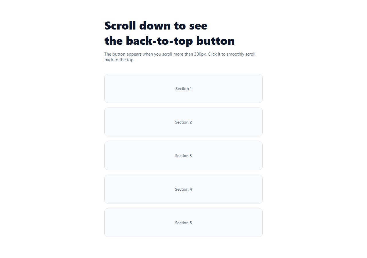
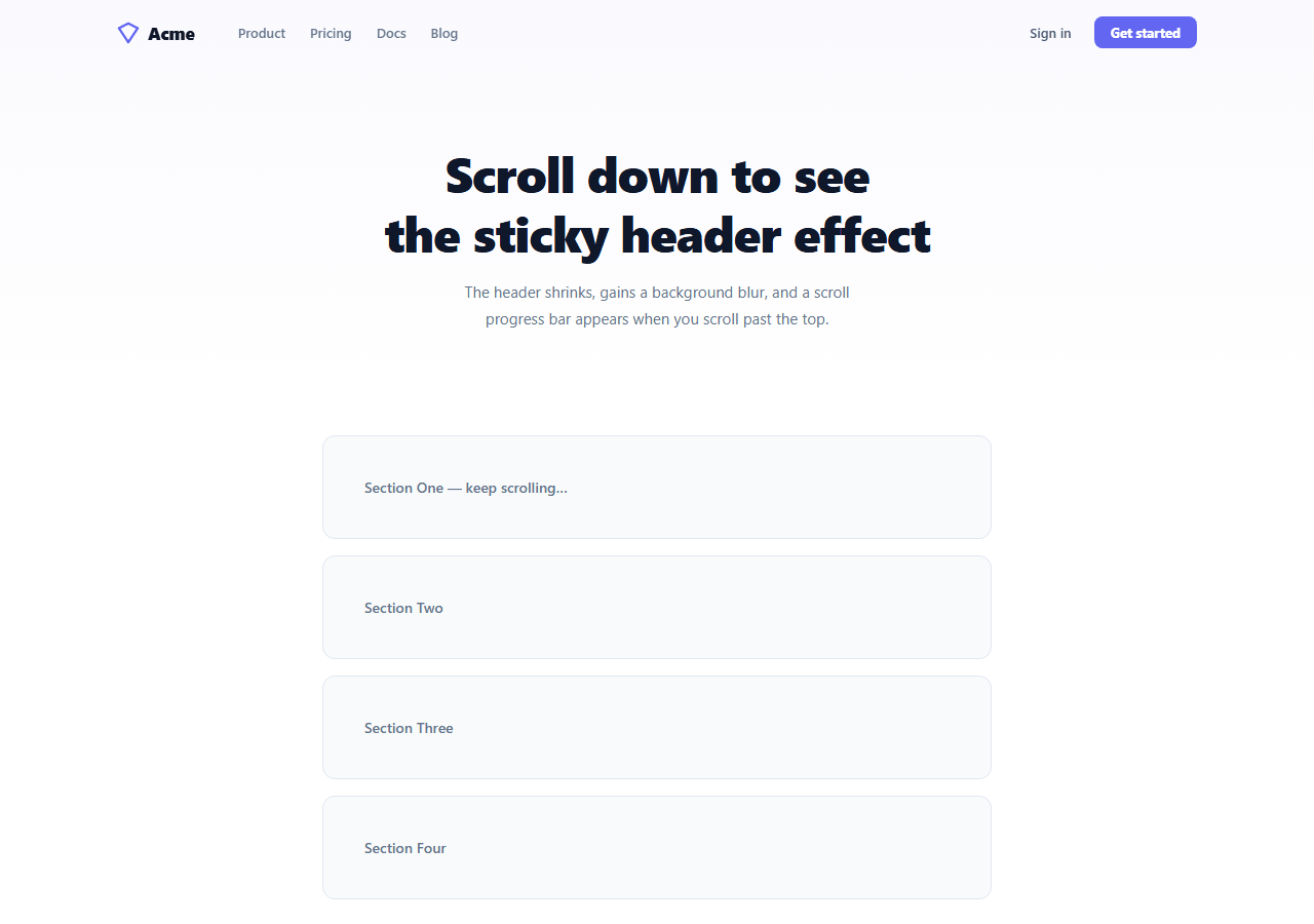
A scroll-to-top button gives users a quick way to return to the top of a long page — essential for mobile users on content-heavy pages, blog posts, and documentation. This snippet provides a polished implementation: a fixed button that appears with a scale+opacity animation after 300px of scroll, a circular SVG progress ring that fills as the user scrolls toward the bottom, smooth scrolling on click, and a hover lift effect. It pairs naturally with a sticky header.
The appear/disappear animation
The button starts at opacity: 0, transform: translateY(16px) scale(0.9), and pointer-events: none. When scrollY exceeds SHOW_AT (300px), the .visible class switches all three to their active values. CSS transition handles the animation. The pointer-events: none in the hidden state prevents invisible button from intercepting clicks on the page.
The SVG progress ring
A progress ring built from two SVG circle elements (ring-track and ring-fill) surrounds the button. The ring-fill uses stroke-dasharray set to the full circumference (2πr) and stroke-dashoffset to control how much of the circle is drawn: circ × (1 - scrollPct). At 0% scroll, dashoffset = circ (ring empty). At 100% scroll, dashoffset = 0 (ring full). The SVG is rotated -90° so the fill starts at 12 o'clock.
The scroll percentage calculation
scrollY / (scrollHeight - innerHeight) gives a 0-to-1 progress value. scrollHeight - innerHeight is the maximum scrollable distance. This is the same formula used in the Scroll Progress Bar snippet but applied to a circular ring rather than a linear bar.
Smooth scrolling
window.scrollTo({ top: 0, behavior: 'smooth' }) triggers the browser's native smooth scroll to position 0. This works in all modern browsers and respects the user's prefers-reduced-motion setting — browsers automatically disable smooth scroll when the user has reduced motion enabled.
Positioning and safe areas
The button is position: fixed at bottom: 28px, right: 28px. On iOS with home indicator, add bottom: calc(28px + env(safe-area-inset-bottom)) to push the button above the safe area for PWA installs.
Keyboard accessibility
The button is a standard button element so it is keyboard-focusable by default. Tab focuses it when visible, Enter or Space activates it. Add a visible focus ring: .stt-btn:focus-visible { outline: 2px solid #6366f1; outline-offset: 3px; } to override the default browser outline with a branded focus indicator. The aria-label="Scroll to top" and title="Back to top" communicate the button purpose to screen readers and mouse hover users respectively.
Build with AI
Build, Understand, Optimize, and Extend It With AI
You do not need to work out the stroke-dashoffset formula or the custom easing curve in scrollToTop by hand. Paste this snippet's HTML, CSS, and JS into an AI coding assistant like Claude and ask it to explain exactly why dashoffset is set to circ times (1 minus pct) instead of just circ times pct, and how the cubic ease-out inside the requestAnimationFrame step function shapes the scroll's deceleration. The same assistant can help optimize it — checking whether the scroll listener's per-event work (recomputing maxScroll on every tick) should be cached and only recalculated on resize, or whether the custom scrollToTop animation should fall back to the native window.scrollTo smooth behavior on browsers that support it. It is just as useful for extending it: ask it to make the button scroll to a specific section instead of the top, add a percentage label inside the ring, or trigger a small confetti burst when the ring reaches 100%. Treat the code less like a finished artifact and more like a starting point for a conversation.
Prompt to recreate it
Copy this into your AI assistant of choice to build the effect from scratch, or as a jumping-off point for your own variant:
Build a "scroll to top" button with a circular progress ring in plain HTML, CSS, and vanilla JavaScript only — no animation library, no build step.

Requirements:
- A fixed-position round button in the bottom-right corner, hidden by default via opacity: 0, a translateY plus scale transform, and pointer-events: none, with a CSS transition on opacity, transform, and background so it animates in and out rather than snapping.
- On scroll, toggle a "visible" class on the button once window.scrollY exceeds a configurable pixel threshold (for example 300), and remove it below that threshold; the visible state must set opacity to 1, remove the transform offset, and re-enable pointer-events.
- Build an SVG progress ring at runtime from two concentric circle elements — a static dim track circle and a bright fill circle — computing the fill circle's stroke-dasharray as its full circumference (2 * PI * radius) up front.
- On the same scroll handler, compute a 0-to-1 scroll percentage as scrollY divided by (document height minus viewport height), and set the fill circle's stroke-dashoffset to circumference times (1 minus that percentage), so the ring visually empties at the top of the page and fills as the user approaches the bottom.
- Register the scroll listener as passive, and implement the click-to-scroll behavior as a custom requestAnimationFrame loop that eases the scroll position from the current position to 0 over a fixed duration using a cubic ease-out curve, rather than relying only on CSS scroll-behavior or window.scrollTo's built-in smooth mode.
- Include an aria-label on the button for screen readers and make sure it is a real button element so it is keyboard focusable and activatable with Enter or Space.
Want to tighten it up first? Run this prompt through the AI Prompt Studio to score it across 8 quality dimensions, catch anti-patterns, and tune the wording for Claude, ChatGPT, or Gemini before you paste it in.
Source Code
<div class="page" id="page">
  <div class="content">
    <div class="hero-text">
      <h1>Scroll down to see<br>the back-to-top button</h1>
      <p>The button appears when you scroll more than 300px. Click it to smoothly scroll back to the top.</p>
    </div>
    <div class="blocks">
      <div class="block">Section 1</div>
      <div class="block">Section 2</div>
      <div class="block">Section 3</div>
      <div class="block">Section 4</div>
      <div class="block">Section 5</div>
    </div>
  </div>

  <!-- Scroll to top button -->
  <button
    class="stt-btn"
    id="stt-btn"
    onclick="scrollToTop()"
    aria-label="Scroll to top"
    title="Back to top"
  >
    <svg width="18" height="18" viewBox="0 0 24 24" fill="none" stroke="currentColor" stroke-width="2.5" stroke-linecap="round" stroke-linejoin="round">
      <polyline points="18 15 12 9 6 15"/>
    </svg>
    <div class="stt-ring" id="stt-ring"></div>
  </button>
</div>
* { box-sizing: border-box; margin: 0; padding: 0; }
html { scroll-behavior: smooth; }
body { font-family: system-ui, sans-serif; background: #fff; overflow-x: hidden; }
.page { min-height: 400vh; position: relative; }
.content { max-width: 600px; margin: 0 auto; padding: 60px 24px; display: flex; flex-direction: column; gap: 20px; }
.hero-text h1 { font-size: clamp(24px,4vw,40px); font-weight: 800; color: #0f172a; margin-bottom: 12px; }
.hero-text p { font-size: 15px; color: #64748b; }
.blocks { display: flex; flex-direction: column; gap: 16px; margin-top: 20px; }
.block { background: #f8fafc; border: 1px solid #e2e8f0; border-radius: 12px; padding: 40px; font-size: 14px; color: #64748b; font-weight: 500; text-align: center; }
/* Scroll to top button */
.stt-btn { position: fixed; bottom: 28px; right: 28px; width: 48px; height: 48px; border-radius: 50%; background: #6366f1; color: #fff; border: none; cursor: pointer; display: flex; align-items: center; justify-content: center; box-shadow: 0 4px 20px rgba(99,102,241,0.35); z-index: 50; opacity: 0; transform: translateY(16px) scale(0.9); transition: opacity 0.3s, transform 0.3s, background 0.15s; pointer-events: none; position: fixed; }
.stt-btn.visible { opacity: 1; transform: translateY(0) scale(1); pointer-events: all; }
.stt-btn:hover { background: #4f46e5; transform: translateY(-2px) scale(1.05); }
.stt-btn:active { transform: scale(0.95); }
/* Progress ring */
.stt-ring { position: absolute; inset: -4px; border-radius: 50%; }
/* SVG ring drawn by JS */
.stt-ring svg { position: absolute; inset: 0; transform: rotate(-90deg); }
.ring-track { fill: none; stroke: rgba(255,255,255,0.2); stroke-width: 3; }
.ring-fill { fill: none; stroke: rgba(255,255,255,0.7); stroke-width: 3; stroke-linecap: round; transition: stroke-dashoffset 0.1s linear; }const btn = document.getElementById('stt-btn');
const ringWrap = document.getElementById('stt-ring');
const SHOW_AT = 300;
// Build SVG progress ring inside button
const r = 26;
const circ = 2 * Math.PI * r;
ringWrap.innerHTML = '<svg viewBox="0 0 60 60" width="60" height="60"><circle class="ring-track" cx="30" cy="30" r="' + r + '"/><circle class="ring-fill" id="ring-fill" cx="30" cy="30" r="' + r + '" stroke-dasharray="' + circ + '" stroke-dashoffset="' + circ + '"/></svg>';
const ringFill = document.getElementById('ring-fill');
window.addEventListener('scroll', () => {
const scrollY = window.scrollY;
const maxScroll = document.documentElement.scrollHeight - window.innerHeight;
const pct = maxScroll > 0 ? scrollY / maxScroll : 0;
// Show/hide button
btn.classList.toggle('visible', scrollY > SHOW_AT);
// Update progress ring
ringFill.style.strokeDashoffset = circ * (1 - pct);
}, { passive: true });
function scrollToTop() {
const start = window.scrollY || document.documentElement.scrollTop || document.body.scrollTop;
if (!start) return;
const duration = 500;
const t0 = performance.now();
function step(now) {
const p = Math.min((now - t0) / duration, 1);
const ease = 1 - Math.pow(1 - p, 3);
const y = start * (1 - ease);
window.scrollTo(0, y);
document.documentElement.scrollTop = y;
document.body.scrollTop = y;
if (p < 1) requestAnimationFrame(step);
}
requestAnimationFrame(step);
}Step by step
How to Use
- 1Scroll down to see the button appearAfter 300px of scroll the button slides up and fades in with a scale animation. The SVG progress ring fills as you scroll further. Click the button to smoothly return to the top of the page.
- 2Change the scroll thresholdUpdate SHOW_AT = 300 to any pixel value. 100 for pages that should show the button almost immediately, 600 for very long pages where users need to scroll significantly before the button is relevant.
- 3Change the button colourUpdate background: #6366f1 on .stt-btn and the stroke colour on .ring-fill (currently rgba(255,255,255,0.7)) to match your brand. The shadow colour in box-shadow should match the button background.
- 4Add a label below the arrowAdd a span inside the button: <span class="stt-label">Top</span>. Change border-radius from 50% to something like 24px to accommodate the label. Adjust width/height accordingly.
- 5Disable progress ring for simpler useRemove the stt-ring div from HTML, the SVG ring CSS, and the ringFill.style.strokeDashoffset line from the scroll handler. The button still appears and disappears correctly without the ring.
- 6Export in your formatClick "HTML" for a standalone file, "JSX" for a React component using useEffect for the scroll listener, or "Tailwind" for a React + Tailwind CSS version.
Real-world uses
Common Use Cases
Got questions?
Frequently Asked Questions
The ring is an SVG circle with stroke-dasharray set to the full circumference (2πr = 163.4px for r=26). stroke-dashoffset controls how much of the stroke is hidden. Setting dashoffset = circumference × (1 - scrollPct) means: at 0% scroll, the entire stroke is hidden (offset = full circumference). At 50% scroll, half is hidden. At 100% scroll, dashoffset = 0 and the full ring is visible. The SVG is rotated -90° so the fill starts at 12 o'clock instead of 3 o'clock.
Replace window.scrollTo({ top: 0, behavior: "smooth" }) with: const target = document.getElementById("section-id"); target.scrollIntoView({ behavior: "smooth", block: "start" }). This scrolls smoothly to any element. For multiple scroll targets, give each section an id and change the button's onclick to call scrollTo("section-id").
display: none would prevent CSS transitions — an element that is not rendered cannot be transitioned into view. opacity: 0 with pointer-events: none keeps the element in the layout but makes it invisible and non-interactive. When .visible is added, the CSS transition animates opacity from 0 to 1 and transform from the offset to default. If you used display: none and switched to display: flex, the element would appear instantly without animation.
Click "JSX" to download. Manage visible and scrollPct with useState. Add the scroll listener in a useEffect: const handler = () => { setVisible(window.scrollY > 300); setScrollPct(window.scrollY / (document.documentElement.scrollHeight - window.innerHeight)); }; window.addEventListener("scroll", handler, { passive: true }); return () => window.removeEventListener("scroll", handler). Apply the ring strokeDashoffset as an inline style: style={{ strokeDashoffset: circ * (1 - scrollPct) }}.