
Learn Coding Visually
Learn to code with interactive, live-preview playgrounds — HTML, CSS, JavaScript, React & more.
 HTML Playground42 lessons · Click-based · Live preview
 CSS PlaygroundLearn CSS with a live editor
 JavaScript Playground60 lessons · DOM · Async · Canvas
 React PlaygroundLearn React with a live code editor
 GSAP PlaygroundLearn GSAP animation interactively
 SVG Playground44 lessons · shapes · paths · animation
 SCSS Playground45 lessons · Sass modules · tokens
 Tailwind PlaygroundLearn Tailwind CSS with a live editor
 Bootstrap 5 Playground50 lessons · live preview
Sticky Header — Free HTML CSS JS Snippet
Sticky Header · Navigation · Plain HTML, CSS & JS · Live preview
What's included
Features
About this UI Snippet
Sticky Header — Scroll-Triggered Blur, Shrink Animation, Progress Bar & Responsive Mobile Nav
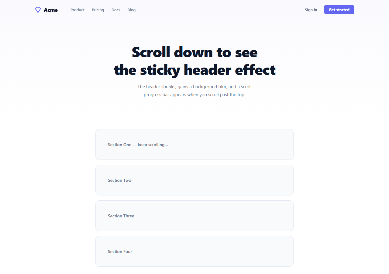
A sticky header that changes its appearance on scroll is one of the most universally used navigation patterns on the web. The header starts transparent and full-height at the top of the page, then transitions to a frosted glass appearance with reduced padding as the user scrolls. This snippet implements the complete sticky header pattern: position: fixed, scroll-triggered .scrolled class toggling, backdrop-filter blur, box-shadow transition, padding reduction, a scroll progress bar, and a mobile hamburger navigation.
The scroll event handler
A passive scroll event listener fires on every scroll event. It reads window.scrollY and toggles the .scrolled class on the header when scrollY > 20 (past the initial hero area). The passive: true option tells the browser this listener never calls preventDefault(), allowing it to run on a separate thread without blocking smooth scrolling.
The CSS transition approach
All header style changes are handled by CSS transitions on the .scrolled class — no JavaScript style manipulation. transition: background 0.25s, box-shadow 0.25s, padding 0.25s, backdrop-filter 0.25s on .header animates every property simultaneously when .scrolled is added or removed. The JavaScript only adds or removes one class.
The frosted glass blur
backdrop-filter: blur(12px) creates the frosted glass effect. background: rgba(255,255,255,0.9) provides the semi-transparent tint. -webkit-backdrop-filter is the Safari prefix. The header must NOT be fully opaque — the blurred content behind must show through for the effect to work.
The scroll progress bar
The built-in scroll progress bar uses scrollY / (scrollHeight - innerHeight) × 100 for the scroll percentage. The progress bar uses this percentage as its width. opacity transitions from 0 to 1 when .scrolled is applied, keeping the bar hidden at the top of the page.
Mobile hamburger navigation
On screens under 640px, the nav and CTA buttons hide and the hamburger button appears. Clicking it toggles .mobile-open on the nav (which switches it to an absolute dropdown panel) and .open on the burger (which animates the three spans into an ×). The mobile nav slides in from below the header.
Preventing layout shift
When the header transitions from absolute to fixed (or from tall to short), content can jump because the document flow changes. Prevent this by wrapping the page content in a container with padding-top equal to the header's maximum height. This reserves space for the header at all scroll positions without layout recalculation.
Build with AI
Build, Understand, Optimize, and Extend It With AI
You don't have to work out the scroll-to-percentage math by hand. Paste this snippet's HTML, CSS, and JS into an AI coding assistant like Claude and ask it to explain exactly how maxScroll and pct are derived from scrollHeight and innerHeight, and why passive: true on the scroll listener matters for smooth scrolling on the compositor thread. The same assistant can help optimize it — for instance whether the single scroll handler that both toggles the scrolled class and updates the progress bar width should be split or debounced differently for very long pages, or whether backdrop-filter blur has a measurable cost on lower-end devices. It's also useful for extending the header: ask it to highlight the current nav link based on which section is in view with an IntersectionObserver, add a hide-on-scroll-down/show-on-scroll-up behavior, or make the mobile dropdown animate its height instead of just appearing. Treat the code less like a finished artifact and more like a starting point for a conversation.
Prompt to recreate it
Copy this into your AI assistant of choice to build the effect from scratch, or as a jumping-off point for your own variant:
Build a scroll-reactive "sticky header" in plain HTML, CSS, and JavaScript using a single passive scroll listener and CSS transitions — no framework, no scroll library.

Requirements:
- A fixed-position header that starts transparent with generous padding, and gains a semi-transparent background, backdrop-filter blur, a box-shadow, and reduced padding once the page has scrolled past a small pixel threshold (e.g. 20px) — all of these style changes must be driven by toggling a single CSS class, not by setting individual inline styles from JavaScript.
- A thin scroll progress bar inside the header whose width is set, on every scroll event, to the percentage computed as window.scrollY divided by (document.documentElement.scrollHeight minus window.innerHeight) times 100, clamped to avoid division by zero when the page isn't scrollable.
- The scroll event listener must be registered with the passive: true option so it never blocks the browser's scroll compositor thread.
- A responsive nav that hides the inline links and call-to-action buttons under a set breakpoint and replaces them with a hamburger button; clicking the hamburger must toggle a class that shows an absolutely positioned dropdown panel below the header and simultaneously animates the three hamburger bars into an X shape using CSS transforms, while also updating the button's aria-expanded attribute for accessibility.
- Ensure the header transition covers background, box-shadow, padding, and backdrop-filter together so all these properties change in sync when the scrolled class is toggled.
Want to tighten it up first? Run this prompt through the AI Prompt Studio to score it across 8 quality dimensions, catch anti-patterns, and tune the wording for Claude, ChatGPT, or Gemini before you paste it in.
Source Code
<div class="page">
  <header class="header" id="header">
    <div class="header-inner">
      <a href="#" class="logo">
        <svg width="22" height="22" viewBox="0 0 24 24" fill="none" stroke="currentColor" stroke-width="2.5" stroke-linecap="round" stroke-linejoin="round"><polygon points="12 2 2 7 12 22 22 7 12 2"/></svg>
        <span>Acme</span>
      </a>

      <nav class="nav" id="nav">
        <a href="#" class="nav-link">Product</a>
        <a href="#" class="nav-link">Pricing</a>
        <a href="#" class="nav-link">Docs</a>
        <a href="#" class="nav-link">Blog</a>
      </nav>

      <div class="header-cta">
        <a href="#" class="btn-ghost">Sign in</a>
        <a href="#" class="btn-solid">Get started</a>
      </div>

      <button class="burger" id="burger" onclick="toggleMobileNav()" aria-label="Menu" aria-expanded="false">
        <span></span><span></span><span></span>
      </button>
    </div>

    <div class="scroll-bar" id="scroll-bar"></div>
  </header>

  <div class="hero-section">
    <h1>Scroll down to see<br>the sticky header effect</h1>
    <p>The header shrinks, gains a background blur, and a scroll progress bar appears when you scroll past the top.</p>
  </div>

  <div class="content-blocks">
    <div class="block">Section One — keep scrolling…</div>
    <div class="block">Section Two</div>
    <div class="block">Section Three</div>
    <div class="block">Section Four</div>
  </div>
</div>
* { box-sizing: border-box; margin: 0; padding: 0; }
body { font-family: system-ui, sans-serif; background: #fff; }
.page { min-height: 300vh; }
/* Header */
.header { position: fixed; top: 0; left: 0; right: 0; z-index: 100; transition: background 0.25s, box-shadow 0.25s, padding 0.25s, backdrop-filter 0.25s; padding: 16px 0; }
.header.scrolled { background: rgba(255,255,255,0.9); backdrop-filter: blur(12px); -webkit-backdrop-filter: blur(12px); box-shadow: 0 1px 0 rgba(0,0,0,0.06); padding: 10px 0; }
.header-inner { max-width: 1100px; margin: 0 auto; padding: 0 24px; display: flex; align-items: center; gap: 32px; }
.logo { display: flex; align-items: center; gap: 8px; text-decoration: none; font-size: 17px; font-weight: 800; color: #0f172a; letter-spacing: -0.3px; }
.logo svg { color: #6366f1; }
.nav { display: flex; align-items: center; gap: 4px; flex: 1; }
.nav-link { font-size: 13px; font-weight: 500; color: #64748b; text-decoration: none; padding: 7px 10px; border-radius: 7px; transition: color 0.12s, background 0.12s; }
.nav-link:hover { color: #0f172a; background: #f8fafc; }
.header-cta { display: flex; align-items: center; gap: 8px; flex-shrink: 0; }
.btn-ghost { font-size: 13px; font-weight: 600; color: #475569; text-decoration: none; padding: 7px 14px; border-radius: 8px; transition: color 0.12s; }
.btn-ghost:hover { color: #0f172a; }
.btn-solid { font-size: 13px; font-weight: 700; color: #fff; background: #6366f1; text-decoration: none; padding: 7px 16px; border-radius: 8px; transition: background 0.12s; }
.btn-solid:hover { background: #4f46e5; }
/* Scroll progress bar */
.scroll-bar { position: absolute; bottom: 0; left: 0; height: 2px; background: linear-gradient(90deg,#6366f1,#ec4899); width: 0%; transition: opacity 0.3s; opacity: 0; }
.header.scrolled .scroll-bar { opacity: 1; }
/* Burger */
.burger { display: none; flex-direction: column; gap: 4px; background: transparent; border: none; cursor: pointer; padding: 4px; }
.burger span { width: 20px; height: 2px; background: #374151; border-radius: 2px; transition: all 0.2s; display: block; }
.burger.open span:nth-child(1) { transform: rotate(45deg) translate(4px, 4px); }
.burger.open span:nth-child(2) { opacity: 0; }
.burger.open span:nth-child(3) { transform: rotate(-45deg) translate(4px, -4px); }
@media (max-width: 640px) {
.nav, .header-cta { display: none; }
.nav.mobile-open { display: flex; flex-direction: column; position: absolute; top: 100%; left: 0; right: 0; background: #fff; padding: 12px; border-bottom: 1px solid #f1f5f9; box-shadow: 0 8px 24px rgba(0,0,0,0.08); }
.burger { display: flex; margin-left: auto; }
}
/* Page content */
.hero-section { padding: 140px 24px 80px; text-align: center; background: linear-gradient(180deg,#fafafe,#fff); }
.hero-section h1 { font-size: clamp(28px,5vw,48px); font-weight: 800; color: #0f172a; letter-spacing: -1px; line-height: 1.2; margin-bottom: 16px; }
.hero-section p { font-size: 15px; color: #64748b; max-width: 420px; margin: 0 auto; line-height: 1.75; }
.content-blocks { max-width: 700px; margin: 0 auto; padding: 20px 24px 120px; display: flex; flex-direction: column; gap: 16px; }
.block { background: #f8fafc; border: 1px solid #e2e8f0; border-radius: 12px; padding: 40px; font-size: 14px; color: #64748b; font-weight: 500; }const header = document.getElementById('header');
const scrollBar = document.getElementById('scroll-bar');
window.addEventListener('scroll', () => {
const scrollY = window.scrollY;
const maxScroll = document.documentElement.scrollHeight - window.innerHeight;
const pct = maxScroll > 0 ? (scrollY / maxScroll) * 100 : 0;
// Sticky scrolled class
header.classList.toggle('scrolled', scrollY > 20);
// Progress bar
scrollBar.style.width = pct.toFixed(1) + '%';
}, { passive: true });
function toggleMobileNav() {
const nav = document.getElementById('nav');
const burger = document.getElementById('burger');
const isOpen = nav.classList.toggle('mobile-open');
burger.classList.toggle('open', isOpen);
burger.setAttribute('aria-expanded', isOpen);
}Step by step
How to Use
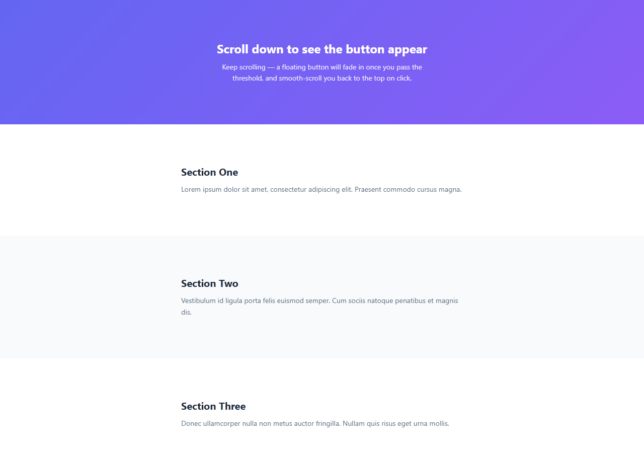
- 1Scroll down to see the header transformPast 20px of scroll the header gains a frosted glass background, box-shadow, and reduced padding. The scroll progress bar appears and grows as you scroll further down the page.
- 2Resize to mobile to test the hamburger navAt under 640px wide, the nav links and CTA buttons hide and a hamburger button appears. Click it to toggle the mobile dropdown nav. The three lines animate to an × when open.
- 3Update the logo and nav linksReplace the SVG icon and "Acme" text in .logo. Edit the four .nav-link anchor elements with your page sections and routes. Update .btn-solid and .btn-ghost href values.
- 4Change the scroll trigger thresholdUpdate scrollY > 20 in the JavaScript to any pixel value. Use > 0 to trigger immediately on any scroll, or > 100 to wait until the user has scrolled past the full hero area.
- 5Change the frosted glass colourUpdate rgba(255,255,255,0.9) on .header.scrolled for a coloured tint — e.g. rgba(15,23,42,0.8) for a dark header. Also update nav-link, logo, and button colours to maintain contrast on the new background.
- 6Export in your formatClick "HTML" for a standalone file, "JSX" for a React component using useEffect for the scroll listener, or "Tailwind" for a React + Tailwind CSS version.
Real-world uses
Common Use Cases
Got questions?
Frequently Asked Questions
The passive: true option tells the browser that this scroll listener will never call e.preventDefault(). This allows the browser to continue smooth scrolling on a separate thread (the compositor) without waiting for the JavaScript to finish. Without passive: true, the browser must wait for the scroll handler to complete before advancing the scroll position, which can cause jank on slow devices. Always add passive: true to scroll, touchstart, and touchmove listeners that do not prevent default.
For a dark hero, start the header with no background (remove the default white background). Set nav-link, logo, and button text colours to white or light grey. When .scrolled applies, the dark rgba background and light text remain. Add a CSS transition for color on .nav-link and .logo so the text colour also transitions smoothly when the header changes state: .header.scrolled .nav-link { color: #64748b; }.
For a multi-page site, add .active to the link matching the current URL: const current = window.location.pathname; document.querySelectorAll(".nav-link").forEach(link => { link.classList.toggle("active", link.getAttribute("href") === current); }). For smooth scroll single-page navigation, use IntersectionObserver to add .active to the link corresponding to the currently visible section. Style .active: color: #6366f1; font-weight: 600.
Click "JSX" to download. The header component needs "use client" since it uses a scroll event listener. In a useEffect: window.addEventListener("scroll", handler, { passive: true }); return () => window.removeEventListener("scroll", handler). Manage scrolled state with useState(false). In Next.js, use this as a client component inside your app/layout.tsx server component: import Header from "@/components/Header"; export default function Layout({ children }) { return <><Header />{children}</>; }.