Source Code
<div class="carousel-wrap">
  <div class="carousel-header">
    <h2>Related articles</h2>
    <div class="carousel-controls">
      <button class="carousel-btn" id="prevBtn" onclick="scrollByCard(-1)" aria-label="Previous article">
        <svg viewBox="0 0 24 24" width="16" height="16" fill="none" stroke="currentColor" stroke-width="2.5" stroke-linecap="round" stroke-linejoin="round"><polyline points="15 18 9 12 15 6"/></svg>
      </button>
      <button class="carousel-btn" id="nextBtn" onclick="scrollByCard(1)" aria-label="Next article">
        <svg viewBox="0 0 24 24" width="16" height="16" fill="none" stroke="currentColor" stroke-width="2.5" stroke-linecap="round" stroke-linejoin="round"><polyline points="9 18 15 12 9 6"/></svg>
      </button>
    </div>
  </div>
  <div class="carousel-track" id="carouselTrack">
    <a class="article-card" href="#"><div class="cover" style="background: linear-gradient(135deg,#6366f1,#8b5cf6)"></div><h3>Why we rebuilt our design system</h3><span class="read-time">6 min read</span></a>
    <a class="article-card" href="#"><div class="cover" style="background: linear-gradient(135deg,#f97316,#f43f5e)"></div><h3>Shipping faster without breaking trust</h3><span class="read-time">4 min read</span></a>
    <a class="article-card" href="#"><div class="cover" style="background: linear-gradient(135deg,#10b981,#06b6d4)"></div><h3>The case for boring UI patterns</h3><span class="read-time">5 min read</span></a>
    <a class="article-card" href="#"><div class="cover" style="background: linear-gradient(135deg,#eab308,#f97316)"></div><h3>A retro on our Q2 roadmap</h3><span class="read-time">7 min read</span></a>
    <a class="article-card" href="#"><div class="cover" style="background: linear-gradient(135deg,#ec4899,#8b5cf6)"></div><h3>Notes from our first offsite</h3><span class="read-time">3 min read</span></a>
    <a class="article-card" href="#"><div class="cover" style="background: linear-gradient(135deg,#0ea5e9,#6366f1)"></div><h3>How we onboard new engineers</h3><span class="read-time">8 min read</span></a>
  </div>
</div>
* { box-sizing: border-box; }
body { font-family: system-ui, sans-serif; background: #f8fafc; padding: 32px; margin: 0; display: flex; align-items: center; justify-content: center; min-height: 100vh; }
.carousel-wrap { width: 100%; max-width: 760px; margin: 0 auto; }
.carousel-header {
display: flex;
align-items: center;
justify-content: space-between;
margin-bottom: 14px;
}
.carousel-header h2 { font-size: 18px; color: #1e293b; margin: 0; }
.carousel-controls { display: flex; gap: 8px; }
.carousel-btn {
width: 32px;
height: 32px;
border-radius: 50%;
border: 1px solid #e2e8f0;
background: #fff;
color: #475569;
display: flex;
align-items: center;
justify-content: center;
cursor: pointer;
transition: background 0.15s, color 0.15s;
}
.carousel-btn:hover { background: #6366f1; color: #fff; border-color: #6366f1; }
.carousel-btn:focus-visible { outline: 2px solid #6366f1; outline-offset: 2px; }
/*
scroll-snap-type on the track combined with scroll-snap-align on each
card makes the scroll position always settle on a card boundary,
whether the user drags, uses a trackpad, or clicks the arrow buttons.
*/
.carousel-track {
display: flex;
gap: 16px;
overflow-x: auto;
scroll-snap-type: x mandatory;
scroll-behavior: smooth;
padding-bottom: 6px;
-ms-overflow-style: none;
scrollbar-width: none;
}
.carousel-track::-webkit-scrollbar { display: none; }
.article-card {
flex: 0 0 200px;
scroll-snap-align: start;
background: #fff;
border: 1px solid #e2e8f0;
border-radius: 12px;
overflow: hidden;
text-decoration: none;
transition: transform 0.15s ease, box-shadow 0.15s ease;
}
.article-card:hover {
transform: translateY(-3px);
box-shadow: 0 10px 22px rgba(0,0,0,0.08);
}
.cover { height: 100px; width: 100%; }
.article-card h3 {
font-size: 13.5px;
color: #1e293b;
margin: 12px 14px 8px;
line-height: 1.4;
}
.read-time {
display: block;
font-size: 11.5px;
color: #94a3b8;
margin: 0 14px 14px;
}const track = document.getElementById('carouselTrack');
function scrollByCard(direction) {
const card = track.querySelector('.article-card');
const cardWidth = card.getBoundingClientRect().width;
const gap = parseFloat(getComputedStyle(track).gap) || 16;
track.scrollBy({ left: direction * (cardWidth + gap), behavior: 'smooth' });
}Learn Coding Visually
Learn to code with interactive, live-preview playgrounds — HTML, CSS, JavaScript, React & more.
 HTML Playground42 lessons · Click-based · Live preview
 CSS PlaygroundLearn CSS with a live editor
 JavaScript Playground60 lessons · DOM · Async · Canvas
 React PlaygroundLearn React with a live code editor
 GSAP PlaygroundLearn GSAP animation interactively
 SVG Playground44 lessons · shapes · paths · animation
 SCSS Playground45 lessons · Sass modules · tokens
 Tailwind PlaygroundLearn Tailwind CSS with a live editor
 Bootstrap 5 Playground50 lessons · live preview
Related Articles Carousel — Free HTML CSS JS Scroll-Snap Snippet
Related Articles Carousel · Scroll · Plain HTML, CSS & JS · Live preview
What's included
Features
About this UI Snippet
Related Articles Carousel — HTML, CSS & JavaScript Scroll-Snap Carousel
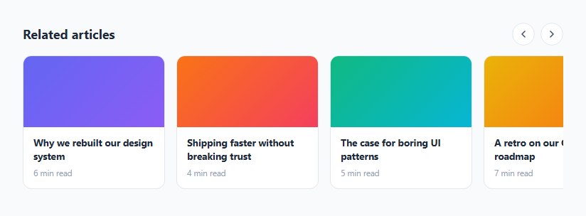
A "related articles" row at the bottom of a blog post needs to show more cards than fit on screen at once, scroll smoothly, and always come to rest with a card cleanly aligned to the edge — never stopped halfway between two cards. Modern CSS handles the alignment part natively via scroll-snap, and a small amount of JavaScript adds prev/next arrow buttons for people who'd rather click than drag.
This snippet builds the whole carousel in plain HTML, CSS, and vanilla JavaScript.
How scroll-snap keeps cards aligned
The scrolling container, .carousel-track, has overflow-x: auto and scroll-snap-type: x mandatory. Every .article-card inside it has scroll-snap-align: start. Together, these two properties tell the browser: this is a horizontally scrollable area, and whenever scrolling comes to rest, snap the nearest card's start edge to the container's edge. This works identically whether the user drags with a mouse, scrolls with a trackpad, swipes on a touchscreen, or the container is scrolled programmatically — the browser handles the snapping physics natively, no JavaScript needed for that part.
How the arrow buttons work
Clicking the next/previous buttons calls scrollByCard(direction), which reads the actual rendered width of the first card via getBoundingClientRect() and the track's gap value from its computed style, then calls track.scrollBy({ left: direction * (cardWidth + gap), behavior: 'smooth' }). Because this measures the real card width and gap at runtime rather than hardcoding a pixel value, the arrows keep scrolling exactly one card at a time even if you change the card size or gap in the CSS panel.
Hiding the native scrollbar
scrollbar-width: none (Firefox) and a ::-webkit-scrollbar { display: none } rule (Chrome/Safari/Edge) hide the browser's default horizontal scrollbar, since the arrow buttons and touch/trackpad scrolling already provide enough affordance — this keeps the carousel visually clean without sacrificing scrollability.
Why scroll-snap instead of a full carousel library
Older carousels needed JavaScript to calculate slide positions, handle transitions, and manage infinite-loop wrapping. CSS scroll-snap moved most of that responsibility into the browser's own scrolling engine, which means better performance (no JS-driven animation frames), better touch/trackpad feel (it's real native scrolling, not a simulation), and dramatically less code.
Build with AI
Build, Understand, Optimize, and Extend It With AI
Give this snippet's HTML, CSS, and JS to an AI coding assistant like Claude and ask it to explain exactly how scroll-snap-type on the container and scroll-snap-align on each card cooperate to produce native, physically-correct snapping regardless of whether the user drags, swipes, or clicks a button — and why that native approach behaves more smoothly on touch devices than a JavaScript-simulated carousel would. It's also worth asking the assistant to help extend this into a true infinite-loop carousel if your use case needs one, since that requires either cloning cards at both ends and silently repositioning scroll on wraparound, or a more involved virtualized approach — both meaningfully more complex than the finite scroll-snap row shown here, so it's worth discussing the tradeoff before committing to it.
Prompt to recreate it
Copy this into your AI assistant of choice to build the effect from scratch, or as a jumping-off point for your own variant:
Build a horizontally scrollable "related articles" carousel in plain HTML, CSS, and JavaScript, using native CSS scroll-snap — no carousel/slider library.

Requirements:
- A horizontally scrolling flex container with overflow-x: auto and scroll-snap-type: x mandatory, containing several fixed-width article cards, each a real anchor element with scroll-snap-align: start so scrolling always comes to rest with a card cleanly aligned to the container's edge.
- Hide the native horizontal scrollbar cross-browser (both the Firefox scrollbar-width property and the WebKit ::-webkit-scrollbar pseudo-element) while keeping the row fully scrollable by drag, trackpad, and touch.
- Add a previous and a next arrow button above or beside the carousel that scroll the container by exactly one card's width (measured at runtime from the actual rendered card width and the container's gap, not a hardcoded pixel value) using scrollBy with smooth behavior.
- Each card must contain a cover image placeholder, a headline, and a small secondary metadata line (such as a read-time estimate), and must remain a functioning link even if JavaScript fails to load.
- The solution must support any number of cards without requiring changes to the JavaScript or CSS, and must not implement any custom drag-tracking or touch-event handling — rely entirely on native scrolling plus scroll-snap for the interaction itself.
Want to tighten it up first? Run this prompt through the AI Prompt Studio to score it across 8 quality dimensions, catch anti-patterns, and tune the wording for Claude, ChatGPT, or Gemini before you paste it in.
Step by step
How to Use
- 1Load the snippetClick "Related Articles Carousel" in the sidebar Library tab. The preview shows six article cards in a horizontally scrollable row.
- 2Try the arrow buttonsClick the left and right arrow buttons to scroll exactly one card at a time, smoothly snapping into alignment.
- 3Try dragging or scrolling directlyScroll the row directly with a trackpad, mouse wheel (shift+scroll), or touch drag — notice it still snaps cleanly to a card edge when you stop.
- 4Add more articlesIn the HTML panel, copy an existing .article-card anchor and update its gradient, title, and read time — no JS or CSS changes are needed.
- 5Adjust the card widthIn the CSS panel, change the flex-basis value (200px) on .article-card — the arrow scroll distance automatically adjusts since it's measured at runtime.
- 6Export in your formatClick "HTML" for a standalone file, "JSX" for React, or "Tailwind" for React + Tailwind CSS.
Real-world uses
Common Use Cases
Got questions?
Frequently Asked Questions
No. The core scrolling and snapping behavior comes entirely from native CSS scroll-snap properties. The only JavaScript is a small function that scrolls the container by one card width when the arrow buttons are clicked — everything else is handled by the browser.
scroll-snap-type: x mandatory on the container tells the browser this axis must always come to rest on a snap point. scroll-snap-align: start on each card marks that card's starting edge as a snap point. The browser then always settles the scroll position on the nearest card's start edge, regardless of how the scroll was triggered.
scrollByCard() measures the first card's actual rendered width with getBoundingClientRect() and reads the track's gap value from its computed styles, then scrolls by exactly cardWidth + gap. This means the buttons always advance exactly one card, even if you resize the cards or change the gap in CSS.
scrollbar-width: none (for Firefox) and a matching ::-webkit-scrollbar rule (for Chromium/WebKit browsers) hide the default horizontal scrollbar so the carousel looks cleaner, while overflow-x: auto still keeps the row fully scrollable by drag, trackpad, touch, or the arrow buttons.
Yes — scroll-snap is native browser scrolling, so touch swiping works naturally and snaps to card boundaries exactly like mouse or trackpad scrolling does, with no separate touch-event handling required.
Copy an existing .article-card anchor element in the HTML panel and update its gradient background, title text, and read-time label. No JavaScript or CSS changes are needed — the scroll-snap behavior and arrow-button math both scale automatically to any number of cards.
Not with this snippet as written — it stops at the natural start and end of the scrollable content. A true infinite loop requires either duplicating cards at both ends and jumping the scroll position invisibly, or reordering the DOM on each scroll, both of which add meaningful complexity compared to this straightforward snap-based approach.
Yes — every .article-card is a genuine anchor tag with an href, so clicking a card navigates normally even if JavaScript fails to load; only the arrow-button scrolling behavior depends on the script.