Source Code
<div class="scene">
  <div class="rings">
    <div class="ring-wrap">
      <svg width="100" height="100" viewBox="0 0 100 100">
        <circle class="track" cx="50" cy="50" r="40"/>
        <circle class="fill" cx="50" cy="50" r="40" id="r1" data-pct="75"/>
      </svg>
      <div class="ring-label"><span class="pct" id="p1">0</span>%<span class="desc">Performance</span></div>
    </div>
    <div class="ring-wrap">
      <svg width="100" height="100" viewBox="0 0 100 100">
        <circle class="track" cx="50" cy="50" r="40"/>
        <circle class="fill pink" cx="50" cy="50" r="40" id="r2" data-pct="92"/>
      </svg>
      <div class="ring-label"><span class="pct" id="p2">0</span>%<span class="desc">Accessibility</span></div>
    </div>
    <div class="ring-wrap">
      <svg width="100" height="100" viewBox="0 0 100 100">
        <circle class="track" cx="50" cy="50" r="40"/>
        <circle class="fill green" cx="50" cy="50" r="40" id="r3" data-pct="58"/>
      </svg>
      <div class="ring-label"><span class="pct" id="p3">0</span>%<span class="desc">SEO</span></div>
    </div>
  </div>
  <button class="replay" onclick="animateRings()">Replay ↺</button>
</div>
* { box-sizing: border-box; margin: 0; padding: 0; }
body { font-family: system-ui, sans-serif; background: #0f172a; display: flex; align-items: center; justify-content: center; min-height: 100vh; }
.scene { display: flex; flex-direction: column; align-items: center; gap: 28px; }
.rings { display: flex; gap: 24px; flex-wrap: wrap; justify-content: center; }
.ring-wrap { display: flex; flex-direction: column; align-items: center; gap: 10px; }
svg { transform: rotate(-90deg); }
.track { fill: none; stroke: #1e293b; stroke-width: 8; }
.fill {
fill: none; stroke: #6366f1; stroke-width: 8;
stroke-linecap: round;
stroke-dasharray: 251.2;
stroke-dashoffset: 251.2;
transition: stroke-dashoffset 1.2s cubic-bezier(0.4,0,0.2,1);
}
.fill.pink { stroke: #ec4899; }
.fill.green { stroke: #10b981; }
.ring-label { text-align: center; transform: none; }
.pct { font-size: 20px; font-weight: 800; color: #f1f5f9; display: block; line-height: 1; }
.desc { font-size: 11px; color: #475569; display: block; margin-top: 3px; text-transform: uppercase; letter-spacing: 0.5px; }
.replay { padding: 8px 20px; background: none; border: 1px solid #334155; border-radius: 8px; font-size: 12px; font-weight: 600; color: #475569; cursor: pointer; font-family: inherit; transition: all 0.15s; }
.replay:hover { border-color: #6366f1; color: #6366f1; }const CIRCUMFERENCE = 2 * Math.PI * 40; // 251.2
function animateRings() {
document.querySelectorAll('.fill').forEach((circle, i) => {
const pct = parseFloat(circle.dataset.pct);
const pctEl = document.getElementById('p' + (i+1));
circle.style.strokeDashoffset = CIRCUMFERENCE;
pctEl.textContent = '0';
setTimeout(() => {
circle.style.strokeDashoffset = CIRCUMFERENCE * (1 - pct / 100);
let cur = 0;
const step = pct / 60;
const t = setInterval(() => {
cur = Math.min(pct, cur + step);
pctEl.textContent = Math.floor(cur);
if (cur >= pct) clearInterval(t);
}, 20);
}, i * 150);
});
}
animateRings();Learn Coding Visually
Learn to code with interactive, live-preview playgrounds — HTML, CSS, JavaScript, React & more.
 HTML Playground42 lessons · Click-based · Live preview
 CSS PlaygroundLearn CSS with a live editor
 JavaScript Playground60 lessons · DOM · Async · Canvas
 React PlaygroundLearn React with a live code editor
 GSAP PlaygroundLearn GSAP animation interactively
 SVG Playground44 lessons · shapes · paths · animation
 SCSS Playground45 lessons · Sass modules · tokens
 Tailwind PlaygroundLearn Tailwind CSS with a live editor
 Bootstrap 5 Playground50 lessons · live preview
SVG Progress Ring — Free HTML CSS JS Snippet
SVG Progress Ring · Loaders · Plain HTML, CSS & JS · Live preview
What's included
Features
About this UI Snippet
SVG Progress Ring — stroke-dashoffset, CIRCUMFERENCE Formula & Count-Up
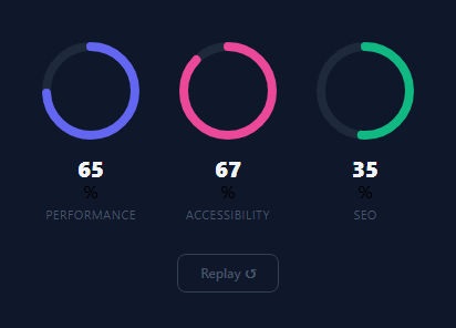
An SVG progress ring shows a percentage or progress value as a circular arc — used in analytics dashboards, skill showcases, goal-completion displays, and loading screens. The ring is built entirely with an SVG circle element and two CSS properties: stroke-dasharray and stroke-dashoffset. No canvas, no library, no images.
The mathematics: CIRCUMFERENCE = 2 × Math.PI × radius. Setting stroke-dasharray: CIRCUMFERENCE makes the stroke one continuous dash equal to the full circle perimeter. stroke-dashoffset controls where that dash starts along the perimeter — setting it to CIRCUMFERENCE hides the full ring (empty); setting it to 0 shows the full ring (100%). The fill formula: dashoffset = CIRCUMFERENCE × (1 - percentage / 100).
The rotate(-90deg) on the circle element moves the stroke start from 3 o'clock (SVG default) to 12 o'clock — the orientation users expect for progress rings. This is applied via CSS transform on the circle element.
The snippet shows three rings simultaneously at different radii, colours, and target percentages. Each ring has its own CIRCUMFERENCE calculation and a separate requestAnimationFrame count-up animation that ease-outs as it approaches the target value. The count-up uses a quartic ease-out function: progress = 1 - Math.pow(1 - t, 4) where t is elapsed time divided by duration.
The CSS transition: stroke-dashoffset 1s ease on the circle element provides an alternative to the JS animation — changing the data-pct attribute and computing dashoffset triggers the CSS transition automatically without any requestAnimationFrame loop. Use CSS transition for static displays; use the JS animation for dynamic updates that need synchronised number count-up.
Multiple rings at different sizes: change the r attribute and viewBox dimensions together. Keep the stroke-width proportional to the radius for visual consistency — a 52px radius ring looks best with a 6-8px stroke; a 100px radius ring can use 10-12px. Larger strokes make the ring appear as a thick gauge; thinner strokes give a delicate circular progress appearance.
For accessibility, add an aria-valuenow attribute that updates with the animated percentage, and aria-valuemin="0" and aria-valuemax="100" to communicate the range to screen readers. This ensures the progress value is announced correctly by assistive technology as the ring fills.
Build with AI
Build, Understand, Optimize, and Extend It With AI
You don't have to work out the stroke-dashoffset formula from scratch. Paste this snippet's HTML, CSS, and JS into an AI coding assistant like Claude and ask it to explain exactly why CIRCUMFERENCE equals 2 times pi times the radius, how the dashoffset formula of circumference times one minus the percentage hides or reveals the arc, and why the circle needs a rotate(-90deg) transform to start filling from 12 o'clock. The same assistant can help optimize it — for instance whether the count-up setInterval running alongside the CSS transition could drift out of sync on a slow device, or whether three independent intervals should be consolidated into one requestAnimationFrame loop. It's also useful for extending the rings: ask it to trigger the animation only when the rings scroll into view with an IntersectionObserver, add aria-valuenow updates for accessibility, or turn one ring into an indeterminate spinner for unknown-duration loading. Treat the code less like a finished artifact and more like a starting point for a conversation.
Prompt to recreate it
Copy this into your AI assistant of choice to build the effect from scratch, or as a jumping-off point for your own variant:
Build a set of "SVG progress rings" in plain HTML, CSS, and JavaScript using only stroke-dasharray and stroke-dashoffset — no canvas, no charting library.

Requirements:
- Multiple SVG circles, each with a background track circle and a foreground fill circle sharing the same center and radius, where the fill circle's stroke-dasharray is set to a CIRCUMFERENCE constant computed as 2 times Math.PI times the circle's radius.
- The fill circle must start with stroke-dashoffset equal to the full circumference (fully hidden) and animate to an offset equal to circumference times (1 minus target-percentage/100) to visually reveal that percentage of the ring, driven by a CSS transition on stroke-dashoffset.
- Apply a rotate(-90deg) CSS transform to the SVG element (or the circle) so the arc begins filling from the top of the circle (12 o'clock position) instead of the SVG default starting point at 3 o'clock.
- Each ring's target percentage must be read from a data attribute on its fill circle element (not hardcoded in the JS), so adding a new ring with a new target requires only a markup change.
- Alongside the ring animation, run a synchronized count-up of the displayed percentage number from 0 to the target value, incrementing in small steps via setInterval so the number reaches the target at roughly the same time the ring finishes filling.
- Stagger the start of each ring's animation with a small per-ring delay (e.g. based on its index) so multiple rings don't all animate in perfect lockstep.
- Give the fill circles rounded stroke-linecaps and a Replay button that resets every ring's dashoffset back to the full circumference and re-triggers the fill and count-up animations from zero.
Want to tighten it up first? Run this prompt through the AI Prompt Studio to score it across 8 quality dimensions, catch anti-patterns, and tune the wording for Claude, ChatGPT, or Gemini before you paste it in.
Step by step
How to Use
- 1Watch the rings animateThe three rings count up from 0 to their target percentages using requestAnimationFrame with ease-out deceleration.
- 2Update ring percentagesIn the HTML panel, change the data-pct attribute on each .fill circle element to your target percentage (0-100).
- 3Change ring coloursUpdate stroke colour on .fill elements in the CSS panel — or use different stroke colours per ring via inline stroke attributes.
- 4Change the ring sizeUpdate r="40" on the SVG circles and recalculate CIRCUMFERENCE = 2 * Math.PI * newR in the JS panel.
- 5Add labelsUpdate the percentage text and ring label in the HTML panel for each .ring-wrap div.
- 6Export in your formatClick "HTML" for a standalone file, "JSX" for a React component, or "Tailwind" for a React + Tailwind version.
Real-world uses
Common Use Cases
Got questions?
Frequently Asked Questions
CIRCUMFERENCE = 2*Math.PI*radius = 2*3.14159*40 = 251.2px. stroke-dasharray: 251.2 sets the full ring as one dash exactly one circumference long. stroke-dashoffset shifts the start of that dash: at 0 the full ring is visible; at 251.2 it is fully hidden. To show 75%: offset = 251.2 * (1 - 0.75) = 62.8px.
SVG starts drawing at the 3 o'clock position (rightmost point of the circle). Rotating by -90 degrees moves the starting point to 12 o'clock (top centre), which is the conventional start for progress indicators — matching how clock hands, speedometers, and activity rings work.
Update r="40" on both the .track and .fill circle elements. Update cx and cy to half your new SVG viewBox size. In the JS panel, update const CIRCUMFERENCE = 2 * Math.PI * newRadius. The stroke-width (8) can also be adjusted proportionally to the new size.
Wrap animateRings() in an IntersectionObserver: const obs = new IntersectionObserver(entries => { entries.forEach(e => { if(e.isIntersecting) { animateRings(); obs.disconnect(); } }); }, { threshold: 0.5 }); obs.observe(document.querySelector(".rings")). This fires exactly once when the rings section scrolls into view.
Add a stroke attribute directly on each .fill circle: <circle class="fill" stroke="#22c55e" ...>. The inline attribute overrides the CSS stroke colour for that specific element. Use semantic colours: green for good performance, amber for moderate, red for below target.
Yes. Create a ProgressRing component with pct and colour props. Use useEffect to start the animation on mount: the effect reads the pct prop and animates strokeDashoffset via useRef on the circle element. Pass an animate={true} prop to trigger the animation when the component becomes visible.