Learn Coding Visually
Learn to code with interactive, live-preview playgrounds — HTML, CSS, JavaScript, React & more.
 HTML Playground42 lessons · Click-based · Live preview
 CSS PlaygroundLearn CSS with a live editor
 JavaScript Playground60 lessons · DOM · Async · Canvas
 React PlaygroundLearn React with a live code editor
 GSAP PlaygroundLearn GSAP animation interactively
 SVG Playground44 lessons · shapes · paths · animation
 SCSS Playground45 lessons · Sass modules · tokens
 Tailwind PlaygroundLearn Tailwind CSS with a live editor
 Bootstrap 5 Playground50 lessons · live preview
Activity Rings — Concentric Progress Rings HTML CSS
Activity Rings · Dashboards · Plain HTML, CSS & JS · Live preview
What's included
Features
About this UI Snippet
Activity Rings — Apple-Style Concentric Goal Rings in SVG
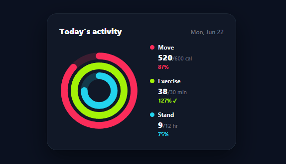
Apple's activity rings — three nested, brightly colored arcs that fill as you close each daily goal — are one of the most recognizable data visualizations ever shipped, because they pack three progress metrics into one glanceable, motivating graphic. This snippet recreates that concentric-rings pattern in plain HTML, CSS, and SVG: any number of rings, each animating from empty to its goal percentage, with a matching value/goal legend.
Nested rings from one loop
Each ring is a pair of SVG circles — a faint full-circle track and a colored progress arc — sharing a center but with a decreasing radius so they nest inside one another. The radius for ring i steps inward by the stroke width plus a gap (CENTER − STROKE/2 − 4 − i × (STROKE + GAP)), so the rings sit concentrically with even spacing regardless of how many you add. Thick stroke-linecap: round strokes give the signature chunky, rounded-end look. It's all generated in a single loop over the ring data, so three rings or five is the same code.
The fill is stroke-dashoffset, capped at 100%
Each progress arc uses the stroke-dasharray / stroke-dashoffset technique: the dasharray is set to the circle's circumference, and the dashoffset starts at the full circumference (empty) and animates to circumference × (1 − percent) so the arc fills to exactly the goal fraction. The percent is clamped to 1, so an over-achieved goal (like 38 of 30 exercise minutes in the demo) fills the ring completely rather than overflowing — and the legend still shows the true 127%, the way Apple's rings do. The arcs are rotated −90° so they start filling from the top (12 o'clock) rather than 3 o'clock.
Animation that draws the rings on
On load, each arc starts empty and animates to its filled offset via a CSS transition with a smooth ease, using the double-requestAnimationFrame pattern to ensure the browser registers the starting state before the transition runs (otherwise it would jump straight to filled with no animation). The rings sweep into place over a second, which is both satisfying and draws the eye to each metric's progress — the motion is the moment that makes the rings feel alive rather than static.
A legend that names the numbers
Rings alone are evocative but ambiguous, so a legend lists each ring's name, current value over goal with units ("520/600 cal"), and percentage, color-matched to its arc, with a ✓ when a goal is met. This pairs the at-a-glance ring graphic with the precise numbers, covering both the "how am I doing overall" and "exactly what are my numbers" questions. Color is the link between a ring and its legend row.
Fully data-driven and re-themeable
Everything comes from the RINGS array — name, value, goal, unit, color — so adapting this to any three (or more) goals is a data edit. Apple uses Move/Exercise/Stand, but the same component works for any nested-goal display: daily tasks done, calories/protein/water, or three KPIs against targets. Swap the colors and labels and it fits any brand or metric set.
Build with AI
Build, Understand, Optimize, and Extend It With AI
You don't have to work through the circle geometry yourself — paste this snippet's HTML, CSS, and JS into an AI coding assistant like Claude and ask it to explain exactly how the radius formula CENTER minus STROKE/2 minus 4 minus i times (STROKE plus GAP) keeps each ring evenly nested, and why the stroke-dashoffset is clamped separately from the percentage shown in the legend. The same assistant is useful for optimizing it — asking whether building the SVG circles imperatively with createElementNS is worth it here versus writing the SVG markup directly and only updating dashoffset in JS. It's just as good for extending the rings: ask it to add a fourth ring with a different unit, animate the legend numbers counting up alongside the ring fill, or make the rings interactive so clicking one shows a weekly history chart for that metric. Treat the code less like a finished artifact and more like a starting point for a conversation.
Prompt to recreate it
Copy this into your AI assistant of choice to build the effect from scratch, or as a jumping-off point for your own variant:
Build Apple-style "activity rings" (concentric animated goal progress rings) in plain HTML, CSS, and JavaScript using SVG — no charting library, no canvas.

Requirements:
- A data array of ring objects, each with a name, current value, goal, unit, and color, rendered as nested SVG circles generated entirely from a loop (not one hardcoded circle per ring).
- Each ring must consist of two concentric SVG circle elements sharing the same center: a faint, low-opacity full "track" circle, and a colored "progress" arc drawn on top of it.
- Compute each ring's radius so that ring index 0 is the outermost and each subsequent ring's radius steps inward by exactly one stroke-width-plus-gap amount, so any number of rings nest evenly with no overlap and no gaps, using only the ring's index in the formula.
- The progress arc must use the stroke-dasharray/stroke-dashoffset technique: set the dasharray to the circle's circumference, start the dashoffset at the full circumference (empty), and animate it via a CSS transition to circumference times (1 minus the completion fraction) so it visually fills to the goal percentage. Clamp the fill fraction used for the dashoffset to a maximum of 100%, but keep tracking and displaying the true, uncapped percentage separately in a legend (so a ring that's 127% of goal shows a full ring but a legend that reads "127%").
- Rotate each progress arc -90 degrees around its center so it starts filling from the 12 o'clock position rather than 3 o'clock, and give the strokes a round linecap for the characteristic chunky rounded-end look.
- Trigger the fill animation using two nested requestAnimationFrame calls after the arcs are inserted into the DOM (not immediately), so the transition actually plays on load instead of jumping straight to the filled state.
- Generate a legend below or beside the rings from the same data array, showing each ring's color-matched dot, name, "value/goal unit" text, and percentage with a checkmark when the goal is met or exceeded.
Want to tighten it up first? Run this prompt through the AI Prompt Studio to score it across 8 quality dimensions, catch anti-patterns, and tune the wording for Claude, ChatGPT, or Gemini before you paste it in.
Step by step
How to Use
- 1Paste HTML, CSS, and JSAn activity-rings card renders on a dark background; the three rings animate from empty to their goal progress.
- 2Read the ringsEach concentric ring fills toward its goal — Move, Exercise, Stand — in its own color, starting from the top.
- 3Check the legendThe side legend shows each ring's value/goal with units and percentage, color-matched, with a ✓ when met.
- 4Note over-achievementA goal exceeded (38/30 min) fills its ring completely while the legend shows the true 127%.
- 5Edit the goalsChange the RINGS array (name, value, goal, unit, color) — radii, animation, and legend all recompute.
- 6Connect real dataPopulate RINGS from your fitness, habit, or goal data and re-run build() to draw the day's progress.
Real-world uses
Common Use Cases
Got questions?
Frequently Asked Questions
Edit the RINGS array — each entry has a name, value, goal, unit, and color. The build loop computes each ring's radius from its index, so adding a fourth ring nests it inside automatically; just give it a distinct color. The legend regenerates from the same array, so values and percentages update with no other changes.
Each progress arc's stroke-dasharray is set to the circle's circumference, turning the stroke into one dash as long as the ring. The stroke-dashoffset starts at the full circumference (fully hidden) and animates to circumference × (1 − percent), revealing exactly the goal fraction. The percent is clamped to 1 so an exceeded goal fills the ring completely rather than wrapping past the start.
CSS transitions only animate when a property changes after the element is rendered with its initial value. Setting dashoffset to empty and immediately to filled in the same frame would skip the animation. Two nested requestAnimationFrame calls let the browser paint the empty state first, so the subsequent change to the filled offset transitions smoothly.
Clamp only the visual fill (Math.min(1, value/goal) for the dashoffset) but compute the legend's percentage from the raw value/goal — so the ring caps at full while the number reads 127%. This mirrors Apple's behavior where the ring completes but the count keeps going, signaling over-achievement honestly.
In React, map the RINGS array to <circle> elements in JSX, computing each radius and dashoffset with useMemo, and trigger the animation with a mounted state or key; in Vue, use v-for with computed geometry; in Angular, use *ngFor. The radius/circumference/dashoffset math is plain SVG that ports unchanged — only the mount-time animation trigger uses each framework's lifecycle.