Learn Coding Visually
Learn to code with interactive, live-preview playgrounds — HTML, CSS, JavaScript, React & more.
 HTML Playground42 lessons · Click-based · Live preview
 CSS PlaygroundLearn CSS with a live editor
 JavaScript Playground60 lessons · DOM · Async · Canvas
 React PlaygroundLearn React with a live code editor
 GSAP PlaygroundLearn GSAP animation interactively
 SVG Playground44 lessons · shapes · paths · animation
 SCSS Playground45 lessons · Sass modules · tokens
 Tailwind PlaygroundLearn Tailwind CSS with a live editor
 Bootstrap 5 Playground50 lessons · live preview
Stat Comparison Card — KPI Trend Card HTML CSS JS
Stat Comparison Card · Dashboards · Plain HTML, CSS & JS · Live preview
What's included
Features
About this UI Snippet
Stat Comparison Card — KPI Value with Period-Over-Period Change & Sparkline
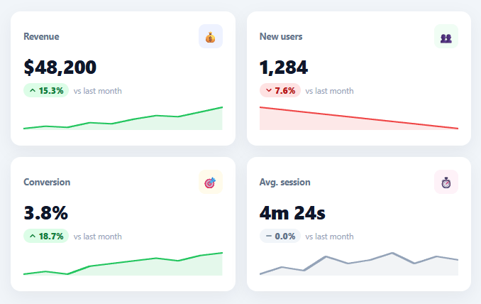
Every analytics dashboard opens with a row of KPI cards, and a good one never shows a number in isolation — it shows the value, how it compares to last period, and the recent trend, so a glance answers "is this good and which way is it heading?" This snippet builds those stat comparison cards in plain HTML, CSS, and vanilla JavaScript: a big value, a color-coded percent-change pill with a direction arrow, a "vs last month" reference, and an inline SVG sparkline — all generated from data.
A number with context, not in a vacuum
Each card pairs the headline value with a delta computed against the previous period ((value − prev) / prev × 100). The delta renders as a pill — green with an up arrow for an increase, red with a down arrow for a decrease, gray with a flat line when essentially unchanged — plus the "vs last month" label so the comparison is explicit. This is the difference between "Revenue: $48,200" (which means nothing alone) and "$48,200, ▲15.3% vs last month" (which is a decision-ready insight).
Direction-aware, not just positive/negative
The card classifies the change into up, down, or *flat* — a change under a small threshold (0.05%) reads as "no real change" rather than a misleadingly precise "▲0.0%". This matters for metrics that hover (like average session time in the demo, which is unchanged): forcing every metric into up-or-down would imply movement that isn't there. And critically, color follows direction, not value — for a metric where down is good (like churn), you'd flip the tone, since "green = good" depends on the metric.
Smart per-metric formatting
Different KPIs need different formats, so fmtValue() handles currency ($48,200 with thousands separators), counts (1,284), percentages (3.8%), and durations (4m 24s) from a fmt flag on each stat. The value, the delta, and the sparkline all derive from the same data object, so a card is fully described by its data — adding a new KPI is one array entry, not new markup.
An inline sparkline built from a path
The mini trend chart is a tiny inline SVG. sparkPath() normalizes the data series to the chart's height (scaling between the series min and max so the shape fills the space), builds an M…L… line path, and closes it into a filled area below. The sparkline's color matches the trend direction, reinforcing the up/down signal visually — a falling metric gets a red line, a rising one green. It's drawn with preserveAspectRatio="none" so it stretches to the card width responsively, and at this size a sparkline conveys "the shape of recent history" far better than any axis-laden chart.
Responsive grid, drop-in ready
The cards sit in an auto-fit grid that reflows from four across down to one on narrow screens. Because everything is data-driven and self-contained, you populate STATS from your analytics API (current value, previous-period value, and a short series for the sparkline) and the whole row renders — values formatted, deltas computed, trends colored, sparklines drawn. The FAQs cover wiring real data and handling metrics where down is the good direction.
Build with AI
Build, Understand, Optimize, and Extend It With AI
You don't need to work out the delta classification and sparkline normalization by hand. Paste this snippet's HTML, CSS, and JS into an AI coding assistant like Claude and ask it to explain exactly why changes under the 0.05 percent threshold are classified as flat rather than a misleadingly precise up or down arrow, or how sparkPath normalizes an arbitrary-length data series to a fixed chart height using its own min and max rather than a hardcoded scale. The same assistant can help optimize it, for example checking whether fmtValue's if-chain of format types would benefit from a lookup object as more formats (like compact-K notation) get added. It's also useful for extending the feature: ask it to add an inverted flag so metrics like churn treat a decrease as the good direction, animate the delta pill's percentage counting up on render, or add a click handler that expands a card into a full time-series chart. Treat the code less like a finished artifact and more like a starting point for a conversation.
Prompt to recreate it
Copy this into your AI assistant of choice to build the effect from scratch, or as a jumping-off point for your own variant:
Build a row of KPI comparison cards with sparklines in plain HTML, CSS, and JavaScript, no charting library.

Requirements:
- Render every card from a single array of stat objects, each with a label, an icon, a current value, a previous-period value, a format type flag, and a short numeric array for the sparkline — no hardcoded per-card markup.
- Write one formatting function that renders a value differently depending on its format flag: as currency with thousands separators, as a plain count with thousands separators, as a percentage with one decimal place, and as a minutes-and-seconds duration — selectable purely by the flag, not by special-casing each card in the render loop.
- Compute each card's percent change from current versus previous value, and classify it into exactly three states — up, down, or flat — where "flat" applies whenever the absolute percent change falls under a small threshold (not just when it's exactly zero), so metrics that barely moved don't display a misleadingly precise directional arrow.
- Color and arrow-direction for the delta pill must be driven entirely by that up/down/flat classification (green up arrow, red down arrow, gray flat line), and the same classification's color must also be used for the sparkline stroke and fill, so the whole card visually agrees on direction.
- Build the sparkline as a normalized SVG path: given the arbitrary-length numeric series, scale every point to the chart's fixed pixel height using that series' own minimum and maximum (not a fixed range), and close the line into a filled area path beneath it. The SVG must stretch to the card's actual width responsively.
- Lay the cards out in a CSS grid that auto-fits from several columns down to a single column as available width shrinks, with no JavaScript-driven layout logic.
- As a documented extension in a code comment, describe how to add an "inverted" flag per stat so metrics where a decrease is the desirable direction (like churn or error rate) flip the color mapping while keeping the same percent and arrow logic.
Want to tighten it up first? Run this prompt through the AI Prompt Studio to score it across 8 quality dimensions, catch anti-patterns, and tune the wording for Claude, ChatGPT, or Gemini before you paste it in.
Step by step
How to Use
- 1Paste HTML, CSS, and JSA responsive row of KPI cards renders — revenue, users, conversion, and session time — each with a value, change, and sparkline.
- 2Read the deltasEach card shows a colored pill: green ▲ for up, red ▼ for down, gray for essentially unchanged, vs last month.
- 3Note the sparklineThe mini trend line under each value matches the change color, showing the recent shape at a glance.
- 4Check the formattingValues format per metric — currency, counts, percentages, and durations — from the fmt flag.
- 5Edit the statsChange the STATS array (value, prev, fmt, icon, tone, spark) to your KPIs — cards regenerate.
- 6Connect real analyticsPopulate STATS from your analytics API with the current value, previous-period value, and a sparkline series.
Real-world uses
Common Use Cases
Got questions?
Frequently Asked Questions
Populate the STATS array from your analytics API: each entry needs the current value, the previous-period value (prev) for the delta, a fmt flag for formatting, and a short numeric series (spark) for the sparkline. Fetch those on load (and on refresh), assign to STATS, and call render() — every card's value, delta, and trend recompute from the data.
For metrics like churn, bounce rate, or error count, "down" is positive, so invert the color logic for those cards — add an inverted flag to the stat and, when set, map a negative change to the green/up tone and a positive change to red/down. The percent and arrow stay the same; only the color tone flips to reflect that lower is better.
A metric that barely moved shouldn't display a precise "▲0.0%" with an up arrow, which implies meaningful growth. Treating changes below a small threshold as flat (gray, with a neutral line) honestly communicates "no real change," which is more useful than forcing every metric into up or down. Adjust the threshold to your tolerance.
sparkPath() finds the series min and max, normalizes each point to the chart height (so the line fills the vertical space regardless of the values' scale), and builds an SVG path with M/L commands, then closes a filled area below it. preserveAspectRatio="none" stretches it to the card width. Pass any-length series; the path adapts to the number of points.
In React, hold the stats in useState and compute each delta and sparkline path with useMemo, rendering cards with .map(); in Vue, use a computed over a reactive stats array; in Angular, use *ngFor with getters or pipes. The delta, formatting, and sparkline functions are plain JavaScript that port unchanged — only the per-data re-render moves into the framework.