Learn Coding Visually
Learn to code with interactive, live-preview playgrounds — HTML, CSS, JavaScript, React & more.
 HTML Playground42 lessons · Click-based · Live preview
 CSS PlaygroundLearn CSS with a live editor
 JavaScript Playground60 lessons · DOM · Async · Canvas
 React PlaygroundLearn React with a live code editor
 GSAP PlaygroundLearn GSAP animation interactively
 SVG Playground44 lessons · shapes · paths · animation
 SCSS Playground45 lessons · Sass modules · tokens
 Tailwind PlaygroundLearn Tailwind CSS with a live editor
 Bootstrap 5 Playground50 lessons · live preview
Quota Usage Meter — Plan Limits HTML CSS JS
Quota Usage Meter · Dashboards · Plain HTML, CSS & JS · Live preview
What's included
Features
About this UI Snippet
Quota Usage Meter — Per-Resource Plan Limits with Tiered Warnings & Upgrade Nudge
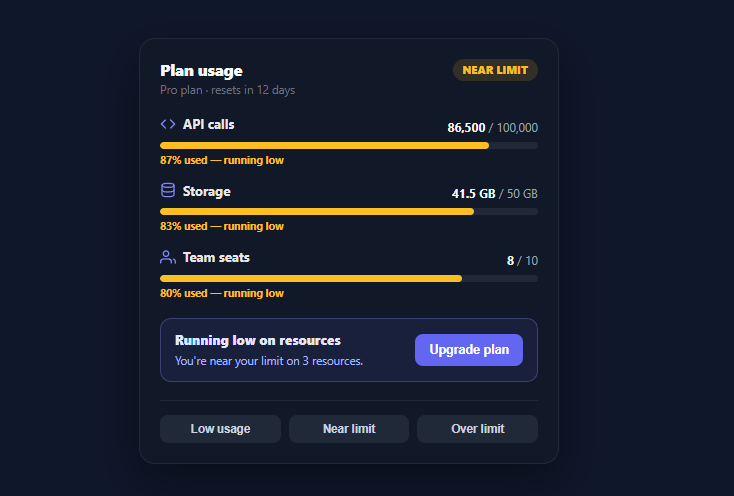
Every usage-based SaaS — API platforms, storage products, team tools — needs to show customers how much of their plan they've consumed before they hit a wall. A good quota meter does three jobs at once: it shows current usage against each limit, warns clearly as a resource approaches its cap, and surfaces an upgrade path at exactly the moment it's relevant. This snippet builds that complete plan-usage dashboard in plain HTML, CSS, and vanilla JavaScript, driven by one data array.
Per-resource meters from data
Each tracked resource — API calls, storage, team seats — is an object with a used, a limit, a unit, and an icon key. render() maps the array into a labelled meter showing the formatted used/limit values, a progress fill, and a percentage caption. Numbers format intelligently (thousands get comma separators via toLocaleString, fractional GB values show one decimal), so "86,500 / 100,000" and "41.5 GB / 50 GB" both read naturally. Adding or removing a tracked resource is a data edit, not new markup.
Three-tier warning colors, computed not stored
The whole point of a usage meter is to warn *before* the customer is blocked. Each meter computes a tier from its percentage: ok (under 80%, indigo), warn (80–99%, amber, "running low"), and over (at or above 100%, red, "Limit reached"). The fill color, the percentage caption color, and the caption text all derive from that one tier function — so a resource at 86% automatically turns amber with a "running low" message, and there's no way for the color and the text to disagree. The fill width is capped at 100% so a maxed-out resource doesn't overflow its track.
An overall badge that reflects the worst resource
A single status badge in the header answers "is my account okay?" at a glance by reducing all resources to their *worst* tier — if any resource is over its limit the badge reads "Limit reached" in red; if any is merely near the limit it reads "Near limit" in amber; otherwise "On track" in green. This mirrors how users actually think about their account: one blocked resource is a problem even if the others are fine, so the summary surfaces the most urgent state rather than an average that would hide it.
An upgrade nudge that appears only when relevant
Beneath the meters, an upgrade panel stays hidden while everything is healthy and appears the moment any resource crosses into warn or over, with a message that counts how many resources are affected ("You're near your limit on 2 resources"). This is contextual monetization done right — the upsell shows up precisely when the customer has a reason to care about it, not as permanent dashboard clutter. The message wording also adapts between "near your limit" and "you've hit your limit" based on severity.
Pure render, easy to wire up
The demo buttons swap between low, near-limit, and over-limit datasets to show every state, but the component is just render(rows) — pass it your real usage data (from a billing or metering API) on load and whenever it refreshes, and the meters, badge, and upgrade nudge all recompute. There's no internal state to manage and every visual is derived from the numbers, so it can't drift out of sync with reality.
Build with AI
Build, Understand, Optimize, and Extend It With AI
You do not have to work out the derived-state logic here by hand. Paste this snippet's HTML, CSS, and JS into an AI coding assistant like Claude and ask it to walk through exactly how tier() feeds the fill color, the caption color, and the caption text from one function so they can never disagree, and how the worst-resource reduce() in render() decides the overall badge state. The same assistant can help you optimize it — ask whether rebuilding the entire listEl.innerHTML string on every render() call is wasteful for a dashboard that refreshes frequently, and how you would patch just the changed meter instead. It's also useful for extending the widget: ask it to add a fourth "critical" tier between warn and over, animate the upgrade panel's appearance instead of a hard show/hide, or wire render() to a polling fetch against a real billing API. Treat the code less like a finished artifact and more like a starting point for a conversation.
Prompt to recreate it
Copy this into your AI assistant of choice to build the effect from scratch, or as a jumping-off point for your own variant:
Build a SaaS plan-usage dashboard card in plain HTML, CSS, and JavaScript with no framework or library.

Requirements:
- Render one meter per tracked resource from a single data array of objects, each with a name, a used value, a limit value, and a unit string — the meter list, header badge, and upgrade panel must all be pure functions of this one array (no separate state to keep in sync).
- Compute a percentage-used tier for every resource with one function: under 80% is "ok", 80% up to just under 100% is "warn", and 100% or more is "over". The fill bar's color, the percentage caption's color, and the caption's text must all be derived from that same tier function's return value, never set independently.
- Cap the visual fill width at 100% even if usage exceeds the limit, but still classify that resource as "over" for tier purposes.
- Add an overall status badge in the header that reduces every resource to its single worst tier (over beats warn beats ok) — one over-limit resource must turn the badge red even if every other resource is healthy.
- Add an upgrade-nudge panel that stays hidden while every resource is "ok" and becomes visible the moment any resource enters "warn" or "over", with message text that counts how many resources are affected and changes wording between "near your limit" and "you've hit your limit" depending on whether the worst tier is warn or over.
- Format large numbers with thousands separators and fractional units (like GB) with one decimal place so values read naturally rather than as raw floats.
Want to tighten it up first? Run this prompt through the AI Prompt Studio to score it across 8 quality dimensions, catch anti-patterns, and tune the wording for Claude, ChatGPT, or Gemini before you paste it in.
Step by step
How to Use
- 1Paste HTML, CSS, and JSA dark "Plan usage" card renders with API calls, Storage, and Team seats meters in a near-limit state.
- 2Switch usage statesClick the Low / Near limit / Over limit demo buttons to see the meters, colors, badge, and upgrade nudge react.
- 3Read the tier colorsMeters under 80% are indigo, 80–99% turn amber ("running low"), and 100%+ turn red ("Limit reached").
- 4Check the overall badgeThe header badge reflects the worst resource — any over-limit resource turns it red even if others are fine.
- 5See the contextual upgrade nudgeThe upgrade panel appears only when a resource is near or over its limit, counting how many are affected.
- 6Connect real usage dataReplace the DATASETS with live values from your metering/billing API and call render(rows) on load and refresh.
Real-world uses
Common Use Cases
Got questions?
Frequently Asked Questions
The component is a pure function of one rows array — each { key, name, used, limit, unit } object is one meter. Fetch live values from your metering or billing API, map them into that shape, and call render(rows) on load and whenever the data refreshes (polling, a websocket, or on navigation). Every meter, the badge, and the upgrade nudge recompute from the numbers.
Edit the tier() function — currently 100% is "over" and 80% is "warn". Lower the warn threshold (e.g. 75%) to nudge earlier, or add a fourth tier for "critical" at 95% with its own color and message. Because the fill color, caption, and badge all derive from tier(), changing it once updates everything consistently.
Give such a resource a null or Infinity limit and special-case it in render(): show the used value with an "Unlimited" label and either hide the bar or render it empty, and exclude it from the worst-tier and upgrade-nudge calculations so it never triggers a false warning.
This snippet shows it as soon as any resource reaches the warn tier (80%), which catches users before they're blocked — the highest-converting moment. If that feels too eager, gate it on the "over" tier only, or on a resource being within a few percent of its cap. Avoid showing it permanently; contextual relevance is what makes it convert rather than annoy.
In React, pass the rows as a prop and derive each meter's tier, the worst tier, and the nudge visibility with useMemo; in Vue, use computed properties over a reactive rows ref; in Angular, use an @Input with getters or pipes. The tier and worst-resource reduction are plain functions that port unchanged.