Learn Coding Visually
Learn to code with interactive, live-preview playgrounds — HTML, CSS, JavaScript, React & more.
 HTML Playground42 lessons · Click-based · Live preview
 CSS PlaygroundLearn CSS with a live editor
 JavaScript Playground60 lessons · DOM · Async · Canvas
 React PlaygroundLearn React with a live code editor
 GSAP PlaygroundLearn GSAP animation interactively
 SVG Playground44 lessons · shapes · paths · animation
 SCSS Playground45 lessons · Sass modules · tokens
 Tailwind PlaygroundLearn Tailwind CSS with a live editor
 Bootstrap 5 Playground50 lessons · live preview
Budget Tracker Card — Spending by Category HTML/CSS/JS
Budget Tracker Card · Dashboards · Plain HTML, CSS & JS · Live preview
What's included
Features
About this UI Snippet
Budget Tracker Card — Overall Progress, Per-Category Caps & Over-Budget Warnings
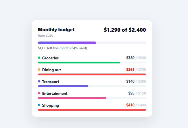
A budget tracker only earns trust if it's honest about overspending — a green bar that quietly turns red is far more useful than a generic progress indicator. This snippet builds a monthly budget card with an overall spend bar that shifts from indigo to amber to red as it fills, plus a per-category breakdown that flags any category individually over its own cap, all driven by one small data array.
One data array drives everything
CATEGORIES is a plain array of { name, color, spent, cap } objects, and BUDGET_CAP is the single overall monthly limit. render() sums every category's spent for the total, computes the overall percentage against BUDGET_CAP, and rebuilds the category list — so updating a single number anywhere in the data instantly recomputes the whole card with one function call, no manual DOM bookkeeping per field.
Three-state overall bar
The top progress bar's fill width is the spend percentage capped at 100% (so an over-budget month doesn't overflow the track), and its color escalates through three CSS classes: the default indigo-to-purple gradient under 80% used, an amber-to-orange .warn gradient from 80–100%, and a red .over gradient once total spend exceeds the cap. The label beneath switches wording too — "$X left this month" while under budget, "$X over budget" once it isn't — so the message matches the math instead of always reading as a vague percentage.
Per-category caps, independent of the overall total
Each category has its own cap, and a category can go over its own cap (shown in red, with the row's amount text turning red via an .over class) even while the *overall* budget is still healthy — exactly how real budgeting works: groceries can run over while the month as a whole is fine because other categories came in under. This nuance is what makes a per-category breakdown more useful than a single combined bar.
Smooth, export-safe fills
Every bar fill transitions only its width with a cubic-bezier ease — width transitions on a fixed-height track are stable in every export target because the track's own dimensions never change, only the inner fill's width, so there's no layout-shift risk the way animating a container's height would have.
Connecting real transaction data
The numbers here are static placeholders meant to demonstrate the visual states; a production budget tracker sums real transactions grouped by category, typically from a bank-linking API (Plaid and similar providers) or a manually logged expense table. Because every visual — bar width, color, and label wording — is recomputed from CATEGORIES and BUDGET_CAP inside a single render() call, swapping the data source is a one-line change: replace the static spent values with a sum of that period's transactions per category, call render() again, and the card's entire visual state (including which categories flip to the over-budget red) updates correctly with no other code to touch.
Build with AI
Build, Understand, Optimize, and Extend It With AI
You don't have to trace the color-threshold logic by hand to see why it feels trustworthy. Paste this snippet's HTML, CSS, and JS into an AI coding assistant like Claude and ask it to explain exactly how render computes the overall fill's color class independently from each category row's own over-cap check, and why a category can render red even while the overall bar is still indigo. The same assistant can help optimize it — asking whether rebuilding the entire cats innerHTML string on every single render call is wasteful compared to updating just the changed row's width and class, or whether the currency formatting should account for negative remaining amounts more clearly. It's also useful for extending the card: ask it to add a month-over-month comparison, animate the category bars staggered instead of simultaneously, or add a drill-down that lists individual transactions per category. Treat the code less like a finished artifact and more like a starting point for a conversation.
Prompt to recreate it
Copy this into your AI assistant of choice to build the effect from scratch, or as a jumping-off point for your own variant:
Build a "budget tracker card" in plain HTML, CSS, and JavaScript that shows an overall monthly spend bar plus independent per-category budgets — no charting library, no framework.

Requirements:
- Drive the entire card from one plain JavaScript array of category objects (each with a name, a color, an amount spent, and a cap) plus a single separate overall budget cap number — every visual element must be recomputed from these two data sources inside one render function, with no other place in the code manually touching individual DOM values.
- An overall progress bar whose fill width is the total spent (summed across all categories) divided by the overall cap, capped visually at 100% width so an over-budget month never visually overflows its track, and whose color must switch between three distinct states via CSS classes: a default gradient under 80% of the cap, a warning gradient between 80% and 100%, and a danger gradient once total spending exceeds the overall cap.
- A text label under the overall bar whose wording itself changes (not just its color) depending on whether the user is under or over budget — showing a "remaining amount" phrasing while under, and a distinct "over budget" phrasing once exceeded.
- A per-category row for every category showing its name with a colored identifying dot, its spent amount over its own cap, and its own progress bar filled proportionally to that category's own spend-versus-cap ratio (capped at 100% width) — and each category row must independently switch to a distinct over-budget visual style (different bar color and different text color) whenever that category's own spend exceeds only its own cap, regardless of whether the overall budget is currently under or over.
- All bar width changes must animate smoothly via a CSS transition on width only (not on any layout-affecting property), and all dollar amounts over 999 must render with comma thousands separators.
Want to tighten it up first? Run this prompt through the AI Prompt Studio to score it across 8 quality dimensions, catch anti-patterns, and tune the wording for Claude, ChatGPT, or Gemini before you paste it in.
Step by step
How to Use
- 1Paste HTML, CSS, and JSA budget card renders with an overall progress bar and five category rows (Groceries, Dining, Transport, Entertainment, Shopping).
- 2Read the overall barIts color and the label beneath show whether you're under budget, in the 80%+ warning zone, or over for the month.
- 3Check each categoryCategories over their own cap show in red even if the overall budget is still healthy — read each row independently.
- 4Edit the dataChange any spent or cap value in the CATEGORIES array, or BUDGET_CAP, and call render() to see every bar and label recompute.
- 5Add or remove categoriesPush or remove an object in CATEGORIES — the category list and overall total both adjust automatically.
- 6Connect real transaction dataReplace the static spent values with a sum of your transaction API's amounts grouped by category, then call render() after each fetch.
Real-world uses
Common Use Cases
Got questions?
Frequently Asked Questions
Fetch your transactions, group and sum them by category into the same { name, color, spent, cap } shape used by CATEGORIES, assign the result to CATEGORIES, and call render() — every bar, label, and color recomputes from the new totals.
Edit the thresholds in render(): the ".warn" class is added when pct > 80, and ".over" when totalSpent > BUDGET_CAP — change 80 to whatever warning threshold fits your use case.
Add an input bound to BUDGET_CAP (or each category's cap) and call render() on change — the existing percentage math and color thresholds will reflect the new limit immediately.
The card has no built-in time period logic — it just compares spent against cap. Swap BUDGET_CAP and the category caps for your daily/weekly limits, and update the header text ("June 2026") to match your period.
In React, keep categories and budgetCap in state and compute percentages with useMemo, rendering rows with .map(); in Vue, use a computed categories array with v-for; in Angular, use *ngFor with a getter for percentages. The color-threshold logic ports directly into each framework's conditional class binding.