Learn Coding Visually
Learn to code with interactive, live-preview playgrounds — HTML, CSS, JavaScript, React & more.
 HTML Playground42 lessons · Click-based · Live preview
 CSS PlaygroundLearn CSS with a live editor
 JavaScript Playground60 lessons · DOM · Async · Canvas
 React PlaygroundLearn React with a live code editor
 GSAP PlaygroundLearn GSAP animation interactively
 SVG Playground44 lessons · shapes · paths · animation
 SCSS Playground45 lessons · Sass modules · tokens
 Tailwind PlaygroundLearn Tailwind CSS with a live editor
 Bootstrap 5 Playground50 lessons · live preview
Gradient Progress Bars — Animated HTML CSS JS Snippet
Gradient Progress Bars · Loaders · Plain HTML, CSS & JS · Live preview
What's included
Features
background-size: 200% 100% + background-position keyframe animation creates a continuous shimmer sweep without JavaScript.repeating-linear-gradient(45deg, ...) layered over a gradient base, animated with background-position — creates diagonal moving stripe pattern.--p custom property on each bar drives width: var(--p) — set fill amount with a single inline style attribute..done, .active, and default states. Active segment pulses with an opacity keyframe animation.width: 0% on init, animated to data-p + '%' via a 200ms-delayed setTimeout — ensures visible animation after first paint.adjustBar(delta) clamps value to 0–100 and updates both the CSS custom property and label text simultaneously.cubic-bezier(.4,0,.2,1) easing on width — smooth deceleration that feels physical rather than linear.About this UI Snippet
Gradient Progress Bars — CSS Shimmer, Stripe Animation, Segmented Steps & Skill Bars
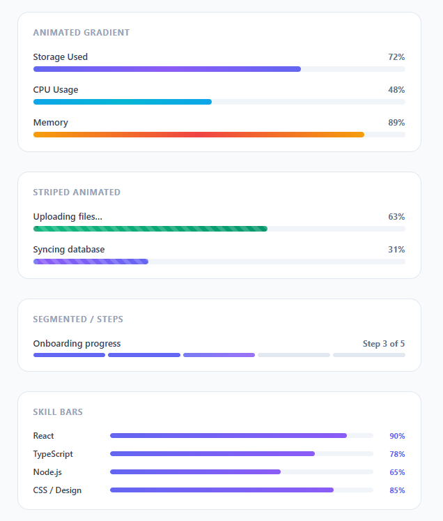
Progress bars are among the most versatile UI components — used for file uploads, page load indicators, onboarding completion, skill showcases, storage usage displays, and interactive data visualisations. This snippet delivers five distinct progress bar styles in a single cohesive component: animated gradient shimmer bars, moving stripe bars, segmented step indicators, animating-in skill bars, and an interactive bar with +/- controls.
Getting progress bars right requires solving several CSS challenges simultaneously: the fill width must animate smoothly, the gradient must feel alive (not static), stripes must animate without background-position glitches, and the on-load animation must feel purposeful rather than mechanical.
Animated gradient shimmer
The shimmer effect uses a wider-than-container gradient: background: linear-gradient(90deg, #6366f1, #8b5cf6, #6366f1) with background-size: 200% 100%. The @keyframes shimmer animates background-position from 200% 0 to -200% 0 over 2 seconds — this creates a continuous sweep of lighter purple across the bar. The background-size: 200% means the gradient repeats: as the right edge exits, the left edge enters, creating a seamless loop.
The fill width is driven by a --p CSS custom property set inline on each bar: style="--p:72%". The width: var(--p, 0%) in CSS reads this property. Animating from 0% to the target width is handled by transition: width .6s cubic-bezier(.4,0,.2,1) — the same Material Design easing used for panel motions.
Striped moving bars
Striped bars layer two backgrounds: a repeating diagonal stripe pattern using repeating-linear-gradient(45deg, ...) over a solid gradient base. The stripe animation uses background-position increments — moving by one stripe-width (24px) per second creates the illusion of movement. The key implementation detail is setting background-position as the animation property (not background-image) since position-only animation avoids repaints.
Segmented step indicator
The step bar uses a flex row of equal-width <div class="seg"> elements with 4px gaps. Completed steps get .done (solid indigo), the active step gets .active (gradient with a pulsing opacity animation at 1.4s ease-in-out), and future steps remain light grey. This pattern is used in multi-step forms and onboarding flows.
Skill bars with load animation
Skill bars start at width: 0% and animate to their target via a setTimeout on DOMContentLoaded — the 200ms delay ensures the page has painted before the animation runs, making it feel like a triggered reveal rather than a flash. The data-p attribute stores the target percentage, read by JS and set as bar.style.width.
Build with AI
Build, Understand, Optimize, and Extend It With AI
Instead of eyeballing which CSS property drives which bar style, paste this snippet's HTML, CSS, and JS into an AI coding assistant like Claude and ask it to explain exactly how the shimmer bars use a custom property named p combined with a wider-than-container gradient and a separate background-position keyframe to look alive even while stuck at one width. The same assistant can help you optimize it — ask whether the skill bars' fixed 200ms setTimeout after DOMContentLoaded is reliable across slow connections, or whether swapping it for an IntersectionObserver would avoid animating bars that are still off-screen. It is also a good way to extend the component: ask it to drive the interactive bar from a real fetch or XHR progress event instead of the plus/minus buttons, add a bar variant that changes color as it crosses a warning threshold, or make the segmented step indicator clickable so users can jump to a completed step. Treat the code less like a finished artifact and more like a starting point for a conversation.
Prompt to recreate it
Copy this into your AI assistant of choice to build the effect from scratch, or as a jumping-off point for your own variant:
Build a set of five progress bar variants in plain HTML, CSS, and vanilla JavaScript, no chart or progress library.

Requirements:
- A base track and fill pair where the fill's width is driven entirely by a CSS custom property (for example a variable named p) set as an inline style on each bar, read in CSS as width: var(p, 0%), with a transition on width using an easing curve so changing the variable animates smoothly.
- The fill's background must be an oversized multi-stop linear-gradient combined with a background-position keyframe animation, so the bar visibly shimmers in place even when its width is not changing.
- A striped variant that layers a repeating-linear-gradient diagonal stripe pattern over a solid gradient base, animated purely by shifting background-position by one stripe-width per animation cycle, not by changing background-image.
- A segmented step indicator built from a flex row of equal-width divs representing steps, where completed steps get one modifier class, the current step gets a different modifier class with a pulsing opacity keyframe animation, and future steps stay at a neutral background color.
- A set of skill bars that start at width 0% in the markup and animate to a target width read from a data attribute, triggered by a short delayed setTimeout after DOMContentLoaded so the fill-in is visibly animated rather than appearing instantly.
- An interactive bar with plus and minus buttons that adjust a live percentage value, clamp it between 0 and 100, and update both the bar's width custom property and a text label showing the current percentage on every click.
Want to tighten it up first? Run this prompt through the AI Prompt Studio to score it across 8 quality dimensions, catch anti-patterns, and tune the wording for Claude, ChatGPT, or Gemini before you paste it in.
Step by step
How to Use
- 1Paste HTML, CSS, and JSFive grouped sections appear: gradient shimmer bars, striped animated bars, segmented steps, skill bars, and an interactive bar with controls.
- 2Watch the animationsGradient bars shimmer continuously. Striped bars have diagonal lines moving right-to-left. Skill bars animate in from 0% to their target width on load.
- 3Use the +/- buttonsThe interactive bar section adjusts "Project completion" in 5% or 10% steps. The bar animates smoothly between values.
- 4Set progress valuesChange
style="--p:72%"on any.prog-barto set its fill width. Values from 0% to 100% work directly. - 5Change the colour variantSwap
bar-indigo,bar-cyan,bar-red,bar-green, orbar-purpleon any.prog-barto change the gradient colour scheme. - 6Update the segmented stepsAdd or remove
<div class="seg">elements. Apply.doneto completed steps and.activeto the current step. The flex layout adjusts automatically.
Real-world uses
Common Use Cases
Got questions?
Frequently Asked Questions
Use an IntersectionObserver on each .prog-bar. When the bar enters the viewport, set bar.style.setProperty('--p', targetWidth). Start with --p: 0% in CSS so bars don't animate before they're visible. See the reveal on scroll snippet for the observer pattern.
Make the bar position: relative and add a <span class="label"> child with position: absolute; right: 6px; top: 50%; transform: translateY(-50%). Ensure the bar height is at least 18px. Hide the label when --p < 15% to avoid overflow.
Call bar.style.setProperty('--p', value + '%') to update the fill width. For upload progress: read event.loaded / event.total * 100 from an XHR or Fetch progress event and call setProperty on each progress update.
Create a ProgressBar component with {label, value, variant, striped} props. value drives style={{['--p']: value + '%'}}. variant applies the colour class. striped conditionally adds the stripe class. The skill bar animation uses useEffect with a setTimeout(() => setWidth(targetValue), 200).