



Learn Coding Visually
Learn to code with interactive, live-preview playgrounds — HTML, CSS, JavaScript, React & more.
 HTML Playground42 lessons · Click-based · Live preview
 CSS PlaygroundLearn CSS with a live editor
 JavaScript Playground60 lessons · DOM · Async · Canvas
 React PlaygroundLearn React with a live code editor
 GSAP PlaygroundLearn GSAP animation interactively
 SVG Playground44 lessons · shapes · paths · animation
 SCSS Playground45 lessons · Sass modules · tokens
 Tailwind PlaygroundLearn Tailwind CSS with a live editor
 Bootstrap 5 Playground50 lessons · live preview
Reveal on Scroll — Free HTML CSS JS Snippet
Reveal on Scroll · Scroll · Plain HTML, CSS & JS · Live preview
What's included
Features
About this UI Snippet
Reveal on Scroll — IntersectionObserver, Fade-Up Transition & Stagger Delay
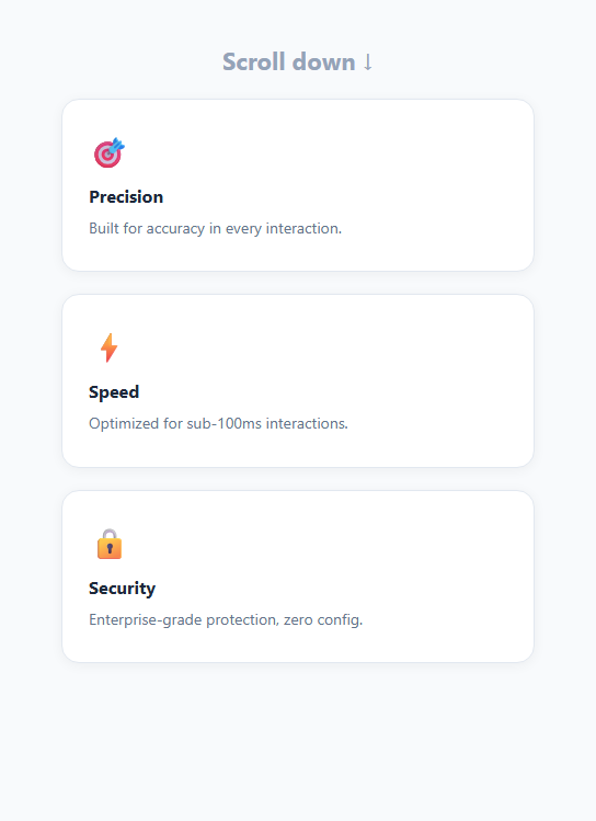
Reveal-on-scroll animations make content appear to rise into view as it enters the viewport. They are one of the most widely used micro-animations on landing pages and long-form content sites — each section fades up as the user scrolls down (pair with a split text headline reveal or a scroll-snap gallery), creating a sense that the page is being revealed progressively rather than all at once.
The .fade-up starting state
Elements with .fade-up start invisible and slightly below their final position: opacity: 0; transform: translateY(24px). Both have a CSS transition so changes animate smoothly: transition: opacity 0.55s ease, transform 0.55s ease.
The IntersectionObserver trigger
A single IntersectionObserver watches all .fade-up elements with threshold: 0.15 — the callback fires when 15% of the element is in the viewport. When e.isIntersecting is true, the observer adds .visible to the element: opacity: 1; transform: translateY(0). The CSS transition handles the animation. obs.unobserve(e.target) immediately disconnects the observer for that element — the animation fires once and never repeats.
Stagger delay
CSS transition-delay can be set via inline style on each element: style="transition-delay: 0.1s", 0.2s, 0.3s. This staggers the reveal so sibling elements animate in sequence rather than simultaneously — the same technique as the stagger list.
Why IntersectionObserver over scroll events
IntersectionObserver is asynchronous and runs off the main thread — it does not block rendering. Scroll events fire synchronously on every scroll tick and require manual threshold calculations. For reveal animations, IntersectionObserver is always the better choice.
Respecting reduced-motion preferences
Add @media (prefers-reduced-motion: reduce) { .fade-up { transition: none; transform: none; opacity: 1; } } to disable the animation for users who have requested reduced motion in their OS settings. This is important for accessibility compliance.
IntersectionObserver with threshold
The observer watches each .reveal element with threshold: 0.1 — the callback fires when 10% of the element is visible. Inside the callback, entry.isIntersecting determines if the element entered (add .visible) or left (optionally remove it for re-trigger). obs.disconnect() after the first trigger is intentional for most use cases — animations that re-play every scroll are typically more annoying than engaging.
The CSS animation on .visible
The .reveal class sets opacity: 0 and transform: translateY(30px) as the initial hidden state. The .visible class sets opacity: 1 and transform: translateY(0). CSS transition: opacity 0.6s ease, transform 0.6s ease handles the animation. The transition only fires when .visible is added — if .visible is set in HTML for above-the-fold content, no animation plays (the element starts visible).
Staggered children with animation-delay
For list items that should reveal one by one, add animation-delay: calc(var(--i) * 0.1s) where --i is a CSS custom property set as inline style on each child: style="--i:3". This creates a cascading reveal effect without JavaScript for each individual child.
Build with AI
Build, Understand, Optimize, and Extend It With AI
You do not have to work through the observer mechanics by hand. Paste this snippet's HTML, CSS, and JS into an AI coding assistant like Claude and ask it to explain exactly why obs.unobserve is called inside the callback rather than after the forEach loop, and why IntersectionObserver's asynchronous, off-main-thread design makes it strictly better here than computing getBoundingClientRect on a scroll listener. The same assistant can help you optimize it — ask whether a single shared observer instance watching every .fade-up element (as this snippet does) scales better than creating one observer per element, and at what element count that distinction starts to actually matter. It's also useful for extending the effect: ask it to add a reduced-motion media query fallback that skips the animation entirely, support re-triggering the reveal every time an element re-enters view instead of only once, or drive the stagger delay from a CSS custom property set per element instead of inline transition-delay. Treat the code less like a finished artifact and more like a starting point for a conversation.
Prompt to recreate it
Copy this into your AI assistant of choice to build the effect from scratch, or as a jumping-off point for your own variant:
Build a "reveal on scroll" fade-up animation in plain HTML, CSS, and JavaScript using the IntersectionObserver API — no scroll event listeners, no animation library.

Requirements:
- Give elements meant to reveal a starting CSS state of opacity 0 and a transform of translateY by a positive pixel amount (so they sit slightly below their final position), with a CSS transition declared on both the opacity and transform properties.
- Create exactly one IntersectionObserver instance (not one per element) with a threshold around 0.15, and use it to observe every element carrying the reveal class via a single querySelectorAll loop.
- Inside the observer's callback, when an entry's isIntersecting property is true, add a "visible" class to that element (setting opacity to 1 and the transform to none, which the existing CSS transition will animate smoothly) and immediately call unobserve on that specific element so it can only ever animate in once, not on every scroll back and forth.
- Support staggering multiple sibling elements by allowing each one to declare its own transition-delay (via inline style) so they animate in sequence rather than all at once when they enter the viewport together.
- Add a prefers-reduced-motion media query that disables the transition and transform entirely and forces opacity to 1, so users who have requested reduced motion see the content immediately with no animation.
Want to tighten it up first? Run this prompt through the AI Prompt Studio to score it across 8 quality dimensions, catch anti-patterns, and tune the wording for Claude, ChatGPT, or Gemini before you paste it in.
Source Code
<div class="page">
  <h1>Scroll down ↓</h1>
  <div class="card fade-up"><div class="icon">🎯</div><h3>Precision</h3><p>Built for accuracy in every interaction.</p></div>
  <div class="card fade-up" style="transition-delay:0.1s"><div class="icon">⚡</div><h3>Speed</h3><p>Optimized for sub-100ms interactions.</p></div>
  <div class="card fade-up" style="transition-delay:0.2s"><div class="icon">🔒</div><h3>Security</h3><p>Enterprise-grade protection, zero config.</p></div>
</div>
* { box-sizing: border-box; margin: 0; padding: 0; }
body { font-family: system-ui, sans-serif; background: #f8fafc; }
.page { max-width: 480px; margin: 0 auto; padding: 40px 24px 80px; display: flex; flex-direction: column; align-items: center; gap: 20px; }
h1 { font-size: 22px; font-weight: 700; color: #94a3b8; }
.card { background: #fff; border-radius: 16px; padding: 28px 24px; border: 1px solid #e2e8f0; width: 100%; box-shadow: 0 2px 12px rgba(0,0,0,0.05); }
.icon { font-size: 28px; margin-bottom: 12px; }
h3 { font-size: 16px; font-weight: 700; color: #1e293b; margin-bottom: 8px; }
p { font-size: 14px; color: #64748b; line-height: 1.6; }
.fade-up { opacity: 0; transform: translateY(24px); transition: opacity 0.55s ease, transform 0.55s ease; }
.fade-up.visible { opacity: 1; transform: translateY(0); }const obs = new IntersectionObserver(entries => {
entries.forEach(e => { if (e.isIntersecting) { e.target.classList.add('visible'); obs.unobserve(e.target); } });
}, { threshold: 0.15 });
document.querySelectorAll('.fade-up').forEach(el => obs.observe(el));Step by step
How to Use
- 1Scroll in the previewScroll down in the preview to see each card fade up from below as it enters the viewport. Each fires once via obs.unobserve.
- 2Add .fade-up to any elementIn the HTML panel, add class="fade-up" to any element you want to reveal on scroll. The JS observer picks it up automatically via querySelectorAll.
- 3Add stagger delayAdd style="transition-delay: 0.1s" to the second element, 0.2s to the third, etc. to stagger siblings in a grid or list.
- 4Change the trigger thresholdIn the JS panel, update 0.15 in { threshold: 0.15 } to control how far the element must be in view before revealing.
- 5Add reduced-motion fallbackIn the CSS panel, add @media (prefers-reduced-motion: reduce) { .fade-up { transition: none; transform: none; opacity: 1; } }.
- 6Export in your formatClick "HTML" for a standalone file, "JSX" for a React component, or "Tailwind" for a React + Tailwind version.
Real-world uses
Common Use Cases
Got questions?
Frequently Asked Questions
Elements start with opacity: 0 and translateY(24px) — invisible and 24px below final position. An IntersectionObserver adds .visible when the element enters the viewport, triggering CSS transitions: opacity: 1 and translateY(0). The CSS handles the animation; JS only toggles the class.
IntersectionObserver runs asynchronously off the main thread and does not cause layout thrashing. Scroll events fire synchronously on every scroll tick and require manual getBoundingClientRect calls. For animations, IntersectionObserver is more performant and simpler to write.
obs.unobserve() disconnects the observer for that specific element after it has revealed. Without it, the observer would continue checking the element on every scroll tick, and if the element leaves and re-enters the viewport it would animate again.
Add style="transition-delay: 0.1s" to the second element, 0.2s to the third, 0.3s to the fourth, etc. Each element starts its animation after the specified delay, creating a sequential reveal across a row.
Add @media (prefers-reduced-motion: reduce) { .fade-up { opacity: 1; transform: none; transition: none; } } to the CSS. This immediately shows all fade-up elements without animation for users who have enabled reduced motion in their OS.
Yes. Click "JSX" for a React component. In React, use a useEffect with an IntersectionObserver. Attach a ref to the container, observe all .fade-up descendants, and clean up the observer on unmount.