Source Code
<section class="ssf-hero">
  <div class="ssf-visual" id="ssfVisual">
    <div class="ssf-frame">
      <div class="ssf-slide ssf-slide-active" data-slide="0">
        <div class="ssf-mock-bar"></div>
        <div class="ssf-mock-line" style="width:70%"></div>
        <div class="ssf-mock-line" style="width:45%"></div>
        <div class="ssf-mock-chip"></div>
      </div>
      <div class="ssf-slide" data-slide="1">
        <div class="ssf-mock-grid">
          <span></span><span></span><span></span><span></span>
        </div>
      </div>
      <div class="ssf-slide" data-slide="2">
        <div class="ssf-mock-chart">
          <i style="height:40%"></i><i style="height:72%"></i><i style="height:58%"></i><i style="height:88%"></i><i style="height:64%"></i>
        </div>
      </div>
      <div class="ssf-slide" data-slide="3">
        <div class="ssf-mock-lock">
          <svg width="34" height="34" viewBox="0 0 24 24" fill="none" stroke="currentColor" stroke-width="1.8"><rect x="4" y="10" width="16" height="10" rx="2"/><path d="M8 10V7a4 4 0 0 1 8 0v3"/></svg>
        </div>
      </div>
    </div>
  </div>

  <div class="ssf-copy">
    <span class="ssf-eyebrow">Why teams switch</span>
    <h1 class="ssf-h1">One workspace,<br>every reason to stay</h1>

    <ul class="ssf-features" id="ssfFeatures">
      <li class="ssf-feature ssf-feature-active" data-slide="0">
        <span class="ssf-num">01</span>
        <div><h3>Unified workspace</h3><p>Docs, tasks, and chat live in one place instead of five disconnected tabs.</p></div>
      </li>
      <li class="ssf-feature" data-slide="1">
        <span class="ssf-num">02</span>
        <div><h3>Flexible layouts</h3><p>Switch between grid, list, and board views without losing your filters.</p></div>
      </li>
      <li class="ssf-feature" data-slide="2">
        <span class="ssf-num">03</span>
        <div><h3>Real-time analytics</h3><p>Every dashboard updates live as your team works — no manual refresh.</p></div>
      </li>
      <li class="ssf-feature" data-slide="3">
        <span class="ssf-num">04</span>
        <div><h3>Enterprise-grade security</h3><p>SSO, audit logs, and field-level permissions built in from day one.</p></div>
      </li>
    </ul>
  </div>
</section>*{box-sizing:border-box;margin:0;padding:0}
body{font-family:system-ui,-apple-system,sans-serif;background:#0d0f17;color:#f1f2f8}
.ssf-hero{display:grid;grid-template-columns:1fr 1fr;gap:40px;max-width:1120px;margin:0 auto;padding:64px 24px}
.ssf-visual{position:sticky;top:64px;align-self:start;height:min(440px,72vh)}
.ssf-frame{position:relative;width:100%;height:100%;background:#171a26;border:1px solid rgba(255,255,255,.08);border-radius:20px;overflow:hidden;box-shadow:0 30px 70px rgba(0,0,0,.4)}
.ssf-slide{position:absolute;inset:0;display:flex;flex-direction:column;align-items:center;justify-content:center;gap:14px;padding:32px;opacity:0;transform:scale(.96);transition:opacity .4s,transform .4s}
.ssf-slide.ssf-slide-active{opacity:1;transform:scale(1)}
.ssf-mock-bar{width:80%;height:34px;background:#252840;border-radius:8px;align-self:flex-start}
.ssf-mock-line{height:12px;background:#252840;border-radius:6px;align-self:flex-start}
.ssf-mock-chip{width:120px;height:36px;background:#6366f1;border-radius:8px;align-self:flex-start;margin-top:8px}
.ssf-mock-grid{display:grid;grid-template-columns:1fr 1fr;gap:12px;width:80%}
.ssf-mock-grid span{aspect-ratio:1.3;background:#252840;border-radius:10px}
.ssf-mock-grid span:first-child{background:#6366f1}
.ssf-mock-chart{display:flex;align-items:flex-end;gap:10px;height:60%;width:70%}
.ssf-mock-chart i{flex:1;background:linear-gradient(180deg,#6366f1,#4338ca);border-radius:6px 6px 0 0}
.ssf-mock-lock{width:88px;height:88px;border-radius:50%;background:#252840;display:flex;align-items:center;justify-content:center;color:#a5b4fc}
.ssf-copy{padding-top:8px}
.ssf-eyebrow{font-size:12px;font-weight:700;letter-spacing:.08em;text-transform:uppercase;color:#a5b4fc}
.ssf-h1{font-size:clamp(28px,4vw,42px);font-weight:800;line-height:1.15;letter-spacing:-.02em;margin:12px 0 40px}
.ssf-features{list-style:none;display:flex;flex-direction:column}
.ssf-feature{display:flex;gap:16px;padding:26px 4px;border-left:2px solid rgba(255,255,255,.08);padding-left:20px;opacity:.4;transition:opacity .3s,border-color .3s}
.ssf-feature.ssf-feature-active{opacity:1;border-color:#6366f1}
.ssf-num{font-size:12px;font-weight:800;color:#6366f1;flex-shrink:0;padding-top:2px}
.ssf-feature h3{font-size:16.5px;font-weight:700;margin-bottom:6px}
.ssf-feature p{font-size:13.5px;color:#9498b3;line-height:1.6}
@media(max-width:820px){
.ssf-hero{grid-template-columns:1fr;gap:24px}
.ssf-visual{position:static;height:280px}
}// Scrollytelling via IntersectionObserver: as each feature list item crosses the
// vertical center of the viewport, its matching visual "slide" becomes active while
// the sticky visual panel itself stays pinned in place during the whole scroll.
var features = document.querySelectorAll('.ssf-feature');
var slides = document.querySelectorAll('.ssf-slide');
function activateSlide(index) {
slides.forEach(function (slide) {
slide.classList.toggle('ssf-slide-active', slide.dataset.slide === String(index));
});
features.forEach(function (feature) {
feature.classList.toggle('ssf-feature-active', feature.dataset.slide === String(index));
});
}
// rootMargin trims the observer's viewport to a thin horizontal band near vertical
// center, so a feature only "activates" once it scrolls through the middle of the
// screen rather than as soon as it merely enters view at the bottom.
var observer = new IntersectionObserver(
function (entries) {
entries.forEach(function (entry) {
if (entry.isIntersecting) {
activateSlide(entry.target.dataset.slide);
}
});
},
{ rootMargin: '-45% 0px -45% 0px', threshold: 0 }
);
features.forEach(function (feature) { observer.observe(feature); });Learn Coding Visually
Learn to code with interactive, live-preview playgrounds — HTML, CSS, JavaScript, React & more.
 HTML Playground42 lessons · Click-based · Live preview
 CSS PlaygroundLearn CSS with a live editor
 JavaScript Playground60 lessons · DOM · Async · Canvas
 React PlaygroundLearn React with a live code editor
 GSAP PlaygroundLearn GSAP animation interactively
 SVG Playground44 lessons · shapes · paths · animation
 SCSS Playground45 lessons · Sass modules · tokens
 Tailwind PlaygroundLearn Tailwind CSS with a live editor
 Bootstrap 5 Playground50 lessons · live preview
Split Hero with Scroll-Highlighted Feature List — Free HTML CSS JS Snippet
Split Hero with Scroll-Highlighted Feature List · Heroes · Plain HTML, CSS & JS · Live preview
What's included
Features
About this UI Snippet
Scrollytelling Split Hero — Sticky Visual Synced to Feature List via IntersectionObserver
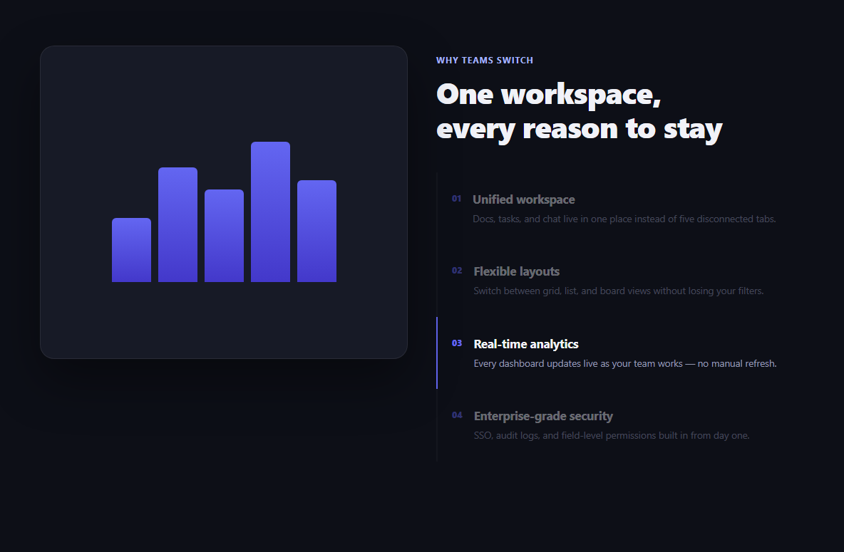
A plain feature list explains what a product does; a plain product screenshot shows what it looks like. This snippet does both at once and connects them: a sticky visual panel stays pinned on one side while a scrolling list of feature descriptions passes on the other, and each feature "activates" its own matching visual slide exactly when it crosses the vertical center of the screen — the classic scrollytelling technique, built with no scroll-tied JavaScript math.
`position: sticky`, not a JS-calculated pin
The .ssf-visual panel uses plain CSS position: sticky; top: 64px — it's pinned by the browser's own layout engine for as long as its parent .ssf-hero grid column is taller than the viewport, then unpins naturally once the feature list runs out. No scroll-position math, no transform recalculated on every scroll event.
`IntersectionObserver` instead of scroll-position math
Rather than listening to scroll and computing which feature is "current" by comparing getBoundingClientRect() coordinates on every single event (expensive, and easy to get subtly wrong), each .ssf-feature list item is registered with a single IntersectionObserver. The browser itself notifies the callback only when a feature's intersection state actually changes — dramatically cheaper than a scroll listener, and correct by construction.
Why `rootMargin` is set to `'-45% 0px -45% 0px'`
A default IntersectionObserver reports an element as intersecting as soon as any part of it enters the viewport — which would trigger activation the moment a feature merely scrolls into view at the bottom, well before a reader has actually reached it. Setting rootMargin to -45% on the top and bottom shrinks the *effective* observed viewport down to a thin 10%-tall band centered vertically — so a feature only reports as intersecting once it scrolls through roughly the middle of the screen, which is where a reader's attention naturally sits.
Slide and feature state share one function
activateSlide(index) toggles .ssf-slide-active on the matching visual slide *and* .ssf-feature-active on the matching list item in the same call, driven off each element's own data-slide attribute rather than an array index — so the visual and the text list can never fall out of sync with each other, and adding a fifth feature is just adding a fifth data-slide="4" pair.
CSS-only slide crossfade
Each .ssf-slide is absolutely positioned within the same frame with opacity/transform: scale transitions; only the currently active one has opacity: 1. This means the crossfade between visuals is a pure CSS transition triggered by a class toggle, not a JavaScript-driven animation loop.
Customizing it
Add a fifth feature/slide pair by giving both a new matching data-slide value — the observer and activateSlide() both work generically off that attribute, no index-counting logic to update. Adjust how "centered" a feature needs to be before activating by changing the rootMargin percentages — a smaller magnitude activates earlier, a larger one requires the feature to be closer to dead-center. On narrow viewports the sticky visual switches to a normal static block above a full-width feature list, since scrollytelling reads better as a full-width story on mobile.
Build with AI
Build, Understand, Optimize, and Extend It With AI
Rather than reasoning through the rootMargin math alone, paste this snippet's HTML, CSS, and JS into an AI coding assistant like Claude and ask it to explain exactly why rootMargin is set to "-45% 0px -45% 0px" on the IntersectionObserver, what viewport band that leaves for detecting "the currently active feature," and why that's more reliable than computing scroll offsets by hand on a scroll event listener. The same assistant can help you extend it — ask it to add a scroll-linked progress indicator alongside the feature list showing how far through the story the reader is, animate the visual slide transition with a slide/wipe effect instead of a plain crossfade, or convert the vanilla IntersectionObserver logic into a React hook that tracks the active index in state. It's also useful for auditing the responsive fallback: ask whether the mobile layout (where the sticky panel becomes static) should instead keep a smaller sticky preview, or whether a horizontal scroll-snap carousel would read better on touch devices than a stacked column. Treat the code less like a finished artifact and more like a starting point for a conversation.
Prompt to recreate it
Copy this into your AI assistant of choice to build the effect from scratch, or as a jumping-off point for your own variant:
Build a split-screen hero section in plain HTML, CSS, and vanilla JavaScript that implements scrollytelling — a sticky visual panel on one side that swaps between several "slides" as the reader scrolls past matching feature descriptions on the other side — using only IntersectionObserver, no scroll-hijacking library.

Requirements:
- A two-column layout: a visual panel on one side containing several absolutely-positioned "slide" elements stacked on top of each other (each a distinct mock UI illustration built from plain divs/CSS, no images), and a vertical list of feature descriptions on the other side, each with a heading and a short paragraph.
- The visual panel must be pinned in place using CSS position: sticky (not JavaScript scroll-position calculations) so it stays visible while the feature list scrolls past it, for as long as the feature list column is taller than the viewport.
- Each feature list item and its matching visual slide must share an identifying data attribute (e.g. data-slide="0"). Use a single IntersectionObserver watching all the feature list items, configured with a rootMargin that shrinks its effective viewport to a thin band centered vertically on the screen, so a feature is only considered "active" once it scrolls through roughly the middle of the viewport rather than the instant it appears at the bottom edge.
- When a feature becomes the active one (per the observer callback), toggle an active class on both that feature's list item and its matching visual slide using their shared data attribute — through one shared function, not duplicated logic — so the visual and text list can never fall out of sync with each other.
- The visual slide crossfade must be a pure CSS opacity/transform transition triggered by the class toggle, not a JavaScript animation loop.
- On narrow viewports, the layout must collapse to a single column with the visual panel becoming a normal static block instead of staying sticky, since a pinned side panel does not translate well to mobile.
Want to tighten it up first? Run this prompt through the AI Prompt Studio to score it across 8 quality dimensions, catch anti-patterns, and tune the wording for Claude, ChatGPT, or Gemini before you paste it in.
Step by step
How to Use
- 1Scroll down the feature listThe sticky visual panel on the left stays pinned while you scroll past each feature on the right.
- 2Watch the active feature highlightWhichever feature is nearest the vertical center gets a colored left border and full opacity.
- 3Watch the visual crossfadeThe matching slide fades in on the sticky panel exactly as its feature becomes active.
- 4Add a fifth featureAdd a new .ssf-feature list item and a matching .ssf-slide, both sharing the same data-slide value.
- 5Adjust the activation zoneChange the rootMargin percentages in the JS panel to make features activate earlier or later.
- 6Export in your formatClick "HTML" for a standalone file, "JSX" for a React component, or "Tailwind" for a React + Tailwind version.
Real-world uses
Common Use Cases
Got questions?
Frequently Asked Questions
No — it uses plain CSS position: sticky with a top offset. The browser's own layout engine keeps it pinned within its parent grid column for as long as that column is taller than the viewport, and unpins it naturally once the feature list scrolls past. No scroll listener repositions it.
A scroll listener would need to run expensive getBoundingClientRect() calculations on every single scroll event (which can fire dozens of times per second) to figure out which feature is currently centered. IntersectionObserver instead asks the browser to notify a callback only when an element's intersection state actually changes, which is both cheaper and less error-prone than manual scroll-position math.
rootMargin: "-45% 0px -45% 0px" shrinks the observer's effective viewport by 45% from both the top and bottom, leaving only a thin 10%-tall band centered vertically. A feature is only reported as "intersecting" once it scrolls into that centered band — not simply whenever any part of it becomes visible at the edge of the screen — which is what makes the activation timing feel natural rather than premature.
Both the .ssf-slide elements and the .ssf-feature list items carry a matching data-slide attribute. A single activateSlide(index) function toggles the active class on whichever slide and whichever feature share that exact data-slide value, so there is only one place that could ever get the pairing wrong, and no separate index counters to keep aligned.
Add a new li.ssf-feature with data-slide="4" to the feature list, and a new div.ssf-slide with the same data-slide="4" to the visual frame. No JavaScript changes are needed — the observer is attached generically to every .ssf-feature element, and activateSlide() matches purely on the shared attribute value.
Below 820px, the CSS switches .ssf-hero to a single column and the visual panel from position: sticky to a static, fixed-height block sitting above the feature list — since scrollytelling with a pinned side panel does not translate well to narrow viewports, the layout instead reads as a normal top-to-bottom feature list with a preview image on top.