
Learn Coding Visually
Learn to code with interactive, live-preview playgrounds — HTML, CSS, JavaScript, React & more.
 HTML Playground42 lessons · Click-based · Live preview
 CSS PlaygroundLearn CSS with a live editor
 JavaScript Playground60 lessons · DOM · Async · Canvas
 React PlaygroundLearn React with a live code editor
 GSAP PlaygroundLearn GSAP animation interactively
 SVG Playground44 lessons · shapes · paths · animation
 SCSS Playground45 lessons · Sass modules · tokens
 Tailwind PlaygroundLearn Tailwind CSS with a live editor
 Bootstrap 5 Playground50 lessons · live preview
CSS View Timeline Card Flip In — Native animation-timeline: view()
CSS View Timeline Card Flip In · Scroll · Plain HTML, CSS & JS · Live preview
What's included
Features
About this UI Snippet
CSS View Timeline Card Flip In — Per-Card 3D Rotation via animation-timeline: view()
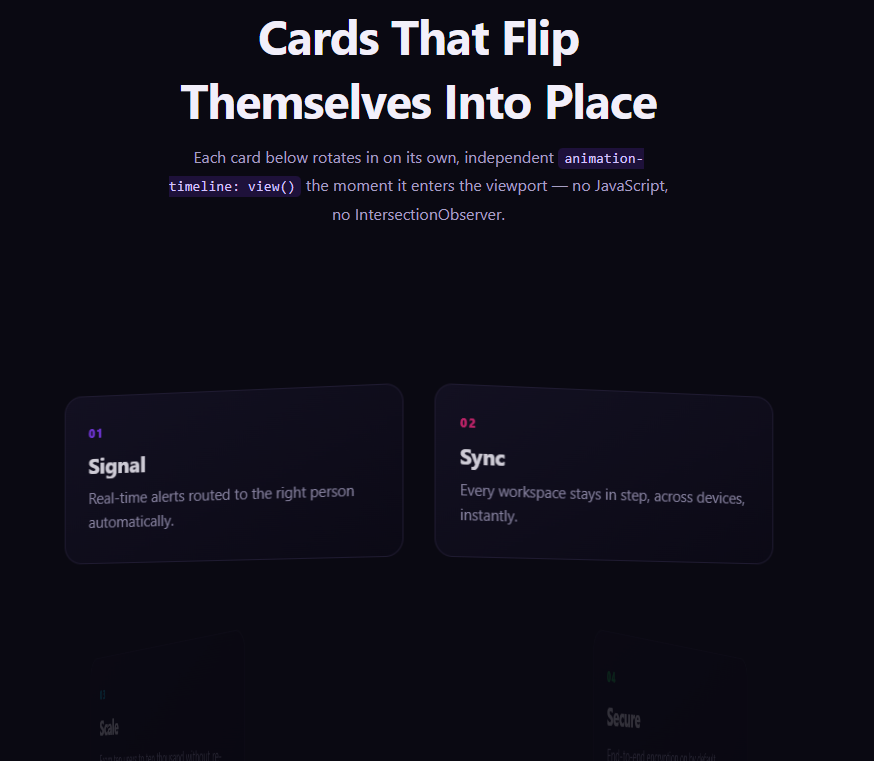
Staggered 3D card entrances are usually built with an IntersectionObserver toggling a class per card as it scrolls into range. This snippet gets the same per-card independence from a native CSS primitive instead: each .cfi-card declares its own view-timeline-name, so its rotateY flip is timed purely by its own transit through the viewport, with zero JavaScript observing anything.
A perspective grid, not a single rotating plane
The grid container sets perspective: 1400px once, giving every card inside it a shared 3D vanishing point, while each card itself uses transform-style: preserve-3d and a transform-origin set to its own hinge edge — left-center for odd cards, right-center for even ones — so alternating cards visually flip open from opposite sides rather than all rotating identically.
Two keyframe directions, one shared mechanism
cfi-flip rotates odd cards in from rotateY(-78deg), while a mirrored cfi-flip-r rotates even cards in from rotateY(78deg) — both keyframes are bound the same way, via animation-timeline: --card-in referencing each card's own named view timeline, so the only difference between a left-hinged and right-hinged card is which keyframes rule it points at.
animation-range narrows the flip window
animation-range: entry 0% cover 45% starts the flip the instant a card begins entering the viewport and finishes it once the card is 45% covered — well before the card would otherwise finish scrolling fully into frame, so the flip reads as a quick, decisive motion rather than a slow drag tied to the whole scroll transit.
Why this beats a shared page-level timeline for a grid
A single scroll(root)-bound animation cannot give six differently-positioned cards six independently-timed entrances — every card would animate off the same document-wide percentage. Per-element view() timelines solve exactly this: each card is only aware of its own position relative to the viewport, so a two-column, multi-row grid naturally staggers itself with no manual delay values to calculate.
Browser support
Chromium-based browsers (Chrome, Edge, Opera, Brave) support animation-timeline: view() today; Firefox and Safari support is still landing. The @supports not (animation-timeline: view()) block removes the rotation and opacity animation entirely, so unsupported browsers see a fully visible, flat grid rather than cards stuck mid-flip or invisible.
Customizing it
Change perspective for a more or less dramatic 3D depth, swap rotateY for rotateX for a top-down flip, or narrow animation-range further for a snappier reveal. Pair it with CSS View Timeline Stagger List Items for a related independently-timed entrance pattern.
Build with AI
Build, Understand, Optimize, and Extend It With AI
You don't have to puzzle out per-card 3D view timelines by hand. Paste this snippet's HTML, CSS, and JS into an AI coding assistant like Claude and ask it to explain exactly why every card sharing the same view-timeline-name still animates independently, and how the alternating rotateY keyframe rules combine with transform-origin to make the grid feel hand-choreographed rather than mechanical. The same assistant is useful for extending the effect: ask it to add a third hinge direction for a three-column grid, combine the flip with a color or shadow shift as each card settles, or add a horizontally-scrolling variant using view-timeline-axis: inline. Treat the code less like a finished artifact and more like a starting point for a conversation.
Prompt to recreate it
Copy this into your AI assistant of choice to build the effect from scratch, or as a jumping-off point for your own variant:
Build a grid of cards that each 3D-flip into place independently as they enter the viewport, using only native CSS animation-timeline: view() — no IntersectionObserver, no JavaScript scroll handling.

Requirements:
- A responsive multi-column grid of card elements, with perspective set on the grid container so every card shares one consistent 3D vanishing point.
- Every card must declare its own view-timeline-name (cards can share the same custom-ident name since each gets an independent timeline instance) and view-timeline-axis: block, then reference that timeline via animation-timeline on a keyframe animation applied to the same card.
- Define at least two mirrored @keyframes rules that rotate a card in via transform: rotateY() from a steep angle (for example -78deg for one direction, +78deg for the mirrored direction) down to 0deg, combined with opacity from 0 to 1, and assign alternating cards (for example by nth-child odd/even) to opposite-direction keyframe rules and opposite transform-origin edges so the grid flips open from alternating sides.
- Use animation-range (for example entry 0% cover 45%) to narrow the portion of each card's view timeline that the flip actually plays across, so it completes quickly as the card enters rather than stretching across its entire scroll transit.
- Set the animation's fill mode to both so cards correctly reverse their flip when scrolled back out of view and re-play it when scrolled back in.
- Add an @supports not (animation-timeline: view()) fallback that removes the rotation and opacity animation entirely so cards render fully visible and flat in unsupported browsers instead of stuck mid-flip or invisible.
- Keep any JavaScript limited to a feature-support check (CSS.supports('animation-timeline: view()')) logged to the console — it must not drive or trigger the flip itself.
Want to tighten it up first? Run this prompt through the AI Prompt Studio to score it across 8 quality dimensions, catch anti-patterns, and tune the wording for Claude, ChatGPT, or Gemini before you paste it in.
Source Code
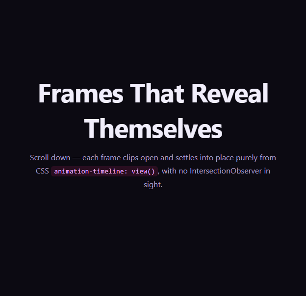
<section class="cfi-intro"><h1>Cards That Flip Themselves Into Place</h1><p>Each card below rotates in on its own, independent <code>animation-timeline: view()</code> the moment it enters the viewport — no JavaScript, no IntersectionObserver.</p></section>
<div class="cfi-grid">
  <article class="cfi-card" style="--c:#7c3aed"><div class="cfi-glyph">01</div><h3>Signal</h3><p>Real-time alerts routed to the right person automatically.</p></article>
  <article class="cfi-card" style="--c:#db2777"><div class="cfi-glyph">02</div><h3>Sync</h3><p>Every workspace stays in step, across devices, instantly.</p></article>
  <article class="cfi-card" style="--c:#0891b2"><div class="cfi-glyph">03</div><h3>Scale</h3><p>From ten users to ten thousand without re-architecting.</p></article>
  <article class="cfi-card" style="--c:#16a34a"><div class="cfi-glyph">04</div><h3>Secure</h3><p>End-to-end encryption on by default, everywhere.</p></article>
  <article class="cfi-card" style="--c:#ea580c"><div class="cfi-glyph">05</div><h3>Support</h3><p>A real human answers, day or night.</p></article>
  <article class="cfi-card" style="--c:#4338ca"><div class="cfi-glyph">06</div><h3>Simple</h3><p>No onboarding call required — it just works.</p></article>
</div>
<section class="cfi-outro"><p>Every card above flipped in on its own schedule, timed purely by its own transit through the viewport.</p></section>*{box-sizing:border-box;margin:0;padding:0}
body{font-family:system-ui,-apple-system,sans-serif;background:#0a0912;color:#f2effa}
code{background:rgba(124,58,237,.18);color:#d4c2ff;padding:2px 6px;border-radius:5px;font-size:.9em;font-family:ui-monospace,Consolas,monospace}
.cfi-intro,.cfi-outro{min-height:56vh;display:flex;flex-direction:column;justify-content:center;align-items:center;text-align:center;gap:12px;padding:24px;max-width:560px;margin:0 auto}
.cfi-intro h1{font-size:clamp(28px,5.4vw,48px);letter-spacing:-.02em}
.cfi-intro p,.cfi-outro p{color:#a79fc4;font-size:16px;line-height:1.75}
.cfi-grid{
display:grid;grid-template-columns:repeat(2,1fr);gap:12vh 24px;
max-width:760px;margin:0 auto;padding:8vh 24px 22vh;perspective:1400px;
}
.cfi-card{
background:linear-gradient(155deg,#151225,#0c0a17);
border:1px solid #241f38;border-radius:18px;padding:28px 24px;
transform-style:preserve-3d;transform-origin:center bottom;
view-timeline-name:--card-in;
view-timeline-axis:block;
animation:cfi-flip linear both;
animation-timeline:--card-in;
animation-range:entry 0% cover 45%;
}
.cfi-card:nth-child(odd){ transform-origin:left center }
.cfi-card:nth-child(even){ transform-origin:right center }
.cfi-glyph{font-size:12px;font-weight:800;letter-spacing:.1em;color:var(--c)}
.cfi-card h3{font-size:21px;margin-top:10px;letter-spacing:-.01em}
.cfi-card p{color:#9c96b8;font-size:14.5px;line-height:1.65;margin-top:8px}
@keyframes cfi-flip{
from{ opacity:0; transform:rotateY(-78deg) translateZ(-40px); filter:brightness(.5) }
to{ opacity:1; transform:rotateY(0) translateZ(0); filter:brightness(1) }
}
.cfi-card:nth-child(even){ animation-name:cfi-flip-r }
@keyframes cfi-flip-r{
from{ opacity:0; transform:rotateY(78deg) translateZ(-40px); filter:brightness(.5) }
to{ opacity:1; transform:rotateY(0) translateZ(0); filter:brightness(1) }
}
@media (max-width:640px){
.cfi-grid{grid-template-columns:1fr;gap:8vh 0}
}
@supports not (animation-timeline: view()){
.cfi-card{opacity:1;transform:none;filter:none;animation:none}
}// Every card above flips into place via CSS animation-timeline: view() (a
// named per-element view-timeline on each .cfi-card) -- each card's own
// entry into the viewport drives its own rotateY animation independently.
// No JS observes scroll position; this script only reports feature support.
const supportsView = typeof CSS !== 'undefined' && CSS.supports('animation-timeline: view()');
console.log('[card-flip-in] animation-timeline: view() supported:', supportsView);
if (!supportsView) {
console.log('[card-flip-in] falling back to fully visible, unflipped cards via @supports.');
}Step by step
How to Use
- 1Paste the HTML, CSS, and JSAn intro, a six-card grid, and an outro render — no CDN needed.
- 2Scroll down slowlyEach card 3D-flips into place independently the moment it enters the viewport.
- 3Notice the alternating hingeOdd cards flip open from the left, even cards from the right.
- 4Scroll back upCards flip back out in reverse as they exit downward (animation both).
- 5Tune the flip windowAdjust animation-range (entry 0% cover 45%) to make the flip finish sooner or later.
- 6Export in your formatClick "HTML" for a standalone file, "JSX" for a React component, or "Tailwind" for a React + Tailwind version.
Real-world uses
Common Use Cases
Got questions?
Frequently Asked Questions
Because view-timeline-name creates a new timeline instance scoped to the element that declares it, every card sharing the same custom-ident name still gets its own entirely independent timeline tracking only its own transit through the viewport — the name is just a label the animation-timeline property references, not a shared clock.
cfi-flip rotates odd cards in from rotateY(-78deg) (opening from the left) while the mirrored cfi-flip-r rotates even cards in from rotateY(78deg) (opening from the right), giving the grid an alternating, livelier entrance instead of every card rotating in the identical direction.
It restricts the flip animation to only the first part of each card’s view timeline — starting the instant the card begins entering the viewport and finishing once it is 45% covered — so the flip reads as quick and decisive rather than stretching across the card’s entire scroll transit.
The @supports not (animation-timeline: view()) block disables the animation and rotation entirely, so unsupported browsers render a fully visible, flat, unrotated grid rather than cards stuck mid-flip or invisible.
Yes — the technique scales to any grid column count since each card’s timeline is entirely independent of its neighbors; you may want to alternate the hinge direction by column position rather than by nth-child(odd/even) for a wider grid so the flip direction still reads intentionally.