You Might Also Like
Learn Coding Visually
Learn to code with interactive, live-preview playgrounds — HTML, CSS, JavaScript, React & more.
 HTML Playground42 lessons · Click-based · Live preview
 CSS PlaygroundLearn CSS with a live editor
 JavaScript Playground60 lessons · DOM · Async · Canvas
 React PlaygroundLearn React with a live code editor
 GSAP PlaygroundLearn GSAP animation interactively
 SVG Playground44 lessons · shapes · paths · animation
 SCSS Playground45 lessons · Sass modules · tokens
 Tailwind PlaygroundLearn Tailwind CSS with a live editor
 Bootstrap 5 Playground50 lessons · live preview
Splitting.js CSS Stagger — Per-Character Text Animation
Splitting.js CSS Stagger · Animations · Plain HTML, CSS & JS · Live preview
What's included
Features
About this UI Snippet
Splitting.js CSS Stagger — Let CSS Own the Animation, Not JavaScript
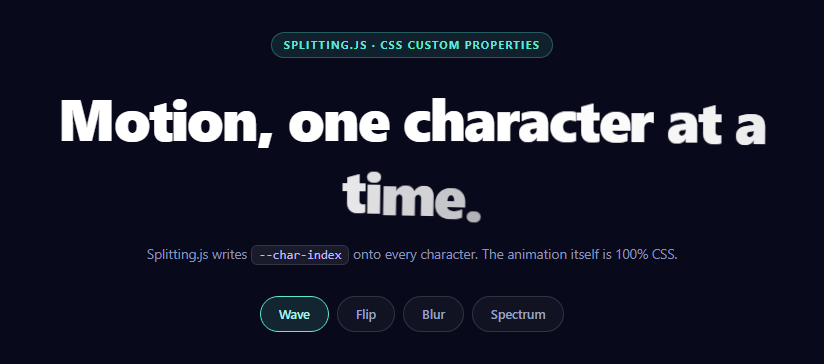
Almost every per-character text animation on the web is driven by a JavaScript timeline: a library splits the text, then the same library animates each piece on a stagger. That works, but it means the animation lives in your bundle, runs on the main thread, and cannot be restyled without editing code.
Splitting.js takes a different position, and it is the reason to choose it over a full animation library. Splitting.js does not animate anything. It splits text into elements and writes CSS custom properties onto them. Every effect after that is plain CSS.
What it actually produces
One call — Splitting() — finds every element carrying data-splitting and rewrites its contents. This:
<h1 data-splitting>Motion</h1>
becomes a nest of <span class="word"> and <span class="char"> elements, each character carrying:
- --char-index — its position in the element, zero-based
- --char-total — how many characters there are in total
- a data-char attribute holding the character itself
That is the entire API surface being used here, and it is enough to build effects that would otherwise need a timeline library.
Staggering with arithmetic instead of a timeline
The stagger is one CSS declaration:
animation-delay: calc(var(--char-index) * 34ms)
Character 0 starts immediately, character 10 starts 340ms in. There is no loop, no per-element JavaScript, and no timeline object held in memory. The browser schedules all of it, which means the animations run off the main thread wherever the animated properties allow it, and they keep working if your JavaScript later throws.
The effect that shows why --char-total matters
Three of the four effects here only use the index. The fourth uses both, and it is the one that demonstrates the real ceiling of this technique:
color: hsl(calc(190 + var(--char-index) / var(--char-total) * 170), 92%, 68%)
Dividing index by total gives a 0–1 position within the string, which is then mapped across a 170-degree sweep of hue. The result is a gradient distributed evenly across the characters — and because it is derived rather than hard-coded, it stays correct if you rewrite the headline to be twice as long. No JavaScript recalculates anything. This is the trick worth taking away: any per-character value that can be expressed as arithmetic on position can be pure CSS.
The two CSS rules that are not optional
.char { display: inline-block } — inline elements ignore transform entirely. Leave this out and every transform-based effect silently does nothing while opacity effects still work, which is a genuinely confusing way to debug. .word { display: inline-block } does the same job at word level and has the bonus of keeping words from breaking mid-way across lines.
perspective: 800px on the title plus transform-style: preserve-3d on the characters is what makes the flip effect read as rotation in depth rather than a vertical squash. Without a perspective ancestor, rotateX(-92deg) is an orthographic projection — the character simply flattens to nothing.
Replaying a CSS animation
A CSS animation runs once when its class is applied and will not replay just because the class is re-added in the same frame. playEffect() handles this with the standard reflow trick:
EFFECTS.forEach(remove); void title.offsetWidth; title.classList.add(name);
Reading offsetWidth forces a synchronous layout, which makes the browser commit the class removal before the addition. Skip it and clicking the already-active effect does nothing at all, because as far as the style engine is concerned the class never left.
Accessibility
Splitting.js fragments text into dozens of spans, which historically wrecked screen-reader output — assistive tech would read individual letters. Modern screen readers handle inline-block spans inside a heading correctly and announce the full string, but the safe production pattern is to keep the original text in an aria-label on the heading and mark the split output aria-hidden. For anything longer than a headline, that is not optional. A prefers-reduced-motion block that sets animation: none on .char should also ship with this.
Reusing it
Add data-splitting to any element, call Splitting() once after the DOM is ready, and write your effect as a keyframe plus a calc() delay. Splitting also exposes --word-index and --line-index if you would rather stagger by word or by line — the same arithmetic applies. Compare it with GSAP SplitText when you need a real timeline with scrubbing and reversal, or text generate for a simpler word-by-word reveal.
Build with AI
Build, Understand, Optimize, and Extend It With AI
This snippet is unusual in that the library does almost nothing and CSS does almost everything, which makes it a great one to have unpacked. Paste the HTML, CSS, and JS into an AI assistant like Claude and ask it to explain exactly what Splitting() writes into the DOM and why animation-delay: calc(var(--char-index) * 34ms) is sufficient to replace a JavaScript stagger loop entirely. Then ask it to work through the spectrum effect's hsl() calc step by step, and predict what happens to the gradient if the headline is doubled in length — the answer, that it stays evenly distributed, is the whole argument for deriving values from --char-total. Ask why .char must be display: inline-block and have it describe the exact symptom of omitting it. For optimization, ask whether animating filter: blur on every character is compositor-friendly and at what headline length it would start to cost frames. To extend it: have it add a prefers-reduced-motion block, add an aria-label plus aria-hidden pattern so screen readers read the whole string, trigger the effect from an IntersectionObserver, or build a hover effect using --char-index without any keyframes at all. Treat the code less like a finished artifact and more like a starting point for a conversation.
Prompt to recreate it
Copy this into your AI assistant of choice to build the effect from scratch, or as a jumping-off point for your own variant:
Build a per-character headline animation using Splitting.js (from a CDN, global Splitting) where the LIBRARY DOES NO ANIMATION — every effect must be written in pure CSS driven by the custom properties Splitting writes.

Requirements:
- Call Splitting() once to split a headline marked with data-splitting into .word and .char spans. Splitting writes --char-index and --char-total onto the characters; use only those, plus CSS.
- Create the stagger entirely with CSS arithmetic: animation-delay: calc(var(--char-index) * Xms). Do not write any JavaScript loop that sets per-element delays or runs a timeline.
- Include the two rules that are mandatory and explain why in comments: .char and .word must be display: inline-block, because inline elements ignore transform entirely and every transform-based effect would silently do nothing while opacity still worked.
- Provide four switchable effects as CSS classes on the heading:
  1. Wave — characters rise from below with a slight rotation, cubic-bezier ease-out.
  2. Flip — characters rotate in on rotateX. This requires perspective on the heading and transform-style: preserve-3d on the characters, otherwise rotateX is orthographic and the character just squashes flat.
  3. Blur — characters scale down from oversized while filter: blur animates to zero.
  4. Spectrum — in addition to a pop-in keyframe, derive each character's COLOR from its position with no JavaScript: color: hsl(calc(BASE + var(--char-index) / var(--char-total) * RANGE), 92%, 68%). Dividing index by total yields a 0-to-1 position in the string, so the gradient stays evenly distributed even if the headline length changes.
- Implement effect switching with a replay function that removes all effect classes, forces a synchronous reflow by reading offsetWidth, then adds the new class — explain that a CSS animation will not re-run if the class is removed and re-added in the same frame, so clicking the already-active effect would otherwise do nothing.
- Also make clicking the headline itself replay whichever effect is currently active.
- Style it as a dark centered hero with a small monospace code chip in the supporting copy, and keep all animated properties to transform, opacity and filter.
Want to tighten it up first? Run this prompt through the AI Prompt Studio to score it across 8 quality dimensions, catch anti-patterns, and tune the wording for Claude, ChatGPT, or Gemini before you paste it in.
Step by step
How to Use
- 1Add the Splitting.js CDNInclude splitting from the CDN panel — global Splitting.
- 2Paste HTML, CSS, and JSThe headline splits into characters and plays the wave effect.
- 3Switch effectsWave, Flip, Blur, and Spectrum are four CSS keyframes over one split.
- 4Click the headlineThe active effect replays using the forced-reflow restart.
- 5Write your own effectAdd a keyframe plus animation-delay: calc(var(--char-index) * Xms).
- 6Try word-level staggerSwap --char-index for --word-index to animate whole words.
Real-world uses
Common Use Cases
Got questions?
Frequently Asked Questions
No, and that is the point of choosing it. It only rewrites the element into .word and .char spans and writes --char-index, --char-total and a data-char attribute onto them. Every animation is written by you in CSS, so effects can be restyled or themed without touching JavaScript.
With one declaration: animation-delay: calc(var(--char-index) * 34ms). Character zero starts immediately and each subsequent character is offset by another 34ms. The browser schedules all of it, so there is no per-element JavaScript loop and no timeline held in memory.
It converts an absolute position into a 0-to-1 fraction of the string, which can then be mapped onto any range — here a 170-degree hue sweep. Because it is derived rather than hard-coded, the gradient stays evenly distributed even if you rewrite the headline to a different length.
Inline elements ignore transform completely. Without that rule the wave, flip and blur effects silently do nothing while opacity still animates, which is a confusing failure to debug. The same rule on .word also stops words breaking across lines mid-word.
rotateX without a perspective ancestor is an orthographic projection, so the character just squashes flat instead of rotating in depth. Setting perspective on the title and transform-style: preserve-3d on the characters gives the rotation real depth.
Call Splitting({ target: ref.current }) in a mount effect after the text has rendered, not during render, since it rewrites DOM. Re-run it if the text content changes, and be aware it replaces children — so let Splitting own that subtree rather than having the framework re-render into it. Keep the effect class in state and toggle it; for replay, remove the class, read offsetWidth, then re-add in the same handler.