More Charts Snippets
Front-End Coding Playgrounds
Learn to code with interactive, live-preview playgrounds — HTML, CSS, JavaScript, React & more.
 HTML Playground42 lessons · Click-based · Live preview
 CSS PlaygroundLearn CSS with a live editor
 JavaScript Playground60 lessons · DOM · Async · Canvas
 React PlaygroundLearn React with a live code editor
 GSAP PlaygroundLearn GSAP animation interactively
 SVG Playground44 lessons · shapes · paths · animation
 SCSS Playground45 lessons · Sass modules · tokens
 Tailwind PlaygroundLearn Tailwind CSS with a live editor
 Bootstrap 5 Playground50 lessons · live preview
Sparkline Chart — Free HTML CSS JS Canvas Snippet
Sparkline Chart · Charts · Plain HTML, CSS & JS · Live preview
What's included
Features
About this UI Snippet
Sparkline Chart — Canvas Bezier Curve, Gradient Fill, End Dot & Normalised Coordinates
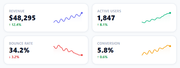
A full chart needs axes, gridlines, a legend, and room to breathe. A sparkline needs none of that — just enough ink to answer "is this going up or down?" in the time it takes an eye to pass over a number. Edward Tufte coined the term for exactly this kind of "intense, simple, word-sized graphic," and it's now the default companion to any KPI on a dashboard: a revenue figure means little until a tiny rising line beside it says *and it's been climbing all month*. This snippet draws four such metric cards directly to <canvas> — smooth curves instead of jagged polylines, a soft gradient fill beneath the line, a dot marking the latest value, and a coordinate system that adapts itself to whatever numbers you hand it.
Mapping arbitrary numbers onto a fixed-size canvas
Revenue might range from 27 to 48; active users from 1,150 to 1,847. Both need to fill the same 100×40 canvas without the chart author hand-tuning a scale for each metric. The fix is normalisation: (value - min) / range converts any number in the dataset into a position between 0 and 1 — purely *where it sits relative to the dataset's own minimum and maximum* — and multiplying that fraction by the canvas's available height converts it into pixels. The final twist, canvasHeight - padding - scaledValue, flips the result, because canvas coordinates grow *downward* from the top-left corner while every chart convention on Earth expects "higher value" to mean "higher on the screen."
Smooth curves from a single line of geometry
ctx.lineTo would connect the data points with sharp, jagged corners — technically accurate, visually noisy. Instead, each segment uses ctx.bezierCurveTo with control points placed at the horizontal midpoint between consecutive points: const mx = (prev.x + next.x) / 2. Anchoring both control points to that shared midpoint — one paired with the previous point's height, one with the next's — produces a curve that eases smoothly out of one point and into the next, with no separate smoothing pass or external charting math required. It's the same "let geometry do the work" instinct behind the gliding indicator in the Scroll-Spy Navigation snippet.
A gradient that fades the story toward the baseline
The filled area beneath each line uses createLinearGradient running from an opaque tint at the top to fully transparent at the bottom — drawn by tracing the curve, dropping straight down to the canvas floor, and closing the path back to the start before calling ctx.fill(). The fade keeps the eye anchored on the *line*, which carries the actual information, while the colour wash beneath it adds just enough visual weight to read as "area under a trend" rather than a bare line floating in space.
Why canvas, not SVG, for a wall of small charts
A dashboard might show twenty or fifty of these at once. Each SVG sparkline would be its own subtree of DOM nodes for the browser to parse, lay out, and keep in memory; a canvas sparkline is a handful of draw calls into a single bitmap that simply *is* what it looks like — no nodes, no reflow, trivially cheap to redraw on a live data tick. For a handful of hero charts, SVG's crispness and CSS-styleability often win; for a grid of glanceable trend lines like the Stats Card or Line Chart Widget might use, canvas is the pragmatic choice.
Build with AI
Build, Understand, Optimize, and Extend It With AI
You don't have to work out the coordinate normalization or the bezier smoothing on your own. Paste this snippet's HTML, CSS, and JS into an AI coding assistant like Claude and ask it to explain exactly why drawSparkline computes (value - min) / range before scaling to pixels, and why the y coordinate then gets subtracted from canvasHeight rather than used directly. The same assistant can help optimize it, for instance checking whether recomputing the same min/max and gradient on every single redraw call matters if a dashboard redraws 20 sparklines on every live data tick, or whether caching those values per dataset would help. It is just as useful for extending the sparklines: ask it to animate the line drawing in progressively left-to-right on first load, add a hover tooltip showing the exact value at the nearest point using mouse position mapped back through the same coordinate math, or make the fill gradient's opacity reflect whether the trend is up or down. Treat the code less like a finished artifact and more like a starting point for a conversation.
Prompt to recreate it
Copy this into your AI assistant of choice to build the effect from scratch, or as a jumping-off point for your own variant:
Build a grid of metric cards with canvas "sparkline" mini-charts in plain HTML, CSS, and JavaScript using only the Canvas 2D API — no charting library.

Requirements:
- Several metric cards, each showing a label, a large current value, a colored percentage-change indicator, and a small fixed-size canvas element for its trend line.
- A single reusable draw function that takes a canvas element and an array of numeric data points, computes the dataset's own minimum and maximum, and maps every value to a canvas y-coordinate using linear normalization: (value - min) / (max - min || 1), scaled to the canvas's available height after subtracting padding, and inverted by subtracting from canvas height so higher values appear higher on screen (since canvas y grows downward).
- X coordinates must be evenly distributed across the canvas width based on each point's index in the array, independent of the y-coordinate math.
- Connect the points with smooth curves, not straight line segments: for each pair of consecutive points, use a bezier curve whose two control points are both anchored at the horizontal midpoint between the two points, so the curve eases naturally in and out of every point with no separate smoothing algorithm.
- Beneath the line, fill the area down to the canvas floor with a vertical linear gradient that is opaque near the line and fully transparent by the bottom, so the trend has visual weight without competing with the line itself.
- Draw a small filled circle at the last data point to mark the current/latest value, and give each metric card's sparkline its own distinct line and fill color tied to whether the metric is generally good-when-up or good-when-down (e.g. green for rising revenue, red for a rising bounce rate).
- The draw function must work unmodified for datasets of very different scales (e.g. one series ranging 27 to 48, another ranging 1150 to 1847) without any per-metric manual scale configuration.
Step by step
How to Use
- 1View the four metric cards with their sparklinesEach card shows a label, value, percentage change, and a mini sparkline chart. The last data point has an endpoint dot. Green for growth metrics, red for bounce rate (where lower is better).
- 2Replace the DATA arrays with your own metricsUpdate the DATA object: each key is a canvas ID suffix (sp-X), the value is an array of numbers. Use the last 7, 14, or 30 days of data. The sparkline automatically normalises to fit any range.
- 3Change sparkline coloursUpdate COLORS: each key needs a line colour (hex) and fill colour (rgba with low opacity). Match the colour to the metric's semantic meaning — green for growth, red for declining metrics, blue for neutral.
- 4Add more metric cardsDuplicate a .metric-card div and add matching entries to DATA and COLORS. Call drawSparkline("sp-newkey", "newkey") at the bottom. The 2-column grid automatically accommodates more cards.
- 5Animate the sparkline on loadFor an animated draw effect, modify drawSparkline to draw progressively: use requestAnimationFrame and draw only the first N points per frame, incrementing N until all points are drawn. This creates a left-to-right reveal animation.
- 6Export in your formatClick "HTML" for a standalone file, "JSX" for a React component using useRef for canvases and useEffect for drawing, or "Tailwind" for a React + Tailwind CSS version.
Real-world uses
Common Use Cases
Got questions?
Frequently Asked Questions
Two calculations: X = padding + (index / (dataLength - 1)) × availableWidth. Y = canvasHeight - padding - ((value - min) / range) × availableHeight. The X formula distributes points evenly across the canvas width. The Y formula: (value - min) / range normalises the value to 0-to-1, then multiplying by availableHeight scales to pixels. Subtracting from canvasHeight - padding inverts the Y axis (canvas Y increases downward, but charts conventionally show higher values higher up).
For each pair of adjacent points (prev, next), the midpoint mx = (prev.x + next.x) / 2 is computed. bezierCurveTo uses (mx, prev.y) as the first control point and (mx, next.y) as the second. The first control point extends horizontally from the previous point, and the second extends horizontally to the next point. This creates a smooth curve that transitions horizontally between each data point.
Call drawSparkline(canvasId, dataKey) whenever the data updates. In the DATA object, push new values and shift old ones to maintain a fixed length: DATA.revenue.push(newValue); DATA.revenue.shift(). Then redraw: drawSparkline("sp-revenue", "revenue"). For a 1-second update: setInterval(() => { fetchMetric().then(v => { DATA.revenue.push(v); DATA.revenue.shift(); drawSparkline("sp-revenue", "revenue"); }); }, 1000).
Click "JSX" to download. Use useRef(null) for each canvas element: const revenueRef = useRef(null). The drawSparkline function takes the canvas element directly instead of looking up by ID. Call it in useEffect: useEffect(() => { drawSparkline(revenueRef.current, "revenue", data.revenue, COLORS.revenue); }, [data]). When data changes, the useEffect dependency fires and the sparkline redraws automatically.