More Charts Snippets
Front-End Coding Playgrounds
Learn to code with interactive, live-preview playgrounds — HTML, CSS, JavaScript, React & more.
 HTML Playground42 lessons · Click-based · Live preview
 CSS PlaygroundLearn CSS with a live editor
 JavaScript Playground60 lessons · DOM · Async · Canvas
 React PlaygroundLearn React with a live code editor
 GSAP PlaygroundLearn GSAP animation interactively
 SVG Playground44 lessons · shapes · paths · animation
 SCSS Playground45 lessons · Sass modules · tokens
 Tailwind PlaygroundLearn Tailwind CSS with a live editor
 Bootstrap 5 Playground50 lessons · live preview
Line Chart Widget — Free HTML CSS JS SVG Snippet
Line Chart Widget · Charts · Plain HTML, CSS & JS · Live preview
What's included
Features
About this UI Snippet
Line Chart Widget — SVG Line & Area Chart with Mousemove Tooltip and Period Tab Switcher
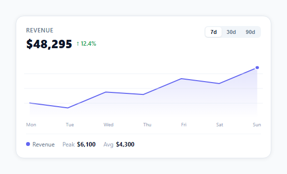
If you need a revenue or metric line chart for a dashboard without importing a charting library, this snippet builds a complete SVG line chart from scratch: a normalised SVG polyline path, a gradient area fill, a mousemove tooltip with a tracking dot, a period tab switcher (7d / 30d / 90d), and a footer with peak and average statistics — all in plain HTML, CSS, and vanilla JavaScript.
How the SVG path is generated
The chart function takes the data array and normalises each value to an SVG coordinate. The X position is evenly distributed: x = pad + (i / (n-1)) * (svgW - pad*2). The Y position inverts the scale: y = svgH - pad - ((val - min) / (max - min)) * (svgH - pad*2) — subtracting from svgH because SVG Y increases downward. These (x,y) points form an array of coordinate pairs. The SVG path D attribute is built by joining M (moveto) for the first point and L (lineto) for each subsequent point.
The gradient area fill
A linearGradient element in the SVG defs fades from indigo at 18% opacity to transparent. The area path starts at the line path, then closes back along the bottom edge of the chart (L to the last x at svgH, then L to the first x at svgH, then Z). The fill is set to url(#areaGrad).
The mousemove tooltip
On mousemove over the SVG, the mouse X position is converted from pixel coordinates to SVG coordinates using getBoundingClientRect(). The closest data point is found by comparing each point X to the converted mouse X. The tracking dot is moved to that point, and the tooltip div is positioned using percentage-based left/top derived from the SVG coordinate divided by svgW and svgH.
Period tab switcher
Three datasets (7 days, 30 days, 90 days) are stored as separate arrays. Clicking a period tab calls renderChart(idx) which regenerates all SVG paths, updates the header total and change, and refills the X axis labels and footer stats.
No library required
This pattern replaces Chart.js or Recharts for simple single-series line charts. The full implementation is under 100 lines of JavaScript.
Build with AI
Build, Understand, Optimize, and Extend It With AI
You do not need to reverse the coordinate math in your head to follow it. Paste this snippet's HTML, CSS, and JS into an AI coding assistant like Claude and ask it to explain precisely why the Y formula subtracts from svgH before scaling, and how the area path's closing "L...L...Z" segment reuses the same points array as the line path to build the gradient fill. The same assistant can help optimize it, for instance asking whether recomputing the full pts array and rewriting the tooltip's onmousemove handler on every renderChart() call is wasteful compared to caching points per dataset, or whether the closest-point search should use binary search once the x-values are known to be sorted. It is also useful for extending the widget: ask it to add a second overlaid line for a comparison metric, support pinch-zoom on the date range, or animate the path's d attribute smoothly between period switches instead of relying on the CSS transition on d. Treat the code less like a finished artifact and more like a starting point for a conversation.
Prompt to recreate it
Copy this into your AI assistant of choice to build the effect from scratch, or as a jumping-off point for your own variant:
Build a "line chart widget" card in plain HTML, CSS, and JavaScript using raw SVG paths — no charting library, no canvas.

Requirements:
- An SVG with a fixed viewBox (e.g. 0 to 420 by 0 to 120) containing a linearGradient definition, a filled area path, a stroked line path, a circle that tracks the current hover point, and a few static horizontal gridlines.
- Given an array of numeric values, compute each point's x as padding plus (index / (count - 1)) times the usable width, and its y as the chart height minus padding minus the value normalized between the data's min and max times the usable height — remembering that SVG y grows downward so the value-to-y mapping must be inverted.
- Build the line path's d attribute by joining an "M" moveto for the first point and "L" lineto commands for every subsequent point, formatted to one decimal place.
- Build the area path by reusing the exact same line path string, then appending a line down to the chart's bottom edge at the last point's x, another line across to the bottom edge at the first point's x, and a closing Z, so the area is always in sync with the line.
- Implement at least two switchable time-period datasets (e.g. 7 days and 30 days) as separate arrays, and a tab-click handler that regenerates the line, area, x-axis labels, and header stats (peak and average) for whichever dataset is active, without reloading the page.
- On mousemove over the SVG, convert the cursor's pixel position to the SVG's internal coordinate space using getBoundingClientRect(), find the closest data point by comparing x-distances, move the tracking circle and a positioned tooltip div to that point, and show the corresponding date label and formatted value. Reset the tracking circle to the last point and hide the tooltip on mouseleave.
Step by step
How to Use
- 1Hover over the chartMove the cursor across the chart area to see the tracking dot and tooltip update. The tooltip shows the date label and value for the nearest data point.
- 2Click the period tabsSwitch between 7d, 30d, and 90d. Each tab loads a different dataset, regenerates the SVG path, and updates the header total, change percentage, and footer stats.
- 3Replace the data arraysIn the JS panel, update the vals arrays in each dataset object. The chart automatically normalises any range of values to fit the 120px SVG height.
- 4Change the chart colourReplace #6366f1 in the CSS and SVG attributes with your brand hex. Update both the stroke colour on the line path and the stop-color in the linearGradient.
- 5Change the metric labelUpdate "Revenue" in the .card-title and the total/change strings in each dataset object. Add more stat-pair entries in the footer for additional metrics like Min or Total.
- 6Export in your formatClick "HTML" for a standalone file, "JSX" for a React component using useState for period and useMemo for chart path calculation, or "Tailwind" for a Tailwind CSS version.
Real-world uses
Common Use Cases
Got questions?
Frequently Asked Questions
Each data value is converted to an (x,y) SVG coordinate. X is evenly distributed: x = pad + (index / (n-1)) * (svgWidth - pad*2). Y is normalised and inverted: y = svgHeight - pad - ((value - min) / (max - min)) * (svgHeight - pad*2). Subtracting from svgHeight inverts the scale because SVG Y increases downward. These points are joined into an SVG path D string: "M x0,y0 L x1,y1 L x2,y2 ...".
The mousemove handler reads e.clientX and the chart SVG's getBoundingClientRect() to compute xRel — the cursor position in SVG coordinate units. It then iterates all point X coordinates and tracks the index with the minimum absolute distance to xRel. That index selects the tooltip label, value, and dot position. The dot and tooltip update on every mousemove event.
Add a second path element to the SVG with a different stroke colour: <path id="line2" fill="none" stroke="#10b981" stroke-width="2"/>. In renderChart(), compute pts2 from the second data array using the same coordinate math. Set document.getElementById("line2").setAttribute("d", lineD2). Add a second legend dot in the footer with the new colour.
Click "JSX" to download. Manage activePeriod with useState. Compute pts with useMemo from the active dataset — recalculate only when activePeriod or data changes. Set the SVG path d attribute via a state variable that updates when pts change. For the tooltip, use useState for hover position and onMouseMove on the SVG element.