More Charts Snippets
Front-End Coding Playgrounds
Learn to code with interactive, live-preview playgrounds — HTML, CSS, JavaScript, React & more.
 HTML Playground42 lessons · Click-based · Live preview
 CSS PlaygroundLearn CSS with a live editor
 JavaScript Playground60 lessons · DOM · Async · Canvas
 React PlaygroundLearn React with a live code editor
 GSAP PlaygroundLearn GSAP animation interactively
 SVG Playground44 lessons · shapes · paths · animation
 SCSS Playground45 lessons · Sass modules · tokens
 Tailwind PlaygroundLearn Tailwind CSS with a live editor
 Bootstrap 5 Playground50 lessons · live preview
Donut Chart — Free HTML CSS JS SVG Snippet
Donut Chart · Charts · Plain HTML, CSS & JS · Live preview
What's included
Features
About this UI Snippet
Donut Chart — SVG Stroke-Based Segments, Hover Highlight, Interactive Legend & Detail Strip
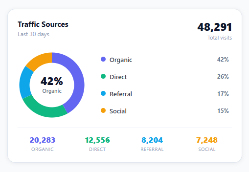
A donut chart is the most popular dashboard visualisation for showing part-to-whole relationships — traffic sources, revenue breakdown, user demographics, or any percentage distribution. It combines a visual arc layout with a centre label for immediate context. This snippet builds a complete donut chart from scratch: SVG stroke-dasharray segments computed from data percentages, hover highlight with opacity dimming of other segments, an interactive legend that mirrors the hover effect, a centre label that updates on hover, and a bottom detail strip — all in plain HTML, CSS, and vanilla JavaScript with no chart library.
How SVG stroke segments work
Each segment is an SVG circle element with the same cx, cy, and r as the background circle. stroke-dasharray defines how much of the stroke is solid (the segment arc) and how much is transparent (the gap). For a segment with 42% of the total: dash = (42/100) × CIRCUMFERENCE; gap = CIRCUMFERENCE - dash. stroke-dashoffset controls where the segment starts along the perimeter — each segment is offset by the sum of all previous segment lengths.
The -90 degree rotation
By default, SVG strokes start at the 3 o'clock position. transform: rotate(-90deg) on the SVG element rotates the start to 12 o'clock — the expected position for donut charts. Because the segments are children of the rotated SVG, they all rotate together.
Hover highlight pattern
On mouseenter for any segment or legend item, highlightSeg(idx) sets all other segments to opacity: 0.3 and the hovered segment to 1. The centre label updates to show the hovered segment's percentage and label. resetHighlight() on mouseleave restores all segments to opacity: 1 and resets the centre to the first segment.
The interactive legend
The legend mirrors the chart: hovering a legend item calls the same highlightSeg() function as hovering a segment. Both input devices produce identical visual feedback — users who prefer clicking on text labels get the same experience as users who hover the arc segments.
Customising the chart
Update the DATA array: each entry needs label, value (raw number for the detail strip), pct (percentage of total), and color. The segment sizes compute from pct values. Update the total variable if your percentages do not sum to 100.
Build with AI
Build, Understand, Optimize, and Extend It With AI
Rather than reconstructing the stroke-dasharray math yourself, paste this snippet's HTML, CSS, and JS into an AI coding assistant like Claude and ask it to explain exactly how each segment's dash length is derived from CIRC and its pct/total ratio, and why the running offset variable has to accumulate the previous segments' dash lengths rather than each segment computing its own offset independently. The same assistant can help optimize it, for instance asking whether recreating all SVG circle elements from scratch would be needed if DATA changes at runtime, or whether existing elements could be updated in place instead. It is also useful for extending the chart: ask it to animate the segments sweeping in from zero on load, add a click handler that filters the legend and detail strip to a single selected segment, or support a "no data" empty state. Treat the code less like a finished artifact and more like a starting point for a conversation.
Prompt to recreate it
Copy this into your AI assistant of choice to build the effect from scratch, or as a jumping-off point for your own variant:
Build an interactive donut chart in plain HTML, CSS, and SVG with vanilla JavaScript — no chart library.

Requirements:
- An SVG containing one background circle plus one circle element per data segment, all sharing the same cx, cy, and radius, with the whole SVG rotated -90 degrees so segments start at the 12 o'clock position instead of 3 o'clock.
- Compute the circumference once as 2 times PI times the radius. For each segment, set stroke-dasharray to "dash gap" where dash equals (segment percentage / total percentage) times the circumference, and gap is the circumference minus dash.
- Maintain a running offset variable across the loop that builds the segments: each segment's stroke-dashoffset must be the negative of the sum of all dash lengths from every previously drawn segment, so segments sit end to end around the ring with no gaps or overlaps.
- Render a legend list and a bottom detail strip from the same data array used to build the segments, so all three (ring, legend, detail strip) share one source of truth.
- Add mouseenter and mouseleave handlers to both the SVG segments and the legend items (not just one or the other) so hovering either sets every other segment's opacity to a dimmed value and the hovered one to full opacity, while updating a center label to show that segment's percentage and name; mouseleave must restore full opacity to all segments and reset the center label back to the first segment.
Step by step
How to Use
- 1Hover over segments or legend itemsMoving the cursor over any segment or legend item highlights it (other segments dim to 30% opacity). The centre label updates to show the hovered segment's percentage and name.
- 2Update the DATA array with your valuesEdit DATA at the top of the JS panel. Each object needs label, value (raw number for the detail strip), pct (percentage), and color (hex). Keep pct values summing to 100 for a complete donut.
- 3Change the number of segmentsAdd or remove objects from DATA. The chart builds segments dynamically from the array length. More than 6 segments can make the chart hard to read — consider grouping small segments into an "Other" category.
- 4Change segment coloursUpdate the color field in each DATA entry. Use brand colours, semantic colours (green for positive, red for negative), or a sequential colour scale. The legend dots and detail strip numbers automatically use the same colour.
- 5Change the hole sizeUpdate the stroke-width on .donut-bg and .donut-seg (default 18). Increasing stroke-width makes the ring thicker (smaller hole); decreasing makes it thinner (larger hole). Keep stroke-width below the radius (48px) to avoid overlapping.
- 6Export in your formatClick "HTML" for a standalone file, "JSX" for a React component with useMemo for segment computation, or "Tailwind" for a React + Tailwind CSS version.
Real-world uses
Common Use Cases
Got questions?
Frequently Asked Questions
Each segment is a circle element with stroke-dasharray: [dash] [gap]. CIRCUMFERENCE = 2 × π × r = 301.6px for r=48. For a 42% segment: dash = 0.42 × 301.6 = 126.7px; gap = 301.6 - 126.7 = 174.9px. stroke-dashoffset shifts the start: negative offset moves the dash clockwise. Each segment's offset is -(sum of all previous dash lengths). The SVG is rotated -90° so the first segment starts at 12 o'clock.
Set all segments to stroke-dasharray: 0 CIRCUMFERENCE initially (empty segments), then use requestAnimationFrame or CSS transition to animate to their final values. For a staggered entrance, add animation-delay: calc(i × 0.1s) to each segment via JavaScript: seg.style.transitionDelay = i * 0.1 + "s". Then set the final stroke-dasharray in the next frame to trigger the CSS transition.
Create a .tooltip div positioned with position:absolute. On mouseenter for each segment, position it near the cursor: tooltip.style.left = (e.pageX + 12) + "px"; tooltip.style.top = (e.pageY - 8) + "px". Set tooltip.textContent = d.label + ": " + d.value.toLocaleString(). On mousemove, update the position. On mouseleave, hide the tooltip. Add pointer-events:none to the tooltip so it never interferes with cursor events.
Click "JSX" to download. Compute segments with useMemo([data]): iterate data, accumulate offset, return array of {color, dash, gap, offset, idx}. Map segments to SVG circle elements. Manage hovered state with useState(null) — on mouseEnter set it to the segment index, on mouseLeave null. Derive opacity for each segment from hovered state. Pass data as a prop for reusability across different chart instances in your dashboard.