More Charts Snippets
Front-End Coding Playgrounds
Learn to code with interactive, live-preview playgrounds — HTML, CSS, JavaScript, React & more.
 HTML Playground42 lessons · Click-based · Live preview
 CSS PlaygroundLearn CSS with a live editor
 JavaScript Playground60 lessons · DOM · Async · Canvas
 React PlaygroundLearn React with a live code editor
 GSAP PlaygroundLearn GSAP animation interactively
 SVG Playground44 lessons · shapes · paths · animation
 SCSS Playground45 lessons · Sass modules · tokens
 Tailwind PlaygroundLearn Tailwind CSS with a live editor
 Bootstrap 5 Playground50 lessons · live preview
Waterfall Chart — Bridge Chart HTML CSS JS Snippet
Waterfall Chart · Charts · Plain HTML, CSS & JS · Live preview
What's included
Features
build tracks a cumulative total so each step floats at the previous level, and a null closing total auto-computes the net.bottom and height from their start/end levels — increases sit above, decreases hang below the running total.scaleY from a bottom origin with staggered animation-delay, a compositor-smooth cascade that exports cleanly.+/− changes or a toLocaleString total, colour-matched to increase/decrease/total.DATA array; a replay button rebuilds it to re-run the animation.About this UI Snippet
Waterfall Chart — Floating Increase/Decrease Bars, Running Totals & Dotted Connectors
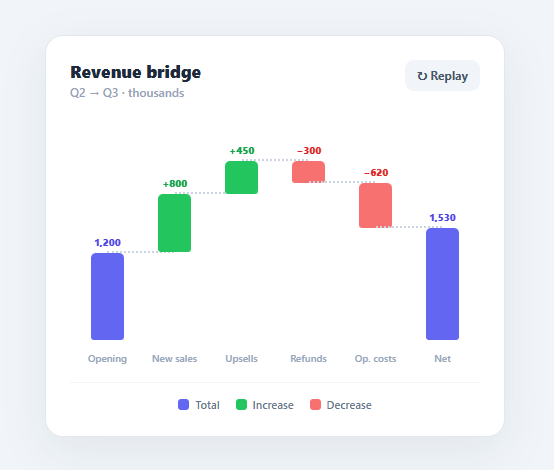
A waterfall (or bridge) chart shows how a starting value becomes an ending value through a sequence of positive and negative changes — revenue bridges, budget variance, profit breakdowns, headcount changes. Each step "floats" at the running total left by the previous step, so the eye walks down (or up) the cascade. This snippet builds one in plain HTML, CSS, and vanilla JavaScript from a simple data array: floating increase/decrease bars, full-height total columns, dotted connectors, value labels, and a staggered grow-in animation.
Running-total math
build walks the data, tracking a cum running total. A total row (opening/closing) draws a full bar from zero to its value; a step row floats from the current total to the new total (cum + value), then updates cum. It records each bar's start and end levels and the overall maxLevel for scaling. The closing total can be left as null to auto-compute the net from the accumulated steps — so the "Net" bar always reflects the real sum.
Floating bars positioned by value
Each bar is absolutely positioned: its bottom is the lower of its start/end levels times a scale factor, and its height is the difference. Increase steps are green and sit above the previous total; decrease steps are red and hang below it; totals are full-height blue columns from the baseline. The scale is derived from maxLevel with headroom so the tallest bar never touches the top. Bar x-positions and widths use percentages, so the chart is responsive without any resize code.
Dotted connectors
Between consecutive bars, a dotted horizontal line is drawn at the end level of the left bar — which is exactly the start level of the next — visually linking each step to where the next one begins. These connectors are what make a waterfall readable as a continuous bridge rather than a set of disconnected bars.
Staggered grow-in
Bars animate up from the baseline with a wf-grow keyframe using transform: scaleY and transform-origin: bottom, with a per-bar animation-delay so the cascade builds left to right. Using a transform (not height) keeps the animation on the compositor and means it exports cleanly to utility frameworks. A replay button rebuilds the chart to replay the animation.
Data-driven and value-labelled
The whole chart regenerates from the DATA array, and each bar shows its signed value (+800, −300, or a total formatted with toLocaleString). Swap the array for your real figures and the bridge redraws. Pair this with a bar chart for categories, a funnel chart for conversion drop-off, or a metric card grid for headline numbers.
Build with AI
Build, Understand, Optimize, and Extend It With AI
Ask an AI coding assistant like Claude to walk through how build() tracks the running cum total across the DATA array to decide each bar's start and end level, and specifically how a null value on the final "total" row lets it auto-compute the net from the accumulated steps instead of you hardcoding it. It's worth pressure-testing the current scale logic too — ask what would need to change if a running total ever dipped negative, since the code as written assumes every level stays at or above zero. For extending the chart, ask for a variant that supports negative running totals with a proper zero baseline, animated re-ordering when you drag a step to a new position, or a way to export the rendered bars as an accessible data table alongside the visual for screen-reader users. Treat the code less like a finished artifact and more like a starting point for a conversation.
Prompt to recreate it
Copy this into your AI assistant of choice to build the effect from scratch, or as a jumping-off point for your own variant:
Build a financial waterfall (bridge) chart in plain HTML, CSS, and JavaScript — floating bars that show how a starting value becomes an ending value through a sequence of increases and decreases — no SVG, no charting library.

Requirements:
- Accept a data array where each entry is typed either "total" (an anchor column, drawn full-height from zero) or "step" (a signed change that floats between the previous running total and the new one); allow the final total entry's value to be null so its value auto-computes as the accumulated net of all the steps.
- Walk the data array once, tracking a running cumulative total, and for every entry record its start level, end level, and the overall maximum level seen, which becomes the basis for the chart's vertical scale (with some headroom so the tallest bar doesn't touch the top).
- Position every bar absolutely using percentages for both horizontal placement (evenly divided columns) and vertical placement (bottom offset and height derived from the lower and higher of its start/end levels times the computed scale) — no bar's geometry should be hardcoded in pixels.
- Color-code bars into three categories: total columns in one color, positive steps in a second color, and negative steps in a third, and label each bar with its total value or its signed change (with a leading plus or minus sign).
- Draw a dotted horizontal connector between each pair of adjacent bars at the exact level where one bar's end matches the next bar's start, so the sequence reads as one continuous bridge rather than disconnected columns.
- Animate every bar growing in from the baseline using a CSS transform: scaleY transition with the transform-origin set to the bottom, staggered per bar with an increasing delay, and provide a replay control that rebuilds the chart to re-trigger the animation.
Step by step
How to Use
- 1Paste HTML, CSS, and JSA "Revenue bridge" card appears and the bars grow up from the baseline left to right, forming the waterfall.
- 2Read the bridgeBlue totals anchor the start and net; green bars step up for increases and red bars step down for decreases between them.
- 3Follow the connectorsDotted lines link the top of each bar to the start of the next, showing the running total carrying across.
- 4Check the valuesEach bar is labelled with its signed change (+800, −300) or its total, formatted with thousands separators.
- 5Replay the animationClick "↻ Replay" to rebuild and re-run the staggered grow-in.
- 6Plug in your dataEdit the
DATAarray — usetype:'total'for anchors (valuenullauto-computes the net) andtype:'step'with signed values for changes.
Real-world uses
Common Use Cases
Got questions?
Frequently Asked Questions
Edit the DATA array: each entry is { label, type, value }. Use type:'total' for anchor columns (set value:null on the final one to auto-compute the net from the steps) and type:'step' with a positive or negative value for each change. build handles cumulative positioning, scaling, connectors, and labels automatically.
The current scale assumes non-negative levels. To support negatives, compute both the min and max level across all bars, map zero to a baseline inside the plot, and position bars relative to that zero line (so decreases below zero hang beneath it). Draw a horizontal zero axis for reference, as financial waterfalls do.
transform: scaleY with a bottom origin runs on the GPU and, importantly for this site's framework exports, Tailwind's transition/animate utilities handle transforms cleanly while raw height animation does not convert reliably. The bar's final height is set inline; the keyframe just scales it up from the baseline.
The bars are decorative, so provide the data as text: each bar is labelled with its value, and you should add an aria-label per bar summarising it ("Refunds: −300, running total 2,150"). Offer an off-screen data table of label/change/running-total for screen-reader users, and give the chart container a role="img" with a descriptive label.
In React, compute the bars with useMemo from your data array (running total, start/end, scale) and render them as positioned <div>s with inline styles — no manual DOM building. In Vue, use a computed that returns the bar models and v-for. In Angular, compute in the component and *ngFor. The scaleY keyframe and connector CSS port unchanged.