More Charts Snippets
Front-End Coding Playgrounds
Learn to code with interactive, live-preview playgrounds — HTML, CSS, JavaScript, React & more.
 HTML Playground42 lessons · Click-based · Live preview
 CSS PlaygroundLearn CSS with a live editor
 JavaScript Playground60 lessons · DOM · Async · Canvas
 React PlaygroundLearn React with a live code editor
 GSAP PlaygroundLearn GSAP animation interactively
 SVG Playground44 lessons · shapes · paths · animation
 SCSS Playground45 lessons · Sass modules · tokens
 Tailwind PlaygroundLearn Tailwind CSS with a live editor
 Bootstrap 5 Playground50 lessons · live preview
Bar Chart HTML CSS JS — Animated SVG Bar Chart
Bar Chart · Charts · Plain HTML, CSS & JS · Live preview
What's included
Features
About this UI Snippet
Bar Chart — How to Build an Animated SVG Bar Chart with Dynamic Scale and Hover Tooltips in JavaScript
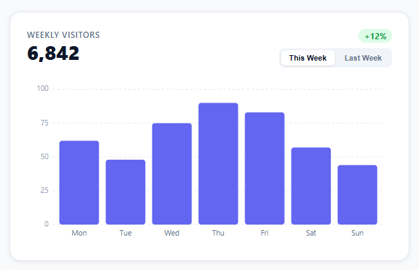
Bar charts are the default visualization for comparing discrete values across categories — daily website visitors, weekly sales by region, monthly signups by plan. A well-built bar chart in vanilla JavaScript requires solving four distinct problems: computing a dynamic Y-axis scale from the data, drawing SVG rectangles with correct coordinates, animating bar growth on load and dataset change, and showing a hover tooltip with the exact value.
This snippet builds a complete bar chart dashboard card in SVG, CSS, and vanilla JavaScript — no Chart.js, no D3.js, no canvas. It shows weekly visitor data with This Week / Last Week toggle buttons, animated bars, a value tooltip on hover, and a total count-up animation in the card header.
SVG Coordinate System and Layout Constants
The SVG viewBox is set to "0 0 540 240". The chart area is inset by padding constants: PAD_LEFT=38 (room for Y-axis labels), PAD_RIGHT=12, PAD_TOP=12, PAD_BOTTOM=28 (room for X-axis labels). The usable chart area is therefore 540-38-12=490px wide and 240-12-28=200px tall.
Bar width is computed as: BAR_W = (chartWidth - (barCount - 1) * BAR_GAP) / barCount — dividing available width by 7 bars minus the 6 gaps between them. This ensures bars always fill the chart width regardless of the number of data points.
Dynamic Y-Axis Scale
The Y axis scale is computed from the data on every dataset switch. maxVal = Math.max(...values) finds the tallest bar. The scale is then rounded up to a "nice" number: the function finds the next multiple of a step size (10, 20, 25, 50, 100, etc.) above the max value to produce clean grid line positions. Five horizontal grid lines are drawn at 20%, 40%, 60%, 80%, and 100% of the scale max — each labeled with its Y value on the left axis.
Converting a data value to a Y coordinate: y = PAD_TOP + chartHeight * (1 - value / scaleMax). SVG Y coordinates increase downward, so a value of 100% maps to PAD_TOP (top of chart area) and 0% maps to PAD_TOP + chartHeight (bottom).
Bar Rendering with SVG rect Elements
Each bar is an SVG <rect> element. The x position: PAD_LEFT + i * (BAR_W + BAR_GAP). The full-height y position and height are computed from the data value. For animation, bars start at height=0 and y at the bottom, then transition to their target height.
The bars use rx="4" for rounded top corners. An interactive <rect class="bar-hit"> of full chart height and same x position sits invisibly on top of each bar to capture hover events — this gives a wider hover target than the bar itself, especially for short bars.
requestAnimationFrame Entry Animation
When bars render (on load or dataset switch), they start at height 0 and animate to their target height using requestAnimationFrame. An ease-out cubic function maps the animation progress t to a smooth deceleration: 1 - Math.pow(1 - t, 3). Each bar animates simultaneously. The animation duration is 600ms.
For dataset switching, the old bars fade out (CSS opacity transition) while new bars enter with the rAF animation. This creates a smooth transition between This Week and Last Week data.
Hover Tooltip
The tooltip is a <g> element containing a rounded <rect> background and two <text> elements — the day label and the value. It is positioned above the hovered bar using the bar's x center and y position minus an offset. Mouse events fire on the invisible hit-area rects.
The tooltip uses pointer-events: none so it does not interfere with mouseover/mouseout on bars below it. The transform: translate(x, y) positions it, and visibility: hidden / visible shows/hides it without layout shift.
Header Count-Up and Change Badge
The card header shows the total visitor count (sum of all bars) animated with a count-up using requestAnimationFrame. On dataset switch, the count animates from the previous total to the new total over 600ms using a quadratic ease-out. The change badge (+12%, +4%) updates immediately and color-codes green for positive change and red for negative via conditional class assignment.
Dataset Toggle Buttons
The This Week / Last Week toggle uses a .active class on the clicked button. Clicking a button: removes .active from all toggles, adds it to the clicked one, reads the dataset from the DATASETS object by key, calls updateHeader(dataset) and renderBars(dataset). The active button has accent color border and text; inactive buttons have muted styling.
Build with AI
Build, Understand, Optimize, and Extend It With AI
You don't have to work out the coordinate math and animation timing here by hand. Paste this snippet's HTML, CSS, and JS into an AI coding assistant like Claude and ask it to walk through exactly how renderBars converts a data value into the rect's y and height attributes using the PAD_TOP/CHART_H constants, or why the bars are set to height 0 first and then animated to their target inside a requestAnimationFrame callback rather than immediately. The same assistant can help optimize it — asking whether rebuilding barsGroup.innerHTML on every dataset switch is wasteful compared to updating existing rect attributes in place, or whether the tooltip's getBoundingClientRect calls on every mousemove could be cached. It's also useful for extending the chart: ask it to add a third dataset, stacked or grouped bars, or a live-updating feed that calls renderBars on an interval. Treat the code less like a finished artifact and more like a starting point for a conversation.
Prompt to recreate it
Copy this into your AI assistant of choice to build the effect from scratch, or as a jumping-off point for your own variant:
Build an animated SVG bar chart dashboard card in plain HTML, CSS, and JavaScript using only SVG rect/line/text elements and requestAnimationFrame — no Chart.js, no D3.js, no canvas.

Requirements:
- An SVG with a fixed internal viewBox (e.g. 0 0 540 240) and padding constants reserved on each side for Y-axis labels (left) and X-axis labels (bottom), so all coordinate math derives from those constants rather than magic numbers.
- Draw a fixed number of horizontal dashed grid lines at even value steps (e.g. 0/25/50/75/100), each paired with a Y-axis text label positioned to the left of the chart area.
- Render one SVG rect per data point, with x computed from the bar's index, gap, and computed bar width so bars always fill the chart width regardless of how many data points there are, and y/height computed by mapping the data value against a fixed maximum onto the chart's pixel height (remembering SVG y grows downward, so full value maps to the top).
- On initial render and on every dataset switch, bars must start collapsed at height 0 sitting on the baseline, then animate to their target height and y inside a requestAnimationFrame (or transitioned) step so bars visibly grow upward from the bottom.
- Attach mouseenter, mousemove, and mouseleave listeners to each bar that show/move/hide a floating tooltip div positioned above the hovered bar, converting the bar's SVG-space coordinates into on-screen pixel coordinates using the SVG element's actual rendered bounding box (not the raw viewBox units).
- Provide at least two named datasets and a toggle control that swaps the active dataset, re-renders the bars with the grow animation, and updates a header total and a color-coded (green/red) percent-change badge to match the newly selected dataset.
Step by step
How to Use
- 1Read the chartSeven bars represent Mon–Sun visitor counts for the current week. The Y axis scales dynamically to the highest value with five labeled grid lines.
- 2Switch datasetsClick "Last Week" to see the previous week's data. Bars animate out and new bars grow in. The total count and change badge in the header update.
- 3Hover for exact valuesHover any bar (or the area above it) to see a tooltip with the exact day and visitor count.
- 4Replace the dataEdit the DATASETS object at the top of the JS. Each dataset has labels (day names), values (counts), total (formatted string), change (+12%), and changeUp (boolean for color).
- 5Add more datasetsAdd more keys to DATASETS and create corresponding toggle buttons with matching data-week attributes. The renderBars() and updateHeader() functions read the dataset by key automatically.
- 6Connect to an APIReplace the static DATASETS object with an async fetch: const data = await fetch('/api/stats/weekly').then(r => r.json()); then pass the response to renderBars() and updateHeader(). The rest stays unchanged.
Real-world uses
Common Use Cases
Got questions?
Frequently Asked Questions
The code finds Math.max(...values) to get the tallest bar. It then computes a step size from the magnitude of the max value (e.g., max=90 → step=10, max=450 → step=50). The scale max is rounded up to the next multiple of step above the max value. Five grid lines are drawn at 20%, 40%, 60%, 80%, and 100% of that scale max, labeled with their Y values. This ensures grid lines always fall on round numbers regardless of the data range.
On renderBars(), all bars start at height=0 and y=chartBottom. A timestamp from performance.now() is captured. On each rAF frame, t = (now - start) / DURATION gives progress 0–1. The easing function 1 - Math.pow(1-t, 3) applies ease-out cubic, making bars accelerate quickly and decelerate near their target. Each bar's rect.setAttribute("height", targetHeight * ease) and rect.setAttribute("y", targetY + targetHeight * (1 - ease)) updates the bar simultaneously. The loop continues until t >= 1.
Add more keys to the DATASETS object: DATASETS.month = { labels: [...30 labels], values: [...30 values], total: "...", change: "...", changeUp: true }. Add a button: <button class="tog-btn" data-week="month">Last 30 Days</button>. The existing toggle event listener reads data-week and looks up DATASETS[key], so no JS changes are needed. The bar width recalculates automatically from the values.length.
Replace the DATASETS object with an async init function: async function init() { const res = await fetch('/api/stats'); const json = await res.json(); Object.assign(DATASETS, json); buildGrid(); updateHeader(DATASETS.this); renderBars(DATASETS.this); } init(); Your API should return an object matching the DATASETS shape: { this: { labels, values, total, change, changeUp }, last: { ... } }.
A standard bar rect captures hover events only over the colored rectangle. For short bars (a day with very few visitors), the hover target might be only 5–10px tall — nearly impossible to hit accurately. The invisible hit-rect is the same width as the bar but spans the full chart height, creating a tall column hover area. This means hovering anywhere in the column above the bar also triggers the tooltip, matching the behavior of professional chart libraries.
Yes. Click JSX for a React component, Vue for a Vue 3 SFC, Angular for a standalone component, or Tailwind for a utility-class version. In React, render the SVG bars from a map() over your data array and trigger the grow animation by toggling a class in useEffect after mount.