More Charts Snippets
Front-End Coding Playgrounds
Learn to code with interactive, live-preview playgrounds — HTML, CSS, JavaScript, React & more.
 HTML Playground42 lessons · Click-based · Live preview
 CSS PlaygroundLearn CSS with a live editor
 JavaScript Playground60 lessons · DOM · Async · Canvas
 React PlaygroundLearn React with a live code editor
 GSAP PlaygroundLearn GSAP animation interactively
 SVG Playground44 lessons · shapes · paths · animation
 SCSS Playground45 lessons · Sass modules · tokens
 Tailwind PlaygroundLearn Tailwind CSS with a live editor
 Bootstrap 5 Playground50 lessons · live preview
Activity Heatmap HTML CSS JS — GitHub-Style Calendar
Activity Heatmap · Charts · Plain HTML, CSS & JS · Live preview
What's included
Features
About this UI Snippet
Activity Heatmap — How to Build a GitHub-Style Contribution Calendar in HTML, CSS, and JavaScript
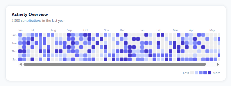
The GitHub contribution graph is one of the most recognized data visualizations in developer tools. Its 52-column × 7-row grid of colored squares communicates an entire year of activity at a single glance — no axes, no numbers, no scrolling. The intensity of each cell encodes a count, so patterns like streaks, weekday vs weekend habits, and seasonal dips emerge immediately from the visual texture.
This snippet replicates that pattern in pure HTML, CSS, and vanilla JavaScript — no D3, no charting library, no canvas. It renders a full 364-day (52 weeks) heatmap with five color intensity tiers, month labels above the grid, day labels on the left, and a hover tooltip showing the exact count and date.
Data Model and Date Generation
The heatmap data is a plain JavaScript object where each key is an ISO date string in YYYY-MM-DD format and each value is an activity count (any non-negative integer). The generateData() function populates this object for the 364 days before today: it counts backwards from today using setDate(today.getDate() - offset) and formats each date as d.toISOString().slice(0, 10).
The distribution is deliberately skewed: approximately 40% of days get a count of 0 (the Math.random() < 0.4 branch), and the remaining 60% get a count from 1 to 20 via Math.ceil(Math.random() * 20). This produces realistic-looking sparse activity rather than a uniform fill.
Quartile-Based Color Tier Binning
Rather than using a fixed scale (e.g., 1–4 = tier 1, 5–9 = tier 2), the snippet uses quartile binning: it collects all non-zero counts, sorts them ascending, and divides the sorted array into four equal quartile buckets. The thresholds are at indices 25%, 50%, and 75% of the sorted array. Any count that falls below the 25th percentile gets tier 1 (lightest), above the 75th gets tier 4 (darkest), and the middle two quartiles get tiers 2 and 3.
This adaptive approach means the color distribution always looks balanced regardless of the actual count magnitude — whether your data ranges from 1–5 or 1–500, the heatmap uses all four non-empty colors. The buildTiers(data) function returns a function tier(count) that takes a count and returns the tier index 0–4 (0 for zero counts).
CSS Grid Layout for the Cell Matrix
The core grid uses CSS: display: grid; grid-template-columns: repeat(52, 11px); grid-auto-rows: 11px; gap: 2px. The 52 columns represent weeks and the 7 rows (auto-generated) represent days. Each cell is an 11×11px div.
The key layout detail is column-first ordering: cells are appended in day order (day 0 of week 0, day 1 of week 0, ..., day 6 of week 0, day 0 of week 1, ...) so CSS Grid naturally flows them into the right column-per-week arrangement. The grid-auto-flow: column equivalent is achieved by setting 52 fixed columns — the browser fills down each column before moving to the next.
Month Label Positioning
Month labels above the grid (Jan, Feb, ..., Dec) are the trickiest part. The label for a given month must appear above the first week-column that starts in that month. For each of the 52 weeks, the snippet checks whether weekStart.getMonth() !== previousWeekStart.getMonth() — if the month changed, that column gets a label. The label div uses absolute positioning with left: (weekIndex * 13)px (column width 11px + gap 2px = 13px per column). The container has position: relative and a fixed height matching the label row.
Day Labels
A separate flex column on the left shows Mon, Wed, Fri at indices 1, 3, 5 (the even-index days are left blank for a GitHub-faithful look). Each label is 11px tall plus 2px gap, aligned to the corresponding grid row.
Hover Tooltip
The tooltip is a single absolutely-positioned div that moves with the mouse. Each cell has data-date and data-count attributes set at render time. mouseover reads these via e.target.dataset and updates the tooltip content and position. The tooltip uses position: fixed and offsets from e.clientX and e.clientY with a 10px nudge to avoid covering the hovered cell. mouseleave on the grid container hides it.
Connecting Real Data
To use real contribution data, replace generateData() with a function that builds the same { [YYYY-MM-DD]: count } object from your API. For GitHub contribution data: call the GitHub REST API (/users/{user}/events) or GraphQL API (contributionCalendar) and map each contribution day to its count. For custom apps, aggregate your events table by date server-side and return the result as a JSON object. The rendering code does not care about the source — it only requires the YYYY-MM-DD: count format.
Performance Characteristics
The snippet creates 364 DOM elements on load. This is well within browser performance limits — modern browsers handle thousands of small divs at 60fps without issue. The hover handler is attached once to the parent container (event delegation), not individually to each cell, so there are no 364 separate event listeners in memory. The month-label calculation is O(n) over 52 weeks, not 364 days.
Build with AI
Build, Understand, Optimize, and Extend It With AI
You don't have to work through the percentile math by hand — paste this snippet's HTML, CSS, and JS into an AI coding assistant like Claude and ask it to explain exactly how buildTiers computes the 25th/50th/75th percentile thresholds from the sorted non-zero values, and why that adaptive quartile approach was chosen over a fixed count-based scale. The same assistant is useful for optimizing it — asking whether creating 364 DOM cells up front is the right tradeoff versus a canvas-based renderer for embedding many heatmaps on one dashboard page, or whether the month-label positioning loop could be simplified. It's just as good for extending the heatmap: ask it to wire generateData up to a real API endpoint and cache the quartile calculation, add a year-picker to swap between different 52-week windows, or add keyboard navigation between cells for accessibility. Treat the code less like a finished artifact and more like a starting point for a conversation.
Prompt to recreate it
Copy this into your AI assistant of choice to build the effect from scratch, or as a jumping-off point for your own variant:
Build a GitHub-style "activity heatmap" (contribution graph) in plain HTML, CSS, and JavaScript — no charting library, no canvas or SVG, using only CSS grid for the cell layout.

Requirements:
- A data model that is a plain object mapping ISO date strings (YYYY-MM-DD) to a non-negative integer count, covering the past 364 days.
- A color-tier function that does NOT use a fixed numeric scale. Instead, collect every non-zero count, sort them ascending, and compute the values at the 25th, 50th, and 75th percentile indices of that sorted array. Map each day's count to tier 0 (zero activity), tier 1 (at or below the 25th percentile), tier 2 (at or below the 50th), tier 3 (at or below the 75th), or tier 4 (above the 75th), so the color distribution adapts automatically whether the data ranges from 1-5 or 1-500.
- A CSS grid with 52 columns (one per week) and 7 fixed rows (one per day, Sunday to Saturday), filling cells in column-first order so each week is a vertical strip.
- Month labels positioned above the grid: iterate all 52 weeks, and only when a week's starting date falls in a different month than the previous week's, insert an absolutely-positioned label at that week's pixel offset (weekIndex times the cell-plus-gap width).
- Day-of-week labels down the left side, showing only alternating labels (e.g. Sun, Tue, Thu, Sat) to avoid crowding.
- A hover tooltip that follows the cursor and displays the exact date and activity count for the hovered cell, plus a five-swatch "Less to More" legend below the grid matching the tier colors exactly.
Step by step
How to Use
- 1See the grid renderThe heatmap renders automatically on load — 364 cells (52 weeks × 7 days) filled with random activity data using quartile color tiers from lightest purple to darkest indigo.
- 2Hover over cellsHover any cell to see a tooltip showing the exact date and activity count. Empty days show "No activity", active days show the count.
- 3Read the legendThe legend row below the grid shows five swatches from empty (grey) to maximum intensity (dark indigo), matching the quartile tier colors used across the grid.
- 4Plug in your dataReplace generateData() with a function returning a plain object: { "2025-06-10": 5, "2025-06-11": 12, ... }. Keys are YYYY-MM-DD strings, values are activity counts. The rendering and tier binning work unchanged.
- 5Change the color paletteEdit the COLORS array — 5 values: [empty, tier1, tier2, tier3, tier4]. Replace with your brand gradient from lightest tint (index 1) to darkest shade (index 4). Index 0 is the zero-activity cell color.
- 6Customize date rangeChange WEEKS from 52 to any number. The loop automatically calculates start and end dates relative to today. For a specific year range, replace the date generation loop with fixed start/end Date objects.
Real-world uses
Common Use Cases
Got questions?
Frequently Asked Questions
Replace the generateData() function body. It must return a plain object where every key is a "YYYY-MM-DD" string and every value is a non-negative integer count. For GitHub: call the GraphQL contributionCalendar API and map week → day entries. For custom apps: aggregate your events table by date server-side and return the JSON. The rest of the rendering code — tier binning, grid layout, labels, tooltip — reads only this object and needs no changes.
buildTiers() collects all non-zero counts from the data object, sorts them ascending, and computes three thresholds at the 25th, 50th, and 75th percentile indices of the sorted array. The returned tier() function maps any count to 0 (zero), 1 (below 25th), 2 (25th–50th), 3 (50th–75th), or 4 (above 75th percentile). This adaptive approach means the heatmap always shows all four active colors regardless of whether your count range is 1–5 or 1–500.
In generateData(), replace the today-relative loop with: const start = new Date("2025-01-01"); const end = new Date("2025-12-31"); const data = {}; for (let d = new Date(start); d <= end; d.setDate(d.getDate() + 1)) { data[d.toISOString().slice(0,10)] = yourCount; }. Update WEEKS = Math.ceil((end - start) / (7 * 86400000)) to match the column count.
In the cell creation loop in buildHeatmap(), add: cell.addEventListener("click", () => { const date = iso; const count = activity[iso] || 0; openDayDetail(date, count); }). The iso and activity variables are in scope via closure. Alternatively, use event delegation: add one click listener to the heatmap-grid container and read e.target.dataset.date and e.target.dataset.count.
Yes — restructure the grid so each column is a month (28–31 cells wide) instead of a week (7 cells tall). Set grid-template-columns based on the number of months you want to show. Within each month column, cells represent days 1–28/30/31. You lose the clean weekly alignment but gain a month-per-column view useful for monthly habit tracking comparisons.
Yes. Use the JSX, Vue, Angular, or Tailwind export buttons to download a converted component. In React, generate the day cells with a map() over your contribution data instead of the DOM loop, and derive each cell’s level class from the count at render time.