Learn Coding Visually
Learn to code with interactive, live-preview playgrounds — HTML, CSS, JavaScript, React & more.
 HTML Playground42 lessons · Click-based · Live preview
 CSS PlaygroundLearn CSS with a live editor
 JavaScript Playground60 lessons · DOM · Async · Canvas
 React PlaygroundLearn React with a live code editor
 GSAP PlaygroundLearn GSAP animation interactively
 SVG Playground44 lessons · shapes · paths · animation
 SCSS Playground45 lessons · Sass modules · tokens
 Tailwind PlaygroundLearn Tailwind CSS with a live editor
 Bootstrap 5 Playground50 lessons · live preview
Metric KPI Card Grid — Dashboard Cards HTML CSS JS
Metric KPI Card Grid · Dashboards · Plain HTML, CSS & JS · Live preview
What's included
Features
<div> bars from a data array, normalised to the max value. Last bar full opacity; earlier bars semi-transparent for temporal context..trend.up (green tint) and .trend.down (red tint) with Unicode arrows — accessible colour + text direction signal.--ic (background) and --stroke (icon colour) on each .metric-icon — one inline style attribute sets the entire icon colour theme..active class on click.translateY(-2px) + box-shadow on hover — consistent with the dashboard card interaction pattern.About this UI Snippet
Metric KPI Card Grid — Sparkline Charts, Trend Badges & Dashboard Layout Pattern
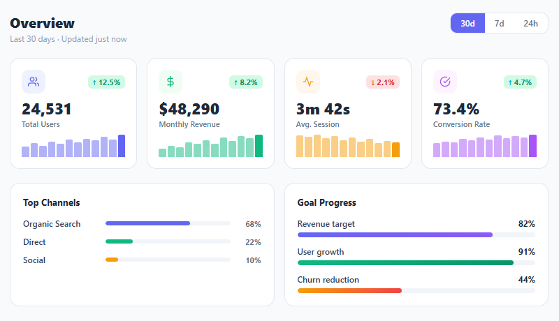
KPI metric cards are the centrepiece of every analytics dashboard — they surface the numbers that matter most and communicate direction (up, down, stable) at a glance. This snippet builds a complete dashboard overview section: a four-card metric grid with sparkline bar charts, up/down trend badges, colour-coded icon system, period toggle, and two breakdown panels (channel attribution and goal progress bars).
Dashboard UI design is one of the most nuanced areas of frontend development. The challenge is information density: each card must communicate the metric value, direction, magnitude of change, and a trend over time — all in a compact card that doesn't feel overwhelming. The sparkline chart, trend badge, and icon each contribute a different signal layer without competing for attention.
Sparkline bar charts via dynamic DOM
Sparklines are rendered via JavaScript rather than embedded SVG because the data values are dynamic — the JS reads arrays from the DATA object and creates <div class="spark-bar"> elements for each data point. Bar height is calculated as (v / max * 100) + '%' — normalising each value against the maximum in the dataset. This makes the tallest bar always 100% height regardless of the absolute values, which maximises use of the available vertical space.
The last bar in each sparkline gets full opacity (1.0) while earlier bars are semi-transparent (0.5) — visually indicating that the rightmost bar is the most recent data point. On hover, all bars dim to 0.6 and the hovered bar gets a slight scale-up, creating an interactive feel without a library.
Trend badge with colour coding
Trend badges use a .trend.up (green background + dark green text) and .trend.down (red background + dark red text) pattern. These use tinted backgrounds rather than just colour text — ensuring sufficient contrast for accessibility. The badge direction (↑/↓) uses Unicode arrow characters rather than SVG icons for weight efficiency. Note that "down" is not always bad — a decreasing churn rate or decreasing session bounce rate would use .trend.down with a positive implication.
Period toggle control
The period toggle is a segmented control built from buttons in a bordered container with overflow: hidden. The active state uses a full background: #6366f1 fill. This pattern is identical to the segmented control snippet — a common dashboard filtering pattern that drives a date range change in production implementations.
Channel breakdown bars
The breakdown panel uses a CSS grid with three columns: label (fixed width), progress bar (flexible), and percentage (fixed width). The bars animate in width via CSS transition — the same gradient progress pattern from gradient progress bars. The three channels (Organic/Direct/Social) cover the most common attribution model for web products.
Build with AI
Build, Understand, Optimize, and Extend It With AI
You don't need to eyeball the sparkline math to trust it. Paste this snippet's HTML, CSS, and JS into an AI coding assistant like Claude and ask it to explain exactly why each sparkline bar's height is normalized against the max value in its own DATA array rather than a shared scale, or why the last bar is deliberately kept at full opacity while the rest sit at half. The same assistant is useful for optimizing it — asking whether rebuilding every sparkline from scratch on a period-toggle click is wasteful compared to updating existing bar heights in place, or how many metric cards this DOM-generation approach can scale to before it should switch to a canvas or SVG sparkline. It's also a fast way to extend the dashboard: ask it to wire the 30d/7d/24h period toggle to an actual data refetch, add a hover tooltip showing each bar's raw value instead of relying on the title attribute, or turn the goal progress bars into a live countdown against a real deadline. Treat the code less like a finished artifact and more like a starting point for a conversation.
Prompt to recreate it
Copy this into your AI assistant of choice to build the effect from scratch, or as a jumping-off point for your own variant:
Build a "KPI metric card grid" dashboard section in plain HTML, CSS, and JavaScript using only CSS grid and dynamically generated DOM elements for the charts — no charting library, no SVG.

Requirements:
- A responsive CSS grid of metric cards (four columns on desktop, collapsing to two on tablet-width screens via a media query), each card containing a colored icon tile, an up or down trend badge with a percentage, a large bold value, a label, and a small bar-chart sparkline area.
- Store each sparkline's data as a plain array of numbers in a JavaScript object keyed by an id per card. For each array, compute the maximum value and generate one absolutely-sized bar div per data point whose height is set to (value / max * 100) + '%', so the tallest point in that specific series always fills the full sparkline height regardless of the series' absolute scale.
- The last (most recent) bar in every sparkline must render at full opacity while every earlier bar renders at a lower opacity, to visually mark which point is "now" versus history, and hovering the sparkline should dim all bars except the one directly under the cursor, which should highlight and scale up slightly.
- Trend badges must use a tinted background color combined with an up or down arrow character, not color alone, so direction is still legible without relying purely on hue — and a "down" trend must be stylable as either good or bad depending on the metric (e.g. down is good for churn, bad for revenue).
- Add a segmented period-toggle control (e.g. 30d / 7d / 24h) built from plain buttons where clicking one adds an active class to itself and removes it from its siblings.
- Below the metric grid, add two side-by-side breakdown cards: one with horizontal labeled bars showing percentage-of-total breakdown (e.g. traffic channels) and one with labeled goal-progress bars showing percent-to-target, both using CSS width transitions so changing the width value animates smoothly.
Want to tighten it up first? Run this prompt through the AI Prompt Studio to score it across 8 quality dimensions, catch anti-patterns, and tune the wording for Claude, ChatGPT, or Gemini before you paste it in.
Step by step
How to Use
- 1Paste HTML, CSS, and JSA four-card KPI grid appears with sparklines, trend badges, and icons. Below it: a channel breakdown bar chart and a goal progress section.
- 2Read the metric cardsTotal Users (↑12.5%), Monthly Revenue (↑8.2%), Avg. Session (↓2.1%), Conversion Rate (↑4.7%). Each card has a sparkline showing the 12-point trend.
- 3Hover the sparkline barsAll bars dim to 60% opacity. The hovered bar returns to full opacity with a slight scale-up — interactive tooltip-ready micro-interaction.
- 4Click the period toggle30d / 7d / 24h buttons highlight the active period. Wire the click handler to reload data for the selected period in production.
- 5Update the metricsChange
.metric-valtext for the displayed number. Change.trendclass and text for the direction badge. Update theDATAarrays in JS for sparkline values. - 6Customise breakdown barsChange the
style="width:X%"on.ch-barelements and update the percentage labels. Update channel names in.ch-name.
Real-world uses
Common Use Cases
Got questions?
Frequently Asked Questions
Add a fetchMetrics(period) function that calls your API with the period parameter. On response, update each .metric-val innerHTML, update the DATA sparkline arrays, re-render sparklines, and update .trend classes based on the new direction. Debounce rapid period switches.
Add position: relative to .sparkline and overflow: visible. On bar mouseover, create a tooltip div with the value, position it above the hovered bar using getBoundingClientRect, and remove it on mouseleave. Or use title attribute — already set in the JS with bar.title = v.
Use a count-up animation: start from 0 and increment to the target value over ~1 second using requestAnimationFrame. The count-up snippet implements this exact pattern — apply it to each .metric-val element on DOMContentLoaded.
Create a MetricCard component with {label, value, trend, trendDir, data, color, icon} props. The sparkline uses useRef and a useEffect to render bars into the DOM. The parent MetricGrid maps a metrics array. The period toggle uses const [period, setPeriod] = useState('30d') and triggers a data refetch via useEffect([period]).