Learn Coding Visually
Learn to code with interactive, live-preview playgrounds — HTML, CSS, JavaScript, React & more.
 HTML Playground42 lessons · Click-based · Live preview
 CSS PlaygroundLearn CSS with a live editor
 JavaScript Playground60 lessons · DOM · Async · Canvas
 React PlaygroundLearn React with a live code editor
 GSAP PlaygroundLearn GSAP animation interactively
 SVG Playground44 lessons · shapes · paths · animation
 SCSS Playground45 lessons · Sass modules · tokens
 Tailwind PlaygroundLearn Tailwind CSS with a live editor
 Bootstrap 5 Playground50 lessons · live preview
Funnel Chart — Conversion Funnel HTML CSS JS Snippet
Funnel Chart · Charts · Plain HTML, CSS & JS · Live preview
What's included
Features
--w custom property and centred with margin: 0 auto, forming the tapering funnel with no SVG or clip-path.min-width keeps even the narrowest stage wide enough to show its label and count, so the funnel base stays legible.fn-grow keyframe animates each bar from zero to var(--w) with nth-child delays, so the funnel pours in top to bottom.var(--w) lets one keyframe rule drive every stage regardless of its target width — no per-bar animation needed.focusStage rings the selected bar and dims the rest, then clears on a second click — built from two classes and one function.--c1/--c2 for its own gradient, giving the funnel a cohesive hue progression down the steps.About this UI Snippet
Funnel Chart — Centred Tapering Bars, Stage Conversion Rates & Drop-Off Indicators
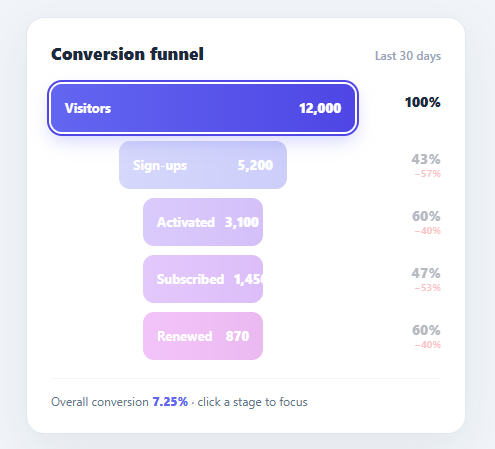
A funnel chart is the clearest way to show how users fall away across the steps of a process — visitors to sign-ups to activated to subscribed. Each stage is narrower than the last, and the shrinking width makes drop-off impossible to miss. This snippet implements a clean, animated funnel in plain HTML, CSS, and vanilla JavaScript: centred tapering bars sized by value, per-stage conversion and drop-off percentages, a staggered grow-in animation on load, and click-to-focus highlighting.
The funnel shape from centred bars
Each stage is a bar whose width is its value as a percentage of the top stage, set via a --w custom property and centred with margin: 0 auto. Because every bar is centred and each is narrower than the one above, the stack naturally forms the symmetric tapering funnel silhouette — no SVG polygons or clip-paths needed. A min-width guarantees even the smallest stage stays wide enough to hold its label and count, so the bottom of the funnel never becomes unreadable.
Two rates per stage: conversion and drop-off
Funnels are only useful if they quantify the fall-off. To the right of each bar, this snippet shows two figures: the step conversion rate (what fraction of the previous stage advanced) and the drop-off below it in red (the percentage lost). Seeing "47%" advance and "−53%" lost on the Subscribed row tells the story at a glance and points analysts straight at the leakiest step. A footer shows the overall end-to-end conversion.
Staggered grow-in animation
On load, each bar animates from width: 0 to its --w target with an fn-grow keyframe, and nth-child animation delays stagger the stages so the funnel "pours" in from top to bottom. The keyframe animates to var(--w), so the same rule works for every stage regardless of its target width. This entrance is what turns a static bar list into a chart that feels alive — and it draws the eye down the funnel in the order the steps actually happen.
Click-to-focus
focusStage adds interactivity: clicking a stage highlights it with a ring and dims the others, so you can isolate one step while presenting. Clicking the same stage again clears the focus. It is a toggle built from two classes — .active on the chosen bar and .dim on the rest — driven by one function, so it stays predictable.
The whole chart is data-light: change a stage's --w, label, count, and rate text to plug in real numbers, or render the stages from an array. Pair this funnel with a bar chart for category breakdowns, a metric card grid for headline KPIs, or a sparkline chart for trends.
Build with AI
Build, Understand, Optimize, and Extend It With AI
You don't have to work out why the bars form a funnel shape on your own. Paste this snippet's HTML, CSS, and JS into an AI coding assistant like Claude and ask it to explain exactly why centering each progressively-narrower bar with margin auto is what produces the tapering silhouette, and why the fn-grow keyframe can animate every stage with the same rule even though each bar's target width is different. The same assistant can help optimize it — ask whether the nth-child animation-delay approach scales cleanly if the number of stages becomes dynamic instead of a fixed five, or whether focusStage's full class-removal-then-reapply pattern is the cheapest way to implement the toggle. It's also useful for extending the chart: have it add absolute drop-off counts alongside the percentages, a horizontal variant that reads left to right instead of top to bottom, or a way to compare two time periods side by side in the same funnel. Treat the code less like a finished artifact and more like a starting point for a conversation.
Prompt to recreate it
Copy this into your AI assistant of choice to build the effect from scratch, or as a jumping-off point for your own variant:
Build an animated conversion funnel chart in plain HTML, CSS, and JavaScript — no chart library, no SVG polygons or clip-paths for the funnel shape itself.

Requirements:
- A card containing several stacked stage rows (at least five), each row showing a horizontal bar with a name and a count on the left, and a step conversion percentage plus a red drop-off percentage on the right.
- Each bar's width must be expressed as a CSS custom property representing that stage's value as a percentage of the very first stage's value, and every bar must be horizontally centered within its row using auto margins — this centering combined with each successive bar being narrower than the one above must be what visually produces the tapering funnel shape, with no other shape-drawing technique involved. Give bars a minimum width so the narrowest stage never becomes too small to hold its label and count.
- Each bar must carry its own two-color gradient via custom properties so the funnel shows a cohesive but distinct hue progression from the first stage to the last.
- On page load, every bar must animate its width from zero up to its target percentage using one single shared CSS keyframe animation that references the width custom property (so the same keyframe rule works regardless of each bar's specific target width), and successive stages must start this animation with an increasing delay so the bars appear to fill in a staggered top-to-bottom sequence rather than all growing simultaneously.
- Clicking any stage must ring/highlight that stage and dim every other stage to roughly a third opacity, isolating it visually; clicking the same already-active stage again must clear the highlight and restore all stages to full opacity. This toggle must be driven by exactly two CSS classes (one for "active", one for "dim") and a single JavaScript function, not per-stage state variables.
- Show an overall end-to-end conversion rate in a footer beneath the stages.
Want to tighten it up first? Run this prompt through the AI Prompt Studio to score it across 8 quality dimensions, catch anti-patterns, and tune the wording for Claude, ChatGPT, or Gemini before you paste it in.
Step by step
How to Use
- 1Paste HTML, CSS, and JSA "Conversion funnel" card appears and five centred bars (Visitors → Renewed) grow in from top to bottom, forming a tapering funnel.
- 2Read the stagesEach bar shows its name and count; its width is proportional to the top stage, so the narrowing visualises drop-off.
- 3Check conversion and lossTo the right of each bar, the step conversion rate sits above the red drop-off percentage (e.g. 47% advanced, −53% lost).
- 4Click a stageClick any bar — it highlights with a ring and the others dim, letting you focus a single step. Click it again to clear.
- 5See overall conversionThe footer shows the end-to-end rate (7.25%), the fraction of visitors who reached the final stage.
- 6Plug in real dataEdit each stage's
--w, label, count, and rate text — or render the stages from your analytics array.
Real-world uses
Common Use Cases
Got questions?
Frequently Asked Questions
Loop your stages array and build each .fn-stage, setting --w to value / stages[0].value * 100 + '%', the count text, and the rate. Compute the step conversion as value / prev.value and the drop-off as 1 − that. Keeping --w relative to the first stage is what produces the correct funnel proportions.
Centring each progressively-narrower bar creates the symmetric funnel silhouette that users instantly recognise as a conversion funnel. Left-aligned bars of decreasing width read as a plain bar chart instead. The margin: 0 auto centring is the single rule that turns bars into a funnel.
Add another line in the .fn-rate column with the lost count (prev.value − value), e.g. "−6,800 users". Many analysts want both the rate and the raw number, since a high percentage on a small stage can matter less than a small percentage on a huge one.
The bars are decorative, so expose the data textually: each stage already shows its name, count, and rate in real text. Add an aria-label per stage summarising it ("Sign-ups: 5,200, 43% of visitors"), and consider an off-screen data table for screen-reader users. Make focusable stages real buttons if click-to-focus is a primary interaction.
In React, map a stages array to bars, compute --w and rates with useMemo, and store the focused index in useState to drive active/dim classes. In Vue, use v-for with :style for --w and a ref for the focused stage. In Angular, *ngFor with [style.--w] and a focused index. The grow keyframe and centring CSS port unchanged.