
Learn Coding Visually
Learn to code with interactive, live-preview playgrounds — HTML, CSS, JavaScript, React & more.
 HTML Playground42 lessons · Click-based · Live preview
 CSS PlaygroundLearn CSS with a live editor
 JavaScript Playground60 lessons · DOM · Async · Canvas
 React PlaygroundLearn React with a live code editor
 GSAP PlaygroundLearn GSAP animation interactively
 SVG Playground44 lessons · shapes · paths · animation
 SCSS Playground45 lessons · Sass modules · tokens
 Tailwind PlaygroundLearn Tailwind CSS with a live editor
 Bootstrap 5 Playground50 lessons · live preview
Onboarding Tour HTML CSS JS — Product Walkthrough Tooltip
Onboarding Tour · Modals · Plain HTML, CSS & JS · Live preview
What's included
Features
About this UI Snippet
Onboarding Tour — How to Build a Product Walkthrough Tour with getBoundingClientRect Tooltip Positioning in JavaScript
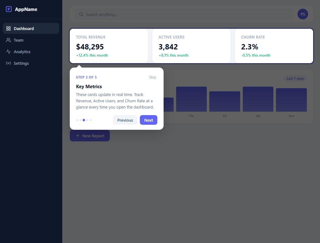
An onboarding tour guides new users through a product's key features on their first visit — highlighting UI elements one by one with positioned tooltips that explain each feature. It's the standard pattern for reducing time-to-value in SaaS products: instead of sending users to a help document, you bring the help directly to the UI elements in context.
Building an onboarding tour from scratch requires solving three genuinely hard problems: accurately positioning a tooltip relative to any arbitrary target element in a scrolled, responsive layout; creating a highlight effect that draws attention to the target without disrupting the layout; and managing step state with keyboard accessibility and resize handling.
This snippet builds a complete five-step product tour in plain JavaScript, without Shepherd.js, Intro.js, or any tour library.
Target Element Positioning with getBoundingClientRect
getBoundingClientRect() returns the position and dimensions of an element relative to the viewport: { top, left, bottom, right, width, height }. This is the correct API for overlay positioning — unlike offsetTop/offsetLeft (which give position relative to the nearest positioned ancestor and require traversing the parent chain), getBoundingClientRect() gives viewport coordinates directly.
The tooltip positioning function: const rect = target.getBoundingClientRect(). For placement: 'right': the tooltip left = rect.right + gap, top = rect.top + rect.height/2 - tooltipHeight/2. For placement below: top = rect.bottom + gap, left = rect.left. The tooltip is position: fixed (not absolute) so it correctly overlays the page regardless of scroll position and parent container transforms.
Viewport Edge Clamping
A positioned tooltip can overflow the viewport if the target element is near a screen edge. After computing the target-relative position, the function clamps: left = Math.max(8, Math.min(left, window.innerWidth - tooltipWidth - 8)) and top = Math.max(8, Math.min(top, window.innerHeight - tooltipHeight - 8)). The 8px margin keeps the tooltip off the absolute viewport edge. This clamping runs after every position computation, including on window.resize.
The Highlight Overlay
Drawing attention to the target element uses two layers. First, a full-screen semi-transparent overlay darkens everything. Second, a "spotlight" cut-out reveals the target at full brightness. This is achieved with a CSS box-shadow technique: the highlight element is sized to match the target element (via getBoundingClientRect) and uses box-shadow: 0 0 0 9999px rgba(0,0,0,0.55) — an enormous outer shadow that spreads to fill the entire viewport around the element, leaving the element itself at normal brightness inside the shadow edge. This creates the spotlight effect without canvas drawing or clip-path masking.
The highlight element is position: fixed and updated on each step transition: highlight.style.top = rect.top - 4 + 'px', highlight.style.left = rect.left - 4 + 'px', highlight.style.width = rect.width + 8 + 'px', highlight.style.height = rect.height + 8 + 'px'. The 4px padding creates breathing room around the target. A border-radius: 6px on the highlight matches the target element's corner rounding.
Step State Machine
The tour has five steps, each defined as: { selector: '#id', title: '...', description: '...', placement: 'right' | 'bottom' | 'left' }. A currentStep integer tracks progress. The functions goNext() and goPrev() increment/decrement currentStep and call showStep(currentStep).
showStep(i) queries the target element (document.querySelector(step.selector)), calls getBoundingClientRect(), positions both the highlight and tooltip, updates the step counter ("3 / 5"), enables/disables Prev/Next buttons at boundaries, and scrolls the target into view with target.scrollIntoView({ behavior: 'smooth', block: 'center' }) to ensure off-screen targets are visible before positioning.
Keyboard Navigation
The tour registers a keydown event listener on document for the duration of the tour: ArrowRight and Enter call goNext(), ArrowLeft calls goPrev(), and Escape calls endTour(). The listener is added when the tour starts and removed when it ends. ARIA attributes — aria-live="polite" on the tooltip content and aria-label on navigation buttons — ensure screen readers announce step changes.
Resize Handling
When the window resizes (e.g., responsive breakpoint change or DevTools opening), target element positions change. A window.resize event listener calls positionTooltip(target, placement) using requestAnimationFrame to debounce: let rafId; window.addEventListener('resize', () => { cancelAnimationFrame(rafId); rafId = requestAnimationFrame(reposition); }). This re-reads getBoundingClientRect() on the current step's target and re-positions both the highlight box and tooltip. Without this, the tooltip and highlight would drift from their targets after a responsive layout change.
Ending and Skipping the Tour
The "Skip" button calls endTour() at any step. endTour() removes the overlay, hides the tooltip and highlight, removes the keyboard listener, and optionally calls localStorage.setItem('tour-complete', '1') to prevent the tour from showing again on page reload. The final step's Next button changes to "Done" and also calls endTour().
Build with AI
Build, Understand, Optimize, and Extend It With AI
You don't need to work out the positioning math and the highlight technique on your own. Paste this snippet's HTML, CSS, and JS into an AI coding assistant like Claude and ask it to walk through exactly how positionTooltip decides between placement right, below, or above by comparing spaceBelow and spaceAbove against the tooltip's measured height, or why the spotlight uses a single box-shadow spread to 9999px instead of a canvas overlay with a cutout. The same assistant can help you optimize it — ask whether the resize listener's requestAnimationFrame debounce is enough on a page with dozens of potential tour targets, or whether repositioning should be skipped entirely while the tooltip is off-screen. It's equally useful for extending the tour: have it add scrollIntoView so off-screen steps auto-scroll into position, support a left or top placement option, or persist tour completion to localStorage so returning users don't see it again. Treat the code less like a finished artifact and more like a starting point for a conversation.
Prompt to recreate it
Copy this into your AI assistant of choice to build the effect from scratch, or as a jumping-off point for your own variant:
Build a "product onboarding tour" in plain HTML, CSS, and JavaScript using only getBoundingClientRect for positioning — no third-party tour library like Shepherd, Intro.js, or Driver.js.
Requirements:
- A STEPS array of plain objects, each with a CSS selector for its target element, a title, a description, and an optional placement (e.g. right, or default below/above).
- A highlight technique that adds a class to the current target element giving it box-shadow: 0 0 0 9999px rgba(0,0,0,0.6) (or similar) plus a colored ring shadow, and a temporarily elevated z-index, so the target appears lit against a fully darkened rest-of-page with no separate overlay element and no clip-path.
- A tooltip element positioned with position: fixed, whose top and left are computed from the target's getBoundingClientRect() each step: if placement is right, center it vertically beside the element; otherwise decide between placing it below or above the target based on which side actually has enough remaining viewport space, defaulting to below when both fit.
- After computing the raw position, clamp both left and top so the tooltip never overflows the viewport edges, leaving a small margin (e.g. 8-12px) on all sides.
- A dot-based progress indicator and a step counter label ("Step N of Total") that update every time the step changes, plus Previous/Next buttons where Previous is disabled on the first step and Next relabels to "Finish" on the last step.
- Keyboard support: ArrowRight or Enter advances, ArrowLeft goes back, and Escape ends the tour immediately, all wired through a single keydown listener active only while the tour is running.
- A window resize listener that recomputes and reapplies the tooltip's position for whatever step is currently active, so the tooltip and highlight never drift away from their target after a layout change.
- On completing the final step, remove the highlight and show a short-lived success toast confirming the tour is done.Want to tighten it up first? Run this prompt through the AI Prompt Studio to score it across 8 quality dimensions, catch anti-patterns, and tune the wording for Claude, ChatGPT, or Gemini before you paste it in.
Source Code
<div class="app">

  <!-- Sidebar -->
  <aside class="sidebar" id="tour-sidebar">
    <div class="sidebar-logo">
      <svg width="22" height="22" viewBox="0 0 24 24" fill="none" stroke="currentColor" stroke-width="2.2" stroke-linecap="round"><rect x="3" y="3" width="18" height="18" rx="3"/><path d="M9 9h6M9 12h6M9 15h4"/></svg>
      <span>AppName</span>
    </div>
    <nav class="sidebar-nav">
      <a class="nav-item active" href="#">
        <svg width="16" height="16" viewBox="0 0 24 24" fill="none" stroke="currentColor" stroke-width="2" stroke-linecap="round"><rect x="3" y="3" width="7" height="7" rx="1"/><rect x="14" y="3" width="7" height="7" rx="1"/><rect x="3" y="14" width="7" height="7" rx="1"/><rect x="14" y="14" width="7" height="7" rx="1"/></svg>
        Dashboard
      </a>
      <a class="nav-item" href="#">
        <svg width="16" height="16" viewBox="0 0 24 24" fill="none" stroke="currentColor" stroke-width="2" stroke-linecap="round"><path d="M17 21v-2a4 4 0 0 0-4-4H5a4 4 0 0 0-4 4v2"/><circle cx="9" cy="7" r="4"/><path d="M23 21v-2a4 4 0 0 0-3-3.87"/><path d="M16 3.13a4 4 0 0 1 0 7.75"/></svg>
        Team
      </a>
      <a class="nav-item" href="#">
        <svg width="16" height="16" viewBox="0 0 24 24" fill="none" stroke="currentColor" stroke-width="2" stroke-linecap="round"><polyline points="22 12 18 12 15 21 9 3 6 12 2 12"/></svg>
        Analytics
      </a>
      <a class="nav-item" href="#">
        <svg width="16" height="16" viewBox="0 0 24 24" fill="none" stroke="currentColor" stroke-width="2" stroke-linecap="round"><circle cx="12" cy="12" r="3"/><path d="M19.07 4.93a10 10 0 0 1 0 14.14M4.93 4.93a10 10 0 0 0 0 14.14"/></svg>
        Settings
      </a>
    </nav>
  </aside>

  <!-- Main content -->
  <div class="main">

    <!-- Header -->
    <header class="header">
      <div class="search-wrap" id="tour-search">
        <svg width="15" height="15" viewBox="0 0 24 24" fill="none" stroke="currentColor" stroke-width="2.2" stroke-linecap="round"><circle cx="11" cy="11" r="8"/><line x1="21" y1="21" x2="16.65" y2="16.65"/></svg>
        <input class="search-input" placeholder="Search anything…" readonly />
      </div>
      <div class="header-right">
        <div class="avatar">PS</div>
      </div>
    </header>

    <!-- Stat cards -->
    <section class="stats" id="tour-stats">
      <div class="stat-card">
        <div class="stat-label">Total Revenue</div>
        <div class="stat-value">$48,295</div>
        <div class="stat-change up">+12.4% this month</div>
      </div>
      <div class="stat-card">
        <div class="stat-label">Active Users</div>
        <div class="stat-value">3,842</div>
        <div class="stat-change up">+8.1% this month</div>
      </div>
      <div class="stat-card">
        <div class="stat-label">Churn Rate</div>
        <div class="stat-value">2.3%</div>
        <div class="stat-change down">-0.5% this month</div>
      </div>
    </section>

    <!-- Chart area -->
    <div class="chart-area" id="tour-chart">
      <div class="chart-header">
        <span class="chart-title">Revenue over time</span>
        <span class="chart-badge">Last 7 days</span>
      </div>
      <div class="chart-bars">
        <div class="bar-col"><div class="bar" style="height:55%"></div><span class="bar-label">Mon</span></div>
        <div class="bar-col"><div class="bar" style="height:70%"></div><span class="bar-label">Tue</span></div>
        <div class="bar-col"><div class="bar" style="height:45%"></div><span class="bar-label">Wed</span></div>
        <div class="bar-col"><div class="bar" style="height:85%"></div><span class="bar-label">Thu</span></div>
        <div class="bar-col"><div class="bar" style="height:65%"></div><span class="bar-label">Fri</span></div>
        <div class="bar-col"><div class="bar" style="height:90%"></div><span class="bar-label">Sat</span></div>
        <div class="bar-col"><div class="bar" style="height:75%"></div><span class="bar-label">Sun</span></div>
      </div>
    </div>

    <!-- Action button -->
    <div class="action-row">
      <button class="action-btn" id="tour-action-btn">
        <svg width="15" height="15" viewBox="0 0 24 24" fill="none" stroke="currentColor" stroke-width="2.5" stroke-linecap="round"><line x1="12" y1="5" x2="12" y2="19"/><line x1="5" y1="12" x2="19" y2="12"/></svg>
        New Report
      </button>
    </div>

  </div><!-- /.main -->
</div><!-- /.app -->

<!-- Start Tour button (shown before tour begins) -->
<div class="tour-launcher" id="tour-launcher">
  <button class="start-tour-btn" id="start-tour-btn">
    <svg width="16" height="16" viewBox="0 0 24 24" fill="none" stroke="currentColor" stroke-width="2.2" stroke-linecap="round"><circle cx="12" cy="12" r="10"/><line x1="12" y1="8" x2="12" y2="12"/><line x1="12" y1="16" x2="12.01" y2="16"/></svg>
    Start Tour
  </button>
</div>

<!-- Tour tooltip -->
<div class="tour-tooltip" id="tour-tooltip" role="dialog" aria-modal="true" aria-label="Tour step">
  <div class="tooltip-header">
    <span class="tooltip-step-label" id="tooltip-step-label">Step 1 of 5</span>
    <button class="tooltip-skip" id="tooltip-skip">Skip</button>
  </div>
  <div class="tooltip-title" id="tooltip-title"></div>
  <div class="tooltip-desc" id="tooltip-desc"></div>
  <div class="tooltip-footer">
    <div class="tooltip-dots" id="tooltip-dots"></div>
    <div class="tooltip-nav">
      <button class="tooltip-btn secondary" id="tooltip-prev">Previous</button>
      <button class="tooltip-btn primary" id="tooltip-next">Next</button>
    </div>
  </div>
</div>

<!-- Success toast -->
<div class="tour-toast" id="tour-toast">
  <span>Tour complete! 🎉</span>
  <span>You're all set — explore the dashboard.</span>
</div>
* { box-sizing: border-box; margin: 0; padding: 0; }
body { font-family: system-ui, -apple-system, sans-serif; background: #f1f5f9; min-height: 100vh; overflow: hidden; }
/* ── App shell ── */
.app { display: flex; height: 100vh; }
/* Sidebar */
.sidebar { width: 200px; flex-shrink: 0; background: #0f172a; display: flex; flex-direction: column; padding: 20px 0; }
.sidebar-logo { display: flex; align-items: center; gap: 9px; padding: 0 18px 20px; color: #f1f5f9; font-size: 15px; font-weight: 700; border-bottom: 1px solid #1e293b; }
.sidebar-logo svg { color: #6366f1; }
.sidebar-nav { padding: 12px 10px; display: flex; flex-direction: column; gap: 2px; }
.nav-item { display: flex; align-items: center; gap: 9px; padding: 9px 10px; border-radius: 8px; color: #94a3b8; font-size: 13px; font-weight: 500; text-decoration: none; transition: background 0.15s, color 0.15s; }
.nav-item:hover { background: #1e293b; color: #f1f5f9; }
.nav-item.active { background: #1e293b; color: #f1f5f9; }
/* Main area */
.main { flex: 1; overflow-y: auto; display: flex; flex-direction: column; gap: 20px; padding: 20px 24px; }
/* Header */
.header { display: flex; align-items: center; gap: 14px; background: #fff; border-radius: 12px; padding: 10px 16px; box-shadow: 0 1px 3px rgba(0,0,0,0.07); }
.search-wrap { flex: 1; display: flex; align-items: center; gap: 8px; background: #f8fafc; border: 1px solid #e2e8f0; border-radius: 8px; padding: 7px 12px; }
.search-wrap svg { color: #94a3b8; flex-shrink: 0; }
.search-input { flex: 1; border: none; background: none; outline: none; font-size: 13px; color: #475569; font-family: inherit; }
.search-input::placeholder { color: #94a3b8; }
.header-right { display: flex; align-items: center; gap: 10px; }
.avatar { width: 34px; height: 34px; border-radius: 50%; background: #6366f1; color: #fff; display: flex; align-items: center; justify-content: center; font-size: 12px; font-weight: 700; flex-shrink: 0; }
/* Stats */
.stats { display: grid; grid-template-columns: repeat(3, 1fr); gap: 14px; }
.stat-card { background: #fff; border-radius: 12px; padding: 18px 20px; box-shadow: 0 1px 3px rgba(0,0,0,0.07); }
.stat-label { font-size: 12px; color: #94a3b8; font-weight: 500; text-transform: uppercase; letter-spacing: 0.4px; margin-bottom: 6px; }
.stat-value { font-size: 24px; font-weight: 700; color: #0f172a; margin-bottom: 4px; }
.stat-change { font-size: 12px; font-weight: 500; }
.stat-change.up { color: #10b981; }
.stat-change.down { color: #10b981; }
/* Chart */
.chart-area { background: #fff; border-radius: 12px; padding: 18px 20px; box-shadow: 0 1px 3px rgba(0,0,0,0.07); }
.chart-header { display: flex; align-items: center; justify-content: space-between; margin-bottom: 16px; }
.chart-title { font-size: 14px; font-weight: 600; color: #0f172a; }
.chart-badge { font-size: 11px; font-weight: 600; color: #6366f1; background: #eef2ff; border-radius: 20px; padding: 3px 10px; }
.chart-bars { display: flex; align-items: flex-end; gap: 8px; height: 100px; }
.bar-col { flex: 1; display: flex; flex-direction: column; align-items: center; gap: 6px; height: 100%; justify-content: flex-end; }
.bar { width: 100%; background: linear-gradient(180deg, #6366f1, #818cf8); border-radius: 4px 4px 0 0; transition: opacity 0.2s; }
.bar-label { font-size: 10px; color: #94a3b8; font-weight: 500; }
/* Action row */
.action-row { display: flex; }
.action-btn { display: flex; align-items: center; gap: 7px; padding: 10px 18px; background: #6366f1; color: #fff; border: none; border-radius: 9px; font-size: 13px; font-weight: 600; cursor: pointer; font-family: inherit; transition: background 0.15s; }
.action-btn:hover { background: #4f46e5; }
/* ── Tour launcher ── */
.tour-launcher { position: fixed; bottom: 24px; right: 24px; z-index: 5; }
.start-tour-btn { display: flex; align-items: center; gap: 8px; padding: 11px 20px; background: #0f172a; color: #f1f5f9; border: none; border-radius: 10px; font-size: 14px; font-weight: 600; cursor: pointer; font-family: inherit; box-shadow: 0 4px 16px rgba(0,0,0,0.25); transition: transform 0.15s, box-shadow 0.15s; }
.start-tour-btn:hover { transform: translateY(-1px); box-shadow: 0 6px 20px rgba(0,0,0,0.3); }
.tour-launcher.hidden { display: none; }
/* ── Tour highlighted element ── */
.tour-highlight {
position: relative;
z-index: 200 !important;
box-shadow: 0 0 0 9999px rgba(0,0,0,0.62), 0 0 0 3px rgba(99,102,241,0.8) !important;
border-radius: 10px;
transition: box-shadow 0.3s ease;
pointer-events: none;
}
/* ── Tour tooltip ── */
.tour-tooltip {
position: fixed;
z-index: 300;
background: #fff;
border-radius: 14px;
padding: 20px 20px 16px;
width: 300px;
box-shadow: 0 12px 40px rgba(0,0,0,0.2), 0 0 0 1px rgba(0,0,0,0.06);
opacity: 0;
transform: translateY(6px);
transition: opacity 0.25s ease, transform 0.25s ease;
pointer-events: none;
}
.tour-tooltip.visible {
opacity: 1;
transform: translateY(0);
pointer-events: all;
}
/* Tooltip arrow */
.tour-tooltip::before {
content: '';
position: absolute;
width: 12px;
height: 12px;
background: #fff;
transform: rotate(45deg);
left: 24px;
top: -6px;
box-shadow: -2px -2px 4px rgba(0,0,0,0.06);
}
.tour-tooltip.arrow-bottom::before {
top: auto;
bottom: -6px;
box-shadow: 2px 2px 4px rgba(0,0,0,0.06);
}
.tooltip-header { display: flex; align-items: center; justify-content: space-between; margin-bottom: 10px; }
.tooltip-step-label { font-size: 11px; font-weight: 700; color: #6366f1; text-transform: uppercase; letter-spacing: 0.5px; }
.tooltip-skip { background: none; border: none; font-size: 12px; color: #94a3b8; cursor: pointer; font-family: inherit; padding: 2px 4px; border-radius: 4px; transition: color 0.15s; }
.tooltip-skip:hover { color: #475569; }
.tooltip-title { font-size: 15px; font-weight: 700; color: #0f172a; margin-bottom: 6px; }
.tooltip-desc { font-size: 13px; color: #64748b; line-height: 1.55; margin-bottom: 16px; }
.tooltip-footer { display: flex; align-items: center; justify-content: space-between; gap: 10px; }
.tooltip-dots { display: flex; gap: 5px; align-items: center; }
.tooltip-dot { width: 6px; height: 6px; border-radius: 50%; background: #e2e8f0; transition: background 0.2s, transform 0.2s; }
.tooltip-dot.active { background: #6366f1; transform: scale(1.3); }
.tooltip-nav { display: flex; gap: 8px; }
.tooltip-btn { padding: 7px 14px; border-radius: 8px; font-size: 13px; font-weight: 600; cursor: pointer; font-family: inherit; border: none; transition: background 0.15s, opacity 0.15s; }
.tooltip-btn.secondary { background: #f1f5f9; color: #475569; }
.tooltip-btn.secondary:hover { background: #e2e8f0; }
.tooltip-btn.secondary:disabled { opacity: 0.35; cursor: default; }
.tooltip-btn.primary { background: #6366f1; color: #fff; }
.tooltip-btn.primary:hover { background: #4f46e5; }
/* ── Success toast ── */
.tour-toast {
position: fixed;
bottom: 28px;
left: 50%;
transform: translateX(-50%) translateY(20px);
background: #0f172a;
color: #f1f5f9;
border-radius: 12px;
padding: 14px 22px;
display: flex;
flex-direction: column;
gap: 3px;
font-size: 14px;
font-weight: 600;
box-shadow: 0 8px 30px rgba(0,0,0,0.25);
opacity: 0;
pointer-events: none;
transition: opacity 0.3s ease, transform 0.3s ease;
z-index: 400;
text-align: center;
white-space: nowrap;
}
.tour-toast span:last-child { font-size: 12px; font-weight: 400; color: #94a3b8; }
.tour-toast.show { opacity: 1; transform: translateX(-50%) translateY(0); }const STEPS = [
{
selector: '#tour-sidebar',
title: 'Sidebar Navigation',
description: 'A product onboarding tour in vanilla JavaScript. Step tooltips highlight key UI elements, with progress tracking, smooth transitions, and dynamic positioning.',
placement: 'right',
},
{
selector: '#tour-search',
title: 'Global Search',
description: 'Search across your entire workspace instantly. Press / from anywhere to focus the search bar without clicking.',
},
{
selector: '#tour-stats',
title: 'Key Metrics',
description: 'These cards update in real time. Track Revenue, Active Users, and Churn Rate at a glance every time you open the dashboard.',
},
{
selector: '#tour-chart',
title: 'Revenue Chart',
description: 'Visualise revenue trends over the last 7 days. Hover any bar for the exact daily figure, or switch to the Analytics view for deeper reports.',
},
{
selector: '#tour-action-btn',
title: 'Create a Report',
description: 'Click "New Report" to generate a custom report — choose date ranges, metrics, and export as CSV or PDF.',
},
];
let currentStep = -1;
let previousEl = null;
/* ── Helpers ── */
function getEl(sel) { return document.querySelector(sel); }
function buildDots(active) {
const container = getEl('#tooltip-dots');
container.innerHTML = '';
STEPS.forEach((_, i) => {
const dot = document.createElement('div');
dot.className = 'tooltip-dot' + (i === active ? ' active' : '');
container.appendChild(dot);
});
}
function positionTooltip(targetEl, placement) {
const tooltip = getEl('#tour-tooltip');
const rect = targetEl.getBoundingClientRect();
const tw = tooltip.offsetWidth || 300;
const th = tooltip.offsetHeight || 160;
const margin = 14;
const vw = window.innerWidth;
const vh = window.innerHeight;
let top, left, arrowBottom = false;
if (placement === 'right') {
// Place to the right, vertically centered on the element
left = rect.right + margin;
top = rect.top + (rect.height / 2) - (th / 2);
tooltip.classList.remove('arrow-bottom');
} else {
// Decide: below or above
const spaceBelow = vh - rect.bottom;
const spaceAbove = rect.top;
if (spaceBelow >= th + margin + 10 || spaceBelow >= spaceAbove) {
top = rect.bottom + margin;
arrowBottom = false;
} else {
top = rect.top - th - margin;
arrowBottom = true;
}
left = rect.left;
tooltip.classList.toggle('arrow-bottom', arrowBottom);
}
// Clamp to viewport
if (left + tw > vw - 12) left = vw - tw - 12;
if (left < 12) left = 12;
top = Math.max(8, Math.min(vh - th - 8, top));
tooltip.style.top = top + 'px';
tooltip.style.left = left + 'px';
}
function highlightStep(index) {
// Remove previous highlight
if (previousEl) {
previousEl.classList.remove('tour-highlight');
previousEl = null;
}
const step = STEPS[index];
const targetEl = getEl(step.selector);
if (!targetEl) return;
targetEl.classList.add('tour-highlight');
previousEl = targetEl;
// Update tooltip content
getEl('#tooltip-step-label').textContent = 'Step ' + (index + 1) + ' of ' + STEPS.length;
getEl('#tooltip-title').textContent = step.title;
getEl('#tooltip-desc').textContent = step.description;
buildDots(index);
// Prev button state
const prevBtn = getEl('#tooltip-prev');
prevBtn.disabled = index === 0;
// Next button label
const nextBtn = getEl('#tooltip-next');
nextBtn.textContent = index === STEPS.length - 1 ? 'Finish' : 'Next';
// Show tooltip (briefly invisible for re-position)
const tooltip = getEl('#tour-tooltip');
tooltip.classList.remove('visible');
// Position after DOM settles
requestAnimationFrame(() => {
positionTooltip(targetEl, step.placement);
requestAnimationFrame(() => {
tooltip.classList.add('visible');
});
});
}
function startTour() {
getEl('#tour-launcher').classList.add('hidden');
currentStep = 0;
highlightStep(currentStep);
}
function endTour() {
// Remove highlight
if (previousEl) {
previousEl.classList.remove('tour-highlight');
previousEl = null;
}
const tooltip = getEl('#tour-tooltip');
tooltip.classList.remove('visible');
currentStep = -1;
}
function skipTour() {
endTour();
getEl('#tour-launcher').classList.add('hidden');
}
function completeTour() {
endTour();
getEl('#tour-launcher').classList.add('hidden');
// Show success toast
const toast = getEl('#tour-toast');
toast.classList.add('show');
setTimeout(() => toast.classList.remove('show'), 3500);
}
function goNext() {
if (currentStep === -1) return;
if (currentStep < STEPS.length - 1) {
currentStep++;
highlightStep(currentStep);
} else {
completeTour();
}
}
function goPrev() {
if (currentStep <= 0) return;
currentStep--;
highlightStep(currentStep);
}
/* ── Event listeners ── */
document.getElementById('start-tour-btn').addEventListener('click', startTour);
document.getElementById('tooltip-next').addEventListener('click', goNext);
document.getElementById('tooltip-prev').addEventListener('click', goPrev);
document.getElementById('tooltip-skip').addEventListener('click', skipTour);
document.addEventListener('keydown', function (e) {
if (currentStep === -1) return;
if (e.key === 'Escape') { skipTour(); return; }
if (e.key === 'ArrowRight' || e.key === 'Enter') { e.preventDefault(); goNext(); }
if (e.key === 'ArrowLeft') { e.preventDefault(); goPrev(); }
});
window.addEventListener('resize', function () {
if (currentStep >= 0 && previousEl) {
positionTooltip(previousEl, STEPS[currentStep].placement);
}
});Step by step
How to Use
- 1Start the tourClick "Start Tour" to begin. The first target element highlights with a spotlight box-shadow and a positioned tooltip appears beside it.
- 2Navigate forwardClick "Next" or press the right arrow key to advance to the next step. Each step highlights a different UI element and repositions the tooltip.
- 3Navigate backwardClick "Back" or press the left arrow key to return to the previous step. The highlight and tooltip move back to the previous target.
- 4Skip or endClick "Skip" at any step to end the tour immediately. On the last step, the Next button becomes "Done" and ends the tour on click.
- 5Define your stepsEdit the STEPS array: each entry needs a selector (#id or .class), a title, a description, and an optional placement (right, bottom, left). The tour positions itself relative to whatever element matches the selector.
- 6Persist tour completionAdd localStorage.setItem("tour-done", "1") in endTour(), then check localStorage.getItem("tour-done") before calling startTour() to skip the tour for returning users.
Real-world uses
Common Use Cases
Got questions?
Frequently Asked Questions
The highlight element is a div sized to match the target element using getBoundingClientRect(). It has box-shadow: 0 0 0 9999px rgba(0,0,0,0.55) — an enormous outer box-shadow that spreads in all directions to fill the entire viewport with a dark overlay. The element itself is left at normal brightness, creating the spotlight effect. A border-radius matches the target element's corners. This technique requires no canvas, no SVG, and no clip-path — just one CSS property on a positioned element.
position:absolute positions relative to the nearest positioned ancestor, which may not be the viewport. If the tour runs inside a container with position:relative and overflow:hidden, an absolute tooltip can be clipped. position:fixed always positions relative to the viewport, regardless of scroll position, parent transforms, or container overflow. Since getBoundingClientRect() also returns viewport-relative coordinates, the two are consistent: fixed + getBoundingClientRect() gives the correct position every time.
In positionTooltip(), add cases for "left" and "top": case "left": left = rect.left - tooltipWidth - gap; top = rect.top + rect.height/2 - tooltipHeight/2; break; case "top": top = rect.top - tooltipHeight - gap; left = rect.left + rect.width/2 - tooltipWidth/2; break;. Then apply the same viewport edge clamping to both. Add the placement to the step definition: { selector: "#id", placement: "left", ... }.
In endTour(): localStorage.setItem("onboarding-v1-done", "1"). In your initialization: if (!localStorage.getItem("onboarding-v1-done")) { startTour(); }. Version the key ("v1") so that a new tour version (new features added) shows to users who already completed the old tour. For server-persisted completion (across devices), save a flag to the user record via your API in endTour() and check it server-side before rendering the tour trigger.
window.addEventListener("resize", handler) fires continuously during a drag-resize. Without debouncing, the handler would call getBoundingClientRect() and update the DOM on every resize pixel, causing performance issues. The rAF debounce: let rafId; const handler = () => { cancelAnimationFrame(rafId); rafId = requestAnimationFrame(reposition); }. cancelAnimationFrame cancels any pending rAF from a previous resize event, and the new rAF schedules one call after the current resize frame. reposition re-reads getBoundingClientRect on the current step target and updates highlight and tooltip positions.
Yes. Export via the JSX, Vue, Angular, or Tailwind buttons on this page. In React, keep the current step index in useState and compute the spotlight position from getBoundingClientRect inside a useLayoutEffect so the highlight measures the target after each render.