Learn Coding Visually
Learn to code with interactive, live-preview playgrounds — HTML, CSS, JavaScript, React & more.
 HTML Playground42 lessons · Click-based · Live preview
 CSS PlaygroundLearn CSS with a live editor
 JavaScript Playground60 lessons · DOM · Async · Canvas
 React PlaygroundLearn React with a live code editor
 GSAP PlaygroundLearn GSAP animation interactively
 SVG Playground44 lessons · shapes · paths · animation
 SCSS Playground45 lessons · Sass modules · tokens
 Tailwind PlaygroundLearn Tailwind CSS with a live editor
 Bootstrap 5 Playground50 lessons · live preview
Mega Menu — Free HTML CSS JS Dropdown Snippet
Mega Menu · Navigation · Plain HTML, CSS & JS · Live preview
What's included
Features
About this UI Snippet
Mega Menu — HTML CSS JavaScript
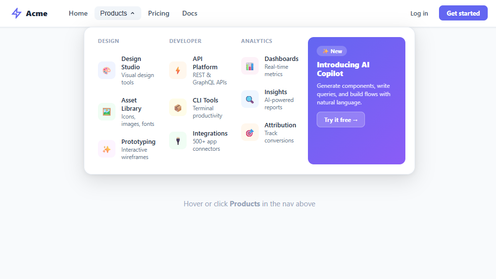
Desktop mega menu with 3 linked columns, featured card, hover and click open, arrow indicator, and Escape-to-close. Pure HTML/CSS/JS.
A mega menu is an expanded navigation dropdown that reveals multiple columns of categorised links, often with a featured promotional panel. It is the standard pattern for product-heavy SaaS sites, e-commerce stores, and enterprise dashboards where a simple one-level dropdown cannot surface enough destinations without overwhelming users. This snippet builds a full mega menu with three linked columns, a gradient featured card, a CSS arrow pointer, and combined hover + click behaviour — all in vanilla HTML, CSS, and JavaScript.
Panel positioning and the CSS arrow
The mega panel is position: absolute; left: 50%; transform: translateX(-50%) on the .has-mega nav item. This centres the panel below the trigger regardless of where the nav item sits in the bar. The open state composes two transforms on a single property: transform: translateX(-50%) translateY(0) scale(1) — the closed state uses translateX(-50%) translateY(-8px) scale(0.98). Both transforms must be written together or the translateX centering is lost when the other transforms change. The decorative arrow pointer is a pseudo-element ::before rotated 45° with the same border-left and border-top as the panel border, positioned absolutely above the panel top edge.
Hover-intent with timer guard
A plain mouseenter / mouseleave approach causes flickering as the mouse moves from the nav trigger across the 14px gap into the panel. The solution is a scheduleClose() function that sets a 150ms setTimeout on mouseleave. Both the trigger's parent <li> and the mega panel itself call clearTimeout on mouseenter, cancelling the pending close. This creates a "hover bridge" — the user can move the mouse across the gap without the panel closing mid-movement.
Dual open trigger (hover + click)
The trigger button also supports click-to-toggle, which is essential for keyboard users and touch devices where hover events do not fire reliably. The click handler calls e.stopPropagation() to prevent the document-level click listener from immediately closing a panel that was just opened. The document listener closes the panel when a click lands outside the .has-mega container, using .contains() to check ancestry.
Keyboard accessibility
An Escape keydown listener on the document always closes the panel regardless of focus position. The trigger button carries aria-haspopup="true" and aria-expanded which is toggled on every open/close. The mega div uses role="region" with aria-label="Products menu" so screen readers announce the region when focus enters.
Featured panel
The fourth column is a gradient card using background: linear-gradient(135deg, #6366f1, #8b5cf6) — the indigo-to-violet diagonal is a common SaaS brand treatment. The featured CTA button uses rgba(255,255,255,0.2) background so it adapts to any gradient colour behind it without needing a hardcoded contrasting colour. The width: fit-content on the CTA prevents it from stretching to full column width.
Build with AI
Build, Understand, Optimize, and Extend It With AI
You don't need to trace the open and close logic by hand to trust it. Paste this snippet's HTML, CSS, and JS into an AI coding assistant like Claude and ask it to explain exactly why the scheduleClose function's 150ms setTimeout paired with clearTimeout on both the trigger and the panel prevents flicker across the gap between them, or why the open state has to rewrite translateX, translateY, and scale together on the transform property rather than layering them separately. The same assistant is useful for optimizing it — asking whether the document-level click listener should be scoped more narrowly once there are several mega menus on one page, or whether the panel's transition properties could be trimmed for snappier perceived response. It's just as good for extending the effect: ask it to add arrow-key navigation between mega-links, support a second mega menu for another nav item, or swap emoji icon tiles for real SVGs without breaking the grid. Treat the code less like a finished artifact and more like a starting point for a conversation.
Prompt to recreate it
Copy this into your AI assistant of choice to build the effect from scratch, or as a jumping-off point for your own variant:
Build a desktop "mega menu" dropdown in plain HTML, CSS, and JavaScript using only CSS grid, transforms, and vanilla event listeners — no libraries.

Requirements:
- A horizontal nav bar with a logo, a list of nav items, and a trigger button for one item (e.g. "Products") that has aria-haspopup="true" and an aria-expanded attribute kept in sync with open state.
- A mega panel absolutely positioned under the trigger's containing list item, centered with left: 50% and transform: translateX(-50%). The open state must add translateY(0) scale(1) to the SAME transform declaration as the centering translateX, not a separate rule, so opening the panel never loses the horizontal centering.
- Inside the panel, a CSS grid with three or more link columns (icon tile, name, description per link) plus a distinct fourth "featured" column styled with a gradient background and a call-to-action button.
- Implement hover-intent: opening on mouseenter of the trigger's parent list item, and on mouseleave scheduling a close with a roughly 150ms setTimeout — but cancel that pending timeout with clearTimeout if the mouse re-enters either the trigger's parent or the panel itself, so moving the cursor across the small gap between trigger and panel never causes a flicker-close.
- Also support opening and closing the panel by clicking the trigger button (call stopPropagation on that click so a document-level click-outside listener doesn't immediately re-close it), by clicking anywhere outside the menu (using contains() to detect outside clicks), and by pressing Escape from anywhere on the page.
- Add a CSS-only arrow/pointer indicator on the panel using a rotated pseudo-element that shares the panel's border color.
- Toggle a chevron icon's rotation to reflect open/closed state, and keep aria-expanded synced on every open and close call.
Want to tighten it up first? Run this prompt through the AI Prompt Studio to score it across 8 quality dimensions, catch anti-patterns, and tune the wording for Claude, ChatGPT, or Gemini before you paste it in.
Step by step
How to Use
- 1Hover over "Products"The mega panel slides down with a scale-and-fade animation and a CSS arrow indicator points up to the trigger button.
- 2Browse the three columnsEach column has a category heading and three links with icon, name, and description. Hover each link for the background highlight.
- 3See the featured cardThe fourth column shows a gradient promotional card with a "New" badge, title, description, and a CTA button.
- 4Move mouse awayMoving the mouse off the panel or the trigger starts a 150ms close timer. Moving back into either cancels it — no accidental closes.
- 5Press EscapePressing Escape closes the panel from anywhere on the page, resetting the trigger's aria-expanded to false.
- 6Add more mega menusDuplicate the .has-mega <li> structure for other nav items. Each needs its own trigger, mega div, and JS listener wired to separate element IDs.
Real-world uses
Common Use Cases
Got questions?
Frequently Asked Questions
Duplicate the .has-mega <li> with a new id on both the trigger button and the mega div. Add a second set of open/close event listeners in JS referencing the new IDs. Each mega menu is fully independent.
On mobile, hide .mega and replace with an off-canvas drawer or accordion. Use a media query to switch the .has-mega from position:relative + hover behaviour to a full-width collapsible panel on small screens.
CSS transform is a single property — setting transform in one rule overwrites any previously set transform values. If the open state only sets translateY(0) scale(1), it loses the translateX(-50%) centering from the base rule. All transforms must be written together.
Fetch your navigation data on page load, then generate the .mega-inner HTML using a template literal map over the response data. Re-attach event listeners after innerHTML is set, or use event delegation with a single listener on .mega-inner.
Listen for ArrowDown on the trigger to move focus into the first mega link. Then listen for ArrowDown/ArrowUp on .mega-link elements to move between them with element.nextElementSibling?.focus(). Tab naturally moves focus forward through links.
Yes. Export it as a React, Vue, or Angular component with the buttons above the preview. The hover-to-open dropdown and the multi-column panel grid are pure CSS, so they port over unchanged; the only JavaScript — the click-outside close and the keyboard focus handling — moves into a useEffect (React), onMounted (Vue), or ngAfterViewInit (Angular) lifecycle hook so listeners attach after the menu mounts. The link data is a natural fit for an array you map over with JSX, v-for, or *ngFor. The Tailwind export rewrites the mega-panel grid, spacing, and hover states as utility classes for a Tailwind project.